If you're a photographer who also does digital art or compositing, I promise you're going to want to watch this quick tutorial.
I've been working in Photoshop for a while now, and I thought I knew the program pretty well, but I learned something today that is going to make my digital art and compositing worlds easier. Photographer and digital artist Dustin Valkema has a portfolio full of super-rad composites and digital art, and in this incredibly helpful little tutorial, he shares a simple tip that helps you color match in seconds. Yes, seconds.

One of the most important things to get right when compositing is matching the color of the elements to the background. If the colors don't match, the end product won't look believable, no matter how skillful the masking. Until now, I've always done this "by hand," playing with curves, color balance, and selective color until things looked right. But Valkema shares a tricky little technique I didn't even know existed to have his element matched to the background in a fraction of the time it might have taken with other methods.
Have you ever heard of this trick before? Let me know in the comments section so I don't feel like a completely inept Photoshop user.
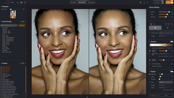
Lead image used with permission of Dustin Valkema





Join the Fstoppers community for free
-
Post comments and join in the discussions
-
Browse the site ad-free
-
Share your work and get featured in the community
-
Compete in the photo contests for fun and prizes
2 Comments
Nice guy, helpful tip.
Definitely.