Making composites look seamless and realistic is the ultimate goal of a digital artist. In this tutorial, you will learn a simple and very effective technique for matching the degree of saturation of your background and subject.
Antti Karppinen is known for creating beautiful storytelling imagery. In this video, he demonstrates how to match the saturation of a subject to the background on which it will be placed. Karppinen notes that it is difficult to perceive differences in the degree of saturation by eye, and he walks us through a quick Photoshop technique to take the guesswork out of achieving consistent saturation.
Karppinen uses a Selective Color adjustment layer and sets the color sliders to 0, and the neutral sliders to 100. This generates a black and white saturation map of the overall image, with white areas indicating regions of high saturation. Once he is able to visualize the areas needing a saturation adjustment, he creates a Hue/Saturation layer that is clipped to the layer containing the subject. In this example, the saturation of the subject layer is decreased. Using the Info tool allows him to precisely assess the saturation levels of specific areas in order to match them accurately.
Blending components of composite images to create uniform tones and saturation will help them to appear realistic and professional. This technique is a quick and easy way to measure and adjust the saturation of any image you wish to create.


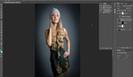

By the way, if the girl on the picture used the rocketlauncher like that she would be cooked by the backdraft.
Yes, clearly that should be pointed out for safety reasons.
Bad picture, google stock pic, both shot with different lighting so all the saturation tricks in the world won't change that unless you like the fake look.
This was not the final image. Just wanted to show the technique and it surely has helped me. You can see the Final image on my webpages, a bit different anyways. www.anttikarppinen.com
Hi everyone.
I'm still have a doubt about the matching saturation among the foreground and the background. By the way, I hope my English would have some sense, so I'm sorry in advance in case I say something incorrected.
I read in differents books about color that this one (the color) changes its saturation because of the atmosphere ambient (let's say dust or other thing in the air).
In that way, theory says that the far the objects in background are, the lower level saturation they will have from a point of view in relation with the objects at the foreground.
So if we do that match with saturation the composition will appear a bit flat, right? well, then we could add some blur to get that deep of field but maybe it would be better change or create a difference saturation for the background to reactivate a bit more that deep of field we created with the blur.
Has it sense? I hope so. And if I misunderstood the concept, please, I'll be happy to get an explanation.