
We’re living in a visual society. Every day, we see new ways of visual advertising. Some of the messages presented without the use of words can be very powerful, as if there's some subliminal code that makes us think. As photographers, we are used to delivering messages by solely providing the image. Or are we? This series is the go-to resource for compelling visual storytelling in landscape photography and closes this week with advanced communication techniques that help create spectacular images. Join me now as we dive into the deep end, far beyond compositional elements like lines and color and learn that secret code by heart.
Imagery and photography have in recent years turned their attention to visual rhetoric. Due to my background in design, I have been taught visual rhetoric and semiotics in composition classes. My teachers have pointed out to me time and again that an increased literacy requires skill with visual communication. After four years of being taught, I have taken to their advice. Seeing and understanding the nature of visual communication feels like standing in Darwin’s shoes on the shore of the Galapagos Islands: suddenly, it all fits together.
On almost every photo-sharing platform, there’s the ability to add a title and description to your uploaded image. But what if the image, devoid of a title or description, could really speak for itself? Imagine your work not on a screen on the internet, but rather as a single piece in a museum hall. Better yet, imagine the photo in a completely white room. There is no little card saying what the depicted is about and no distractions around us. There is only us. The viewer and the image we are looking at. We are going to judge photography based on its merits and on what we know about visuals and language. Here are useful techniques within visual rhetoric that help analyze the hidden visual messages within photography, so that you too can put these secretive codes to use.
Visual Rhetoric
You too can become aware of the act of representation. Let’s start with the art of persuasion using language: rhetoric. Classical philosophers used rhetoric to persuade people to their point of view. The Sicilian philosopher, Gorgias, said rhetoric had the power to create images in a person's mind. Powerful stuff, especially when you learn that visual rhetoric uses just images and representations to convince people. Making persuasive arguments that help convince your audience can be done in numerous ways and formulas.
We have established in this series that visual communication is highly connected to design. When a photographer creates an image, he or she looks at lines, shapes, patterns, luminosity and color. As with design, psychology plays an important role in both the image-making and image-decoding processes. As the viewer tries to figure out what impact certain colors, shapes, or symbols have, there’s probably going to be a reaction at some time during the image-decoding process.
Where and how the photographer decides to encode this implicit reaction is one of the fundamental properties of visual rhetoric. This psychology is different in other cultures, which makes paying attention to cultural differences and similarities important too. Two people from different parts of the world could see images in completely opposite views. In the West, we read from left to right. But in many parts of the world, the image-decoding process starts from the right side of any image. In one documentary about cultural differences in visual acuity, I remember a particular African tribe. These tribesmen discern more shades of blue than you could care to look up on the internet, and don’t forget the Inuit with their many different names for kinds of snow and ice.
These include general appellations such as siku, but also terms as specialized as qautsaulittuq, ice that breaks after its strength has been tested with a harpoon; kiviniq, a depression in shore ice caused by the weight of the water that passed over and accumulated on its surface during the tide; and iniruvik, ice that cracked because of tide changes and that the cold weather refroze. - The Canadian Encyclopedia
Tropes and Schemes
In classical rhetoric (written and spoken language), tropes and schemes provide depth and emotion to words. They dress up an otherwise mundane language, and it is not without reason that many politicians make kind use of them. In photography, a "trope" is making use of depicted elements in a way not intended by its normal signification. It'll become clear once we address some examples. A "scheme" sounds simpler. It’s a change in standard order or pattern. Here are a couple of tropes and schemes that you can use in landscape photography that help to “dress up” your next photo to give them deeper meaning.
Anastrophe
A scheme in which normal order is changed for emphasis.
How you can use it: Make a building in a mountain landscape appear larger than it is. Instead of “here’s a building in a dominating landscape,” create “here’s a landscape, dominated by a building.” This will say something about the effects the building has on the landscape.
Antithesis
A scheme that makes use of contrasting elements in the image and plays with reversal.
How you can use it: Place something natural against something artificial. For instance, instead of a plastic bag in a forest, create an image of a sapling that seemingly grows out of plastic bags. Many urban exploration photographers can unknowingly make good use of this one, as it is synonymous with the genre and our increasingly constructed society.
Hyperbole
The previous example also looks like a hyperbole: a trope composed of exaggerated imagery or ideals used for emphasis. But this is absolutely not to be taken literally.
How you can use it: Both the sun and the moon look ginormous when they kiss the horizon, but that is mainly due to an optical illusion that’s difficult to photograph, unless of course you shoot the landscape at 35mm and the rising moon at 300mm. That will increase the apparent lunar diameter to preposterous proportions, with the message that the moon looked large.
Litotes
Think of this trope like the opposite of the hyperbole: a deliberate understatement for emphasis.
How you can use it: Imagine yourself in a dinghy on an all-inclusive Greenland expedition. There’s single polar bear on a small iceberg. Armed with a wide-angle lens, you position the rubber boat in such a way that there isn’t another iceberg or sheet in sight. There is, however, an endless sea surrounding the relatively small iceberg with the bear on it. There’s a National Geographic image for an article about the melt right there.
Metaphor and Simile
A trope in which you would intentionally take advantage of the relationship between the signified and the signifier is called a "metaphor." It states that the signified is something else, whereas a simile states a comparison between two things that are not alike but have similarities.
How you can use it: Metaphors are hard to employ in landscape photography, but a simile isn’t. I remember seeing a stunning image of lightning on 500px a while ago that instead of coming down from the sky, went up towards the clouds. It was very much like the branches of a tree.
Oxymoron
This trope connects two contradictory terms.
How you can use it: In Hawaii, you can take an image of molten rock dripping into sea, solidifying. There are actually two oxymorons here: the solid land in the liquid water and the extreme heat of the lava that meets the cooling water. Another simpler example would be a fire hydrant in the snow.
Synecdoche
A trope in which you show a part that stands for the whole.
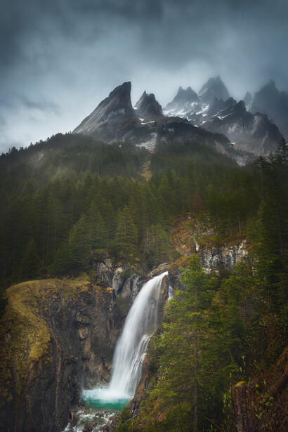
How you can use it: If you would take a picture of the summit of a mountain that anybody (at least in the local area) would recognize as that specific mountain, you would surely have a recipe for a synecdoche. The Matterhorn is one of the mountains that comes to mind. It’s of more practical use in architectural photography. Think of photographing part of a building that’s iconic to that particular building.
Repetition
Lines, patterns, objects, shapes, images: if they’re intentionally repeated in a single photograph, you’re making use of the repetition scheme.
How you can use it: This isn’t a hard one, but is both useful and powerful when used in moderation. A couple of the same type of windmills, power lines, or trees with regular or receding intervals can suggest depth, order, and a sense of scale.
Apposition
This scheme involves placing two elements beside each other. The second serves as an explanation or modification of the first.
How you can use it: A burnt fir tree next to one that looks unaffected by whatever it was that torched the first one.
Pastiche
This is a photo in a style that imitates that of another work, artist, or period.
How you can use it: It’s almost difficult not to use this unintentionally. As photography becomes ubiquitous and so many locations have been photographed, images start to look the same in form, execution, or subject matter.
Framing: Selection, Salience, and Spin
Framing is essentially deciding on what you want to show your audience. To frame is to select some aspect of a perceived reality. And by promoting a piece of that selection in respect to other parts of the image, you are increasing its significance. You are making it more salient in communicating a message. An example I find useful is that of the “luxurious hotel” on the Mediterranean coast.
In the brochure, the images make the swimming pool like the idyllic spa retreat you have been dreaming of. It’s complete with the woman floating about on the water’s surface as she is apparently having a good time, sipping her margarita. Upon arrival you anxiously go to the pool, only to discover that the water is far less luxurious. It’s cold for starters. And it’s smaller than in the brochure. The woman is nowhere to be found, and the pool bar doesn’t serve margaritas. But the thing that bugs you most is that the view to the left overlooks a construction site. You realize that there will be another “luxurious hotel” right next to the place you’re staying at. Clearly, the photo has been doctored. Actually, the photographer made a great scene by choosing his framing carefully. By selecting only the good part of the pool, it looked larger and had palm trees instead of a construction site in the background. He also made it look like this area was a tropical paradise by capturing the cocktail in the model’s hand. He promoted the long side of the pool, making it more salient of the message. As for spin: think of the photographer intentionally depicting the construction going on in the background, but everything else stays the same. Spin is the twist of the story you initially perceive. It’s a quite effective tool in the world of advertising that can convey drama as well as humor in your image.
The elements you put into your frame before pressing the shutter button can represent concepts known to a shared culture or a completely different one. As a photographer, you’re looking for common meaning throughout society. In this way, visual rhetoric is a universal language that transcends the spoken word. So, in photography, visual rhetoric is the study of what goes on in the viewer’s mind after seeing your photograph. But this process of viewing and conjuring up associations starts intertextuality: how does this one photograph relate to another? Are there apparent similarities and differences to be found? Would it fit within a certain category of imagery? I want you to understand that this is important. The more photographs are similar, the more symbols our society comes to know, which leads us to the study of semiotics. The reason that images can mean something or evoke emotion in viewers is because of semiotics.
Semiotics
If semiotics would be the study of signs and symbols (and it is), then semiotics is the study of the building blocks of visual rhetoric. So, we are diving even deeper now. Rhetorical analysis of photography makes use of rhetorical concepts (ethos, pathos, logos, kairos) to describe the social functions in photography. In “The Grammar of Visual Design,” Gunther Kress and Theo van Leeuwen write about grammatical concepts such as modality. In essence, it’s how believable or realistic an image is. Semiotic modes vary by the qualities of the image and the backgrounds of each visual object in the frame. A sharper image may look more realistic, but too much sharpening can result in the photo looking artificial. A waterfall may appear blue in contrast to its surroundings, but too much blue, and the image loses credibility from a journalistic point of view.
Semiotic vocabulary
A "sign" is the smallest unit of meaning and can be anything that is used to convey it, whether that meaning is true to what is depicted or not. Remember the not so luxurious hotel? Well, signs come in three basic forms.
The easiest to understand is the "iconic sign," a mode in which the signifier is perceived as resembling or imitating the signified. Since you depict something that is or was at some point in history, photography inherently is a medium of reproducing iconic signs.
Then there’s the "symbolic sign," where the signifier does not represent the signified. The relationship between those two must be learnt and is therefore conventional. Traffic lights, numbers, and language in general are prime examples of symbolic signs.
"Indexical signs" are fun too. Here, the signifier is caused by the signified. In landscape photography, these have great practical use. Tracks of animals and vehicles tell hints of a story and refer to the animal or vehicle responsible for leaving the tracks.
Decoding the Image: The Denotated Message
When you are deciphering what messages lie at the heart of a photograph, a viewer goes through different phases in the school of semiotics. At first, you start to see the literal image. In this “denotation” phase, the visible elements represent reality. The signifier (that which is seen — what’s actually there) and the signified (that which is the concept or meaning) are one and the same. At this stage, there is no code to decode, because a photograph of a landscape represents a landscape. You instantly understand its similarity to its visual reality. The elements within the composition tell an innocent, iconic, and non-coded message within a realistic context.
In a primary denotated message, a square is a square, and a triangle a triangle. They are nothing more. Put them together a certain way and the image of just these two basic shapes conjures up a house. We call this last step "secondary denotation." It’s the way most people recognize a shape as a representation of reality, despite cultural or societal differences.
Decoding the Image: The Connoted Message
Based on cultural ideas, beliefs and everything the viewer has learned about the world and its inhabitants, he or she has certain preconceptions that contribute to decoding messages within images. Suggestions within the photograph, provided by the captured visual elements, their particular arrangement, their signifiers, and what they signify conjure up all sorts of associative ideas within the viewer. The French Semiotician, Roland Barthes, emphasizes that it is important to separate the literal from the symbolic image in order to understand the final relationship between the message and the image.
To clarify: picture the house from the previous example once more. Add a dim light in the window and imagine a dark silhouette of a person holding a knife. In primary connotation, we look towards cultural influences that help to determine what’s going on in the image we see. Perhaps we are witnessing a murder. On the other hand, it could well be a housewife preparing dinner for her husband who is about to return home from a long day’s work. You might have guessed correctly that there’s a secondary stage to connotation as well. Here, we are projecting our personal experiences, opinions, and beliefs onto the image. I would imagine the shape with the knife to be very reminiscent of 90s horror movies, where a masked killer would steadily decrease the population of a small town.
Try to look at connotation within photography like the way a description or title says something about the image that you can’t directly perceive. Connotation guides the viewer away from the literal image and its message and towards the intended message of the photographer. Thus, Barthes provides a useful tool for analyzing images and for understanding and appreciating how the photographer sends messages that are persuasive and convincing.
The True Image
After all this, an important question comes to mind. Would someone less versed in the language of visual communication take the same message from the image? If we dip into the field of psychology once more, the answer is yes. People are wired more or less the same and therefore look at images in predictable ways. But the way we decipher them is directly related to our genetics, our upbringing, and the lives we live. So, however you choose to encode your photography, be sure to know your audience. In closing of this series, Barthes remarks that the word “image” stems from a Latin term meaning "imitation." Can images truly function as representations of reality? And what about pastiche photography, images of images? Does the visual language within photography really constitute a language? Or could reality be spiraling in on itself and is photography a failed attempt at charting, even substituting the Real? These questions tie in with my previous arc: “The Real Versus the Beautiful,” which I recommend reading if you’re interested in the relationships between Inception and landscape photography.
References:
- Broek, van den, e.a. (2010): Beeldtaal. Netherlands: Boom Lemma
- Barthes, Roland (March 12, 2004): Rhetoric of the Image - Visual Rhetoric in a Visual World: A critical Sourcebook. Bedford/St. Martin's
- Kress, Gunther & Theo van Leeuwen (1996): Reading Images: The Grammar of Visual Design. London: Routledge
Join the Fstoppers community for free
-
Post comments and join in the discussions
-
Browse the site ad-free
-
Share your work and get featured in the community
-
Compete in the photo contests for fun and prizes
8 Comments
Daniel "Professor X" Laan, reads like dense syrup but damn you know it's good for you.
Lol! I don't think I quite enjoy knowing that my stuff reads as dense syrup. I should work on that.
But having said that, there's more lighthearted content coming from my pen. These are finished.
July is almost over, so there's the Milky Way, mushrooms, heather, thunderstorms... To be honest; there aren't enough days in August & September! Which of the above would you like to see covered next?
All the best
Daniel, this series is fantastic. It definitely requires thought, but so does all advanced/tough material. Thank you for your time and effort on this. I don't care what you post next, as long as you post it all.
Thanks a ton, Adam! I really appreciate you saying that. :) A lot more coming! All the best, Daniel
I only meant that this is one of those worthwhile brain workout articles ;-)
I personally love the alien nature of mushrooms, but all of those sound awesome!
Thanks a lot! Your wish is my command. :) Coming soon to Fstoppers is a new, short and practical series, which I'm sure is right up your alley. Cheers, Daniel
Loved it! I was going to ask if there were links to the first 4 parts, but I see them in the "Related Articles" section. I'm a newb here. Great work man. Looking forward to reading the rest.
Hi name buddy! :)
Glad you liked it. There's something else entirely coming to Fstoppers very soon. Glad I could help, Daniel.
All the best.