
Mental images, dynamic range, luminosity masking... This week's article in this series is chock-full of terms that will send your head spinning. But when we want to communicate through landscape photography, it is best to speak the language first. I'll show you a big part of my processing workflow, introduce you to a great alternative to HDR photography, and tell you why Ansel Adams' invention is still applicable in digital photography.
Leveraging the Human Eye’s Dynamic Range
It’s all about what we see with our eyes and how we want to show that to our audience. In the last two articles I showed you this through placement of elements in the image. But when your exposure is all jumbled up, that lead-in line or triangle might not draw the attention you want it to. The human eye isn’t the only organ responsible for observing the world. Firstly, a quick glance with our eyes produces a mental image that’s very similar to what a modern full-frame camera would produce; despite being hard to quantify. That’s because our irises constantly adjust to the world around us and we do not see the world in snapshot-like glances. Our brain converts all of these “snapshots” into a living, breathing universe: An interactive movie, if you will.
And we are really good at making out details in the brightest parts of our corner of the universe, but also in some of the darkest around here. We can look in the general direction of the sun and see an airplane pass in the sky, while moments later stepping indoors and not stumble over the coffee table. We get around by comparing one area of brightness or snapshot to another. This amount of brightness is how luminous an area is to us, while differences in this luminosity create dark and light contrast. Because of the subjective nature of human vision, it’s up to the photographer, not the camera, to create compelling imagery with the right amount of contrast. We are leveraging the human eye’s dynamic range; the ratio between the minimum and maximum measurable light intensities. Cambridge in colour describe it like this:
Quantifying Dynamic Range. The most commonly used unit for measuring dynamic range in photography is the f-stop, so we'll stick with that here. This describes the ratio between the lightest and darkest recordable regions of a scene, in powers of two. A scene with a dynamic range of 3 f-stops therefore has a white that is 8X as bright as its black (since 23 = 2x2x2 = 8).
Contrast & Dynamic Range
When working with negative film, a shorter development will produce less contrast, while a longer development will increase contrast, and as a result, deepen colour saturation. Digital photography has an important rule: It’s easy to increase contrast, but next to impossible to decrease it. If your resulting image looks flat and grey, there are a number of ways to spice it up in post-processing. We just don’t get our hands dirty in a bath of chemicals, but do the math with pixels on computers. Modern cameras are quite good at capturing the world as most of us see it, while providing creative leeway in post-processing. Should your exposure be one or two stops too dark, you can get away with that. Exposure too long and your image became too bright? There’s a way to decrease the overall resulting brightness too. But should your camera be pointed at amazingly bright or dark features, especially both in one frame, you’re left scratching your head. What to show your audience now? The sky or the foreground? There are certain things that you can do to lower the contrast, or rather, increase the dynamic range of an image.
The Graduated ND filter
Film and digital have in common that the image can be influenced by placing something in front of the lens that alters light in one way or another. Polarizing filters let light of a specific polarization pass and block waves of other polarizations, reducing reflections and glare, while at the same time increasing color saturation. The ND filter lets the photographer increase the length of the exposure, while blocking each wavelength (colour) equally. Well, that is the idea. And there are also colour filters, where colours are not blocked equally in order to make film or the sensor more sensitive to one colour than others. This last one is important to remember, as it ties in with something I want to show you around the end of this article when we put it in practice.
But first imagine that neutral density filter going over just the top of the image. That will probably darken the sky, right? As you will know, there is a whole range of these “graduated ND filters” on the market, all used to balance out the exposure of the foreground and the sky. When used properly, these filters will utterly transform your images. From washed out skies to revealing amazing structure in clouds while retaining proper exposure and detail in the foreground. I'm sure you are no stranger to this other method of reducing contrast either.
HDR – Why it doesn’t work
Shooting three to nine images in quick succession with varying shutter speeds calculated by the camera is called auto exposure bracketing. It lets you merge those images later at the computer into one image with a high dynamic range. But there’s a problem with this. Computer screens currently do not display this many levels of luminosity, nor does paper. Both can’t reproduce what the sensor picked up in even one good exposure. The problem that arises when combining more images to increase the dynamic range, is that you can’t display it as is. You have to do something with that huge amount of data to display it correctly. Through processes with names like tonemapping, highlight compression, exposure fusion, or averaging, you can display high dynamic range images on many devices and in print with minimal effort. Dedicated software like Photomatix, HDR Expose and LR/Enfuse will let you have better control over what part will come through of which exposure, but I have yet to find software that yields the results I’m after. You just do not have enough local control.
The Zone System
While photographers have known a long time that you can influence the contrast of the negative by changing the duration of development, there was never a way to quantify how contrasting an image was exactly. Until 1940, when Ansel Adams and Fred Archer developed the Zone System. By relating contrast to exposure, Archer and Adams created a unique workflow for integral photography. From judging light and dark in a scene to visualizing the image and from exposing the negative to developing it; there are many ways in which you can lose track of what light and shadow do to a resulting photograph.
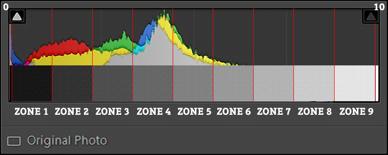
This system can still be used in black and white film photography, but what is its value in today’s digital and colour world? Well, if the dynamic range of an image gets exceeded, it will render either as pure black (shadows) or as pure white (highlights). This is reflected in histograms.
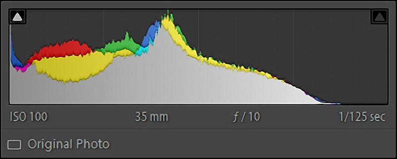
The Zone System consist of 11 zones (0 through 10), where 0 describes an absolute minimum luminosity: Pure black. I bet you can guess what zone 10 entails. Zone 5 includes 50% grey. All neutral tones are part of Zone 5. Everything above Zone 5 is brighter than the average part of the image, while Zones 0-4 are darker than the average part. Try relating those Zones to the histogram I showed earlier:
In conventional photography (doing it all in one image), Zone 4 would be one stop darker than Zone 5. Zone 8 would therefore be three stops brighter than the midtones in Zone 5. It would be very hard to distinguish any detail in Zone 8 or 2 while Zone 1 and 9 are almost completely black and white respectively. The image that came with this histogram should have been exposed either twice as long or with a larger f-stop.
Usage
You can use the Zone System to quickly determine the correct exposure by spot metering parts of the frame, but also in post-processing, when evaluating a flat image that needs contrast enhancements.
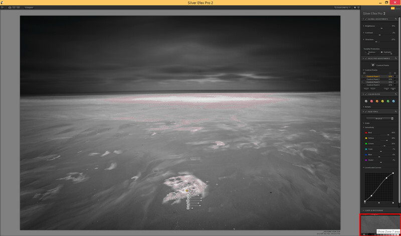
It has also found its way in Nik Silver Efex Pro, which I have found is one of the best software suites to produce stunning black and white images if you pay close attention to the zones in your image. It’s even free now!
A Workflow for Colour Photography
I approach almost every image I shot as a black and white image before I start working on colour. But when you do, it’s important to have enough tonal separation between colours. This means that a good deal of saturation helps to enhance black and white images at a later stage. In colour photography too, it’s about striking the balance between shadows and highlights. Let me show you what I mean by taking you through my workflow.
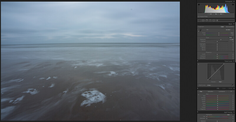
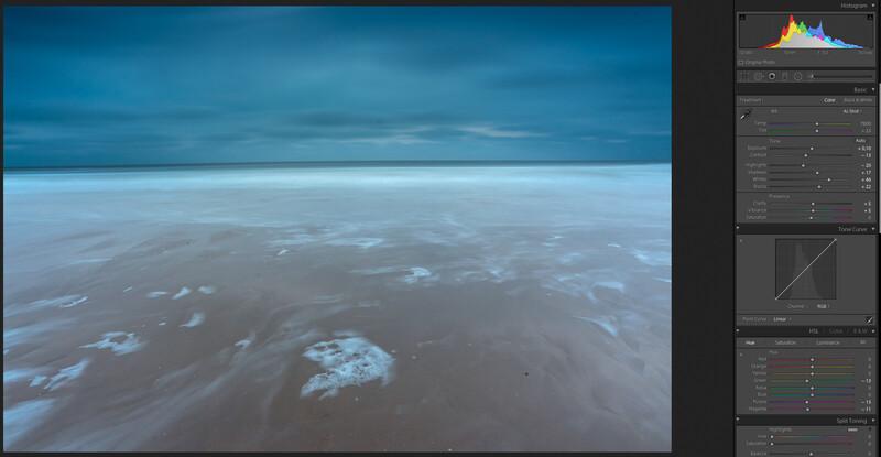
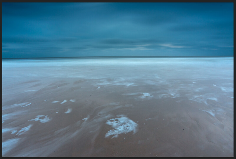
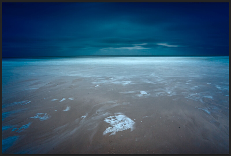
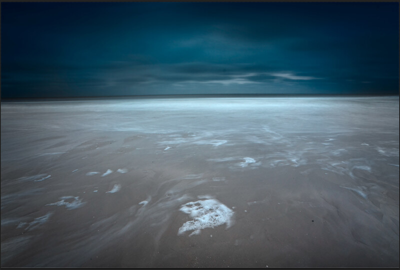
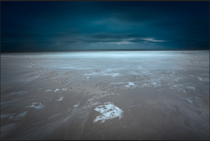
This screenshot is of this one image I shot at my local beach during the blue hour. In the before image, I’ve increased the exposure in Lightroom. Everything else is left as shot. The right (after) image shows what I’m about to export to Photoshop as I start working on a B&W version of this. Notice the change in histogram, as well as how the attention shifted from one part of the image to another. Instead of looking straight towards the sky, I now guide your eye to what’s in the sea and reintroduce the moody blue I’ve experienced standing in the surf.
Coming over to Photoshop, I went straight into Nik Silver Efex Pro. Remember that colour filter I’ve talked about earlier? Here’s an example of what such a filter would look like, as there’s a software equivalent in Silver Efex.
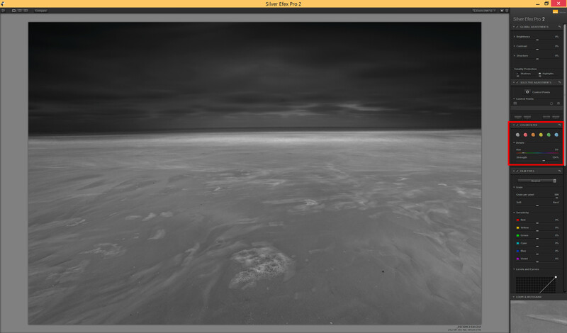
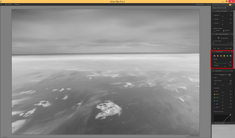
Check out the difference between applying a yellow (left) or blue (right) filter. Notice how your gaze shifts again.
The above example shows exactly what I am trying to tell you: You can exert influence on your audience by shaping how bright (luminous) areas appear to them. The Zone System is a method of translating the landscape into values, which you can work with to not only capture images in the field more quickly and accurately, but really help in post as well. Consider the following image.
Returning to Photoshop, there’s this one thing I do if I had decided earlier that this should be a colour image. Before I do anything else, I set the blending mode to “Luminosity”.
Applying black and white adjustments to colour images can produce overly saturated images. Be sure that this is just a step in your processing chain.
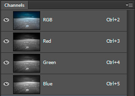
The shadows look overly saturated. We’re fixing this with a mask on another layer. First, duplicate the black and white layer and set that new layer’s blending mode to “Color.” Make both the colour layer and the luminosity layer invisible and open up the channels palette. Hold control (cmd on a Mac) while clicking on the image thumbnail next to “RGB”. This selects the brightest 50% of the image shown on the screen. Inverse the selection by pressing control+shift+I. You now have the darkest 50% selected. Make both new layers visible again and select the top layer. Now click on the rectangle with a dot in it in the layers palette. This creates a mask that conceals the overly saturated darks of the original. What you did here, is gradually decrease the saturation in the shadows through a luminosity mask.
The marching ants only outline the 50% mark of your selection. They don't show that you have also selected, but to a lesser extend, darker areas of the image.
A luminosity mask is nothing more than making a selection based on a particular brightness and creating a mask from that selection. There are all sorts and kinds of Photoshop actions and palettes out there that help you create luminosity masks to quickly make selections to reveal or conceal certain parts of the image. Imagine these masks being used on multiple exposures and the power of luminosity masking starts to reveal itself. This technique, originally developed by Tony Kuyper, puts you are back in the driver’s seat. It puts you back in control of your photography instead of leaving it at the door with algorithms developed by software companies.
But what about controlling colour? That’s something for another article. In which I reconnect with Ted Gore to instruct you about colour theory and how this relates to landscape photography design. Thanks for the read and until next time.
Images by Laanscapes.
Join the Fstoppers community for free
-
Post comments and join in the discussions
-
Browse the site ad-free
-
Share your work and get featured in the community
-
Compete in the photo contests for fun and prizes
3 Comments
Thanks for giving a shout out to Tony Kuyper's luminosity mask actions. He more recently developed an Infinity Mask Panel, which simplifies and strengthens the luminosity mask workflow. I highly recommend checking it out:
http://goodlight.us/writing/infinitymask/infinitymask-1.html
You should look into 32 bit HDR that's built into Photoshop. It will essentially give you the 3, 5, 7 exposures worth of data and then use ACR to adjust highlights/shadows/exposure/etc. That way it stays realistic and doesn't get all the tone mapping look like those other apps give you.
Cheers Matt. Appreciate the input. Although this would be hard to control when there's also focus stacking going on, which I personally always use in wide-angle shots with a prominent foreground subject. But maybe those two 32-bit images can be blended afterwards. I will look into this.