
From Vogue to People, including Playboy and National Geographic, all these popular magazines are familiar to us and instantly recognizable, but just a few of us know what their first editions looked like decades ago. As time passed by, bringing forth new faces, new fashion, and a whole new way of thinking, magazines needed to evolve with their time and adapt. Some have stayed faithful to their initial visual identity, having only undergone minor changes because they knew what worked for them. On the other hand, other magazines covers have changed drastically, their covers being a far cry from the original design.
Back in time, each magazine used to have its own unique identity: the cover always followed the conservative societal norms and the design was mostly about a photo and very little text. Today, all those magazines still strive to be distinct from each other but compared to the good old times, now there is always a flurry of magazines on the stands with loud texts. It's an eyesore really. The magazine covers need to sell and for that, the majority seems to follow one particular formula: a photo of an attractive model or famous face, with a tendency of showing something shocking or of putting a big controversial quote to grab your attention. Let’s not forget how showing more skin or just baring it all has become trendy and easy. It is an interesting aspect of the evolution of magazine covers especially when linked with the ever-changing societal norms. What was acceptable yesterday is just not enough today. Just how far can magazines go to sell copies?
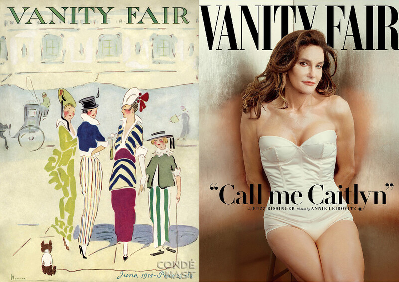
Vanity Fair / 1914 - 2015
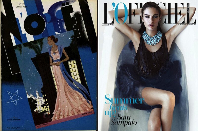
L’OFFICIEL / 1935 - 2016
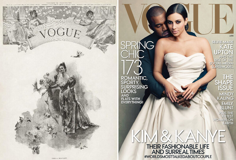
VOGUE / 1892 - 2014
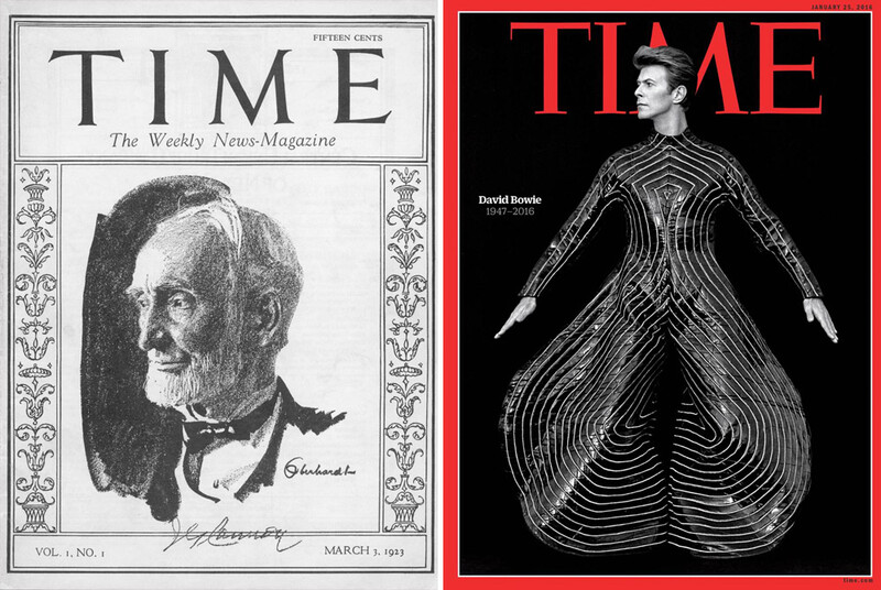
TIME / 1923 - 2016
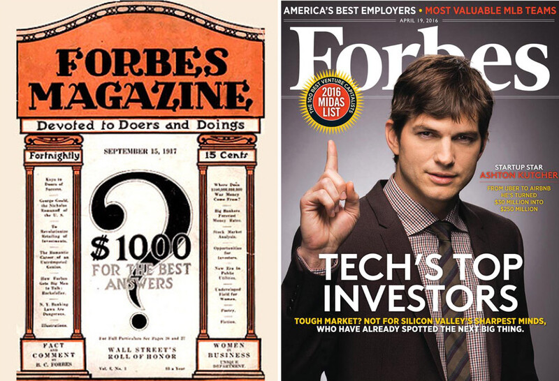
FORBES / 1917 - 2016
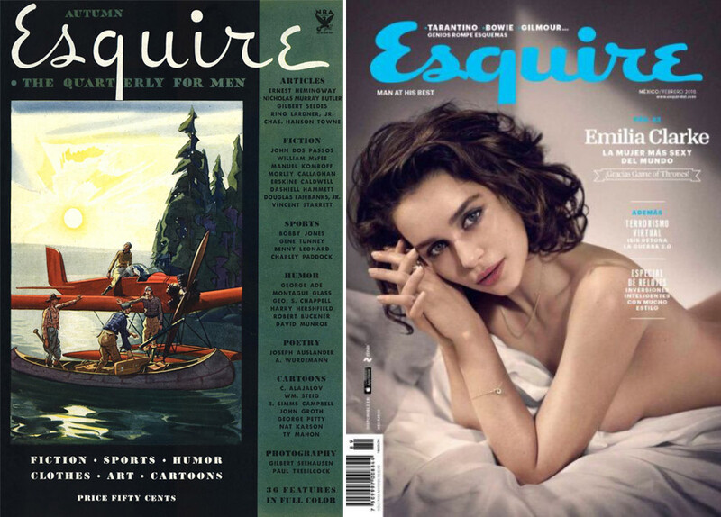
Esquire / 1933 - 2016
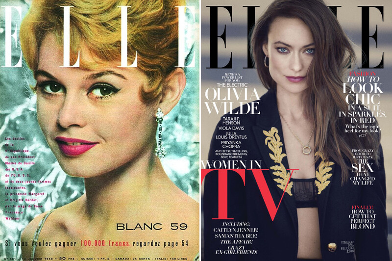
ELLE / 1949 - 2016
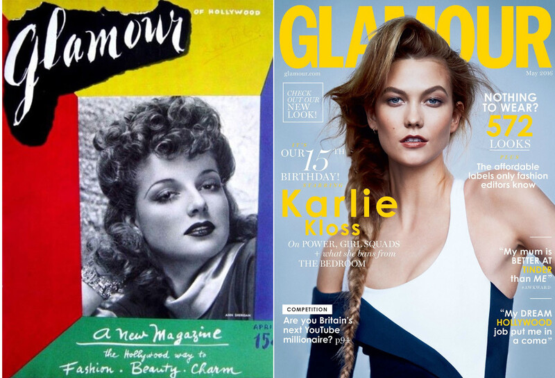
GLAMOUR / 1939 - 2016
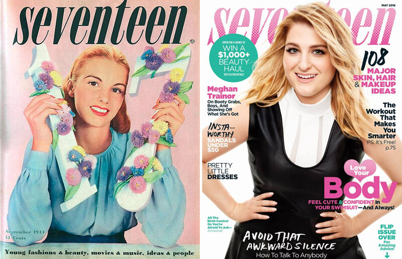
SEVENTEEN / 1944 - 2016
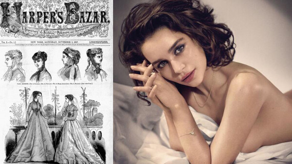
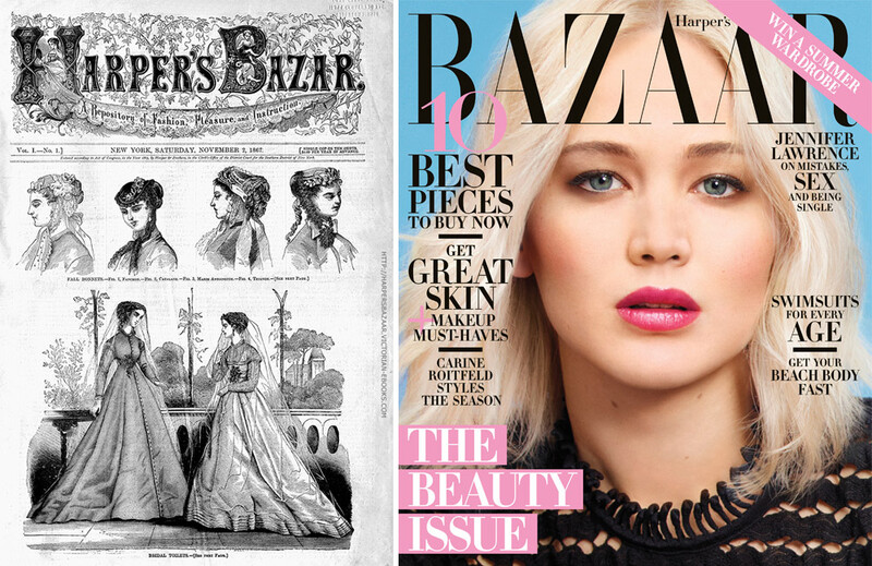
HARPER'S BAZAAR / 1867 - 2016
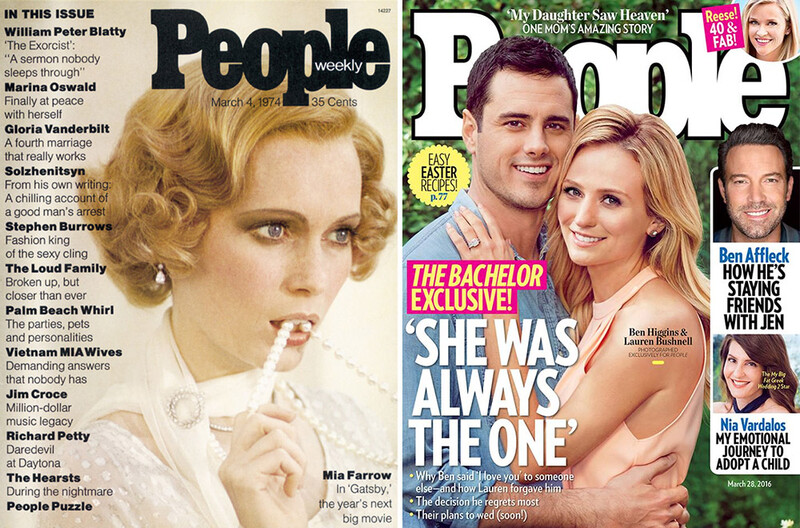
People / 1974 - 2016
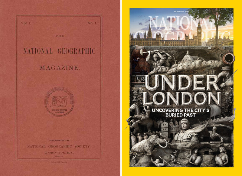
NATIONAL GEOGRAPHIC / 1888 - 2016
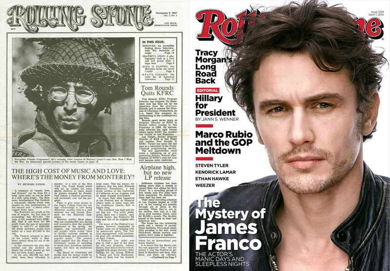
Rolling Stone / 1967 - 2016
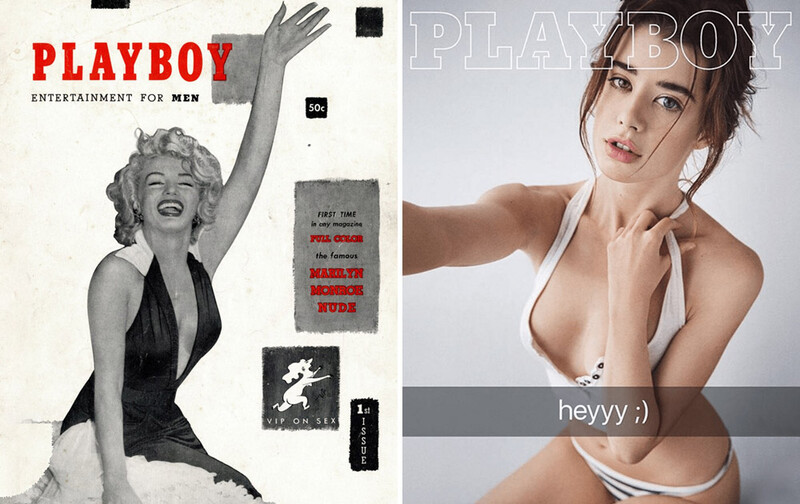
PLAYBOY / 1953 - 2016
Out of all these in the listing, my favorites are the TIME and L’OFFICIEL covers. Which one is your choice?


Join the Fstoppers community for free
-
Post comments and join in the discussions
-
Browse the site ad-free
-
Share your work and get featured in the community
-
Compete in the photo contests for fun and prizes
9 Comments
I have been looking at a lot of erte's work for inspiration. The covers he did are so iconic. Very conceptual.
his work is a true inspiration - memorable and striking
Time definitely nailed it over the years, keeping that red frame. National Geographic today is pretty awesome I believe
Its interesting to see some covers artistic taste have gotten worse.
a lot of them feel like copy-paste , as mentioned above following one recipe to have more readers , but does it really work?
Pretty plain cover for Nat Geo in "1988." Typo?
I think it should be 1888.
thanks for the attention, I have mistyped it
I love looking at old and new(er). There's a bookstore in Burbank, Ca. that's a treasure trove of some amazing old and vintage magazines, prints, and posters if anybody ever gets out that way and is interested in that sort of thing.
My favorite old is the Rolling Stone cover, the 3 column layout and only telling music news- haha! And what a way to come out for Rolling Stone, a John Lennon photograph on your cover; awesome, thank you. Even Tom Rounds quitting AM Radio; although, according to my Dad and a couple of other folks not scientifically polled, nobody really cared...
Favorite new, the Time cover is well done, good stuff for sure.