
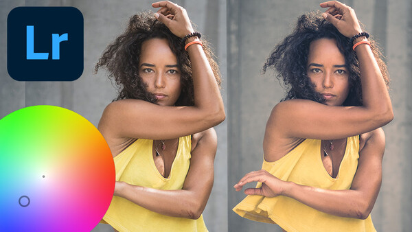
Adobe made a significant update to your ability to tweak colors in the recent version of Lightroom by swapping out Split Toning for Color Grading. Here are five things buried in the interface that you might want to learn about.
What used to be Split Toning is now the greatly-improved Color Grading panel in Lightroom, bringing endless color wheels and even more sliders. A lot of the functionality doubles (or triples) up across various parts of this panel, and Adobe has tucked away a handful of aspects that might be of interest to you.
Here are five nuggets to give you more control over your editing.
1. Luminance Sliders Will Change Your Black and White Points
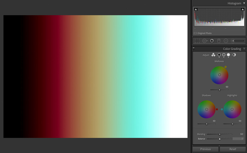
Split Toning was previously limited to hue and saturation, but the new Color Grading panel that replaces it brings you a completely new slider: Luminance. This changes the brightness of your selected color, but what you might not realize is that it has the potential to change your black and white points.
100 percent black and 100 percent white pixels cannot contain any color information, meaning that parts of your image might remain unaffected by any Color Grading. Dragging the Luminance slider in the Shadows color wheel to the right will shift blacks towards gray, allowing Lightroom to introduce some of your selected shadows color into the darkest part of your image.
I created an example using a JPEG that is completely black on the left, completely white on the right, and with a gradient in between. The only color is that being introduced by the Color Grading panel: a hue of zero with its saturation set to 100, and the luminance set to 1.
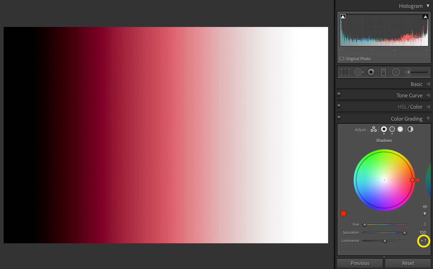
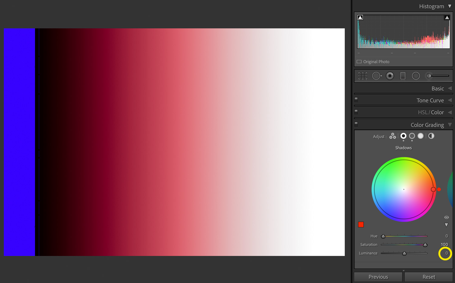
With the black clipping switched on (keyboard shortcut J), it’s evident that no data is being lost to the shadows. However, as soon as the Luminance is reduced to 0, Lightroom’s clipping warning overlay appears:
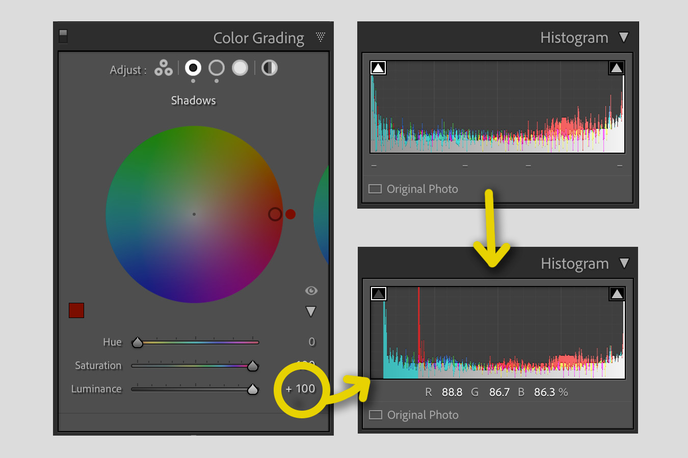
The changes being made by the Luminance slider are more evident when you crank it to 100 and have a look at the Histogram:
The reverse happens when you adjust the Luminance slider underneath in the Highlights color wheel: when you drag the slider to the left, anything that is completely white gets shifted towards gray to allow it to take on some color.
Essentially, if you have a very dark image and you’re struggling to see colors that you’re introducing to the shadows, try tweaking the Luminance slider, but in the knowledge that you’re also shifting your black point — and vice versa for bright images and the Highlights.
2. Hold Alt/Option to Temporarily Boost Your Saturation
The Balance slider determines the relationship between the various colors introduced through your Shadows, Midtones, and Highlights color wheels, but if the tints you’ve introduced are really subtle, it might be hard to see how they are interacting.
To solve this, Lightroom allows you to temporarily boost the saturation of the tints by pressing Alt (Windows) or Option (MacOS) while dragging the Balance slider.
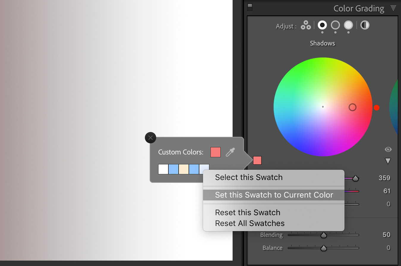
3. Save Colors to Your Color Swatch
If you have a selection of colors that you find yourself using regularly, rather than noting down the values or guessing their location on the color wheel, you can have Lightroom save up to five colors on a swatch. With one of the larger color wheels selected, click on the small square to the bottom left, right click on one of the five colors, and choose “Set this Swatch to Current Color.”
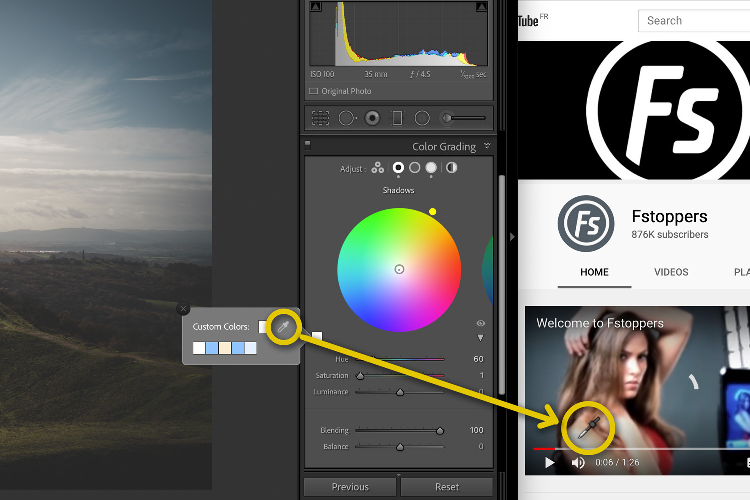
4. Grab a Color From Outside of Lightroom
The same dialogue has an eyedropper too,l which you can grab, drag, and release to select your desired color. If that’s not enough, you can drag this color picker outside of Lightroom, perhaps choosing a color from one of your favorite YouTube videos.
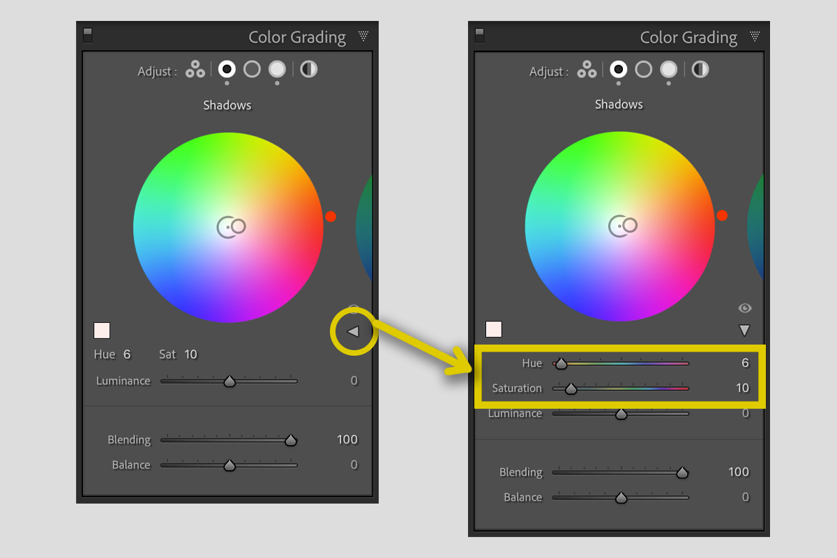
5. Hate the New Interface? Use the Old One (Kind Of)
If you don’t like change or just preferred the simplicity of the old Split Tones panel before it got upgraded, fear not: if you dig deep enough, the old sliders are there.
On any of the larger color wheels, hit the disclosure triangle (that's the official term, apparently) to the bottom right, and the Hue and Saturation sliders will suddenly appear, just above the Luminance slider.
Bonus Tip
By default, Blending is set to 50. However, you might want to keep in mind that Split Tones created using older versions of Lightroom seem to have their Blending set to 100.
Any Others?
If there are any other subtle aspects of Lightroom's new Color Grading panel that you think should be on this list, be sure to post them in the comments below.

Join the Fstoppers community for free
-
Post comments and join in the discussions
-
Browse the site ad-free
-
Share your work and get featured in the community
-
Compete in the photo contests for fun and prizes
4 Comments
Great tips, especially the one that can take colour sample outside LR. Thanks for sharing.
This is worth another read. Great stuff, Andy.
...addicted to climbing and parkour, lives in France, MA in Sociology... Quite natural, must have gotten his degree in SORE BONE! Nice tips.
Ouch. That was a truly awful joke. Congratulations. 😂