Shooting in bad light isn't a death sentence for your images. In fact, some of the strongest nature photographs come from conditions most people walk away from. Knowing how to read light, use contrast, and process with intention separates images that resonate from ones that just document a place.
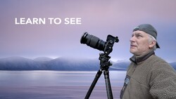
Coming to you from Adam Gibbs, this wide-ranging video is a recording of a live presentation Gibbs gave for Kase Filters at The Photography Show at the NEC in Birmingham. He opens with a claim that might surprise you: light matters more than composition. Not because composition is unimportant, but because without the right light, there is simply no photograph worth making. He backs this up with a 4x5 film image from the Enchantments in Washington State, shot at 12:30 in the afternoon on a cloudless day, which by conventional wisdom is the worst possible time to shoot. The image works because he found a subject that fit the light, a yellow larch in direct sun against a lake sitting in deep shade, producing a blue-to-yellow contrast that gives the image its power. That contrast, he argues, is the real subject.
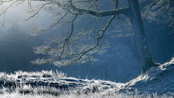
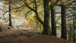
Gibbs also draws a useful distinction between the kinds of contrast worth looking for. It is not just color contrast but contrast in texture, shape, and tone. He walks through images from the Redwoods, the Canadian Rockies, Spooky Gulch in the Escalante region, and Vancouver Island to show how reflected light, flat light, and even midday sun can each work when matched to the right subject. One of the more counterintuitive points he makes is about flat light: for pattern-based images, particularly burnt trees against snow, removing shadows is exactly what you want. The patterns read more clearly without the visual noise of competing shadows. He also explains why he has pulled back on using polarizers over the years, even in woodland scenes where most people reach for one automatically. The reflections on foliage that a polarizer removes are often the same reflections creating depth in the image.
The processing section is where things get particularly practical. Gibbs shows raw files alongside finished images for a dozen or more photographs, and in almost every case the adjustments are surgical rather than sweeping. He is consistently asking one question: where do I want the viewer to look? Brightening a secondary element, darkening a competing highlight, cooling a background to push it back, warming a foreground to bring it forward. These moves are small individually, but stacked together they shift where the eye goes without the viewer noticing. He also addresses aspect ratios more seriously than most, arguing that shooting in pano, square, or 4x5 from the start, rather than cropping after the fact, forces a different and often stronger compositional decision. His point about the Fujifilm GFX system having a dedicated aspect ratio dial is worth noting if you shoot medium format and have not explored that feature.
There is considerably more in the video, including Gibbs's approach to focus stacking, managing expectations on location, ND filter use for water, and how to translate what you felt in the field into a processing decision. It runs long, and he acknowledges that upfront, but it earns the time. Check out the video above for the full presentation from Gibbs.

Join the Fstoppers community for free
-
Post comments and join in the discussions
-
Browse the site ad-free
-
Share your work and get featured in the community
-
Compete in the photo contests for fun and prizes
No comments yet