

It's happened to me and it has most likely happened to you: you order a shirt and can't wait for it to arrive. Then it does and it's a completely different hue than what was pictured in the online store or catalog. Odds are the photographer may not have used a color chart during his or her shoot. There are many photographers that never learn to use a color chart at all, and others who won't do a shoot without one. Here are a few major points on how a color chart can help make your product photography color spot on.
Influencing Light in Your Studio Space
I think an important question to ask yourself is, where are you shooting? What are the variables in the space you are shooting that can throw off your white balance? If you're out in a forest shooting adorable family photos while the sun sets behind them, then you're probably ok to let this one slide. Where the true help comes in, is on a set or as a product photographer. Many times in studios there can be other light influences causing even the slightest temperature differences to be seen in your final images. Having your color chart in your first frame you can grab the color you want by first selecting your white balance and then the rest fo the images will follow suit. Yes if you are shooting products outdoors you're going to want to use a color chart as well!
What Are You Shooting?
For photographers who shoot products, this little sucker can really help you deliver the right color to your clients. Take garments for example; If you are hired to shoot a women's lingerie catalog, your client will want the color to be true to the actual pieces that will be received by their clients. Your little color chart will help you get this right in your raw images. A good color chart to use and a great bargain is the X-Rite Color Checker it also comes with a grey scale card and works for video as well!
Keeping Your Color On Point With Different Gear
Every camera body and lens throws out different color temperature, sometimes very subtle and sometimes not so much. I shoot on a Canon 5D Mark III and see great differences when switching from lens to lens. While some are lenses like my all time favorite, the Canon EF 50mm f/1.2L, produces images that are quite warm, others can be much cooler. This can be a little frustrating when your in post and trying to get your subjects wardrobe or skin tone to match through out your session. If you bring along your color chart, you'll see a world of difference next time your in post.
Setting Camera Profiles
For those times where maybe you weren't expecting to need your color chart having a preset profile can help! Set up a general profile that matches typical lighting situations and you can adjust later in Lightroom. Note, this applies to outdoor situations.
Here is an easy to watch video from The Slanted Lens about how to use the chart and why you need it.
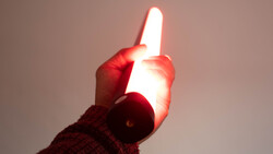
Lead Image used with permission by David Mecey.


Join the Fstoppers community for free
-
Post comments and join in the discussions
-
Browse the site ad-free
-
Share your work and get featured in the community
-
Compete in the photo contests for fun and prizes
26 Comments
Just for readers' information: The small X-Rite Color Checker Passport's software creates DNG profiles which work in Lightroom (DNG is an Adobe proprietary format). These profiles will not work for Capture One. You can always set the white balance from the shot of the Color Checker Passport but DNG camera color profiles won't work in Capture One.
I don't remember the name of the software but I remember reading about free software that would use the output from the passport. :-/
Please let me know when you remember because I work mainly with Capture One Pro and this is something I want for a long time. ;)
I tried another (paid) software but it was giving me weird results.
BUT I use the X-Rite software (and chart) for Photoshop work. For product shots it is quite helpful...
Until I remember, or find it again, you can try this: https://robertharringtonstudios.wordpress.com/2010/11/11/the-x-rite-col…
Okay, as I wrote before, I READ about it so I can't attest to how well it works. That being said, Argyll http://www.argyllcms.com/ is the software. I use Adobe products so, only having a mild interest, I didn't spend a lot of time researching it.
1. It is open-source (free)
2. There is a detailed discussion on LuminousLandscape http://forum.luminous-landscape.com/index.php?topic=49616.0 about the subject as a whole and quite a bit on the use of Argyll. There's a lot of information on their website but I didn't look at it.
Hope this helps.
Haven't tried the Datacolor chart yet, but it looks pretty much like the x-rite chart used in the studio I freelance in. Working with the x-rite software all we've really seen is a jumble of color, not worse or better, just different. Our bigger problem are the cameras (Mk IIS and Mk IIIs) that record excessive red that isn't corrected by the software. We've considered trying the more sophisticated "digital" chart, as it's known, but it requires the purchase of an expensive colorimeter just to access to the software that can make use of it, which is a real rip-off on x-rite's part. We don't really need the specific colorimeter. We're also about to test some Nikon bodies out to bypass the Canon red issue altogether.
Just out of curiosity, when you say "jumble of color" but not better or worse, do you mean it doesn't "look" better or worse or it's not more or less accurate? I ask because I've seen the "jumble" you speak of but have no way of knowing for sure if it's more or less accurate, only if it's more or less pleasing. Skin tones definitely look better but that doesn't really mean they're correct. Throw in the variations within the qualities of light and it's almost impossible to say what is right or wrong.
What I mean is simply colors are altered, but not necessarily to any better place, just different. More or less what you're saying yourself. We're not seeing any advantage, and certainly no correction of the Canon red syndrome. There may be a possibility that the larger gamut x-rite "digital" chart, combined with the "you-can-only-get-it-if-you-buy-our-overpriced-hardware" analyzing software could possibly make a dent, but I don't think this company is going to bite on that purchase. I brought one of my Nikon bodies in one day, we made some tests, and they liked what came out of it, so they'll be testing out some Nikon hardware after their Holiday break.
Sorry but to further clarify, are you talking about a Nikon in conjunction with the Color Passport or with the software's built-in profile. I use my passport with a Nikon body as well and, while I can't verify accuracy, the results are more pleasing than Adobe's Nikon profiles.
No, I meant just Nikon vs Canon straight out of the camera. Below is one of the tests we performed (you may need to click on the image to see all three cameras). Speedotron strobes, flash WB. We don't understand why the Canons record some things, like wood, with a red bias. These are a "medium" tone wood, others come out less hot, while others are red hot. Shooting artwork is a major issue. There are other anomalies with the Canons as well.
In all honesty we've yet to see any advantage from the Passport software.
FYI: you can only manage colour from your workflow to print. You have no control over the colour when an image is displayed on somebody else's device/computer screen. If the viewer doesn't have a calibrated screen or isn't using a browser with colour management you're SOL when it comes to controlling colour.
I bought one of these X-rite colour palette things a couple of years ago and created profiles for my cameras and lenses under various lighting conditions. To be honest, the colour profiles of my Olympus E-M1's looked much closer to reality than the X-rite profiles. I ended up selling the Passport checker and relying on the Olympus profiles instead.
What were you using it for? I find the end result for my portraits far exceeds LR's standard profile and is a little better than their Portrait profile. I primarily shoot with a Nikon D810 so perhaps some of their profiles are better than others!?
Nikon's standard profiles are horrible. I always battled with colour when shooting Nikon digital, so in that case the X-rite is probably going to be a good solution. However, you must remember that you will need to create a profile for every lens, every type of lighting and every camera body you use with that system.
Everyone realises that you cannot control what other people's screens look like, but surely that's not a reason to ignore colour management yourself...especially for product photography as is the topic being discussed here. If you're hired to supply accurate looking files for a product client, it's their issue if the images supplied do not actually represent the product accurately, and conversely, your issue.
When I printed images processed using the Olympus profiles they were closer to the original colour than the X-rite Passport was. Maybe it's just an Olympus thing, but since that's what I use I saw no reason to carry on using the checker.
Also, 99% of the product photography I shoot is for online use, so colour accuracy is again kind of moot.
I use the Color Checker Passport and make and customize my color profiles using Adobes DNG Profile Editor, super easy to use.
Does that provide any advantage over the free software from X-Rite? I can't imagine it being any easier than that so perhaps you can "tweak" the results?
Actually it's super simple (plenty of YouTube tutorials). The he reason I use it is because the x-rite software has problems with one of my cameras dng files, the 645z, their software just doesn't work right with it. X-rite does however work with my Oly and Leica files. So instead of using two different apps I chose just to use Adobe's, especially since you can edit the profiles even more. (Example would be more greens/blues for landscapes, or toning down red/oranges for skin on portraits).
You should give it a try, I believe it was either or fatoppers or another blog that did an article on the editor.
http://petapixel.com/2014/10/01/colorchecker-how-to-get-perfect-skin-co…
J F: X-Rite finally released an updated Lr plugin that creates working profiles for the 645z. I use it all the time. This came out a few months ago and is on their site.
Until this fixed release I used the Adobe software and it worked too, but is much less convenient. I don't care to tweak the profiles though. I prefer to "tweak" in Photoshop when I'm colour grading.
Thanks Bruce, didn't know they had an update :)
X-rites color checker passport is on sale at B&H today for the Deal Zone for $50 instead of $100 for those interested in buying!
I found shooting with strobes has been easier to control the color than shooting continuous/ambient light sources (pre-post) for photography at least.
For my use I just use a grey card for my WB. Why pay for something overly complicated when simple always works best for me.
So is the color checker going to work in basketball and volleyball courts with cycling lights?
Great breakdown on achieving accurate color in product photography. Consistent color management is something many brands overlook, but it makes a massive difference in customer trust and conversion—especially in eCommerce. The article’s explanation of using a color chart is spot-on and a reminder that a solid workflow saves hours in post.
For anyone looking to enhance their visuals with clean, accurate edits, here’s our product photo retouching service: https://www.cutoutexperts.com/e-commerce-image-editing
Thanks for sharing these practical insights!