Getting color consistency from your eye, to your camera, to your computer can be a real pain in the butt. Especially if you still haven't settled into a reliable, regular workflow. Color calibrating your monitor once a month and taking reference images with a gray card are invaluable when it comes to getting consistent color. If you are still struggling with getting your image colors to look right, then Freelance Photographer Gavin Hoey has the video for you. Watch as Gavin walks through a step-by-step process on how to achieve consistent color.
Gavin has been shooting, writing, and offering up advice on all things photographic since 2001. He also writes a “How To” column for one of the best selling photography magazines in the UK, Digital Photo Magazine. After winning Adobe’s Next Photoshop Evangelist competition in 2010, he started teaching sessions on Adobe Photoshop, Lightroom and Photoshop Elements in the UK, Europe, and the U.S. Now he's teamed up with Adorama to continue sharing his photographic know how. It's safe to say, Gavin knows his stuff and you can make things a lot easier on yourself if you adopt some of the good habits he shares in this video.
Here's a list of items, used in the video, in case you're interested in picking up any of the gear:
- WhiBal White Balance G7 Pocket Kit
- Datacolor SpyderCUBE RAW Calibration Tool
- Datacolor SpyderCHECKR 24
- Datacolor Spyder5ELITE Display Calibration System
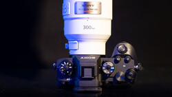
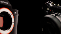
- Olympus PEN-F Mirrorless Micro Four Thirds Digital Camera
- Olympus M. Zuiko Digital ED 12-40mm f/2.8 PRO Lens
You can keep tabs on Gavin via his Facebook, Twitter, Instagram, and YouTube (where his informative videos have been viewed more than 15 million times).
Join the Fstoppers community for free
-
Post comments and join in the discussions
-
Browse the site ad-free
-
Share your work and get featured in the community
-
Compete in the photo contests for fun and prizes
13 Comments
Thank you for getting this out there, excellent advice. This is one of those videos I'll keep referring to as I work something like this into my workflow. As you noted, "Especially if you still haven't settled into a reliable, regular workflow", which is where I'm currently at- trying to improve my workflow.
I use a colour profile created from a ColorChecker Passport, I also sometimes use the WhiBal Balance card, but I prefer the ColorChecker, the main problem is that it doesn't produce any ICC profiles just DNG for Adobe, so you have to use something like the i1 Display Pro software to create the ICC profile and export it for use in CaptureOne or other applications that use ICC profiles.
The reason for the ColorChecker is that it balances all colours, not just white balance. If you're photographing portraits or even clothing with reds/greens in particular then many cameras will over-saturate/desaturate those tones. It's sometimes quite surprising when you see the colour shifts when you apply the colour profile to the image.
When I first bought my 5DIII, I felt that there was something wrong with the colour reproduction and needed to add +30 in tint to get a balanced image (using a grey card in natural daylight). So after having the camera back at Canon a couple of times it seemed to be spot on, and to this day I am blown away by how good images look on the back of the camera, especially when I take the time to set a custom WB. By comparison, I am often sitting next to other photographers courtside chimping and comparing shots, or use a colleagues camera during a wedding (where I can compare my LCD to theirs) and my camera always looks miles better...can't explain it. And fortunately, my images look very similar when imported into LR with only the default import settings, not even a Canon profile applied.
I use the i1 Display Pro for calibrating my Dell U2711 monitor, and even though the monitor is getting on now, the results seem to be very good.
I occasionally use a ColorChecker Passport during shoots to allow me the option to create custom profiles in LR. However, I have played with both the CCP software and Adobe's Profile creator software and I get wildly varied results. The Adobe version is consistently very flat looking and lacking saturation, which bold colours being very muted. The CCP software seems to be at the opposite end, where blues and greens are way over the top. The other thing I notice is that occasionally, profiles created in either software need/make massive adjustments to the tint and temp in WB to achieve a similar look to the original capture settings.
So I find the process of creating profiles and using them to be very hit and miss. Sometimes the results are bang on and beautiful, other times they just seem wrong and way more work to correct than it's worth.
Of course all that goes out the window when most people are using plugins like VSCO as they have their own LR profiles to emulate films. Then, having a calibrated monitor is the only thing that carries any importance...
>>The other thing I notice is that occasionally, profiles created in either software need/make massive adjustments to the tint and temp in WB to achieve a similar look to the original capture settings.
Chris, I sometimes have exactly the same thing happen. The first time I used the CCP I was thrilled after a 50 person corporate shoot. It really did a great job and was fantastic. The next 2 times I got what you described. I chalked it up to something I did wrong and planned on investigating.
Yeah I can't figure it out either. I often take a bunch of shots of the Passport just to be safe. I've had cases where the software wigs out and creates a weird profile from one shot, and the next shot that is identical (to the eye, and with identical settings in camera), creates a 'normal and accurate' looking profile.
Ouch. That doesn't do much for my confidence in it. It worked so well the first time I used it, it was incredibly helpful. When I get tie I'll test it a dozen times and se if I screwed it up somehow.
Yeah, I work in IT/software development...so I know a thing or two about bug testing and repeatability for creating unwanted behaviours...and while I haven't devoted much time to it, I don't trust the Passport/CCP/Profile process very much. I haven't been able to figure out what causes it to wig out, let alone how to avoid it. So I never rely on it. I take some shots with the Passport at significant shoots, or ones where colours might be hard to dial in...and then if it works good. If not, I do it by eye and use the existing profiles for Canon in LR as a starting point.
We have just purchased a i1 Display Pro along with ColorChecker Passport and I'm really at a loss with my workflow...
Bit of a back story. I copy artwork for catalogue production, and our current issue is that even with a custom profile for Nikon D750 under ACR we cannot get the ColorChecker RGB values to match to X-Rite's posted specs when using the color picker/white balance eyedropper.
My white balance is set on custom via ColorChecker, then I've shot the color patches under same lighting we use for artwork copying. After importing, converting to DNG and lastly creating a profile, there is a discrepancy between top neutral gray and bottom neutral gray (same RGB value). When I apply the changes anyway, the overall contrast and brightness match the artwork, but blues are more prominent on (calibrated) iMac screens.
I'm thinking our ancient Bowens setup is to blame for inconsistent starting point, but without any other lights, I can't test to see whether I'm right or wrong. Any thoughts?
First off, matching artwork to screen is exceptionally tricky. I've done a bit of work like that for a local artist any her water-colour images. At the end of the day you're trying to match a reflective (more or less) and textured medium, with a backlit digital screen. That's always going to cause problems.
That said, inconsistent strobe lighting shouldn't cause more than 'minor' WB issues. I've seen it in studio with cheaper Elinchrom D-Lite strobes, but never more than +/-150 temp and +/- 5 tint. And often that occurs only when firing at extreme ends of the power range of the strobe, and/or firing in very quick succession. I'd be surprised if you were doing either of those in your artwork setup.
There is a difference between perfect color and pleasing color. Knowing what is considered perfect gives you good consistent starting point to make the color pleasing. In this video, it looks like his grey is perfect but the skin tones leave something to be desired. Sometimes the numbers don't match what people see
I never use any photoshop for converting raws, I only use Capture One, for the last 12 years more or less, and I would not use any other program. Also Correct color is in the eyes of the beholder bc I find the canned correct color is always too warm. It depends what your wanting to get for your final outcome after post. Most fashion images do not ever have "correct" color. Maybe wedding photographers or other types of photographers are looking for "correct" color. But now a days it seems there is not really a correct color.
I personally stay away from greenish tints to skin tones and I am pretty happy.
Just my personal opinion.
Yes, green skin tones are the worst! For a while there I was tending toward too much magenta and then started checking my numbers in PS, which had me move back toward adding more green tint into my WB. When you do all this stuff by eye though, things can go wrong very gradually, or sometimes quite quickly. I occasionally go back to old edited images and cringe at what I considered to be "correct" (and pleasing). Sometimes even looking at an image the next day cant lead to changes being needed.
I usually use a threshold layer to find the highest bright point with information and then do an info check with cmyk checked and check my values to make sure I have a good base skin tone. There are plenty of videos out there to show you how to do this. Then I check before sending stuff off to magazines or clients to make sure they are still "healthy" after post.