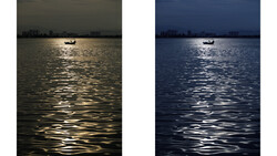
I am not a fan of altering the initial colors and setup of photos after the shoot is done. I prefer to look for the perfect matching background or surrounding to complement the subject I photograph beforehand. However, color grading is an essential step in my work, which completes the overall mood I aim to achieve through my photography. Being one of the most important steps in my workflow, the process usually involves a play with the luminosity, saturation, and some slight tonal tweaks. But there are times when we might have a striking color scheme, but not the perfect surroundings to complement the subject.
This might be due to the lack of time for searching for the perfect location, for finding better light, or for creating the perfect setup. You might end up with a really good outcome, but you will still feel your photos lack something special in the colors. This is where complementary colors come into play.
You might intuitively find colors that look really good together (if you are lucky or if your eyes are well trained), but it’s usually a very tough process. Instead of spending a lot of time and blinding your eyes in front of your screen, Aaron Nace from Phlearn shows a very quick way of finding the precise complementary color in your composition and several ways of integrating it into your retouching process.
All you have to do to choose an average range of color you are looking for in Photoshop is go to Window > Extensions > Adobe Color Themes. Afterwards, you need to choose the best complementary color for the particular image and decide which part of the image it has to be applied to. Everyone has their favorite ways of working with selections and masks, so feel free to use whatever suits you to colorize the image.
Nace notes: "For best results, be sure to have the center color box chosen in the Adobe Color Theme dialog." He creates a Hue/Saturation adjustment layer where, by clicking on "Colorize" button, he enters the exact HSB values from the Adobe Color Theme dialog, after which he selects the desired area and masks the initial color with the chosen complimentary one. In a surprisingly short time, you will be able to make your imagery even more striking by using this simple technique.


Join the Fstoppers community for free
-
Post comments and join in the discussions
-
Browse the site ad-free
-
Share your work and get featured in the community
-
Compete in the photo contests for fun and prizes
5 Comments
For anyone without PhotoShop, Adobe has the Color tools (formerly Kuler) online for free as well:
https://color.adobe.com/create/color-wheel/
thanks for the addition !
There is also an adobe color app for phones. You can take a picture and analyze colors from pictures on your phone and load color themes. It's pretty neat app to have.
Thanks for sharing - I was wondering what the Adobe Capture CC app was all about.