
It seems as though almost every time I ask one of my close friends about a particular aspect of their photo, I usually hear the same reply: "I forgot" or "I didn't think of that." My answer is, typically, "make a checklist."
I'm a tech geek, software developer, and photographer. I live by my to do lists and checklists daily. Airline pilots and military maintenance personnel use checklists for a good reason: because they work. I used them when I was younger also, so it's not just an age thing. Maybe it's just something I learned when I was working on aircraft electronics back in the day.
Regardless of how much experience you have, there's always a chance you might forget an important step. I don't always reference a checklist for my photo editing now that I've been doing it long enough, but I do have checklists for things like providing photos to publishers and clients.
If you're new to photography, you might want to consider a checklist to ensure that you don't forget to do something with your photo while editing. After a while, it will become your natural workflow. Here are a few things that I suggest you put on that checklist.
Straighten and Crop
Perhaps the most common mistake I see is the lack of straightening or cropping of a photo. I live along the shore of Lake Michigan, and many of the images I see daily are of the sunset at the beach. Many of them have a crooked horizon; it's my pet peeve.
Verticals should be vertical, and horizontals should be horizontal. Unless you're doing a dutch angle, learn how to straighten your image. It does not matter what genre of photography you're into; a slightly slanted image can have a significant effect on how people view your image, even if it's subconsciously.
No, your built-in camera level isn't accurate enough. Get it as close as you can in camera and then straighten it in post. Consider cropping the photo if there are any distracting intrusions along the edges like branches, trees, or rocks that are only partially visible.
Adjust White Balance
White Balance can vary quite a bit depending on what you're photographing. Photographers shooting in a studio or taking portraits are going to want their white balance spot on, whereas someone shooting a sunset or wildlife may choose it to be cooler or warmer than it actually should be.
If you shoot in raw, you can change the white balance during post-processing without any repercussions as the white balance is applied when the raw file bis rendered into an image for editing. A JPEG file has the white balance baked into its color pallet and is much more challenging to correct in post.
Check the Exposure
Yes, check the exposure. Your camera meter is just guessing, and there's always a chance the exposure needs a little tweaking, which is especially true if you have compensated for a dark or bright area of the scene.
This is also a good time to decide whether you want certain areas in silhouette or not, adjusting the shadows and highlights accordingly.
Sharpen and De-Noise
Sharpening mistakes are generally in one of three areas: No sharpening at all, too much sharpening, or sharpening in the regions that shouldn't have sharpening applied.
Most of the time, you shouldn't apply sharpening evenly over the entire photo. Out of focus areas and areas without detail should not be sharpened, such as background blur and open spaces such as the clear sky. Learn to use a mask, and if you're using Lightroom Classic, use the masking slider.
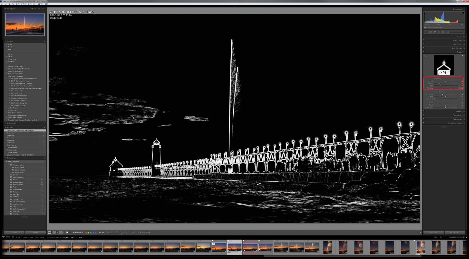
Noise reduction should balance with sharpening. Often there's no need to add as much noise reduction to areas with detail as you would to the background of an image.
Check for Clipping
Highlight and shadow clipping is when these areas lose detail and become all one color. Sometimes you may intend for this to happen, such as when shooting products or people on a completely white or black background.
Having some clipping is just fine, such as in the sun or lights. You'll want to check for clipping not only as you edit but as one of the last steps while editing as the adjustments you make will affect the clipping.
Check for Distractions
The littlest of things can distract a viewer of your image. It may be a branch, leaf, rock, bird, etc. I handle big distractions when I'm framing my composition in the field. I often remove small distractions while editing if they don't involve changing the main subject of the image.
Edge distractions are often overlooked by the photographer, as they are looking at the main part of the image. Viewers however are drawn to these edge distractions as they are exploring the image and that takes their eye away from the main subject of the image.
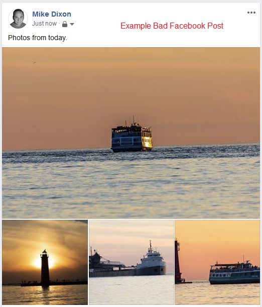
View at Various Sizes and With Different Backgrounds
A photograph can be perceived differently depending on its display size and background color. An image that looks great on a large 4K display can look quite different when displayed as a thumbnail or as a small image on a mobile device.
I always preview my photo at a minimal size in Lightroom, usually at 1:8 or 1:16 ratio. This minimum size gives me an excellent idea of how it might look on a phone or as a smaller image, such as a Facebook post.
I also preview the image with different background colors because the background can change the way you perceive an image. A large white background can make some darker areas look almost black.
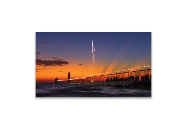
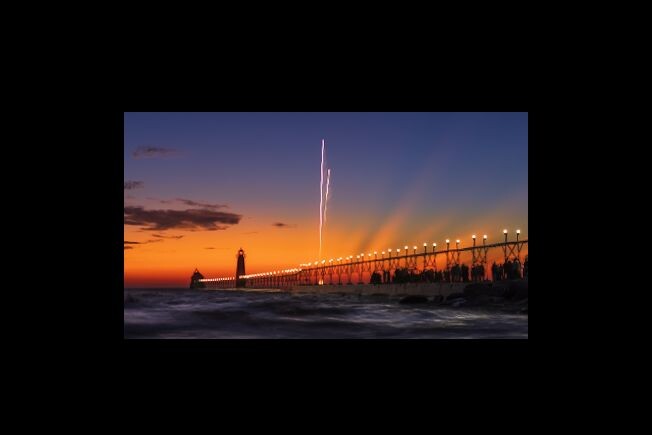
Note how the bottom edge of this image (the water) looks different on a white background than on a black background.
Apply Corrections
One of the simplest things to overlook is applying corrections for chromatic aberration and lens profiles. If you're using Lightroom or Photoshop (Adobe RAW), these will be called "Remove Chromatic Aberration" and "Enable Profile Corrections."
One thing I do is create a preset that applies these and then select that preset during import. Lightroom will remember the last import preset you used, so the next time you import Lightroom will automatically select that preset the next time you import your photos, so it's hard to forget.
Conclusion
Whether you're a novice or just forgetful, a checklist can be a useful tool to ensure you don't forget anything important. Depending on your type of photography, you may wish to add items to your checklist. For example, if you are doing portraits, you may want to add items for skin, hair, eyes, teeth, etc. to your checklist.
Do you use a checklist, or did I forget any essential items? Let me know in the comments.


Join the Fstoppers community for free
-
Post comments and join in the discussions
-
Browse the site ad-free
-
Share your work and get featured in the community
-
Compete in the photo contests for fun and prizes
18 Comments
Excellent post and some good ideas especially for beginners.
You know I’ve been thinking about doing this but I’m never sure about the order of adjustments... (still relatively new to photography)
Solid advice. Pretty sure they designed the software so you can flow through the tools. You might not need a list. For lightroom it would be from the top down, starting with WB and hue I believe. In Capture 1, would be from left to right. However, in C1 you can drag, drop, and sort the tools in the order you use them, and hide the ones you don't.
You can reorder the panels in LR, too. For example, if you prefer to mess with the Tone adjustments first, you can put that panel on top.
Unfortunately, you can't (yet) rearrange sliders in individual panels, something I wish they'd add.
The one I always forget (or rather think I can afford to skip) is "view at different sizes". Then I post to social media, and see that what looks like a smooth gradation at 27" is a sharp line on a phone, and subtle but important elements become invisible.
I use checklists for certain purposes but often forget where I keep them :)
Maybe you shouldn’t ask how they did it. Because it’s not important, and you will learn nothing by knowing, but only copy what they did.
I think most photographers have a structured workflow, that they like. Taking the time to find out what works for you is more important, then copying what someone else does. And by making errors you learn how you can improve.
Given the array of possible edits, maybe a basic flow to get people started would be useful. I agree from there they can develop their own style.
I have a mental checklist but not necessarily an order. I am a list user and like the idea of having a list for each stage of my workflow. As soon as I document my workflow, which is on my to do list, I will create a list of steps in each stage. If anyone out there has a workflow, with a list for each stage, then I think it could add a lot of value to all levels of photographers if you don't mind sharing it.
Co-sign on this!
Pretty good well written sound advice, that I intend to share with a bunch of beginners I know.
The only edits I would suggest is checking and setting the black and white points, which you could add under your exposure heading.
For editing the image, removing visual distractions is pretty important. For photoshop users learning how to use the healing and spot healing brushes and content aware fill I would say are vital skills.
I originally had the black and white points on my list, but it started to get a bit long explaining what it is and how to set them. I think I might do another article on them.
I usually pass over articles with this type of headline, but the image stopped me and I am glad it did. Very well done and useful.
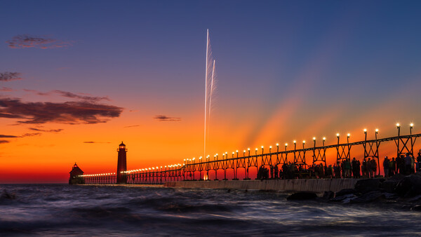
Thanks! Sometimes a headline is just a question. I understand your hesitancy with all the click-bait going around these days. Since you like the image, I'll explain it in more detail. The metal structure leading out to the lighthouse and fog house is called a "catwalk". It was used back in the day to get out to those structures during heavy seas. It was removed 3 years ago to renovate the pier surface. The public raised over $1 million to have it restored and placed back. This was the first lighting of the new catwalk on November 30th, 2019.
The pier is looking great! Thanks for the article and sharing some GH photos, been a while since I’ve been able to visit.
All the points which are highlighted are really usefull for getting the good image