Strong contrast is rarely something you rescue with a single slider after the fact. If you want images that feel intentional instead of flat, you need to think about contrast before you even open an editor, then use the tone curve with a light touch.
Coming to you from Samuel Elkins, this practical video reframes “contrast” as a choice you make in the field and then refine in post. Elkins starts by pushing back on the default habit of reaching straight for exposure, saturation, clarity, and the contrast slider in Lightroom. Instead, you’re pushed to decide what should be light and what should be dark while you’re still shooting, so the file already has a clear direction. That mindset changes how you meter and where you place your subject against the background, especially when the scene has bright sky and deep shade in the same frame. He also flags a common failure point: edits that look “fine” but feel undecided because the tonal range never gets shaped with intent.
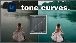
Once Elkins moves to the computer, the focus stays tight on the tone curve as the center of the edit, not a finishing move. You see the curve treated like a full control surface: highlights, lights, darks, and shadows each get nudged for shape, not yanked for drama. He leans on the parametric curve first because it’s easier to read when you’re learning, then shows where the point curve gives you finer control when you’re ready. The examples are pulled from real files, including frames shot on the Fujifilm X100VI, and the edits are built in layers so you can track what each move actually changes. You also get a clear warning: the tone curve can make an image look strange fast if you push too far away from the starting line.
The part worth watching closely is how he separates “tonality” from “brightness,” and how that changes the order you work in. In the demo, he’ll pull highlight tone down to soften the brightest areas without simply dimming the entire file, then shape the shadow side to bring out texture while keeping the image from collapsing into mud. He shows why he tends to avoid heavy-handed moves in the lights and darks, then relies more on subtle midtone shaping when he wants a punchier look. There’s also a simple observation about lighting direction that affects everything you do later: side light gives you a smoother gradient from highlight to shadow, and that gradient is much easier to steer with the curve than a scene lit straight-on. He briefly touches HSL tweaks for problem colors like greens, but he keeps that mostly parked so you stay focused on tone decisions.
You’ll see him copy curve adjustments across different images to test consistency, then spot where the same curve breaks because the underlying light is different. He also references the classic S-curve idea, but the real takeaway is how small anchor-point moves can shift the whole mood without screaming “edited,” especially if you keep your black point from drifting into that lifted, faded look. If your edits swing between too crunchy and too flat, the way he judges midtones versus shadows will likely change how you approach your next session, including how you expose when you know you want depth later. Check out the video above for the full rundown from Elkins.


Join the Fstoppers community for free
-
Post comments and join in the discussions
-
Browse the site ad-free
-
Share your work and get featured in the community
-
Compete in the photo contests for fun and prizes
No comments yet