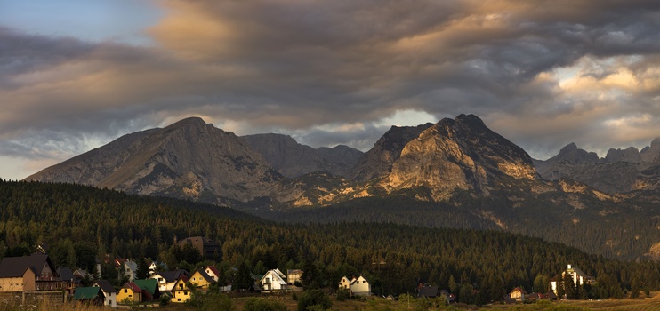


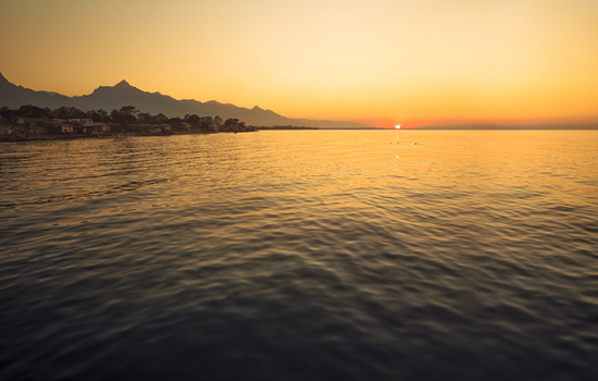


Morning glow in Montenegro
I went back and forth on how to frame this scene. I originally intended the pano to be much wider, as the clouds and peaks continue to the right. However the foreground lost interest so I kept to the scene framed here. I really like the homes in the foreground - for their colors, how their rooflines mimic the peaks of the mountains, and to bring in the sense of scale. Comments welcome.
Click on the thumbnails below to comment and rate each image.
Click here to learn about the Fstoppers rating system and what each star value means.
5 Comments
I love the clouds and the light on the mountains, but i don't share your love for the foreground, it's a bit out of place for me. It's so close to the bottom of the frame that it cannot really decide to be in or out, if you know what i mean. Especially that house in the bottom left and the patch of grass put me off. They also seem a bit slanted to the left, but that might be die to the uneven ground itself.
Hi Max, thanks for the feedback. I get what you mean about the homes being too tight in the frame. I have some extra room in the file, so I'll see what I can achieve with some more work in post. I didn't see the slant at first, but you and Henrik (below) pointed it out so I see it now :)
Great image! Nice landscape and your postprocessing is excellent.
I agree with Maximilian, the foreground is a bit unclear. I like the houses, but I would give them some more space under them. Also, it seems that the photo is tilted counterclockwise?
I would crop the frame more towards the mountain on the right. I love the light on it, and I think cropping the image will give it more focus.
Thanks Henrik! I'll head back into PS and see what improvements can be made to the composition.
Thats a lovely scene!