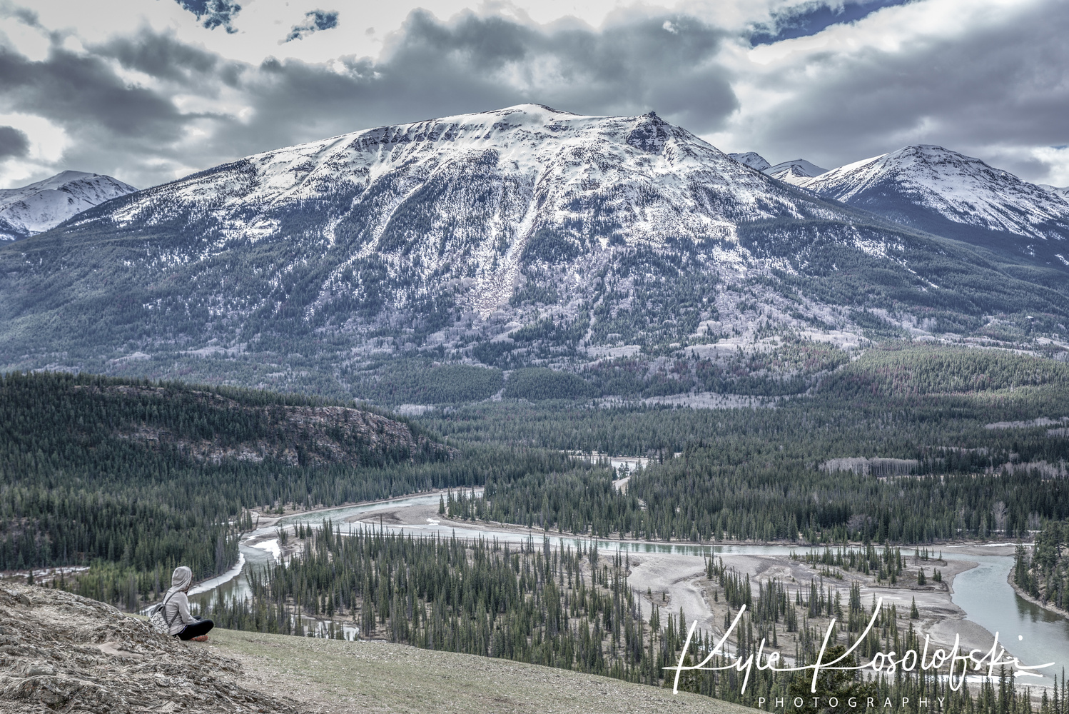
Taking in Jasper Alberta Canada
Contest Submissions
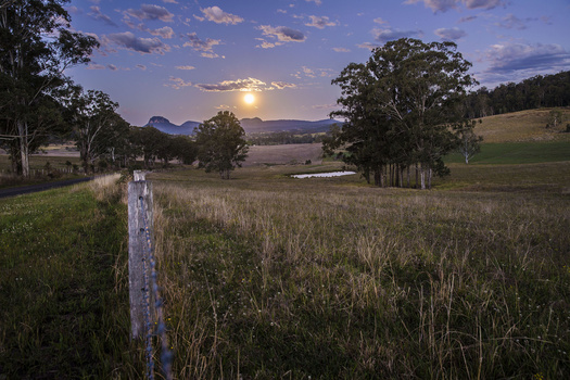
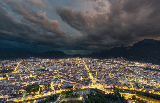
Click on the thumbnails below to comment and rate each image.
Click here to learn about the Fstoppers rating system and what each star value means.
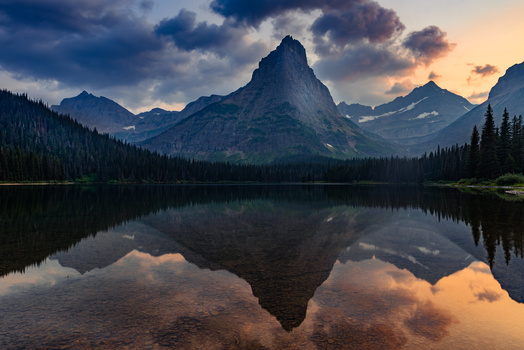
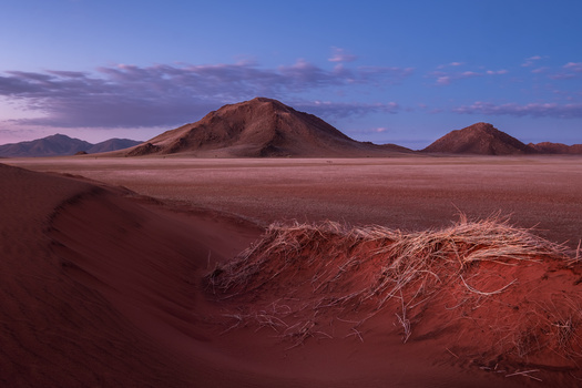
Click on the thumbnails below to comment and rate each image.
Click here to learn about the Fstoppers rating system and what each star value means.


4 Comments
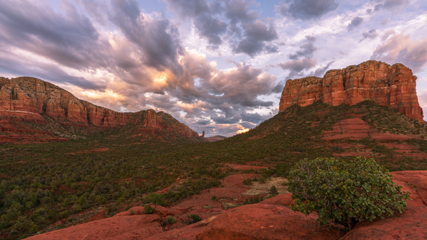
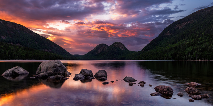
Watermark is way too big - it distracts from what would otherwise be a grand scene. Colors seem muted too - blues (sky) and greens (grass in immediate foreground) are off. Highlights in the clouds are clipped as well.
Mountain looks great, color aside. Looks tact-sharp
Thank you for the input, it’s very much appreciated!
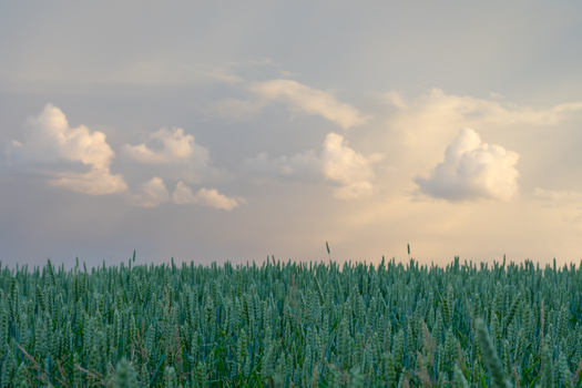
I really like the person sitting in the bottom left, but I didn't even notice her until after I'd looked at the image for nearly a minute. Something to draw out the contrast there to make her more noticeable might help.
Good point my friend! Im going to revisit this photo in Lightroom and see what I can do! Thanks 🙏