Contest Submissions
Click on the thumbnails below to comment and rate each image.
Click here to learn about the Fstoppers rating system and what each star value means.
Click on the thumbnails below to comment and rate each image.
Click here to learn about the Fstoppers rating system and what each star value means.


3 Comments
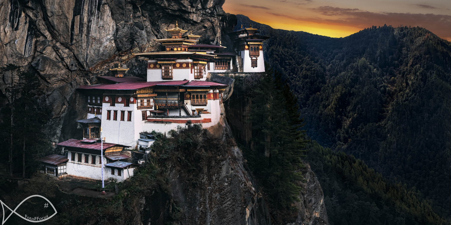
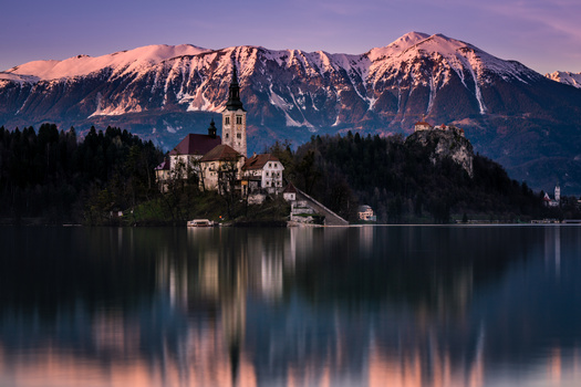
Watermark is way too big and distracting.
Nice atmosphere and scene. It's easy to see the positive elements of this picture. Some feedback:
- The photo is visually imbalanced towards the left. The temple is the brightest part of the image, which draws your eye, while everything around it is dark. What's to the farther left of the building? Maybe the photo could've shown some of that. I've never been there so that might not have worked too!
- Most of the landscape, especially the one on the right, is underexposed. Would suggest you bring out some of the details a little bit.
- The colours look a bit overcooked. Maybe tone down the saturation a bit?
Hope this was helpful!
Looks like some bad dodging and burning in the background trees, and like another poster has said its unbalanced compositionally