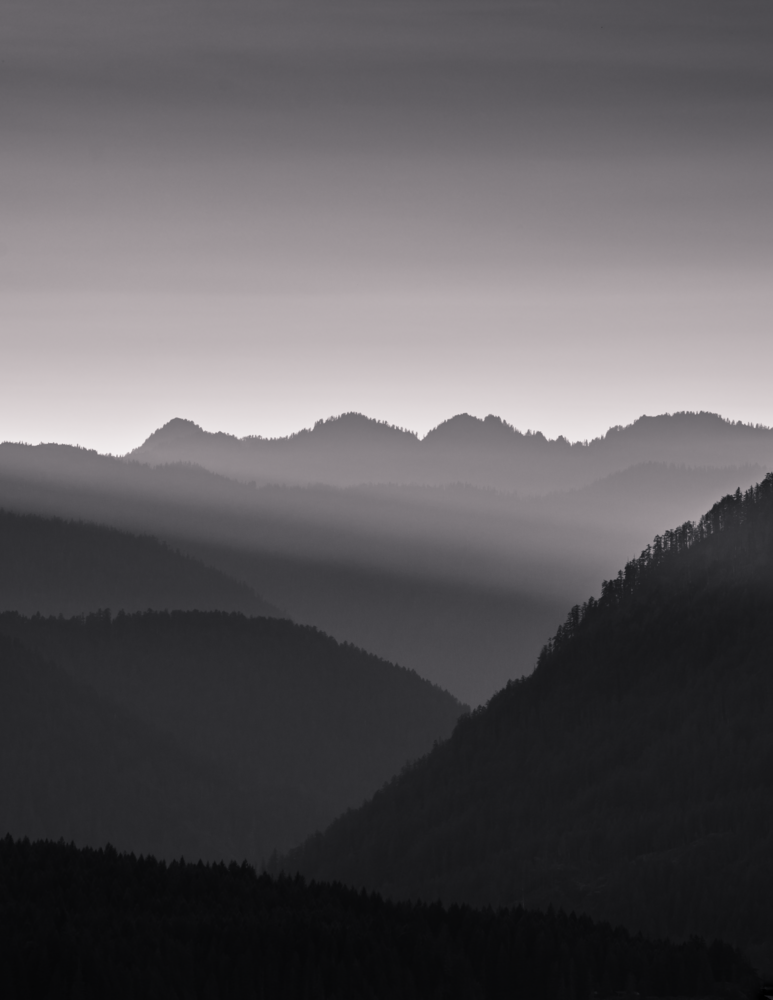
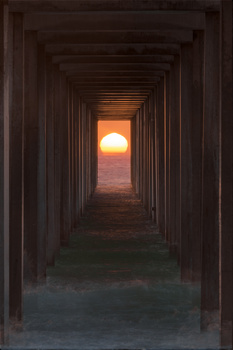
Same image as my other entry, just converted to black and white. I debated for a while on whether this image should be color or B+W so I'm curious to see which one gets rated higher.
Contest Submissions
Click on the thumbnails below to comment and rate each image.
Click here to learn about the Fstoppers rating system and what each star value means.


2 Comments
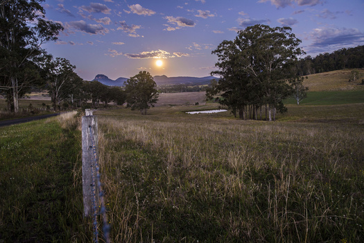
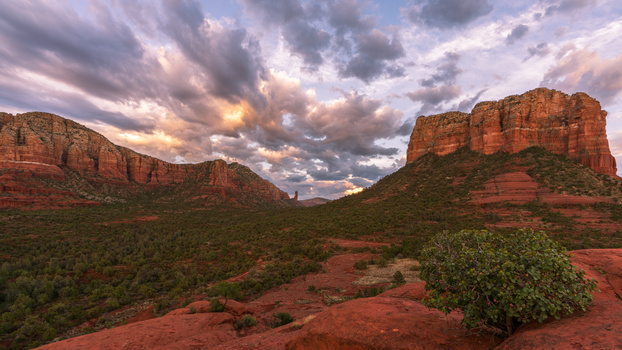
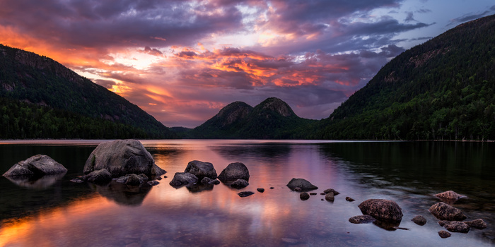
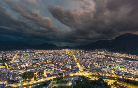
Tones could use a bit of work - looks fairly flat here. Upper 1/2 of the frame is dominated by the empty sky, which isn't really doing anything interesting for you. Might suggest cropping it down a bit.
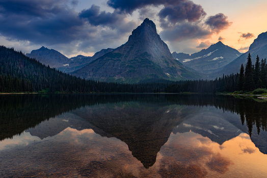
Layers of skylines in the haze or fog seems to be a theme in this one. And I have to say I love it.
Usually I don't comment before the end of the contest, but on this one I have to make an exception. I actually have to second mike r though on the comment with the crop:
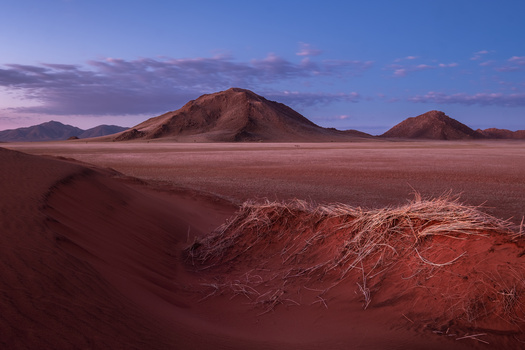
Did you notice that you have an almost perfect heart shape in there, with the two round hilltops in the middle of the far skyline and the valley below the right one?