I've been taking critique and re-uploaded my photos with recommend edits. Let me know if this isn't okay.
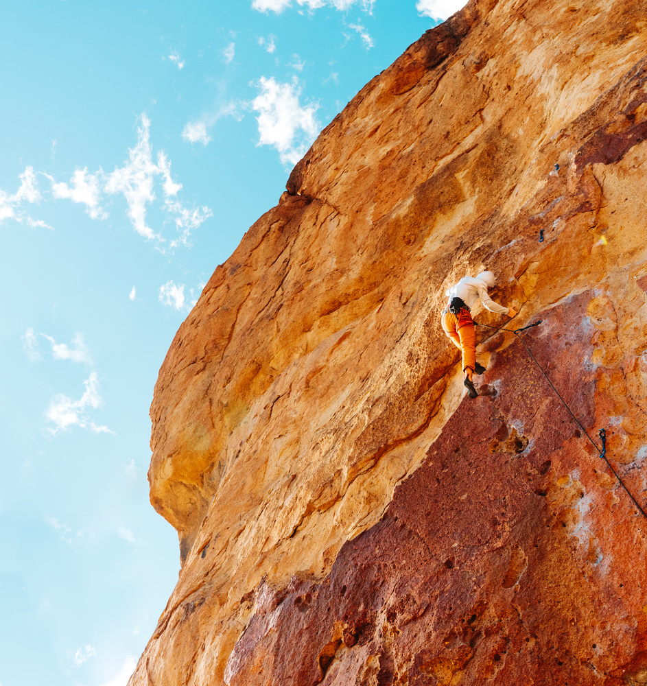
This is my different view of my friend climbing Blue Light Special (5.11b) at Smith Rock, OR
I've been taking critique and re-uploaded my photos with recommend edits. Let me know if this isn't okay.
This is my different view of my friend climbing Blue Light Special (5.11b) at Smith Rock, OR
Click on the thumbnails below to comment and rate each image.
Click here to learn about the Fstoppers rating system and what each star value means.


4 Comments
I love the composition, but I think that the orange is a bit too strong, it looks a bit garish and the detail of the crag is slightly lost.
Thanks for the comment Tom! I think I actually agree with you. I am red/green colorblind and sometimes I kinda miss the mark. Especially now that I am seeing it on a differently calibrated screen.
Agree with Tom, I think the saturation needs to be toned down. I wish the pants were a different color altogether to separate the subject a little better. I also think the highlights on the climber could be pulled back a bit. Overall I think your other submission is stronger--I like that composition with the wider angle with more context given the natural beauty of the surroundings. That being said, I think with a little work this could be a solid submission too.
Thanks for the reply Josh! I like the composition of my other submission more as well. I'll try making those adjustments to the image.