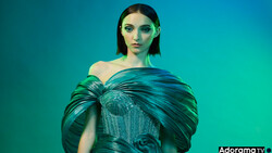
Boutiques, clothing brands, and some stores usually require catalog images for their business and e-commerce websites. Would you be able to deliver clean catalog images? Here's how you can do just that!
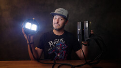
In this video tutorial from V-Flat World, photographer Dani Diamond shares his method of capturing consistent catalog-lit images on a white background. White is one of the most common colors for backgrounds in this type of work. Some sites may have a different aesthetic and will need another color, but this lighting setup can be done on any color. The lighting gear used for this setup includes two strobes and two v-flats to achieve a directional, soft-light look.
This is a standard look that any photographer doing fashion and commercial work should know how to create. Of course, you can make some alterations, but this is a solid starting point to begin with. The great thing is once everything is set and ready to go, you can just focus on shooting. You will be able to capture consistent-looking images perfect for your clients' needs.
What does your typical lighting setup to produce catalog images look like? Let us know in the comments below, and share those lighting diagrams!
Join the Fstoppers community for free
-
Post comments and join in the discussions
-
Browse the site ad-free
-
Share your work and get featured in the community
-
Compete in the photo contests for fun and prizes
2 Comments
I did not get that part I out the color balance? Is he setting color temperature according to ambient light? Or flashes? Those flashes most likely are 5100 kelvin with modifiers. To me setting it manually works great, or auto balance to actually, easy to adjust after. Grey card is nice in post.
In my mind the easiest way is to use one large umbrella, as large as the roof height permits, from a good distance. Distance of flash gives little difference in exposure between model and the white background, giving quite white background, but far from pure white. If you want more shadow a black vflat or something is key.
I mostly end up using flashes on the background because my space is rather small. With out that most of the time it gets to grey for my taste:)
Auto balance is not preferred in studio, especially for catalog. The goal is neutral, consistent color for the entirety of outfit or shoot. Having the camera set white balance automatically on each shot could possibly require different individual adjustment for each shot. That is generally the opposite of the goal of work flow for a catalog shoot.
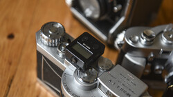
The file extension on the iPad shows .JPG. I don't know if he is also shooting Raw files, but RAW workflow on catalog shoots is, for me, preferable. I would rather do color control on RAW file output in Capture One Pro. Even if you have a camera on auto white balance on RAW files you can apply a consistent color balance in a non-destructive fashion and output consistent neutral files. For me this is important because I don't know how many times a file will be opened, modified and saved potentially losing data with each stage.
Regarding the lighting, I've never been a fan of using a separate light for fill when the intent is to make it work on only the shadows. A similar, or possibly better effect would be to have taken the two lights one on top of each other to create a larger light source. With careful placement, you can feather the falloff of the light to essentially 'push' the strongest part of the beam of light across the set to the reflectors while the edge falloff of the large light source lights the background area closest to the light source. Essentially throwing the beam of light across the set and giving the more power/value to the reflectors. Again, with care, you can light a broad set with a single light.
Another approach would be to have the larger light as main light and the smaller light on the opposite side lighting the background and using only a single white reflector on the shadow side of the subject.