
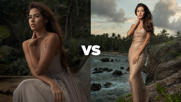
Update: The results are in. Patrick and I are once again competing to see who can photograph the same model best. It's up to you to decide.
The two images are below and further down are two questions. Please answer the poll to let us know which one you think is best and who you believe took each shot.
There is also a bit of a twist to this competition that you will learn about when the video comes out in a few days. Can you guess what it is? Let us know in the comments below.
Related Articles


Join the Fstoppers community for free
-
Post comments and join in the discussions
-
Browse the site ad-free
-
Share your work and get featured in the community
-
Compete in the photo contests for fun and prizes
81 Comments
#2 is out automaticslly. Very awkward looking pose and it shows in her face. #1 is better, but.....way to dark. Im surprised you would even post this improperly exposed photo. Very unprofessional.
Best? Both shots have challenges; too harsh on the face in #2, too soft in the face for #1. If one is shooting a "portrait," then #1 is better. If one is shooting to portray the dress, then #2 is superior. Apples and oranges colleagues, apples and oranges.
I prefer pic 1 but I just noticed a weird halo on the background near the right elbow. Looks like the brush used to dodge was too big and was used coarsely. I prefer the edit in pic 2 but it looks like the pic isn't straight and I would have liked just a bit more green on the trees in the far background.
I like 2. The model has large hands that distract in image 1. Image 2 has obvious flash that a lot of people are slating as unnatural - but why does an outdoor shot have to mimic natural light? Nothing wrong with her being obviously lit in my view. The luminar sky replacement spoils it a bit though.
I voted for 2. The more focused portrait is 1, but the subject seems not lit as much as in photo 2.. so for the reason that the lady is lit better in 2, that's what I voted for.
I voted 2. But with some better editing, photo 1 would have been the better one because photo 2's light looks a bit forced.
I think #1 is the better photo. It can be improved by simply cropping off the sky highlights in the trees at the top of the photo. Bright elements always attract the eye especially if they are near the edge. It will also help to separate the model from the background by bringing down the perceived brightness of the background. I think the lighting on her face is beautiful it is a very nice Rembrandt lighting leaning toward loop lighting. I did not think her "large" hand was distasteful or distracting. The model has beautiful long slender hands that piano players would envy. She does need to bring in her pinky finger a little bit as it sticks out in both photos.
I think #2 has some problems. First the lighting of the model and the rock she is standing on does not come close to matching the background. It certainly separates her from the background but not in a flattering way. If this was a power shot of an athlete or corporate big wig then this may work, but not for a beauty shot. A gel on the light would have made a big difference. Second, I am not sure what is happening on her right thigh, but there is an editing artifact. Third, something with the water looks altered as where the water meets her dress is not as well defined as where the rocks and trees meet the dress. Fourth, the pose is awkward. Her right hip is tilted too much. This may be the best they could get due to the slope of the rock, but it looks awkward.
The right thigh artifact is the slit in her dress. I considered cloning that out but didn’t think anyone would even notice it
I like 2 more. She is lit better and has better separation from the background, Though I like 2 better for some reason I do not like her foot in the image and I am wondering if the sky has been replaced. For what it is worth my wife liked 1 more.lol
Ha, her foot was composited into the shot because her two feet in the original were clinching and looked too strained. Guess I didn’t do a good enough job with the feet
not that you did not do well with the feet .its just a personal preference thing. Many times I have thoughts contrary to what others think but thats ok , thats the nature of art. When I watch you guys do the contest critiques I sometimes completely disagree with you both and at others agree 100 percent.
AH! I was so wrong!!!! (…—ish).
It was not the background which was replaced; It was the foot!
(The replacement was obvious, but the fact that in was the foot, and not the background got me).
Plus, if you took image 2, then I also got that wrong. 😵
Image 1 wins IMO. With the second image, the OCF is too noticeable and becomes a distraction.
hhmm twist?? shot in studio and new background added??
Photo # 2 looks like the model was cut and pasted onto another background. I find photo # 1 better to look at. Although, I think that photo # 1 could be lightened up a little (but not like photo # 2 that is too bright)…both photos were probably shot by the same person....
#2 was shot there on location. Besides some normal editing, it was all as you see it.
Patrick, the only reason I had stated that when I was looking at the photos on a larger screen, photo #2, on the models right hip, looked like it was not right, and then further down the photo, copied and placed onto a photo...Not only that she looks bigger than the rocks she is standing on...(maybe it's me)...
Wow! I would never had thought so. Unless….
What constitutes “normal” editing? 😉😆😁😀😄
[EDIT] I got my answer above. 😁😀😄 I would not call partial image replacement, “normal editing,” myself, but to each their own. [/EDIT]
#1 is better as composition but with the color/lum of the #2
1
THE TWIST
It would seem to me that both of these were composites. The backgrounds were added/changed after the fact.
THE GOOD
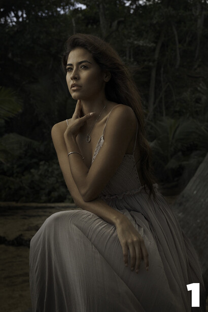
The first one looks like a pose in which I might actually find a real woman. Both hands look natural. I tend to hate images of women in which they seem to caress themselves in weird ways, but this left hand on the neck is not unusual. I do that from time to time.
The facial expression on the first also seems to match the scene. She is observing the sunset and contemplating the day. It even shows in her forehead.
The first one has a closer match of the lighting of the foreground/background, but not perfect. Still, an overcast sky at sunset can give that lighting, so it is not unbelievable.
The background removal in the first was almost perfect. Even the small hairs blowing in the wind, (almost lost in the background), adds realism.
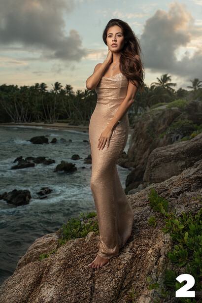
The model is properly exposed in the second one.
In the second one, there is no awkward crease/fold in the dress.
In the second image, the colour grading is good, matching the background sky, the foreground rock, (just the foreground rock, though), and the model's dress.
THE BAD
The model seems under-exposed in the first image. so much so that the Poisson noise is producing a muddy brown on her left upper-arm, shoulder, side, and face. (There is less shot noise in the shadow of the background; another giveaway for background replacement). Perhaps that muddy skin tone is because it was shot with a Canon??? (I notice that in some older Canon, and the Fujifilm X-Trans sensor, but the X-Trans tends to tint the eyes and teeth as well, and I did not notice that in this image).
Colour grading seems off just a tad. Not sure if it is really there, but it seems that the model is a tinsy-bit on the warm side, while the background is just a wee-bit on the cool side. I may be making a mountain out of a molehill, here. It may just be the colour temp of the flash did not quite match the colour temp of the sky, IF there was no background replacement. What can one do?
The perspective in the first image —actually, both images, but I will get to that— does not look right. The model seems to have been shot from close due to the perspective distortion of her hand, but the background seems to suggest perspective compression from being far away. (Hence, a “giveaway” for background replacement).
There is an awkward crease/fold in the dress, behind the right hand. Yes, even the best of us sometimes miss that. I know I do.
Around the right shoulder, the background removal seems too hard. It becomes a little obvious. Another giveaway, if I am right about the twist. If I am wrong about the twist, then too much unsharp mask.
The perspective in the second image is also a bit wonky, but not as bad. Perspective again suggests that the photographer is not too far away from the model, about two to three meters, but the background where she is standing seems to be about a meter away from the photographer. Also, she seems to be taken with a “normal to wide” lens, while the background seems to be taken with a “normal to telephoto” lens.
THE UGLY
What is that model doing in the second image??? Why is she caressing herself in that manner??? No woman ever stands like that, except in catalogues, and fashion shoots.
What is that expression on the face of the second model??? What is she looking at? What is going through her mind? No story —or at least, no believable story— is being told here.
Speaking of story-telling, the second model; perfect dress, perfect makeup, perfect hair, on a rocky tropical cliff. So out of place.
In the second image, the exposure difference between background and foreground is unbelievable. Either bring down the model, or bring up the background.
The second model has too much unsharp mask. Either that, or it is really terrible background removal.
There is a very strong light on the right side of the left foot of the second model. It even looks as if the background removal took off a little sliver of toe and foot. (Yet another giveaway). Forget that; maybe she has an awkward left foot deformity. Fine. The lighting just does not match the rocks.
THE WINNER
The first image. Mostly because the second one was not that good at all. Actually, the first one would be quite good if the exposure of the model was better. Noise is not caused by high exposure index; it is caused by too little light.
THE PHOTOGRAPHERS
I find Lee goes for the WOW factor, and Patrick is very deliberate, and slow. I therefore think the bright lights, perfect glistening dress, body curves, dramatic sky of the second image is Lee, and Patrick did the more thoughtful expression, matching the lighting better, less distracting background of the first image.
I cannot wait to see how well I did in picking the twist and the photographers.
Okay, the “twist” was not a twist at all. Nevertheless, there was some partial image replacement, but I was so wrong on the background. Also wrong on who took which image.
[EDIT] After seeing the before/after of the two images, I was not that wrong about the backgrounds after all. The first image did have its background altered, (as good as being replaced), and the second image did have partial image replacement, but it was not the background with which they tampered. [/EDIT]
Yes, the muddy colour of the skin-tone was not due to it being a Canon; it was taken with the iPhone 12 Pro, —apparently, the twist,— with a “normal” lens, (52 mm equivalent).
Twists: #1 shot on iPhone 12 Pro Max, no flash. #2 shot on iPhone 11 Pro Max with Profoto B1 flash.
Close
Completely unfair comparison: different focal length, different composition, different lighting, different location. Different model attitude. Take two identical shots side by side of her forearm in low light.
Focal lengths were not that different. 52 mm equivalent, and 40 mm, respectively. f/2 and f/4 respectively.
This is not a great comparison. Each composition evokes a different mood. People will select based on the mood that appeals. Do you prefer Matisse or Van Gogh?
A bit of a bogus experiment in my view. Showing a small ~ 700KB image hides the the disadvantages of the phone camera. I can get wonderful large prints out of a full-sized camera. A cell phone camera, not so much.
The phone camera can blow a regular camera out of the water with its advanced processing algorithms if the raw data has not been well handled in post.
Having two different images set out for comparison biases the test as well. One image might just be stronger than the other. In my view, that is likely what happened here.
A fair comparison would have been the same scene shot with two different cameras with a highly experienced retoucher working on both images.
…or no retouching at all.
Hard to do that if one is shooting raw, which many advanced photographers do.
In the case of JPEG or straight-out-of-camera phone photographs the equipment manufacturer has already taken care of that for you. The adjustments have been made by software built into the device. This is the key reason a lot of people suggest phones take better pictures than conventional cameras.
I said, “retouching”, (a.k.a., “post” processing), not developing, (a.k.a., processing).
You also said, “retoucher”. Quite possible with raw. I shoot raw, and rarely retouch.
Phones do not do retouching; they do developing/processing. But, most development software can also take care of that for you. Available options are akin to “Auto adjust” (based on relative brightness and colour), and/or akin to “profile curves” (based on the camera, lens, and APEX settings).
P.s., my phone shoots raw, and I have it set for raw+JPEG, but only really shoot snapshots with it.