
As you may guess, I am not a fan of rules, and the question I often ask is, "Who made the rules, and why do they think they can tell me what to think?" In fact, I may get a T-shirt made that says in large letters, "Screw the rules and screw the horse they came on!" So there, I've said it. And if that sets your teeth on edge... just read on!
Seriously, though, who wrote the so-called “rules of composition,” and why should I treat them like they are the holy grail that all art must attain? To quote one of my photographic heroes, Edward Weston: “Composition is a way of seeing, strong or weak according to the individual. If composition could be taught, anyone might become an artist. Rules of composition are derived from the work of strong masters and used by weak imitators to create nothing.”
As I browse the several photographic pages I subscribe to and walk through popular photographic galleries, I am struck by how much the photographs from the various “artists” look so much alike—almost like formula photographs. So many are so similar! So then, what do we need to do to separate our photographs from the pack? I don’t want to be a “weak imitator creating nothing.”
So then, if we ignore the “rules for fools,” as I call them, how do we know what a good composition looks like? My common reply is this: “Does it look good to you?” “Does it feel good to you?” “Does it say what you want it to say?” If it does those things, then I would posit that it’s a good composition.
A very great problem arises when we blindly follow arbitrary rules set up by someone else. At that point, we begin to lose our own voice and begin to use someone else’s. And frankly, when we lose our own voice and take on someone else’s, we lose the uniqueness that was placed within us at birth and become weak imitators. Imitation may be the highest form of flattery, but it is more often a bitter trap! Imitation may be a great learning tool when you are beginning, but at some point, you will have to seek your own voice, or you could easily lose it.
Now, academicians will start to come at you with all kinds of high, lofty-sounding words that may sound good and intellectual but are just a lot of blather since, most of the time, they don’t have a practical understanding of those things—where they came from and what their practical applications are. So, let me say this: be who you are compositionally. Explore, experiment, ask yourself the question, “What if…?”
A friend of mine, who is very well known as a black-and-white landscape photographer, once said to make your own photographs the way you like them. If someone says, “Why did you do that?” the answer is simple: “Because I liked it that way.” If one person asks and dissents, be confident in your vision. If a hundred people dissent, re-evaluate your vision.
Having said all that, here are some ideas that might help make a stronger composition for you.
1. Balance
Does your photograph feel balanced left and right, top and bottom? Most times, I personally prefer the horizon line to be either smartly above or below image center. But again, that is not universal, and sometimes I will put it almost in the vertical center of the canvas for impact’s sake. So, evaluate the balance of your image.
2, Rhythm and Direction
Is there a rhythm and direction to your photograph? Musical rhythm may be the best analogy I can make. Rhythm can be a valuable tool to create mood. For instance, Allegro in D Major, K. 626b/16 by Mozart gives a light and airy emotional response, while Beethoven’s Fifth is bold, ponderous, and heavy, and Toccata and Fugue in D Minor by Bach evokes a response of darkness and dread. There are dozens of other examples, of course. So where on that continuum do you want your photograph to lie? What is the mood you want to evoke?
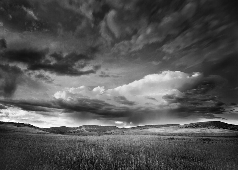
(By the way, this image is a good illustration of using the Scheimpflug principle. It was essential that the heads of grain in the foreground remain sharp despite a light breeze and needing to use an aperture of f/32. See my earlier article about Scheimpflug for more information.)
I used more than three compositional elements to make this image work. Those are balance, rhythm and direction, and texture. See what other composition elements you can find in it.
3. Texture
Never ignore texture. It is texture that gives your photographs a tactile feeling, and texture is revealed by light direction, intensity, and contrast, which I will address in a subsequent writing.
4. Space
Are you filling all the space in your photograph with interesting material? Do you want to have large open spaces in your photograph, like an open sky, for instance? Are you wanting to work a very dark area against a lighter area, or vice versa?
5. Exclusivity
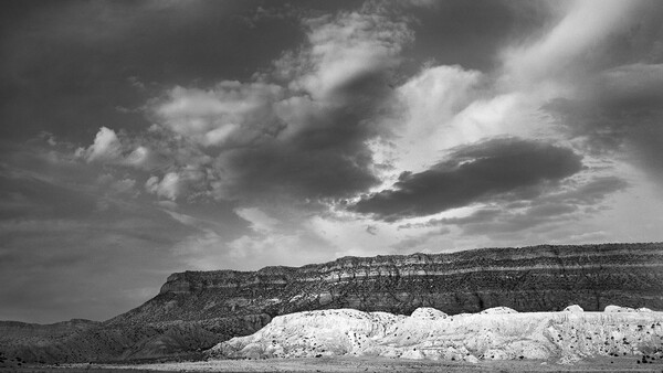
That which is in the minority will always (almost always) get the most attention, as seen here.
6. Attraction
The human eye will usually gravitate to what is the lightest, brightest or in sharpest focus.
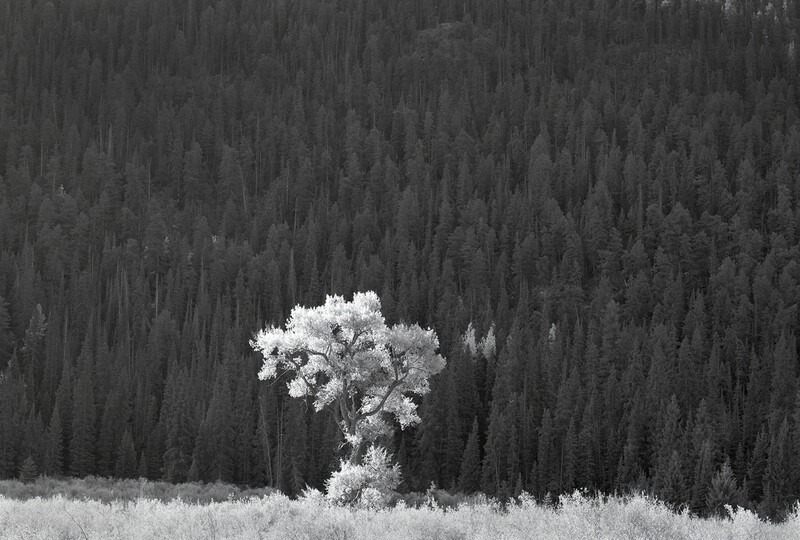
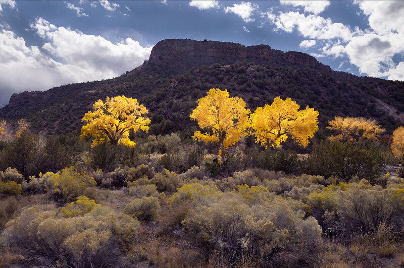
(As you can see, the Huge Cottonwood stands out, and is the most visible against the mountainside of darker trees behind it.)
7. Lines
A leading line can be used to direct the human eye through an image to what it is you want the viewer to see.
8. Camera Position
Always search for the camera position that will most effectively communicate what you’re trying to say. Pay attention to the horizon line: where do you want it to be? What’s more important to your image, the ground or the sky? Sometimes you will have to make a choice, so figure it out. Will it be better if you moved ten feet, or more, to one side or the other? Can you hide that annoying and ugly power pole behind a tree? Are there two or more objects that will blend into one in your photograph? I call these convergences, and they can be good or not good, depending on what you want to say.
9. Layers of Subject Material
I like to show layers of subject material in my photographs—foreground, mid-ground, and background. I have seen a large number of photographs with remarkable mountains and clouds, for instance, and a blank foreground, like over a lake. So, 2/3rds of the image is water, with no notable interest in it. A lesser crime, though still a problem, is when there is a very interesting foreground and mid-ground, but the background is vacant. I actually learned about this one from the country western singer Kenny Rogers. Many don't know that he was an accomplished photographer, doing excellent portrait work as well as landscape photography. For examples of his portrait work you might consider his excellent coffee table book, "Your Friends and Mine."
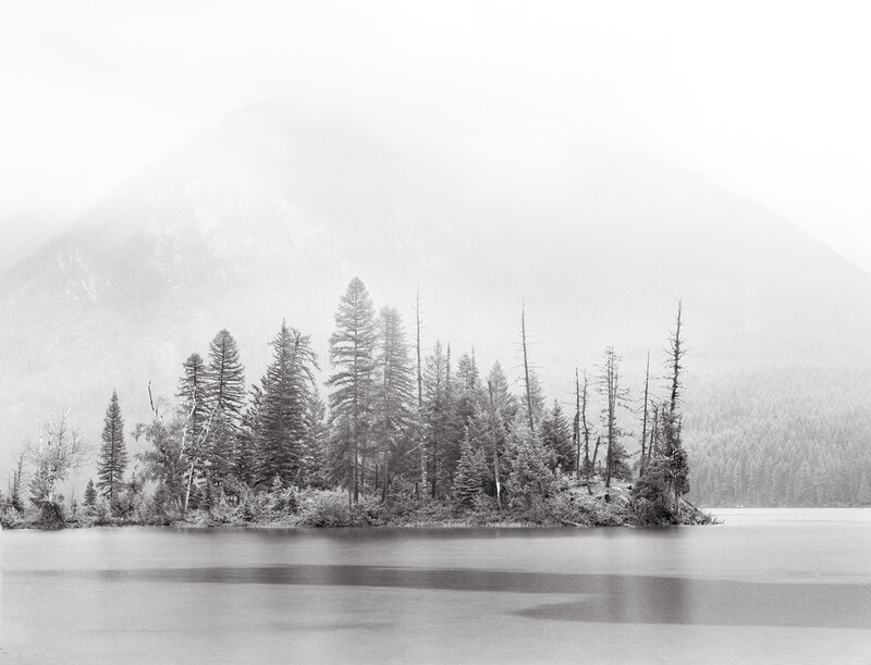
The background was interesting, especially when the clouds dropped down over the mountains in the short distance, visually isolating the isthmus of land into the lake. However, the foreground was blank, and blank = boring most of the time. The "Langmuir Spirals," which cause the areas of slick water, in the lake's foreground gave me something interesting to see in that area. Another element I have not discussed due to space is what I call atmospheric depth of field, where we use atmospheric elements to show what we want to, and add depth to our photograph.
10. If in Doubt, Crop It Out
Don't be afraid to crop out elements that are boring or that don't contribute to your story. (More on this in my next writing, so stay tuned.)
11. Watch Out for Intrusions Near the Borders
Sometimes even your most valiant efforts don't work, and you end up with an image that either makes no sense, or that just isn't quite what you want, or hoped for. Don't discard them ever, unless there is an obvious insurmountable issue, like being completely wrong on the exposure, and unrecoverably so, or being out of focus, and you'll know those things when you see them, either on your computer monitor or when it is proofed in your darkroom. And by the way, a tip for those of you that use film, never trust a photo lab's judgment, they are wrong more than they're right. I have completely given up on lab processing of film, especially black and white film.
Here is an example of an image I had high hopes for; however, in spite of all my valiant efforts, I am not getting what I hoped for originally. It may please others, but it has never been satisfying to me. Maybe it will be someday, but not yet.
The trick in all of this—compositional elements and considerations—and the qualifying equation is when all of these elements can be tied together and used to build a personally satisfying image.
The primary source of all of my expendable supplies like Kodak T-Max 100 is B&H. Good people that do things the right way. See them here.


Join the Fstoppers community for free
-
Post comments and join in the discussions
-
Browse the site ad-free
-
Share your work and get featured in the community
-
Compete in the photo contests for fun and prizes
14 Comments
You probably know I love to comment on pictures. It's by trying to articulate what we like or don't like in pictures that we improve... in my opinion. The first five black and white images have your name stamped all over them (figuratively). They look like your pictures. Your pictures have an inherent simplicity to them. Your pictures have a distinctive mood. Nothing seems forced or compromised. Every element has a reason for being included. The skies are always great, even when they're not always terribly dramatic. Your photos look like a special effort was made to get your camera into position for the shot. I would never call one of your pictures a snap-shot, well, until...
The color image at the end doesn't look like you. I understand you're making a point about how some images disappoint, but I'm amazed you saw potential for the picture when you were composing it, or think there's hope for it. I agree that it comes up short. Here's why (no rules involved): It looks like a roadside image taken as a matter of convenience. My wife calls them a picture that she took to show me what she saw... nothing more. Nothing special or compelling. The rabbit brush adds a nice soft texture, but there's too much clutter at the bottom of the frame. The trees are lined up all on the same plane, which renders the image sort of static. There's no movement through the image. The lighting is harsh making for dead color on the rocks and a bad sky. It can be marginally improved with heavy cropping and converting to black and white, but doesn't approach anywhere near your excellent standards.
This is excellent Nathan, thank you!! Love your work!!
For Ed Kunzelman. For some reason I am not allowed to respond to your comments. I agree, and indeed it was done kind of on the fly. I was driving into Santa Fe from Espanola, NM in the north and this is where the road forks to go to either Los Alamos or Santa Fe. I was attracted, of course by the gorgeous golden Cottonwoods against what was a purple colored mesa, with the chamisa in the foreground. What I had hoped for at the time was quite different than what I saw when I uploaded the image onto my computer. It has never made sense to me, but is illustrative of why we should never pass up an opportunity and also should never delete an image unless there is a very good reason, like having a terrible exposure or it being hopelessly out of focus.
--- "For some reason I am not allowed to respond to your comments"
Just fyi…It's a site glitch since at least a couple of years now. When you enter an article via notification bell (or similar), sometimes you can't reply to certain comments. You'd have to go to the URL and delete anything from "#comment….." so you are only left with the root URL.
If you'd like to test, click here:
https://fstoppers.com/fine-art/power-composition-691471
You should notice the Reply is active for Ed's post.
Nathan, your take on composition is a great reminder that creativity thrives when we trust our instincts. I agree that breaking the rules can lead to powerful imagery, but I also think it is important to understand them as well. In fashion photography, seeking balance, leading lines, and framing helps create stronger compositions—so when I do break the rules, it is most often intentional. Your discussion of rhythm makes me think about how movement and flow influence storytelling in an image. Thanks for sharing!
Paul Tocatlian
Kisau Photography
www.kisau.com
I signed up for an account just to comment on this post. I will be updating my profile soon enough as I have been reading Fstoppers for a while.
This article is very close to what I've been telling people for a while now...Take pictures for you. If others like it, great. If not, who cares...
Photography is an art form, following rules is not part of making art. Any learning I've tried to do is about getting the most from the camera. I really love that you pointed out using "rules" makes your photos the same as whoever else is following those rules.
Thank you for justifying my view!
You signed up just to reply? Wow, I must have irritated you a lot! Kidding of course. Thanks for the nice words.
Nathan,
Thanks for a fine piece! I like your rebellious attitude: "Screw the rules ..." “Because I liked it that way.” Similarly, when I'm helping someone or running a seminar I often bring up the "Rules of Photography Police." I'll say, "Note that the subject is up against the right side, breaking the Rule of Thirds. But don't tell the Rules of Photography Police or I'll be in big twoubble!" We laugh, then move on to another point.
So again, thanks! Break the rules if you think it makes sense, think like an artist, and above all have fun.
The moment we stop having fun creating is the moment it becomes work and stops being creative and merely an exercise.
“Why did you do that?” the answer is simple: “Because I liked it that way.”
That kind of flippant answer isn't ever going to help anyone understand composition better. We should view such questions as an opportunity to teach the person asking the question.
If we strive to articulate why we like what we like, then we can answer such questions in a way that helps the person asking us the question to become more aware of the various components in the scene and how they relate to one another, and how camera position, relative to the scene can affect the way that the various elements of the scene appear in relation to one another.
Just saying "Because I liked it that way" doesn't help the person learn anything about the dynamics or nuances of composition.
I don't feel that "Because I liked it that way" is necessarily a flippant answer. Without context, it's hard to say. Not every question asked of us demands a teaching experience. I'm certainly not obligated to go into depth explaining my composition to everyone who asks. I can't tell you how many times, because I have a professional camera and tripod, that people have come up to me asking for photography advice. As if I don't have work to do. You wouldn't want to discuss composition just as you're waiting for a bird to take flight, would you? People have asked if they could shoot a picture from directly in front of me, at sometimes the most inopportune time. No, I do not owe everyone an explanation. Answering the question at a camera club meeting is one thing... in the field is another.
And often times the answer to "why" stems from a point Nathan made earlier in the article... an image usually "feels" right, or it doesn't. And I'm doubtful that concept can be taught or explained. Edward Weston made the point that he could teach a young child how to use the camera, but some people could never learn the art of "seeing." Anyway, Nathan suggests eleven things worth sticking in the back of your mind which indirectly answers the question "Why did you do that?"
I think your comment, Tom, must have struck a nerve with me. Here's another example of when I don't need to answer the question "Why did you do it that way?" While I was showing my photography in a local gallery, I would say nearly 99.99% of the people who asked something about the technical qualities or compositional decisions reflected in my photos were other photographers... their opinions about what I did wrong, disguised as rhetorical questions. In other words, they were looking to state their position; not buy art. People who buy landscape photos do so because the scene is meaningful to them in some way, not because of the rule of thirds.
Yes, I am quite familiar with the backhanded slights that are poorly masked as questions. I try to be gracious when such things are asked of me, and answer the question as if it were an honest question, even though I know it isn't. At these times I will also explain what things about the photo I wish were better, for no image is without flaws.
I find that when I am willing to be objective and somewhat self-deprecating, then those who try to put my image down by asking a backhanded question all of a sudden don't want to find fault with the image anymore ... as soon as they see that I am not all puffed up with pride and acting as if my images are God's gift to the world, then they seem to actually feel bad that they first tried to point out faults in my work.
Every now and then I find another photographer who has a neat way of interacting. One guy in particular comes to mind. There will often be something that pops out to him as a problem with a photo. He wants to talk about it, because he is so interested in composition and technical aspects of imagery ...... but he doesn't want to be insulting. So he has developed a thoughtful way of questioning the photographer of an image he sees a flaw with; he will ask, "if you could change anything about this image, what would it be?" When we are going to get together, I anticipate that he is going to ask me this about some of my recent work, and I will start thinking ahead of time about what I will say. Knowing he is going to ask me that question helps me to more thoroughly scrutinize my work, and that's a good thing.
Ed Kunzelman wrote:
"Answering the question at a camera club meeting is one thing ... in the field is another."
Ed,
I hardly ever get asked any such questions - about composition - in the field. Questions like that usually come after the shooting is over, like when a bunch of photographers meet at a restaurant for dinner at the end of the day, or when someone comes over to the house for the weekend and there is a lot of downtime to lounge around looking at photos on my computer, or when we email photos back and forth to each other to show what we've been shooting lately.
In the field, experienced photographers most often talk about the subjects themselves, or about light, and I actually enjoy such questions and the ensuing discussions.
In the field, rookies or sub-par photographers often want to talk about gear, and I despise such questions, especially when they get around to lens sharpness or sensor performance, which they invariably do. When someone is insistent about having these conversations in the field, I will usually tell them directly that it is not the time to talk about such things and that they aren't very important anyway.