
July Challenge - Minimalism B
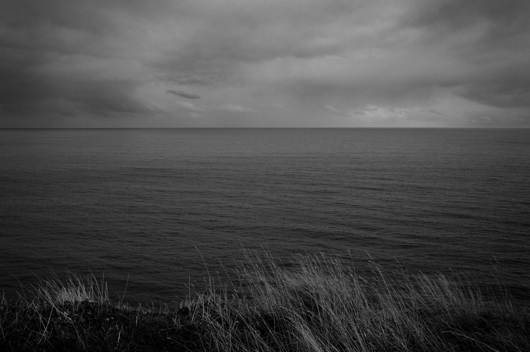
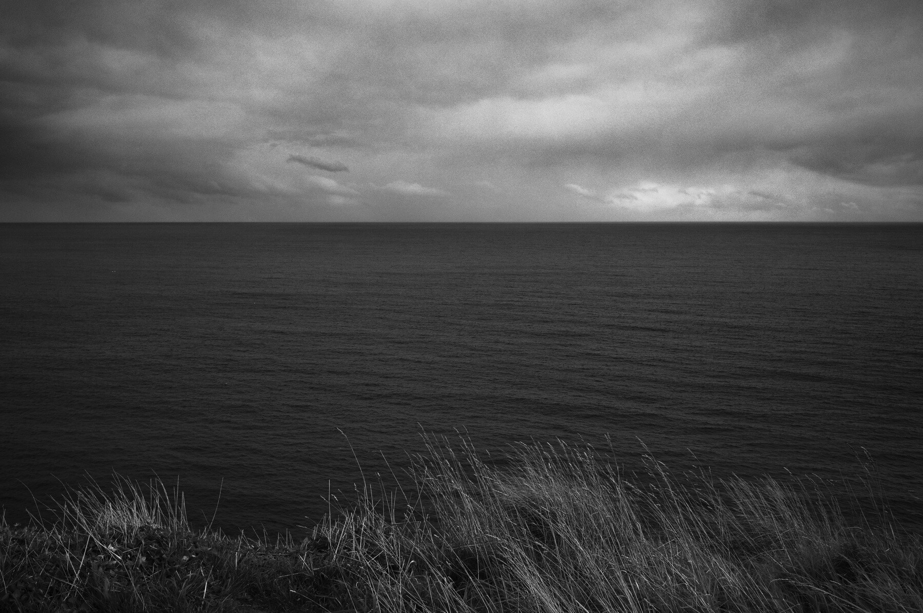
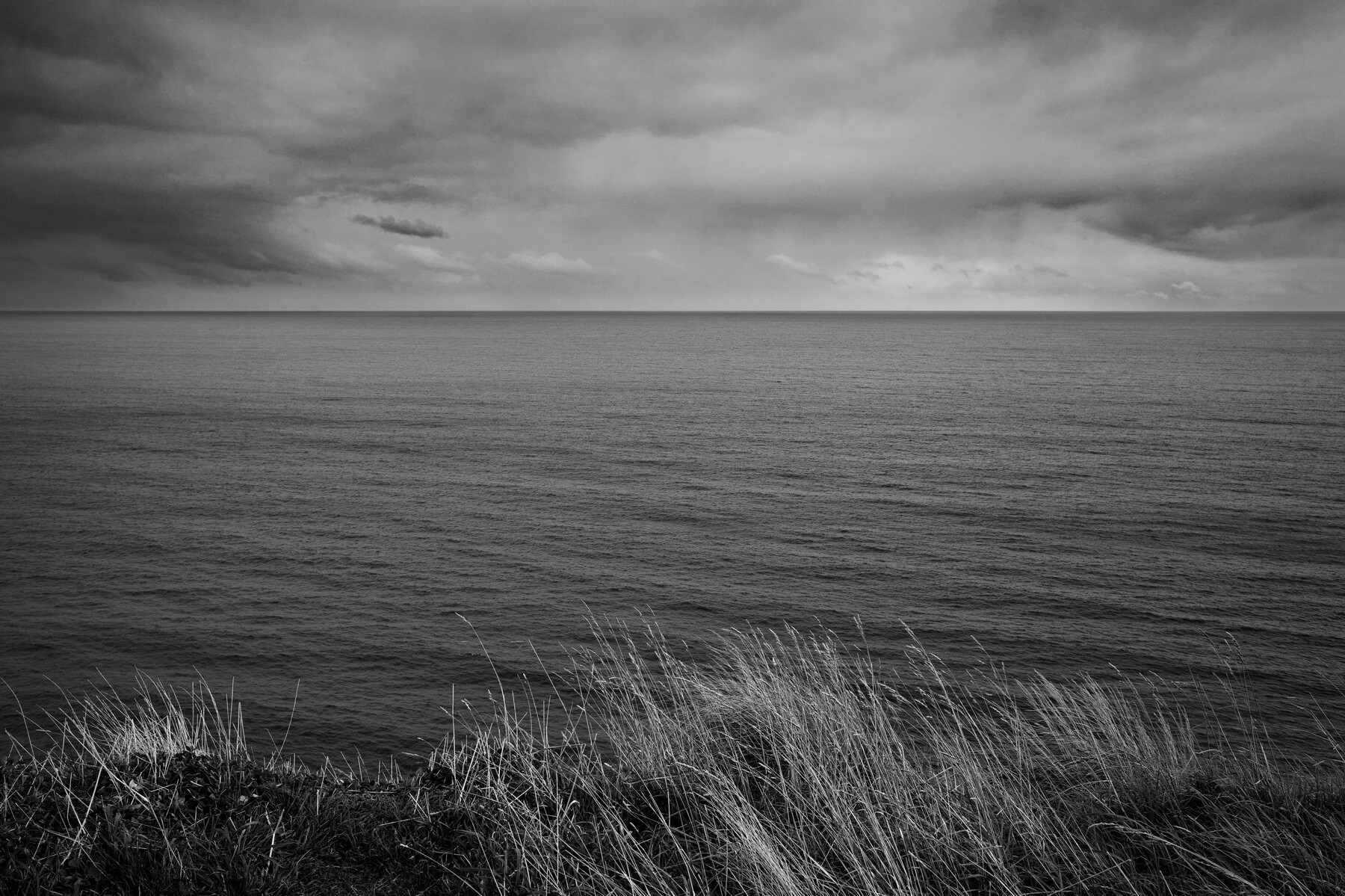
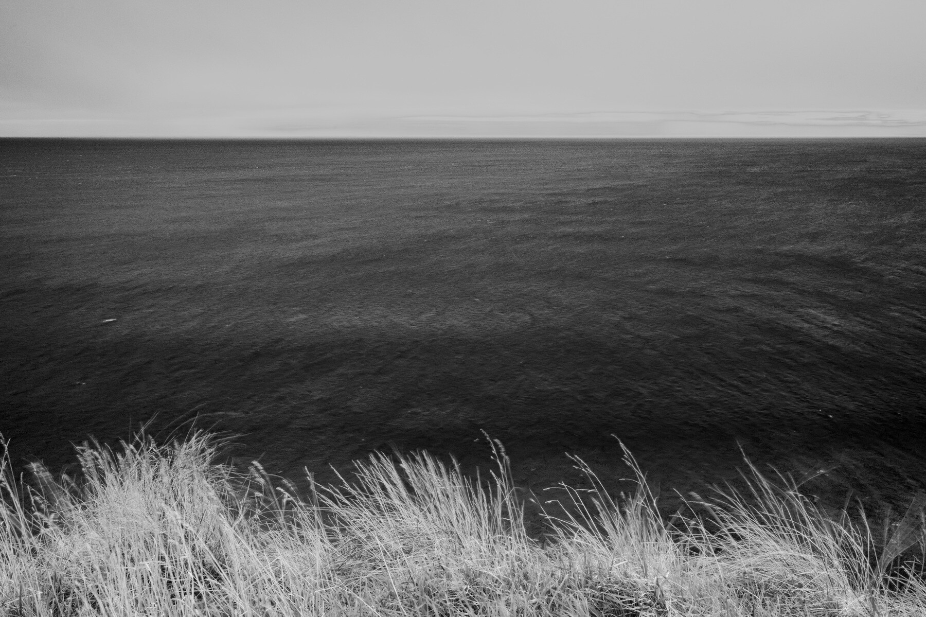
I had the idea of depicting earth, water and sky as simply as possible at my favourite seascape vantage point, Cape Patton on Victoria's southwest coast.
The images also show some of the possibilities of usnig a colour image to create a black & white one, varying the RGB proportions from one capture.
Three captures: two versions of the first capture, then one about half a minute later. The third capture (fourth image) was on a different day.



7 Comments
It is always fun to see what you can accomplish not just with your camera but with postprocessing as well.
Have you ever tried Inverting a photo, edit and then revert back? Now that I think about it, that could be an interesting thing to try.
What got me on the idea was your fourth image that made me think of IR film. That's how my mind works, I get off on wild tangents and never know where it is going to lead.
I do not know what program you are editing with, but in Lightroom® I discovered Adaptive Color and Adaptive Black & White Profiles that don't adjust the sliders.
Thank you for posting and giving me ideas.
Hi Dean! Thanks. Yes, the fourth image also reminded me of IR images. I'll be interested to see if I can apply the same idea to an image with, say, trees in it, and get something like that slightly surreal IR look. It always appealed to me, but it did seem like an awful lot ot trouble for one effect I wouldm't always use. I like to keep things as simple as possible.
I use ACDSee, mainly because I'm familiar with it. (It's reputedly a Photoshop imitation. Its Develop mode I think is like Lightroom, its Edit mode like PS.) I attach two screenshots of using Edit mode to make a B&W image, the first with the default settings, and the second tweaked to make the grass lighter. You can vary the proportions of RGB in your original image file, and also change the Brightness of a given colour in the original image.
When changing from Color to B&W, as with you, I prefer to work individual colors rather then globally.
I remember these photos way, way back ... I need to go back to check if I'm still at the same place, but I love #3 for sure. It strikes just the right balance of everything! Nice work, Chris!
Thanks, Photo Girl! I agree about the third one, although as Dean points out, the infra-red fiilm-like effects possible (as in the last image) are something I hope to play with some more.
Hi Chris, great to see you posting again! I totally agree - converting to B&W offers so many options over and above what color editing can provide.
I typically run through the LR presets to see if I can find a good starting point. Silver Efex Pro (from Nik collection is also good to check as it provides an array of dramatic presets that can trigger a starting point.
Nice shots - my preference is #2 as I feel I am drawn through the image to the dramatic sky.
Thanks for your kind words as ever, Alan! It's good to be back, taking a bit of leave and playing with my mirrorless camera and simplified kit.