
Experimental Editing
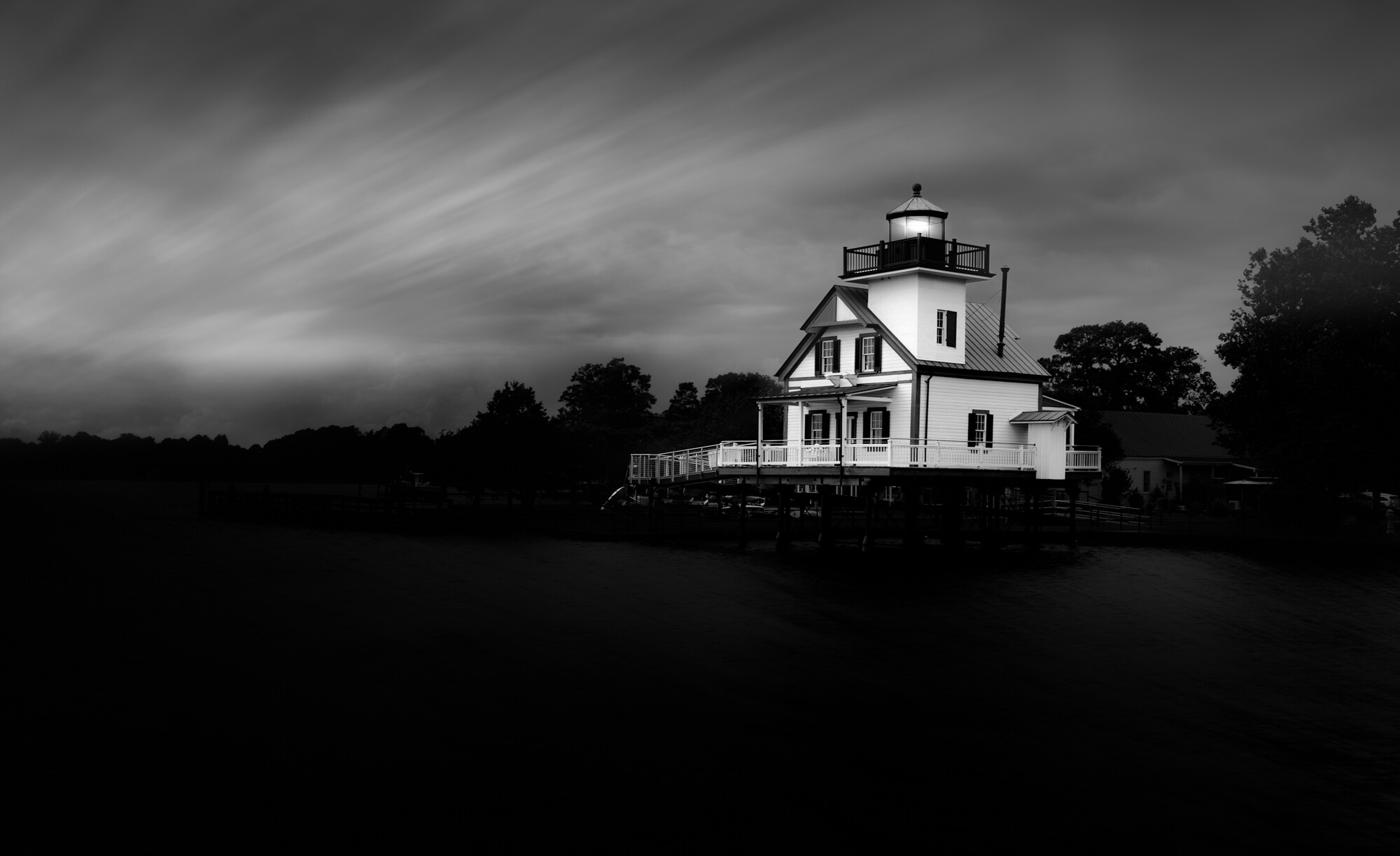
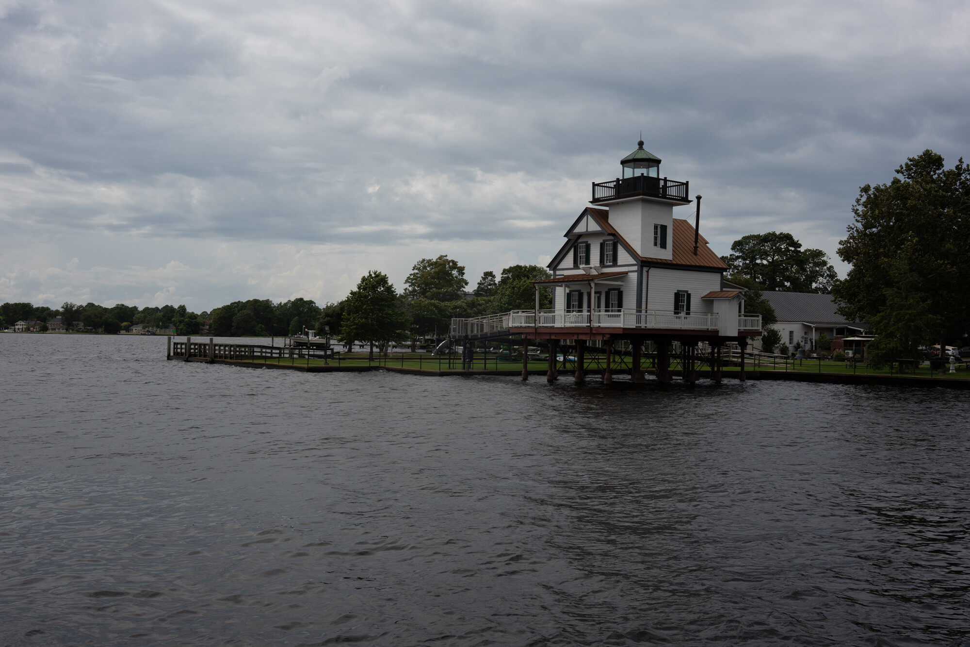
This is in Edenton, North Carolina. The Roanoke River Lighthouse. We usually stop here on our way back to NC from vacation in upstate New York. We split the trip up so we always end up here for lunch, hence I'm always here in the middle of the day.
I've been toying around with this black and white "fine art" style edit. I converted it to black in white in lightroom using mostly selective masking. Then I went over to photoshop. Replaced the sky with a long exposure sky from a different photo I took and did some additional edits. I did some blurring to the water. I also lowered the opacity of the sky replacement so I have the long exposure streaks but there's also some texture left from the original sky.
I'm not 100% satisfied with it but I think it's at a good "rough draft" stage. I'm thinking about getting rid of the some of the trees/land on the left so it looks like it's just sky and water. I think that may make it look a little cleaner? I also think I need to clean up the sky some. I think there are some issues with the mask. I probably got a little careless with my brush!
Anyways, just thought I'd post it and see what others think? I also attached the original unedited raw so you can see what I was working from.



7 Comments
I really like this, Kyle. Other than perhaps adding a tad more light to areas of the water to give it a bit of character I'm not sure if I'd change anything at all.
Check those verticals on the building though - they may be leaning to the right for me. That's just me being picky though.....
Thanks Alan. I wasn't sure about the water my self. I think it needs to be lightened up a bit. I'm sure the verticals are off on the building. It's usually the last thing I do and since I knew I wasn't done I didn't fix them.
Good job experimenting, Kyle. I think this fits the bill with the b&w fine art style that you've been working on. The lines in the sky work really well as leading lines. Good job hiding all the messy details without making it look artificial. I am drawn to the white/black contrast in the lighthouse; but then with b&w, I do prefer a strong contrast rather than everything mixing together. I wonder if there's something you could do with the water so it wouldn't be so black? I'm just a little acquainted with this process from looking up what you shared previously, but I wonder if there's away to draw out some of the highlights in the water. That water has some amazing textures in it.
Thanks! I agree the water needs to be lightened up a bit. It's a little too dark. With the lighthouse I wanted it to stand out. I like strong contrast in my black and whites as well. But it is a fine line between that and it looking weird.
Thank you both for your comments. I agree that the water is a little too dark. I've lightened it up and a bit and I've also experimented with using the normal water instead of the blurred water. I think I might actually like it better than the blurred.
I actually prefer the blurred water, as it feels more in fitting with the long exposure theme.
I'd love to see what it would be like with highlights brought up on the water so the cloud reflections are more evident
Did some more tinkering and came up with this I also noticed there was some funny business going on with the top of the lighthouse.