More minimal
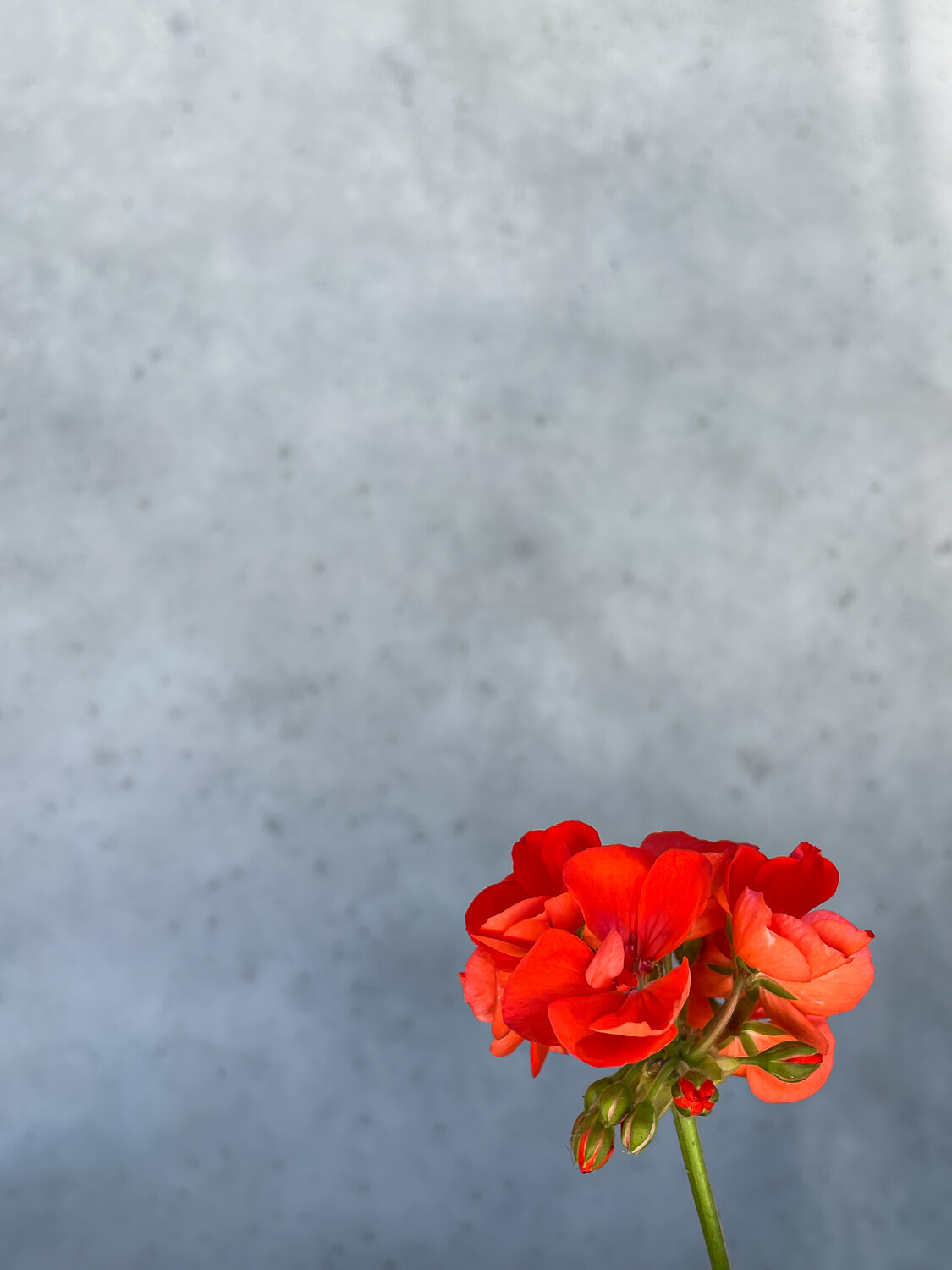
Just to keep Marcus' minimal theme going, this is a shot I took over the summer. I quite like the stark contrast between red and gray, the natural against the fabricated.
How about the crop/balance? All sincere feedback appreciated.

Just to keep Marcus' minimal theme going, this is a shot I took over the summer. I quite like the stark contrast between red and gray, the natural against the fabricated.
How about the crop/balance? All sincere feedback appreciated.
First time this young lady posed and worked in studio. Just finished her Masters degree and is now pursuing her PhD.
Spotted close to walking trail in Ebor NSW. Intense body colour indicates recent skin shedding.


6 Comments
I like the contrast as well. I'm drawn to the horizontal crop myself. I tried a moody edit...it's crude but hopefully conveys the minimalist emotion I'm going for. Thanks for sharing!
That certainly offers something different Marcus - I'll have to try that sometime.
I much prefer the original. Nice. But one thing that bothers me is the digital artifact, dark, pixel line on the border between the red and the background. Maybe it's just a result of the posting it here? Or I assuming post production pushing of the contrast?
Thanks for your response Charles. I'll have to check the original to see how that looks. I did work on softening the background a little so this 'pixel line' could be down to sloppy processing.
Crop : I like as is.
Balance : Attempted for a little diff story
Thanks Vijay, I do like your edit.