Would love some feedback on how to improve these images
Hi, I submitted one of these (the wider perspective) in the latest contest and it was on the "needs work" side of the threshold between that and "solid." Left wondering how specifically to improve either of the attached images. Would really appreciate any input people have.
Thanks,
Rob


13 Comments
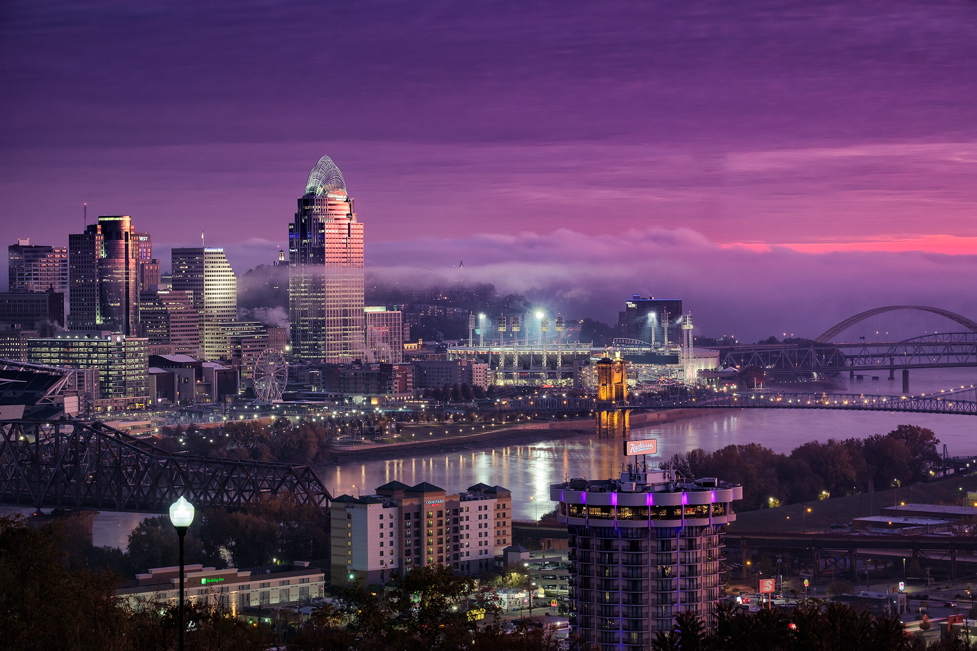
The first one is quite nice. I like the purple mood. The lantern in the lower-left corner is a bit disturbing and worth removing. I would give it at least a 3 but not a 2.
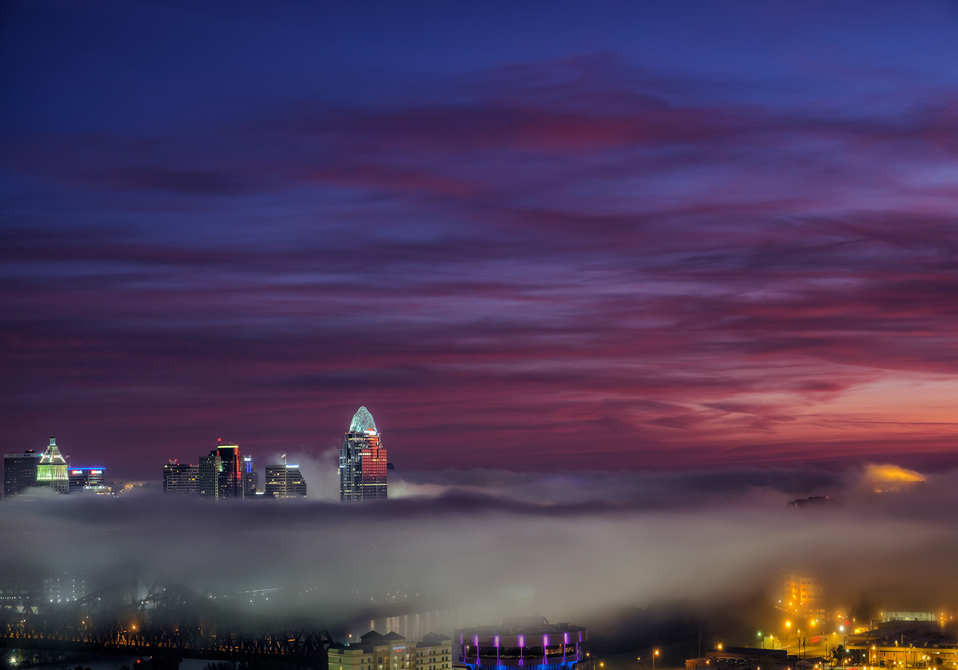
The composition of the second image isn't good as all as it totally concentrates on the sky. I mean the sky looks quite nice but the city and the fog should be the highlight and main subject of that image.
Thanks, Alexander, for your response! Yeah, I think in the second picture there simply isn't enough fog for the image i had in mind (especially without losing the buildings on the right of the frame). I tried to get the horizon at least up to the 1/3 mark, but the fog basically ends at the bottom of the frame. I'll keep waiting for the right conditions--ideally i'd like a composition like the first image, with the fog all the way from the horizon to the bottom. In any event, thanks again.
I think the second image you could crop and make it almost a pano and it might look absolutely incredible. The fog is so spectacular, I think it is right there.
I think if you play with doing a bit of cropping in the second one you can still have an image that is personally satisfying. It’s not all about ratings and scores. What do you like best about the image? What do you want to accentuate or what is the important part of the story for you? I do enjoy the first one; it’s what people expect in a cityscape and very well done. I agree the light post is a distraction but the color is fantastic. Thanks for sharing!
Thanks, Alison. Agreed on your comment re: ratings and scores--just was curious what people would say needed work. After reading the comments here, I agree the second one the composition is off. With what i've captured, I agree that a crop could focus on the main group of buildings on the left. Consequently, this is my favorite part of the image (and fog cityscapes generally): the building lights illuminating the fog. I'll give that a go (and, of course, continue to look for the right conditions). Thanks so much for your response.
Im still a “student” in this art but a couple of notes from the Masters i. E Mike Kelly - chk out some of his work/tuts on here/youtube . He will warn about the Nuclear colors and the over use of the “Harry Potter” slider :) . Almost all masters at this art will warn about over saturation and luminance under specific conditions . I also like vibrant colors but retouched some of my photos by toning down some parameters with great effect- specially on sun set/rises skies / reflections and artificial light sources.
First photo is better wrt detail as oppose to the second that hides the city. But the magenta in the first is “nuclear”
Eyes always goes straight to the most lit up areas and the sky (righthand) can pull you away from the beautiful city. Same with the lamp post ... will not just crop it out but maybe do selective adjustment to dim it a bit and in other areas like the bridge and other key elements bring out more detail/exposure etc. - no i will keep quite - cheers
Thanks for commenting, Marius. The light post and bringing down the magenta on the right of the frame are easy fixes, so thank you. The issue of saturation generally frustrates me, because I'm completely happy with the colors on my calibrated monitor, but agree with you that it is pushed pretty far when i view the image on my phone. (I even specifically checked the sunrise levels to see if they were in fact "nuclear"). Perhaps the best bet is to match my monitor to a phone or non-calibrated monitor, as it seems that most people will view it in this manner. Anyway, thanks again!
all the best with your efforts .. how people visualise it on different media is a big issue /science hence why BW is so popular (if done correctly ) . i have taken a few amazing (to me albeit) sunrise/set shots on bridges / cities and yet when i convert it to BW i will get more OOOs and AAAA's from everywhere. so maybe give it a shot on this one and compare the response.
PS: looking at the rest of your portfolio im the last person to give inputs :)
Hi Rob. For me image 2 is like an incomplete story. Which has potential in future to make interesting. long exposure dynamism of clouds and fog has just initiated an environment to tell something.
At my opinion, All colours are over saturated. perhaps selective saturation may change the look and feel. cheers.
Thanks Vijay and sorry for the late response. Really appreciate your input. As I mentioned somewhere else in this post, I am working on a way to control saturation -- especially on differing monitors/devices. Too easy to crank it to 11 without knowing it. All that said, thanks for taking the time to comment. Much appreciated.
Rob,
I took a stab at image two with a drastically different crop (I am partial to this aspect ratio.
I think it works.
I should have read all the comments before I commented. This is how I would have cropped the second shot, too. Beautiful!
Thanks so much--really appreciate your taking the time to do that. I agree, helps the composition greatly! Thanks again.