I’m always fascinated when a photographer uses their talents for a greater cause than themselves. SlickforceGirl is a commercial and creative pinup brand that helps raise awareness for women’s causes and breast cancer. I recently had the opportunity to review creator Nick Saglimbeni’s Mastering Lighting series, and I wanted to sit with Nick to discuss his SlickforceGirl campaign and how he uses the techniques taught in Mastering Lighting within the campaign.
I’ve been a fan of your SlickforceGirl brand for a couple of years now. Can you explain to our readers what started the idea of a SlickforceGirl?
I originally created SlickforceGirl because I found myself at a crossroads in my art. My career first gained traction in the urban glamour market, an arena which boasts huge fan followings but very little recognition outside of that world. The models are gorgeous and every bit as talented as — and in some cases, more hard-working than — their “mainstream” counterparts, but because they are curvy, or ethnic, or short, they are historically limited to roles such as “music video girls”.
I’ve always seen color, curves and shape as assets rather than hindrances, and I think I instinctively knew how to photograph these women in a way that was different from what had been done before in that world. I wanted to create a diverse universe full of strong female characters for a new generation that isn’t used to every character just being tall, skinny and white.
Why choose pinup/comic-book style portraits for brand? Why not put out the typical celebrity coffee book featuring women of color?
Comic books have always been a huge influence on my art. My still work is probably informed more by comic-book art than by actual photography. The first time I saw Todd McFarlane’s linework for Spider-Man, or Michael Turner’s Fathom or J. Scott Campbell’s Danger Girl, I thought to myself, “Wow, there has to a way to bring that energy into live-action photography.”
Paradoxically, in the photography business, as you advance and get higher-profile clients, the projects often become less creative—whether because of egos and having too many cooks in the kitchen, or simply because so many companies now just want everything shot on white seamless. I was grateful for the work but becoming frustrated as an artist, and I needed a new outlet. I’ve always loved classic war-era pinups, and I thought it would be fun to bend live-action photography in a more surreal direction.

Can you discuss your approach to photographing SlickforceGirl since the characters each have wildly different looks?
The goal was for each character to have her own self-contained universe. Anyone who has dealt with hardships will tell you they are uniquely personal experiences. I wanted our characters’ stories to represent the strength of the individual. Vanessa is the most literal example of this. She’s an astrophysicist who’s been marooned in outer space, left to fend for herself.
It was fascinating creating comic-book concepts for live-action photography, since an illustrator can draw anything within their imagination. But to capture it with live models — each image provided a new technical challenge for how to create it practically.
The scale of your Astronaut Vanessa character looks massive, it looks more like a movie. How did you choose your location and why?

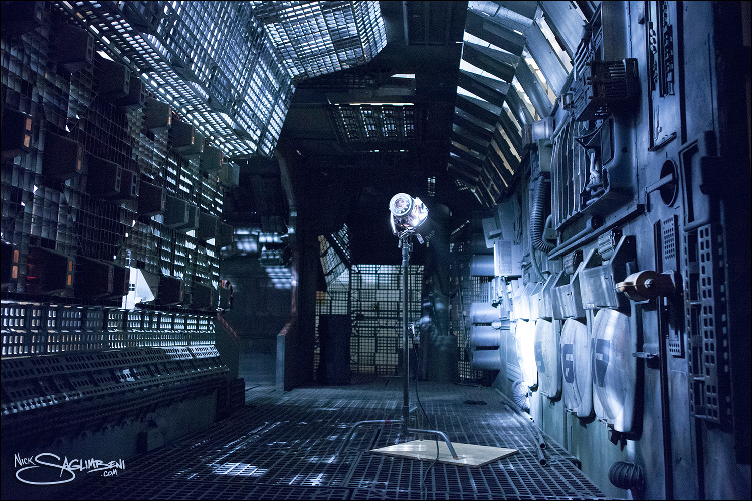
We found a huge spaceship set that was built on a sound stage for a sci-fi movie, and they hadn’t broken it down yet. It was architecturally perfect, but aesthetically very gray and drab. I wanted a very stylized color palette for our pop version of deep space, similar to the bioluminescent scenes in James Cameron’s Avatar.
One of the ways we achieved this was through costume and glam. We originally planned on putting model Vanessa Veasley in an actual NASA Mercury suit, but quickly discovered they were so bulky that it was impossible to shoot anything even remotely sexy. So we had her space suit custom-made, and used fabrics with a reflective sheen to capture the “monitor glow” around the spaceship.
How did you approach the lighting for this concept?
For the cockpit scene, we had two lighting motivators — the interior glow from the monitors and bridge controls, and the exterior glow from the stars. There’s really no manual on lighting for outer space, so I looked at old American Cinematographer articles on Armageddon and Terminator 2 for inspiration.

I didn’t want to deal with the spill from green-screen, so we built two 12x12 white griffolyns outside the cockpit window and fired 4 heads on two 2400w/s packs into them. Compositing is much easier in stills than in motion-picture, so you can use whatever color you want to end up with. We then created “nebula hits” by pointing a couple of strips and softboxes with pink and purple gels directly at Vanessa. The trick with making outer space ambience look believable is to let some of the scene fall completely to black, so we were very careful not to overlight the cramped space. For the interior cockpit glow, we placed small double-silked strip lights with steel blue party gels around the ship and behind camera.
This scene was shot at ISO 100 on a 50mm lens (medium format). Even though we were wide, the biggest challenge is carrying the depth of field at that speed because theoretically both Vanessa and “the stars” needed to be in focus. Ultimately, we were able to get the light barely to an F4/5.6 split, and then I set the lens to F8 and let it underexpose a stop-and-a-half, except for a few highlights on her suit. It would have taken too much power to get our ambience higher, and if there were really stars outside that window, the light that reached the ship would be perfectly believable a few stops under key. Also, blues and purples saturate better at a darker luminance than warm colors so it ended up working in our favor.
In Mastering Lighting, you said that your goal was to help artists break the status quo in their work. How did you break your status quo on this shoot?
I like to learn at least one new thing on every shoot. As a photographer, that spaceship set is the largest standing set I’ve ever lit. We photographed over 100 setups that day, and each one was a new lighting puzzle — how do you light someone in a space shower??.
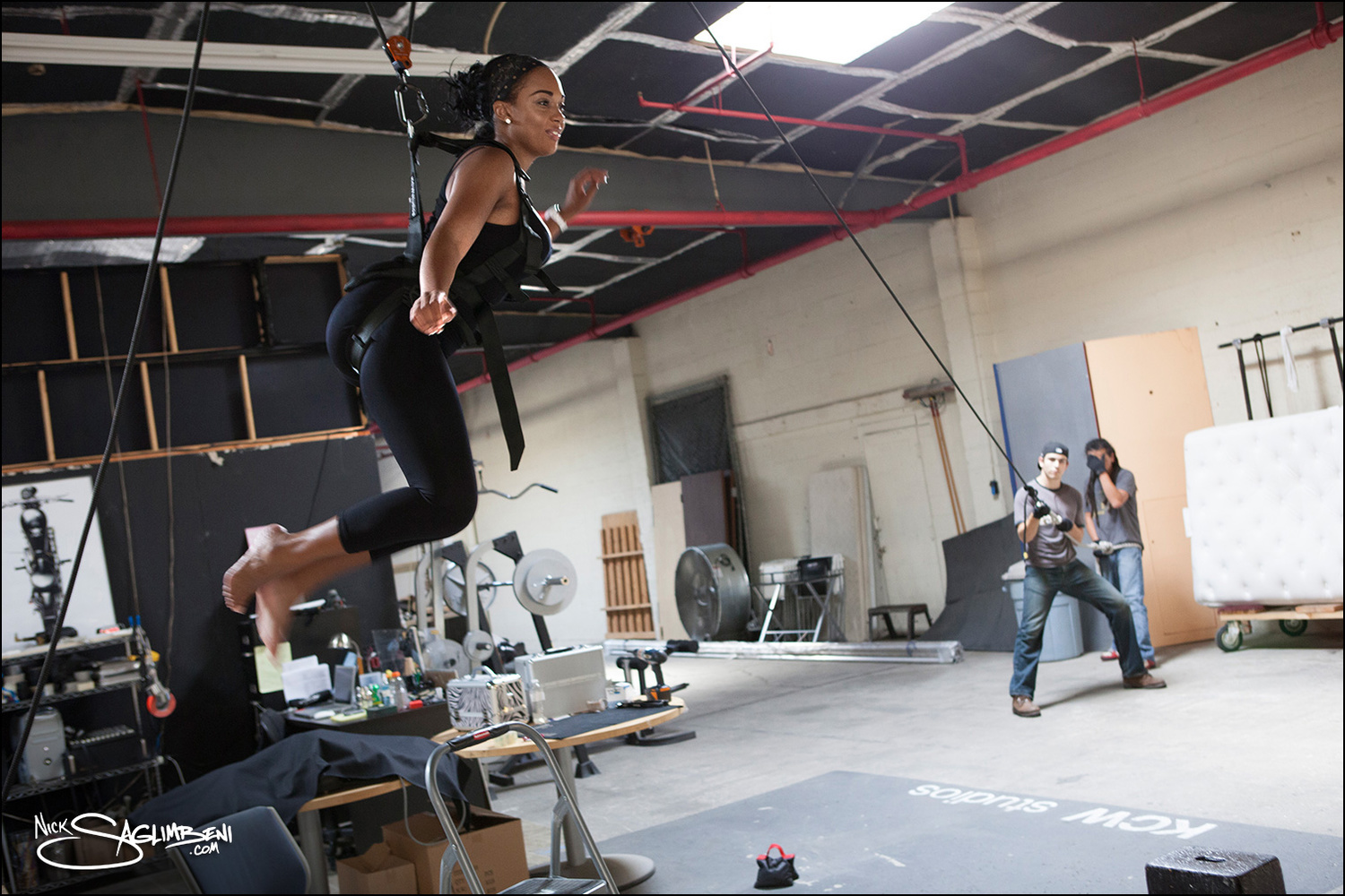
Prior to shooting, to simulate Vanessa floating in space, I sent her to wire-harness stunt-training with an action director. I have to hand it to Vanessa, we really put her through the ringer on this shoot and she was a total champ the whole way through.

Also, I had just built my 3D camera prototype and hadn’t yet fully fleshed out the plan for WMB 3D: World’s Most Beautiful. So we photographed Vanessa’s entire story in 3D, which slows you down tremendously checking focus and lens flares in each “eye”.
Tell us about your newest hero, Desert Mechanic Jessica.
Jessica is our resident roughneck. She can fix anything, including a bad attitude. I cast model Jessica Burciaga, who I’ve worked with many times, because I wanted someone that could bring a humor and a lightness to a very gritty character. I also knew she would look great no matter how much dirt we piled on her.

Very different from Vanessa. How did you approach the lighting for Jessica’s shoot?
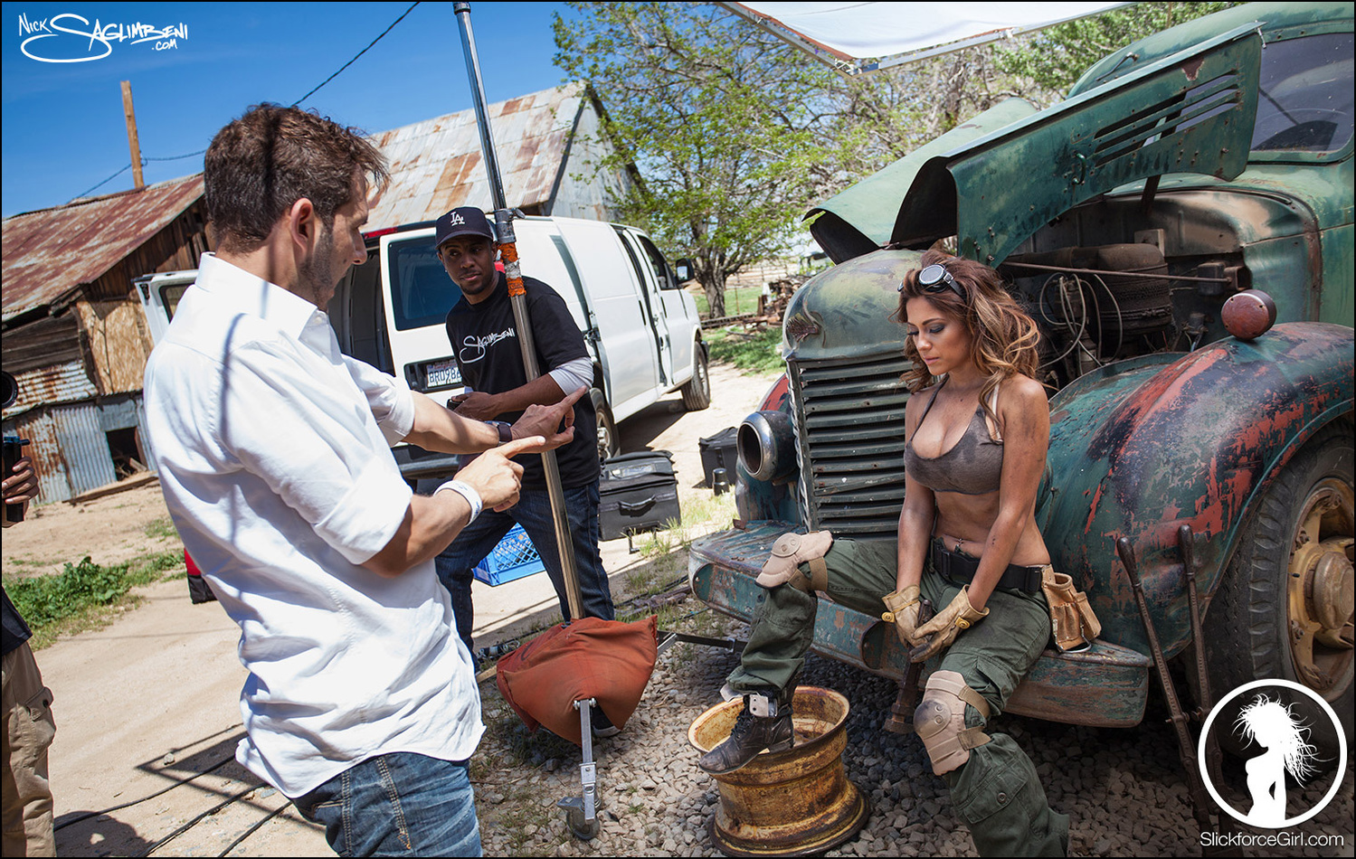
I wanted a retro pin-up look to the shoot, with soft, romance-novel-cover lighting but with rich colors as if it was shot on Kodachrome reversal film. We photographed Jessica’s concept at a ranch in Lancaster, CA that has all these old post-war pickup trucks — it’s straight out of a time machine.
Because the desert sun is so toppy and unforgiving for most of the day, we built a 12x12 silk over most of the setups. For the scene where Jessica is on the ground fixing the truck, I knew I couldn’t light her pinup-style if she were under an actual vehicle, so we flew two 4x8 solids above her, which was great because they mimicked the shadow cast by truck but allowed me to sneak reflectors in between them. We positioned Jessica so that the sun provided a beautifully soft backlight rim through the silk, and I placed a soft light diffuser just off of camera so it threw the shadows down her nose and chin. All of her scenes were shot at ISO 50 at F5.6.

Are some of the lighting techniques you used on Vanessa and Jessica’s shoots covered in Mastering Lighting?
Absolutely. I devote entire chapters to working with fog and maximizing its effect, softening your strobes to blend them with the natural light, and making your models skin and hair glow. One thing we really focus on in Mastering Lighting is just how easy it is to control your environment lighting — for example, moving the sun around using flags, silks and mirrors. You’re selling yourself short each time you just “deal with” what’s in front of you. It’s not that there is anything wrong with that inherently, it’s just that you’re likely to get the same shot everyone else is getting. Knowing how to sculpt your lighting in a unique way will make your work stand out.
How has your background as a commercial photographer and cinematographer helped you in visualizing and executing each shoot?
Photography and cinematography are very different processes, and I’m glad I learned cinematography first, because it would have been much harder to go the other direction. On a film set, you have to direct a team, even on really small productions. You have to know when to move lights and when to shut up because the actors are speaking. There’s a discipline to it, which I really appreciate.
Most photoshoot sets I go on now, everyone just talks or checks their phones non-stop. Attention spans are at an all-time low. The concept of creating a quiet space where the model and the photographer can work is all but lost, and it shows in the final product. Being a director of photography has also informed the way that I approach lighting. After a location scout, I storyboard almost everything, even for stills.
How does SlickforceGirl help women globally, and how have you managed to use portraits as a means to help women’s causes?
I’ve photographed close to a thousand models in my career, and I’ve gotten to know many of them on a personal level. I’m continually saddened by how much sexual abuse still exists in society, and it’s much worse than the general public believes. SlickforceStudio has always been actively involved with charities such as The Breast Cancer Charities of America and RAINN (Rape, Abuse and Incest National Network), so pairing SlickforceGirl up with women’s causes seemed a logical match.
Our art depicts women using their beauty, courage and intelligence to fight for good, and we donate a portion of profits to related charities. Some people say art can’t be for a good cause if it’s fun or sexy, but you don’t have to be grim or humorless to fight for something you believe in. Even our tagline is a play on how we’ve historically valued women as a society: Girls Gone Hero.
Can I get a small list of main equipment used in shooting and lighting the subjects?
CAMERA: Most of the series was photographed on my Hasselblad 503CW with a Leaf digital back, at ISO 50 or 100. All manual-focus prime lenses (medium format): 50mm, 80mm, 120mm. Occasionally the 40mm for really tight spaces but I don’t like the distortion on faces.
LIGHTS: Because I shoot at such slow ISOs, I typically use 2400w/s strobe packs, with modifiers ranging from soft boxes to strips to umbrellas w/ diffusers. We use multiple brands but I like the simplicity and the fast recycle time of the Pro7A and the durability of the Chimera soft boxes — we need gear that can withstand a beating.
GRIP: The grip gear varies on each production. We have a standing grip package that we take to all location shoots, that includes sandbags, apple boxes, clamps, 4x4 floppies and 6x6/12x12 frames that can be skinned with solids, silks, muslins or black/white griffolyn.
I want to thank Nick for taking the time to sit down with us for the interview. For those who haven’t yet seen it, I highly encourage you to check out Nick’s Mastering Lighting series here, and for a limited time the Slickforce team is offering $30 exclusively to Fstoppers readers — Use promo code FSJULY15. For more information, visit http://SlickforceGirl.com


![Photographer and Former 'America's Next Top Model' Judge Nigel Barker Launches 'Top Photographer' [Exclusive Interview]](https://cdn.fstoppers.com/styles/small-16-9/s3/lead/2016/08/nigel-barker-fstoppers-interview.jpg)


great article and insight. A very inspiring project.