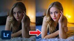
Knowing how to quickly and effectively adjust your photos in Lightroom can significantly improve your final results. Getting the basic sliders right means your images look natural, realistic, and closer to what you saw when taking the shot.
Coming to you from Forest Chaput de Saintonge, this practical video explains exactly how to use Lightroom’s basic panel sliders—exposure, whites, blacks, highlights, shadows, and contrast—to rapidly enhance your raw photos. Chaput de Saintonge emphasizes the importance of adjusting sliders in the right order, starting first with exposure to get the overall brightness correct. He explains clearly that the goal isn’t perfection in every corner but a balanced exposure across the image. From there, he moves to blacks and whites, demonstrating a helpful trick using the option or alt key to ensure a few points in the image go completely black for proper depth, while avoiding blown-out whites.
Next, Chaput de Saintonge covers highlights and shadows, describing these as key creative tools for restoring your photo to what you originally saw. For example, pulling down highlights can recover details in skies or bright areas, and lifting shadows often reveals hidden details. He points out that you should feel free to revisit previous sliders if needed—adjustments aren’t locked in stone once made.
The video then shifts to contrast, specifically mid-tone contrast, as a way to add subtle visual impact. Chaput de Saintonge advises moderation here; too much contrast creates a harsh look, too little leaves images flat. His straightforward demonstration makes clear how these subtle adjustments quickly produce stronger, more balanced results.
When moving into color corrections, Chaput de Saintonge explains temperature, tint, vibrance, and saturation clearly and directly. Temperature controls how warm or cool your image appears, but he highlights two distinct approaches: technical accuracy versus creative choice. He emphasizes the power of using warmer or cooler settings creatively to enhance mood or imply a specific time of day, and he demonstrates the significant impact this can have with just small adjustments.
Vibrance versus saturation is another key distinction he explains clearly. Vibrance enhances weaker colors while minimally affecting strong colors and preserving natural-looking skin tones, making it ideal for portraits. Saturation, on the other hand, boosts all colors equally and can quickly become overwhelming or unrealistic. His preference for vibrance is well-explained, particularly with an example portrait where saturation quickly turns skin tones unnatural, whereas vibrance enhances the scene without unwanted side effects.
Chaput de Saintonge rounds out his explanation by performing a full, rapid edit in real-time, demonstrating that achieving significant improvements in Lightroom can genuinely take just a minute or two. He again reinforces the importance of viewing before-and-after comparisons regularly to ensure you're on track. Check out the video above for the full rundown from Chaput de Saintonge.


Join the Fstoppers community for free
-
Post comments and join in the discussions
-
Browse the site ad-free
-
Share your work and get featured in the community
-
Compete in the photo contests for fun and prizes
1 Comment
Very good info on the sliders and using the alt key to show the level intensity all nice to know. But still why not first go to the four little squares and pick a camera profile that is for jpegs and Adobe and other processing programs best guess of them, then use the color picker (needs a little study to use the right amount percentage of all colors like 30%). Also you can go up and down the WB's and check what is best.
Just a strange thing that no video review person ever shows these starting points! I mean there are a few items you can use to correct colors and exposure level to the way they looked when the capture happened. Yes, we are the artist of an image and make it what we want it to look like I understand.