When you edit your photos, it’s easy to feel lost in endless sliders and panels. You might move contrast, shift white balance, or adjust tones only to second-guess yourself and end up with an image that looks inconsistent from the rest of your work. Editing is not about pulling every lever. It’s about knowing which changes matter most and how to use them with intention.
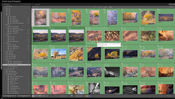
Coming to you from Belinda Shi, this practical video breaks down a Lightroom workflow built on clarity rather than guesswork. Shi starts with light before anything else, pointing out that every photo already carries light information you need to read and respect. If you rush to color grading without first analyzing light, you often end up canceling your own edits—lowering contrast in one panel and reintroducing it in another. Shi shows how to keep adjustments simple, often just in the basic panel or tone curve, with refinement through local edits. The emphasis is on efficiency without sacrificing quality, making it clear that you don’t need every trick you’ve seen in tutorials to get consistent results.
Shi also covers color decisions in a way that cuts through common mistakes. For portraits, skin tones are non-negotiable. If reds and oranges drift too far, a person can end up looking sunburned or even jaundiced, which immediately ruins the image. Landscapes are the opposite. Skies, sunsets, and dramatic natural scenes can handle stronger pushes in saturation and tone without feeling false. This is why a preset that looks great on people might fall flat on landscapes. Shi stresses that your edits should work with the light already present—warm tones at sunset, muted shades in overcast conditions—so the result feels natural and not forced.
Style decisions also play a major role. Shi explains when muting colors can make your subject stand out, especially in busy environments where bold backgrounds compete for attention. By reducing distraction in the environment, the focus returns to the subject itself. At the same time, she points out that in scenes where the energy lives in the colors, you should let those tones shine. The decision is always guided by one key question: is the energy in the subject or in the colors? This framework simplifies what often feels like a confusing artistic choice.
Consistency runs through everything Shi presents. She emphasizes that viewers don’t look at one photo in isolation, but often in sequences, whether in albums, blogs, or social media feeds. A cohesive body of work requires more than strong single images. It requires repeated choices in tone, color balance, and style. Even when shooting in different locations or under different lighting, you can tie images together with deliberate editing. Shi shows how color harmony, balancing warm and cool tones or using complementary shades, creates rhythm across an entire collection. Check out the video above for the full rundown from Shi.





Join the Fstoppers community for free
-
Post comments and join in the discussions
-
Browse the site ad-free
-
Share your work and get featured in the community
-
Compete in the photo contests for fun and prizes
No comments yet