Pantone, arguably one of the biggest authorities on the subject of color communication, has announced their color of the year for 2019. Which did they choose, and why is it important that photographers take note?
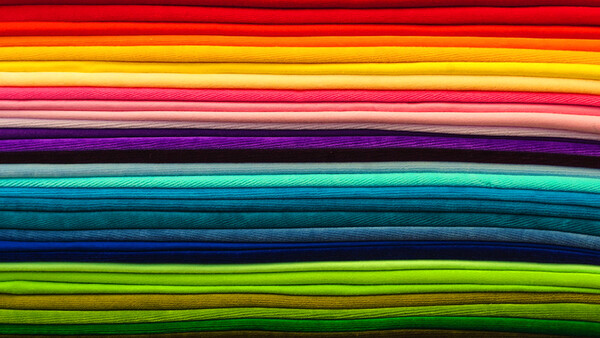
It's that time of year again when Pantone signals to the world which hue variation will be instrumental for the coming year. For over two decades, the company has carefully selected a shade based on trend analysis and forecasts from industry insiders. If you thought 2018 was full of various shades of purple, it may have been down in part to Pantone choosing ultra violet as the current color of the year. This purple tone will soon, however, make way to the vibrant yet mellow PANTONE 16-1546, Living Coral.
I'm sure many of you may think this decision is some kind of a gimmick, but Pantone really does take careful consideration in their choice each year, and creatives from all manner of industries take note. Expect to see shades of coral in everything from design to fashion in 2019.
For us photographers, I do think it's important we know which color has been announced each year so we can stay ahead of the curve or avoid it entirely. Photographers who work closely with design companies could definitely earn extra brownie points if they are seen to be sending out marketing material with the new fashionable shade on it. I do think it's important to consider how quickly a color scheme can date though. If you fill your portfolio with coral in 2019, it may become obvious to clients that the work is old or played out in the coming years. Just like fidget spinners and Lytro cameras, I am going to politely appreciate coral from a distance rather than embracing it wholeheartedly.
Will you be using the new color of the year or avoiding it like the plague? We'd love to hear your thoughts in the comments below.
Lead image by Kesie91, used under Creative Commons.


Join the Fstoppers community for free
-
Post comments and join in the discussions
-
Browse the site ad-free
-
Share your work and get featured in the community
-
Compete in the photo contests for fun and prizes
32 Comments
Noted! ☺
I don't care. I shoot b&w. 😊
I'm sure that somewhere is a whole B&W community that announces a "graytone" of the year as well ;D
taugh reading the line i taugh your gonna say i dont care i shoot raw XD its would have been so funny
I will probably do one shoot series with the color and move on.
Out of curiosity, how would you match this color in a photo shoot? Can you order Pantone colored backgrounds?
It's just a marketing gimmick from Pantone. I don't think we should really take it seriously. Seriously, did anyone notice purple (uh... I mean ultra-violet) take the world by storm last year beyond the the usual purple-loving 8-year-old girls?
Of course it's a marketing gimmick I use them very words in the article. I guess it depends what circles you mix in and what industries you work in. The color of the year does shape things if you see it or not...
Announced by WHO?
Pantene, they make my shampoo I think.
i am dead
If your work has anything to do with color you would know what or who is pantone
There is also RALcolor
Ignorance about Pantone reveals an ignorance of professional design
Jon Winkleman said: "Ignorance about Pantone reveals an ignorance of professional design". Everyone knows what Pantone is Jon. Writing a high handed comment like yours reveals an ignorance of a sense of humor.
It's silly that someone declares one Pantone number to be all the rage next year.
It is just a forcast. What they think about trendy color for next year.
And I think it's a nice color and I saw few photogs that embrace similar color
It IS a nice color.
I declare RGB 0, 0, 0, to be the absence of color of the year.
You should change your profile picture to commemorate this announcement...
But, I'm my profile a grey card! :) Just in case anyone needs one in a pinch.
love it! not all heroes wear capes...
Peach!
Pantone is pretty consistent in the colors they deem as color of the year... hardly stray from the formula. This looks similar to a few other colors they had in years past. It's not that bad of a color, but eh...nothing wowing about it.
I have never understood color of the year
As the industry leader in precision color tones and consulting, Pantone has the leading clients in nearly all fields of design. Their experts and consultants track color trends in emerging fashion, graphic design, product design and interior design. For example during the tech bubble when the economy and individuals were making a great deal of money the tree was towards brighter more frivolous colors. After 9/11 and the 2008 crash trees shifted to earthier more modest and subdued tones. In the 1970 the two huge colors for large and small kitchen appliances was avocado and harvest gold. In the late 90's there was trend for appliances in retro jadeite-minty green. Trends are influenced by the national mood, the economy, film and TV, sometimes the whim of a designer or celebrity (remember Nancy Reagan Red?).
Manufacturers, fashion designers, advertisement execs and other designers want to see what colors are trending with consumers so they will have sufficient products in the colors people want that year. Yes even if Living Coral is trending this year it does not mean everyone likes it. I personally look bad in warm pinks, oranges and yellows so I cannot wear coral no matter how trendy it might be. That does not negate a lot of consumers are favoring the color this year.
start a new Instagram with this color theme and see where it gets you after one year :P do it for science!
I march to the beat of my own color palette, thankyouverymuch.
Damn. I bet a lot of money that it was going to be "Cerulean Mist of Disinterested Regret HPSTR-4567." Now I won't be able to afford the adapter for the EOS-R and will have to attach my 100-400 with duct tape. Again.
The snark in the comments merely betrays an ignorance of professional design. Pantone is THE company in regard to precise color tones in nearly all design industries from graphics to fashion to product design. Photography professionals who are shooting high end product and packaging have to be as precise about color reproduction as graphic designers they certainly consider Pantone important. As the leader in color in so many industries Pantone does track color trends as they are being developed. Color of the Year is a fun designation and Pantone does have influence in how designers choose color in a given season as much as Anna Wintour's opinions and predictions influence women's fashion designs. Though the media like to focus on the single "Color of the Year" Pantones broader predictions of color trends and what pallets of color are hot tend to be pretty accurate.
OMG.
You're right Jon. I think many of us take it seriously. First, they laugh then they follow...
Thanks for your thoughts!
pfft... been using it in my profile for ages. Anyways, by shooting a campaign before a client asks will be adding to the manufactured hysteria. Ignore unless you get paid for shooting it.