
When you’re in the market for buying a new monitor, you’re probably overwhelmed by a host of specifications. Size, resolution, color gamut, and panel technology can make all the difference when you look for a new screen to edit your photos on. As a photographer, not all specs are that important. Dynamic contrast for instance; a feature that adjusts brightness and contrast according to what's on the screen at a given moment. In this guide, we’re focusing on buying a monitor that is geared specifically towards post-processing.
Important Considerations
Right off the bat, we can say that we’re not looking for a panel with a fast response time; a spec that particularly favors gamers. We are, however, interested in how well the colors are displayed under an angle. Resolution also plays a factor, because even with modern software user interfaces, we don’t want to hide our most used actions and panels behind several buttons. We’re further considering grey gradients, wide gamut support and whether a matte or glossy panel fits the bill. And of course: Your budget. Different than the 2017 PC Build Guide, I’m proposing five recommendations based on budget. There’s the midrange monitor recommendation, high-end monitor, the top-of-the-line and a recommendation for the budget conscious photographer.
Calibration and Settings
In any case, if you want the absolute best monitor at any budget, you seriously have to consider calibrating your screen. In this guide, we’re not paying attention to software calibration. All software calibration has one very important flawed factor: your own perception of color. Hardware calibration through a colorimeter corrects differences among individual monitor units but also among brands and types. In short: Calibration makes sure you perceive your colors displayed on the monitor as intended. Today’s reference colorimeters are X-Rite's i1Display Pro and Datacolor’s Spyder5Elite. Either of which are yours for about $250.


For accurate color representation and to retain the maximum amount of data for post-processing, there are a couple of important settings. In whatever image editing software you’re using, the higher the bit-depth, the more detail can be stored. If you’re not sure where your photo is going to be displayed, providing your photos with a wide-gamut color profile is equally important. While it is true that sRGB is today’s web standard, a growing number of user’s monitors supports as much as 98% of the AdobeRGB color space and some photography contests even require you to upload your images with the AdobeRGB color profile. But even AdobeRGB or Apple Retina’s P3 isn’t as wide as we can go. ProPhoto RGB goes even wider.
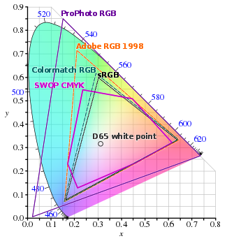
Comparison of some RGB and CMYK colour gamut on a CIE 1931 xy chromaticity diagram, based on http://commons.wikimedia.org/wiki/File:CIE1931xy_blank.svg and data from Blatner and Fraser's "Real World Photoshop CS", p179: http://canopuscomputing.com.au/gallery2/d/8631-1/Gamuts_comparison-B_F.jp.
The Wide-Gamut Discussion
Type “Wide Gamut” into your favorite search engine and you’ll find a metric ton of contradicting advice on how to best edit your images. Yes, the web’s standard is still sRGB. Yes, only a handful of specialist printers can work with wide-gamut color and yes, most professional monitors out there don’t even display the full AdobeRGB color space; let alone the ProphotoRGB color space. So why would you process your images in a color space that you cannot even see? One argument is that you never want to upconvert to a wider color space. In the small chance that you do want to print on a wide-gamut printer, you wouldn’t want the software to fill in the blanks.
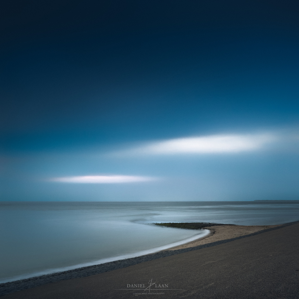
However, if you’re displaying your images on the web, you have to know exactly what you’re doing if you are not saving your work in the sRGB color space. If you’re checking the “convert to sRGB” checkbox upon saving your image in Photoshop or Lightroom, be aware that your photo will be converted from either wide-gamut color space to sRGB using the relative colorimetric rendering intent. That means that each color outside of sRGB will be replaced by its nearest color within gamut. This may be especially noticeable in deep teals of tropical waters, where deep teal will be replaced by just teal, making the image look flat in those saturated areas.

"Where the Secrets Lie Hidden" - Laanscapes Photography. One of those images that would really benefit from a wider gamut. The teals and greens in this image look flat because this was converted and exported in sRGB.
The Resolution Question
So what resolution should you be looking at when comparing monitors for photo-editing? While I do think that this goes hand in hand with the size of the panel, the recommendation is quite easy: As high as you can afford. But won’t everything look tiny on a 21” 4K screen? You can always enable UI scaling in Windows (called “Change the size of text, apps, and other items” in Windows 10) and just about every program out there, so that’s really not an issue.
A monitor’s native resolution also dictates its aspect ratio. And I do like the wider 16:9 aspect ratio as opposed to the 16:10 aspect ratio, because it lets me build presentations and record my screen exactly like it’s displayed on most TV’s and projectors. The even wider 21:9 aspect ratio is somewhat of a novelty that really doesn’t fit photo-editing and 4:3 is a thing of the past.
LCD Technologies
LCD monitors consist of two basic parts. The light source (called backlight) and the panels through which the light travels and controls how it eventually reaches the eyes of the user. Let’s look at panels first.
Panel
TN - Twisted Nematic (TN) panels have poor viewing angles and don’t have very accurate color reproduction. If the panel isn’t specified, you can guarantee that monitor is using a TN panel. They are, however, cheap to produce and are actually common in generic monitors.
IPS - In-Plane Switching (IPS) panels are superior in almost every way; except in price. These panels feature richer blacks, a wider range of colors, brighter displays, increased contrast and better viewing angles than TN panels, making them an ideal candidate for our new monitor. You will also notice that there’s a host of improvements upon the original IPS panel. There’s AH-IPS, E-IPS, PLS and S-IPS for instance. Those generally can be ignored if you’re comparing among IPS panels. My tip is to look for other specs that set them apart.
VA - Vertical Alignment (VA) panels can produce even richer blacks, but their viewing angles aren’t as good. These panels are more commonly found in TV’s than in monitors. As for color reproduction, VA panels are a much better at it than panels using TN technology, but not as good as IPS panels.
Backlight
CCFL - Backlight comes in a couple flavors too. The first ones on the market were Cold Cathode Fluorescent Light (CCFL) backlights. They take some time to warm up in order to attain their maximum brightness. It’s best to leave them on about 15 minutes before starting color sensitive work with these, whether you’re working with or calibrating displays with CCFL technology.
LED - Turn on a Light Emiting Diode (LED) backlit monitor and there’s instant maximum brightness. Most modern LCD monitors use this more efficient technology, which makes them skinny and generally brighter. Different types of LEDs can be used to light your monitor. While most of them use cheaper white LEDs, RGB-LED backlighting is reserved for the best color accuracy.
Within the realm of LCD monitors, IPS panels with RGB-LED backlighting are simply the best for the type of task we photographer throw at them. But we’re nearing the end of 2017 and LCD has a good amount of competition on the playing field.
The Future: OLED
Eventually, OLED monitors will replace LCD displays because they’re superior in just about every way imaginable. Think of refresh rates that go beyond 1000 Hz and almost zero input lag, with all the benefits of IPS panels and even deeper, true blacks. With OLED, you can just turn off a pixel to make that area look black.
Anyway, it all sounds good, but in the professional photography monitor market, we’re not quite there yet. While Dell and LG did put out OLED monitors last year, OLED panels still have two major issues that need attending. Because different OLED colors degrade at different rates over time, these monitors will pick up a color cast over time. This doesn’t happen overnight, but eventually gradual degradation will become noticeable. Another issue is that OLED monitors are sensitive to image burn in. If you’re working at the computer for hours on end and have the taskbar visible or even Photoshop’s main menu, chances are that their images will permanently burn in on your $3500 monitor.
"Duality" - Laanscapes Photography. Whether or not gradients are displayed smoothly and without color casts, is largely dependent on how well your monitor works with grey gradients. Most that can be remedied by correct calibration, though.
A Handful of Features
We’ve covered most technologies that are most important to us, but there are a couple of minor choices that impact the outcome of the recommended monitors. We haven’t talked about the quality of grey gradients yet. Ideally, a gamma curve should increase in brightness over any amount of tones. But without overwhelming you with even more information for advanced users, I find that if you’re monitor is calibrated correctly, the grey gradient factor becomes much less of an issue.
As for the type of finish of your monitor: Glossy finishes exhibit richer color and deeper blacks, but those blacks reflect details of the room you’re working in quite well. My personal preference instead goes out to matte screens where reflections are much less of an issue.
The last thing I’d like to talk about before we get into our recommendations, is monitor bit-depth. In short: If you’re considering a 10-bit monitor, you have to be aware that you need a 10-bit video card to be able to display the wider range of color gradients. Shelling out anything north of a grand on a dedicated video-editing card might be overdoing it as a hobbyist, but we got you covered in the top of the line monitor recommendation.


So what's the current state of Windows 10 and high-res monitors?
I tried a 27" 4k monitor with my Windows machine and found the fonts were so small at the native resolution that they were unreadable. Scaling got rid of the benefits of the higher resolution. I wound up going back to my 24" 1080i monitor.
I'm glad color space is mentioned in this article and points to the impracticality of anything outside of sRGB - even though the conclusion is entirely different than my own. If 99.9% of your audience see your photos in sRGB, why on earth should you care about the advantages of the others? (This is not to say they don't have any, but why should they matter)
I think your explanation of a 10-bit display may be confusing. Most displays that claim to be 10-bit just refer to the LUT built next to the panel. If you calibrate your display, having a 10 bit LUT allows the display to better choose the colors for whichever color space you use.
I can go in more detail, but most people probably don't care so long as the picture looks good