
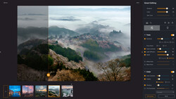
In my look at the new features of ACDSee Photo Studio Ultimate 2021, I was excited to see the inclusion of color wheels and tone wheels. I first started using this style of editor in video production; it’s a big part of what gives stylized video like Mad Max its distinctive look. When editing photos, however, it’s a great, intuitive way of working with the luminosity and color ranges in your image.
While these two tools might look outwardly similar, featuring brightly colored circles and numerous controls, they actually are significantly different. Let’s talk about the color wheel first. The color wheel lets you work with a specific range of colors, one at a time, adjusting the hue, saturation, luminosity (brightness), and contrast of that selected range. The tone wheels instead let you add some color to the highlights, mid-tones, or shadows, but with a greater degree of control than split-toning.
For a lot of landscape and travel photos, color can be the biggest challenge. Whether it’s a sunset that just didn’t meet expectations, a shot with tricky dynamic range, or just a small element that needs a boost of color, using a combination of the tone and color wheels can be a great option.
In Use
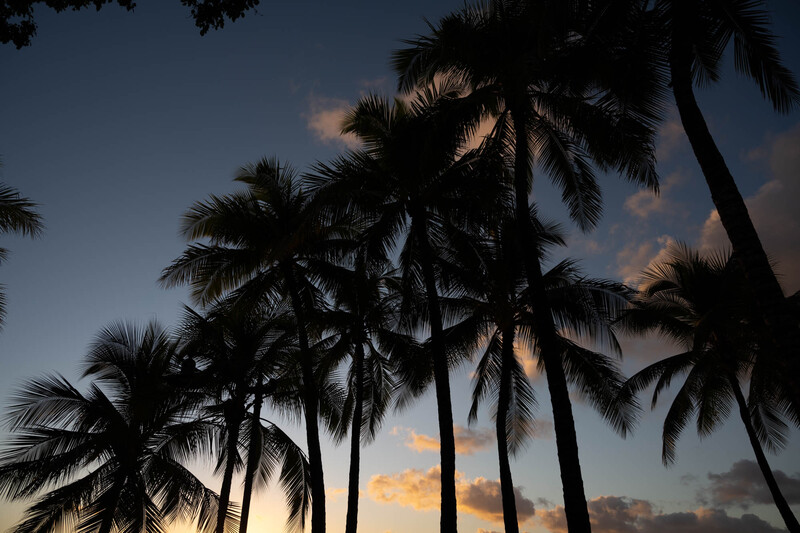
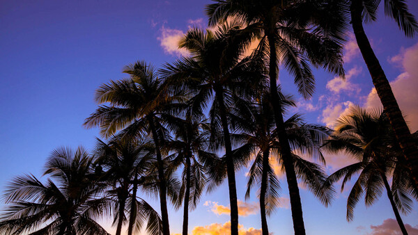
In this shot of a Hawaiian sunset, I had to underexpose by quite a bit to avoid blowing out the brightest clouds and lower portion of the sky. In post, as I boosted the exposure to bring back that sunny feeling, the color just bled out of the darkest parts of the sky. To solve this, it was incredibly easy to quickly select the blue portion of the sky via the color wheel, then restore some of the saturation and contrast that was lost in the earlier editing steps. You can see the selection below and the result at the top of this article.
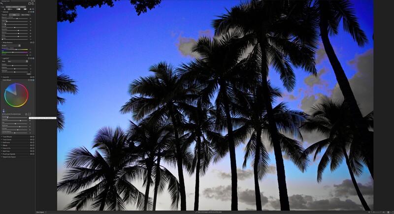
When editing sunsets, it can be tricky to find that right color balance with something as limited as the white balance tool. Skewing too yellow can sap the sky, but going too blue will pull all that great orange out of the sunset itself. The color wheel, with the ability to select and edit both those ranges separately, makes it much easier. Just set a neutral white balance, then work on the parts of the image separately. Photo Studio Ultimate makes this easy to set up, as the wheel provides a live preview on your image of the range you actually have selected, meaning no second-guessing or manually masking.
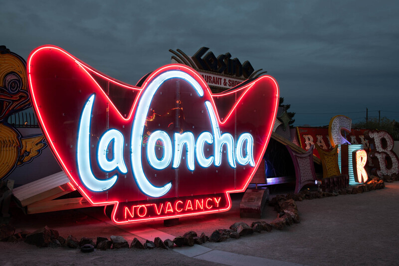
Another area where these tools come in handy is when working with an image where you’re forced to balance very bright and dark objects. Neon signs are a great example. The bulb is very bright as well as very saturated, plus the brightly colored spill on nearby surfaces can all be difficult to capture. Being able to work with those individual ranges lets you easily add back that saturation and contrast that might be lost when balancing your overall exposure.
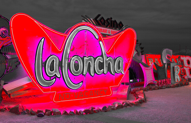
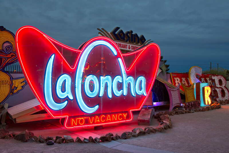
In this example, I used the color wheel to keep that red glow to the actual neon, which was lost when the rest of the exposure was brought up.
Overall, I loved how naturally the color and tone wheels integrated into my existing workflow. For me, they slotted right in after the basic adjustments, effectively serving as a better version of HSL sliders and some targeted adjustments like gradient filters. The interface looks a bit complicated at first, but it is really easy to grasp after just an image or two. The live previews make it very easy to learn, but also serve to speed up the editing process once you’ve learned the tool.
Join the Fstoppers community for free
-
Post comments and join in the discussions
-
Browse the site ad-free
-
Share your work and get featured in the community
-
Compete in the photo contests for fun and prizes
5 Comments
It's a nice app, if you like to blow stuff up.
No, it does not look good at all. That: "In this example, I used the color wheel to keep that red glow to the actual neon, which was lost when the rest of the exposure was brought up." is just not the way to do it and that is why it looks that awful. Use a real raw converter. In this (longer) video it is explained why one shouldn't do it as proposed in this article. Short story: black and white pixels do not have any saturation. That is why your "overblown" neon sign looks that bad.
https://www.youtube.com/watch?v=zbPj_TqTF88
(It is about darktable, but it explains very good what the problems with this kind of images are).
I completely agree with you, the final image look horrible, but do you actually expect anyone to watch an almost 2hour long technically video about it? 😲
No, I do not. But anyone who is interested might do it.
I just upgraded from 2019. They made me an offer I couldn't refuse. 😁
Not to sure about the colour wheels though. My personal preference is for bright, colourful, punchy images. Not a mood photographer at all. I use the neutral setting on the camera (Canon EOS90D) and record in RAW. I have a series of personal presets that I have saved and tend to apply the one I think is best then just a tweak or so gives me the final result that I want.
Having started with B&W film and a Pentax Spotmatic God knows how many years ago, processing is so easy now. I try not to over process as I came through the years of trying for a good exposure which made developing and printing so much easier
Ken