
In late November 2017, Pixelmator Pro was released to those eagerly awaiting a new photo editing solution on the Mac. Whether it was to finally escape the never-ending Adobe Creative Cloud subscription fee, or for those just getting started in photography and looking to get their toes wet, there was a good amount of hype and excitement leading up to its release. One month later, here’s my early impressions of Pixelmator Pro.
Interface
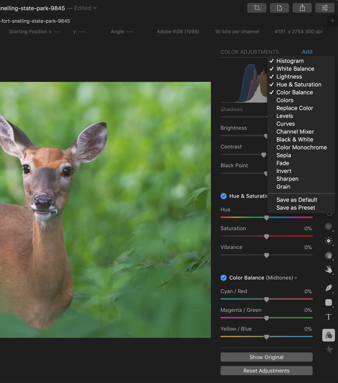
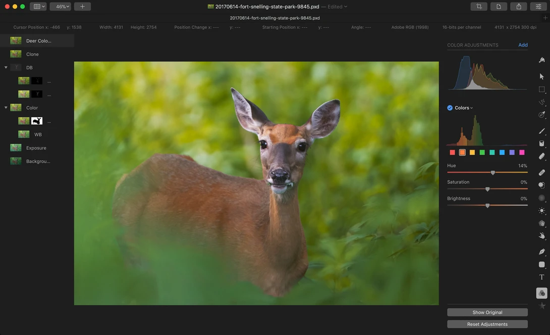
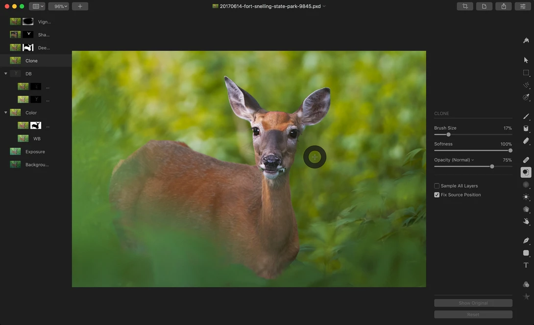
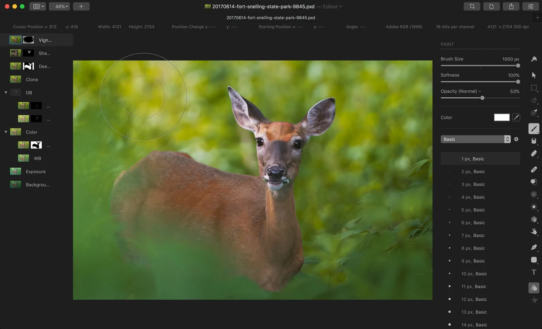
When first opening Pixelmator Pro, we are greeted by a clean interface. By clean, I mean that in a truer sense than you are probably expecting; all the tool panels are collapsed or hidden away requiring an initial setup time to get things to be in a useful arrangement for photo editing.
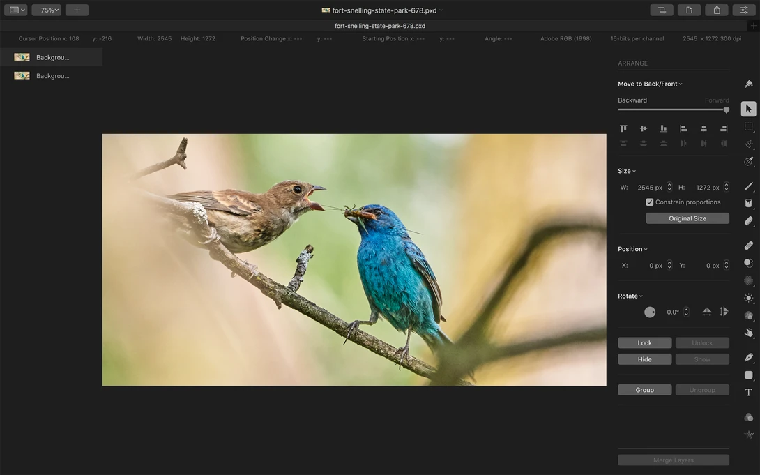
Once you can see what you’re working with, the interface does look very graphically pleasing. There are smooth fade-in-fade-out animations everywhere while moving through the tool panels and even simple operations within them provide subtle animated feedback, such as selecting a radio button. With this, Pixelmator Pro seems to have an extra polish in its design; Nothing ever “just appears,” the fading and other animations always provide context and feedback that’s relatable to the real world where nothing just simply “appears” either. I suppose this is a long way to say they followed Apple’s aesthetic and design language very well and Pixelmator Pro is a Mac app through and through.
The non-optional near-black interface is definitely going to be a turn off for some users. Combined with low contrast gray tool icons and text, your eyes are in for a workout if you spend a lot of time editing. Generally, a middle gray is what I find best for photo editing; a dark interface will usually result in darker images since they appear to be lighter than what they actually are in comparison to the surrounding darkness. Dark interfaces also strain my eyes more because my pupils have to stay wide open to gather more light, just like when forced to read paragraphs of white on black text. Nino Batista has a great article to explore more on the subject if you are interested. Pixelmator’s statement on the issue is that they “feel a dark interface works best for editing images,” continuing, “but we haven’t ruled out a light option in the future.”
Functionality
While the interface looks aesthetically pleasing, once work began on photo editing I started to notice Pixelmator Pro begin to unravel in its functionality. There’s a sizable amount missing from an editor considered “Pro” by name. The first place I looked was the Preferences window, however I was stopped dead in my tracks at the only two tabs on the screen: General and Rulers.
One of the more glaring omissions is having no History panel. Apparently professionals don’t make mistakes and don’t care to one-click check before and after versions of their complex, multi-step changes. There’s the basic Undo and Redo menu actions, but there’s no multi-step undoing and no visual record of what’s happening to the image being edited. Furthermore, some actions appear to not record in the Undo-Redo log, such as deleting a mask. I found out the hard way that if you accidentally delete that complicated mask on a layer that took a long time to draw, you can’t undo that and get it back. When I asked for Pixelmator to confirm that there’s no History panel to be optioned, I got a one-word affirmation of “correct.” I’m thinking that means they don’t intend to change that anytime soon.
Another big issue I have with Pixelmator Pro is that there’s no adjustment layers capability. By that I mean all edits must be made on the same layer that has image material to directly work on. This greatly diminishes any sort of “non-destructive” photo editing because to further an image in its edit, you have to duplicate the layer beneath and start from there. Here’s an example of the problem: you open an image and first adjust its white balance, then you adjust its curves, then you clone a speck of dust. In a non-destructive workflow, these all happen on separate layers. However, after cloning the dust you now decide the image is slightly too warm. If these were adjustment layers you could simply edit the white balance layer in the stack and be on your way. In Pixelmator Pro, you have to either duplicate a fourth layer with the new white balance adjustment on top of the clone layer, or you have to delete your work with the clone layer and the curves layer to get back down to the original white balance layer. Layers and groups also cannot be rearranged in the layer stack for the same reason; the stacking order means everything when there are no floating adjustment layers. Pixelmator told me that there are plans to improve this in the future.
Those are my two biggest complaints with Pixelmator Pro, but there are several more issues to be aware of.
- No actions capability for streamlining processes.
- No pre-defined ratio or custom ratio cropping. Better warm up that calculator.
- No layer blend modes.
- Unable to highlight view a drawn mask. This requires an annoying workaround where you have to intentionally do some wacky edit to the image, such as cranking the exposure down, then undo it back to normal after you see what’s going on with your mask. Pixelmator said they have plans to create something like this in the future though.
- Custom keyboard shortcuts are done outside of the program in your Mac’s System Preferences. Apparently these can’t be single-key customizations either, they have to have modifier keys in combination (e.g., you can’t change the “b” for Brush tool to “p” and instead would have to be command+p or the like). On top of that it's an archaic method where you have to actually type out the exact menu option label in order to then have it assigned a custom shortcut.
- Unpolished functionality in some little things, like not being able to use the arrow keys to nudge tool sliders or points of a curve adjustment.
- Moving sliders will sometimes temporarily glitch out the image I’m editing.
- After about nine layers my computer was starting to slow to a crawl (2013 MacBook Pro 15-Inch; not the latest and greatest, but has no issues with my editing style in Photoshop).
This probably looks like an overwhelming list of negative things to say, but to Pixelmator’s credit they have released a number of updates in just the one month this editor has been available. Take a look at what they’ve done in the past three updates to gauge the pace of their development:
Pixelmator Pro 1.0.5 Release Notes:
- The speed of the painting tools has been improved — your first brushstroke should now be much faster.
- You can now import brushes from the original Pixelmator.
- When you drag and drop a layer to add it your image, it will now be added above your selected layer and not at the top of the layer stack.
- You can now export images to JPEG–2000 format.
- Fixed a number of cases that would make Pixelmator Pro stop responding when using the painting tools.
- You can now use the Command-J and Command-Shift-J keyboard shortcuts to copy/cut and paste selections as layers.
- Graphical artifacts would sometimes appear after repairing with the Repair tool. Fixed.
- When reverting to an earlier version of your image, the background color would sometimes be incorrect. Fixed.
- The colors of images exported to PSD would be incorrect when opened in Final Cut Pro X. Fixed.
- The horizontal edges of objects would snap to the grid incorrectly. Fixed.
- When flipping an object, its position will now be preserved more accurately.
- Merged layers will now be named after the top layer.
- Various fixes improve dragging and dropping shapes and paths.
- The option in Pixelmator Pro preferences for importing images or opening in the native format is now much more descriptive.
- Pixelmator Pro would sometimes stop responding when changing the color of a text layer. Fixed.
- Pixelmator Pro would sometimes stop responding when quickly switching to and from the Crop tool. Fixed.
- Pixelmator Pro would sometimes stop responding when resetting a selection. Fixed.
- Several related fixes make Pixelmator Pro less likely to quit unexpectedly.
Pixelmator Pro 1.0.4 Release Notes:
- The last used Layers view will now be used for all new images
- You can now press the Space bar to use the Hand tool while making selections with Free, Polygonal and Magnetic Selection tools
- The Unite, Subtract, Intersect and Exclude buttons for editing vector shapes are now available when using the Arrange tool
- Copy Style, Paste Style, Unite Shapes, Subtract Shapes, Intersect Shapes and Merge Shape Components are now available in the Layers view shortcut menu
- You can now press Command-Option-A to select all the layers in an image
- The performance of the painting tools has been improved
- Brushes like Varnish should now be much faster, more improvements are also coming
- You can now undo guide movements
- Several related fixes improve the reliability of cursors
- Edit > Cut will now clear selected areas
- Canvas Size will now work with negative values when Relative is selected
- When exporting presets using the preset shortcut menu, only a single preset will be exported
- The Color Fill tool color picker will now be canceled if you press the Escape key
- Trim Canvas will now work correctly with masked layers
- Document PPI will now be preserved when saving
- Fixed an issue that caused Pixelmator Pro to stop responding when resizing the canvas with an active selection
- The Grid will now be displayed correctly with all PPI settings
- Hidden layers will no longer become visible when merging
- The template chooser will now show template details by default
- The Open Recent menu will no longer show nonexistent images
- Your scanned images will now be imported once a scan has been completed
- A range of additional stability fixes and improvements
Pixelmator Pro 1.0.3 Release Notes:
- Fixed an issue that prevented using units other than pixels when changing canvas size.
- Pressing the Command-A keyboard shortcut will now select text in text fields and dialogs if they are active, instead of the entire canvas.
- Pixelmator Pro would sometimes quit unexpectedly when removing a layer while editing effects applied to it. Fixed.
- Fixed an issue that caused Pixelmator Pro to quit unexpectedly when selecting brush presets.
- If the stroke layer style failed to appear when selected, Pixelmator Pro would sometimes quit unexpectedly. Fixed.
- Using the Color Fill tool on an empty layer with preserve transparency enabled would cause Pixelmator Pro to quit unexpectedly. Fixed.
- Fixed several related issues that would cause Pixelmator Pro to stop responding while painting.
- Fixed several issues that would cause Pixelmator Pro to quit unexpectedly while opening PSD files.
- Improved the overall stability of the Arrange tool.
What I Liked
- The interface is aesthetically pleasing to look at and fits well with macOS.
- Remembers tool panels on a per-layer basis. If you have the curves tool open for one layer and not another, it will automatically show it and hide it based on the layer you are on.
What I Didn’t Like
- Unchangeable dark interface.
- Overall lack of customization in preferences.
- A lot of missing functionality that I expect in a professional photo editor.
Unfortunately, Pixelmator Pro does not look like a good alternative to Photoshop. Furthermore, it’s not really even a good photo editor at this point, at least for professionals who spend a great deal of time working on images. Affinity Photo, which costs $10 less at $49.99, is a much more complete photo editing application that I suggest purchasing instead. It certainly has its own issues when compared directly to King Photoshop, but it doesn’t come close to the head spin that is the current iteration of Pixelmator Pro. And for the record, I think the pricing of Pixelmator Pro is fair and that it is Affinity Photo that’s underpriced.
Pixelmator Pro is available now on the Mac App Store for $59.99. At launch the company said they plan on increasing this price as significant new updates roll out. You can try it before you buy it with a free 30-day trial found on the Pixelmator website.



14 Comments
For some reason unknown to a non-programmer like myself, it appears to still be difficult to come up with modern-day, efficient alternative to a program which admittedly has almost a 30 year head start on most other programs out there. I recently bought Affinity Photo just 'cause it was a cheap enough monetary investment, but the bigger investment is in time working at understanding what these alternative apps can and can't do vis-a-vis Photoshop. Which there are a surprising amount of up front things missing from Affinity Photo. I'm all for learning alternatives, but they cost you time and take you out of your production comfort zone. Still, gotta keep options open.
Yet you cling to a 57 year old avatar. ¯\_(ツ)_/¯
What's missing in affinity? The only thing I can't do is gifs...
Affinity Photo appears to have the same limitations as Pixelmator Pro with regard to Smart Objects (they become pixels) and text on a curve (which I use a free iOS app called Phonto for). There are additional Adobe Photoshop features that are proprietary the competition will not be able to support. With that in mind, I expect the competition to find unique ways to differentiate their products over time. Both Affinity and Pixelmator have created competitors to Photoshop and all of them allow you to create beautiful images and artwork. My biggest gripe with Affinity Photo is how large the file sizes are and how much space the app takes up on my iPad Pro (I toggle between Mac and iPad Pro all day and need to be able to work projects on both). It seems Affinity threw in everything but the kitchen sink resulting in large files and a long learning curve.
Good review i am now glad i have been using Affinity Photo to move away from adobe.
For most photographers, I highly recommend Affinity Photo as a Photoshop replacement. And while we are on the topic, Capture One Pro instead of Lightroom.
With Capture One Pro 11 and layers I actually just do most everything in there now without the round trip. I have both Affinity Photo and Photoshop that I use depending on what needs to be done. Affinity Photo isn't very good for my social media workflow since it doesn't remember the last crop setting used and it doesn't support Export in Macros.
"Capture One Pro instead of Lightroom" why?
https://lightroomkillertips.com/brilliant-article-martin-evening-lightr…
http://4bcokm12bvu948gi7312gnab-wpengine.netdna-ssl.com/wp-content/uplo…
People that have stakes in Adobe prefer Lightroom!? Crazy!
Who preffer Lightroom? Where?
I read that article time ago but for what I remember, they didn't say that Lightroom is better. They say they both are fantastic RAW processors with different philosophies. Adobe wants his processor to be professional oriented, so they render the most accurate colors and don't apply adjustments to the image from default except a 25% sharpening (and I don't know why even apply that). Phase One wants his processor to be more user-friendly oriented and delivers pleasant colors and applies contrast and higher levels of sharpening depending on what camera the archive comes from.
For me the two options are good. I always reset the archive see what I really have for starters anyway.
The color issue always confused me. Companies don't want his cameras to be color accurate, they want his colors to be pleasant, that's talking about JPGs. But for a RAW processor, this does not have sense. There's a lot of ways of interpreting colors but some ways are more accurate than others. And the photographer has the power with the RAW processor to create his own style, his own voice. A lot of photographers we praise really have the "style" and are recognized for the colors palette of his film of choice the same that great agency photographers have the style of the editor who almost never was credited. Don't get me wrong, the photographer chooses the composition, the theme... only to name few.
Anyway, I always thought that if Capture One delivers pleasant colors it has to be in a way that doesn't break the contrast ratio the camera captures, and if that's the case, you should be able to achieve the same with every other RAW processor simply knowing what to twitch. The article explains that this is the case and how you can achieve it. My question is, why even anyone could want to do that? I want the more accurate representation, which I try to achieve using Color Checker. This way my eyes don't get used to any deviation. This "accurate" base is a tool for me, and use it constantly in my retouching. When I switch to this first image in the middle of my retouching, can I see if a went too far and if I'm really achieving the color toning I want or if the skin tones are what I wanted to be.
Talking about RAW processors that deliver better images is to me like talking about "handmade bread made in a factory". It defeats the purpose.
There's a lot of other's things you can consider to decide what processor is best for you. In my opinion, the two has good things over the other, but not really significant, so is a matter of what's suits you better for your style or method.
Now we are sick of hearing that Capture One is best. It seems already like ff boys who are despective with m4/3 and crop sensor photographers. If is really superior tell me exactly why. This article tries to bring some information in the issue.
For me both are great.
First of all Mr. Evening is writing books for Adobe Lightroom and Adobe Photoshop (which are very good and I own both). Secondly, Mr Kelby’s Kelbyone service is absolutely terrible in my experience – videos not playing correctly or autoplaying – etc on both the Mac and the iPad, and when you try to cancel there is no cancel button, they force you to CALL them up to cancel.
SO lets level the playing field here a bit shall we, there is in fact a good book on C1 written by Sascha Erni titled “Capture One Pro 9” which
in a level headed writing style covers C1 in depth as Mr. Evening’s books cover Adobe LR/PS. Mr Erni has experience with the developers of C1 as well as Martin does with Adobe so he is an expert on the program and the code comprising some of the image processing algorithems. He compares LR in a straight forward manner without criticizing LR and MR. Evening has also done this for the most part in this articale without criticizing C1.
So with this as a backdrop let me just point out the main difference between C1 and LR in terms of color adjustments. The entire C1 image processing pipeline exclusively uses ICC profiles that are specifically implemented and calibrated for specific hardware devices such as cameras, displays and printers. And Adobe took the lazy way out by plopping in a “one size fits all” approach with the “Adobe Standard” profile. This is nothing to be complemented in any way – it is a waste of our time. C1 “overcooking” images is also a waste of our time.
With respect to this article, I have been a Photoshop user for decades and replaced it with Pixelmator Pro. I am not a photographer (like the author of this article) rather, a Marketing Manager with a hands on approach to graphic design. I love my job!
Pixelmator Pro offers a very cool user interface that is easy to learn and navigate. It works similarly to Apple Pages and the two applications work beautifully together (effectively replacing Adobe Photoshop and InDesign). By doing this, I have been able to successfully bring an iPad Pro into my workflow since these apps work on both MacOS and iOS. I save files in iCloud and open them at work, home or at the coffee shop getting real work done whenever and wherever I am. The flexibility is incredible and it’s very easy to setup. My work is saved as PDF (in Pixelmator Pro or Pages) and emailed to the team for input or approval. As good as Adobe software is, it just doesn’t offer the flexibility to work the way I do with Apple products. Neither does Affinity Photo, which I also own.
The features I need (retouching, merging photos, creating layouts, color correcting, cropping, adding text to photos, making an image more interesting and beautiful - essentially, creating marketing and advertising from business cards to banners) all work great with Pixelmator Pro. While there may be a feature here and there that doesn’t work as Photoshop does it really doesn’t matter as you build your portfolio. Over time I suspect Pixelmator will offer unique features of its own. As detailed above, I find there are already workflow and efficiency advantages.
Pixelmator has a dedicated team that responds quickly and I’m excited to see what else they have to offer in the months and years ahead. It’s an exciting time for creatives like me to be able to sketch out ideas on their iPads and bring them to completion on a Mac (or iPad) - all without leaving Pixelmator. I’ve gotten so much beautiful work done over the past month thanks to you. Kudos to the Pixelmator team for bringing their software to market. It’s great stuff and your time and effort is very much appreciated.