
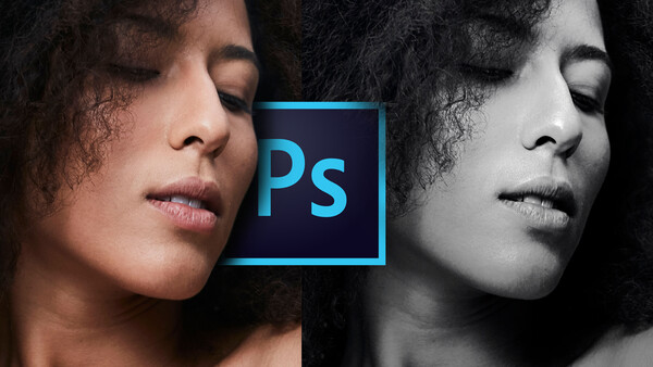
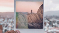
Have you ever seen an incredible and compelling black and white image and wondered how you can create the same impact in your photos? In this quick Photoshop tutorial, learn how you can take your black and white photos to the next level by following this simple series of steps.
When you see any black and white image, it is made up of three main components: the shadows, midtones, and highlights. The shadows are represented by the darkest part of the image, the highlights as the brightest, which typically is where you want the eye to be led to, and the midtones are the glue holding those two components together. Midtones are the combination of the shadows and highlights. These three components are the things that we will be focusing on in this tutorial.
The Distribution of Tonality in Your Image
When it comes to the tonality of your photo, it boils down to where the tones are placed throughout the image. In my opinion, what makes a dynamic black and white photo is where there is an even distribution and gradation of the shadows, midtones, and highlights. You'll notice that nothing is blown out in the image, and there is an even distribution of the tones. Ask yourself: Where does my eye go to first?
Converting Your Image to Black and White
If you shot your image in the JPEG monochrome mode on your camera, the image when you open it in Photoshop, it will already be processed by the camera in black and white. But, If you shot your photograph in raw, it's going to open up as a flat image, and it will be in color.


To create a gradient map, head down to Adjustments (the icon that looks like a black and white cookie) and select "Gradient Map." Click on the gradient and make sure it's set to Black and White.
Make an Even Gradation Between Your Shadows, Midtones, and Highlights
Once you have converted your image to black and white, I like to set it up where the gradation goes from shadows, to midtones, to highlights, leading your eye from darkest to light. I do this globally to the image, but also on a more macro level when looking at specific sections.

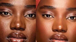
Step 1: Reduce Your Highlights to Their Most Neutral Form
What we're trying to do with this simple adjustment is to dig down into the highlights and bring out the details in the skin. To establish a neutral distribution of tones across the entire image, begin by reducing your highlights or luminosity of your brightest portions of the image down to their midrange form. This will help you sculpt the light in your image and where it will be placed in the scene.
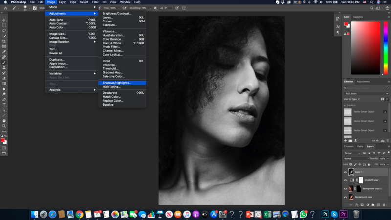
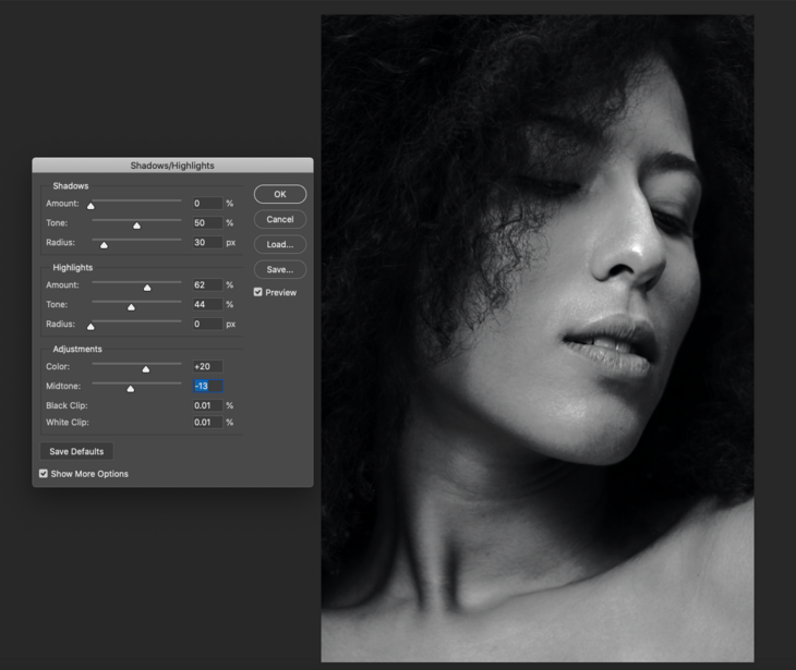
To reduce your highlights, first, head up to Image - Adjustments - Shadows/Highlights. Once you're in the Shadows/Highlights panel, bring your Shadows to 0 percent (it will be at default 35 percent).
Then, scroll down to the Highlights tab and tweak the settings according to your image. First, start with the Amount slider. I typically will drag it up to 50 to 60 percent. Next is the Tone slider. This slider will determine how much contrast there will be between your highlights and shadows. There is no set formula, but aim to eliminate a majority of the contrast, as we will bring that out later through dodging and burning. Then, there is the Radius slider. Aim to leave this slider on the lowest possible setting to avoid any haloing around the subject. Lastly, the final touch for this step is to scroll down to Midtone and shift the slider in the negative direction to help even out the global contrast of the image, in this case to bring down the brightness of the background to be darker than the subject.
Step 2: Lift Your Shadows
Now that the highlights have been brought down, the shadows are the next thing to think about. You don't want your shadows going too dark, so to alleviate this, lift your shadows up to the same brightness level as the highlights. By doing these steps first, you want to aim to establish a neutral exposure and eliminate the contrast in your shot, because you want to maintain complete control over where the light falls in the image.
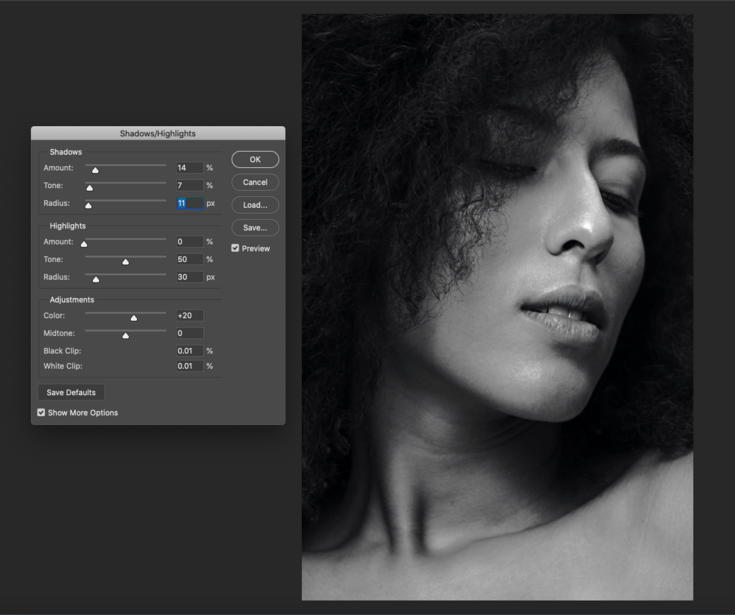
To lift your shadows, head over to Image - Adjustments - Shadows/Highlights. Once you're in the Shadows/Highlights panel, move your Shadows slider anywhere from 5-10 percent depending on how dense your shadows are in the raw image. Then, head down to the Tone slider and adjust it anywhere from 15-20 percent. This will determine how much contrast there is in the darkest areas of your photograph. Lastly, keep the radius as low as possible to eliminate halos or banding in the shot.
Step 3: Lead the Audience's Eyes to the Main Area of Focus in the Image
Once all of the exposure in the image is evened out, you can begin to accentuate certain areas of the frame where you want the audience's eyes to go to. You could do this through a multitude of different ways, but my favorite is using levels or curves.
To pull up the Levels panel, scroll down to the bottom of the Layers panel and look for the icon that looks like a black and white cookie. Click on it, and scroll down until you see Levels or Curves.

Once you make a new levels adjustment, you'll see a histogram, where the highlights are all the way on the left, the midtones are in the middle, and the shadows are all the way to the left. For this step, we're essentially just making the to the lightest part of the image brighter then the rest of the image. This is where the eye will be led to first. To do this, simply drag the highlights slider to the left until it's not blown out. Then, drag your shadow slider down to condense the darkest areas of your image.
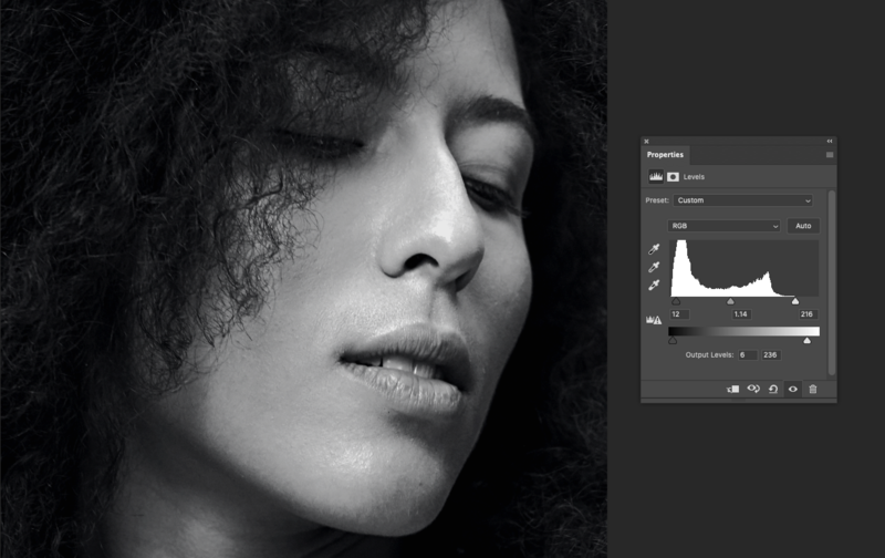
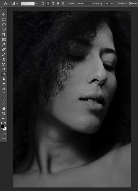
For this specific adjustment, you don't want it to be affecting the entire image, so to control where you want it to show, make a layer mask. A layer mask is your way of telling Photoshop what you want to be seen on a layer or what you want taken away. In Photoshop terms, having a white layer mask means that the effect is visible across the entire image, as opposed to when the mask is filled with black and the effect can't be seen. To fill the layer with black, simply press Command+I, and it will invert it. To reveal the effect, set your foreground color to white, change the blend mode of the layer to soft light, and with your brush settings dialed into 14% opacity and 100% flow, you're ready to go! With this combination of settings locked in, you'll be able to build your effect up in strength using the brush, but maintain the gradation between your highlights, midtones, and shadows.

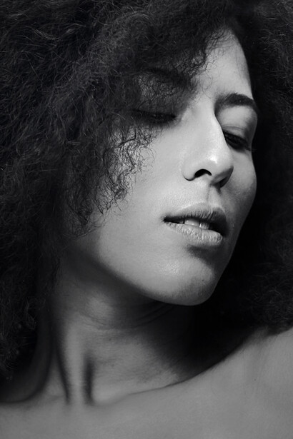
Step 4: Darken the Areas of the Image That You Don't Want People Focusing On
When you follow the above steps, it does a great job starting us off, but to bring our eye to the center of the image, the last thing to do is create a vignette around the edges of the photo. I developed a technique that gives you total control over the intensity of the vignette and making sure it's in the right place.
To make the vignette, on a blank layer (Shift+Option+Command+N), make a gradient. Press G and set the gradient type to Foreground to Transparent. Make sure your foreground color is black and your background color is white. Next, draw your gradient from the corner of the image towards the center. At first, it may seem like the vignette is too dark and intense, so to bring down the effect, press Command+T to bring up the transform panel.

Using shift and scale, stretch out the gradient and move it out of frame until it creates a smooth transition from dark to light. Once the first corner is drawn in, duplicate that layer by pressing Command+J, go into the transform panel, and "press flip horizontal." By using the transform tool, it will give you an exact duplicate of the first one, with the same tonality and scale. Move the second gradient out of frame again until you get a smooth transition. To get the same effect on the top two corners, press the rotate 180 degrees button and repeat. When you're done, shift-click all of your layers and group them together by pressing Command+G. To control the intensity of the effect, raise or lower the group's opacity to taste.
By making a vignette using gradient masks, this leaves a gradation intact from shadows to our midtones to the brightest part of the image, which in most cases for me is the center.
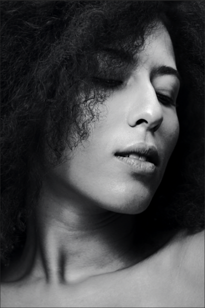
The Final Results

In just a few simple steps, you can transform any image into a dynamic black and white rendition. Leave some of your favorite black and white images in the comments below!

Join the Fstoppers community for free
-
Post comments and join in the discussions
-
Browse the site ad-free
-
Share your work and get featured in the community
-
Compete in the photo contests for fun and prizes
1 Comment
As always with Photoshop, there are a hundred different ways to do anything. That being said, I’d argue that while this is far from the worst way to do a BW conversion, it’s not exactly efficient either.
Steps 1 & 2 are the main issue. First, the Shadows / Highlights option is destructive. You can’t modify these settings once you’ve made them. If you open that dialog a 2nd time, the original changes aren’t available for tweaking… it basically applies a “2nd wave” of changes. Sure, you can do this on a dedicated layer and reduce the opacity if the effect is too strong, but then you’re creating unnecessary pixel layers, since this isn’t available as an adjustment layer. I’m not saying it’s always bad to use pixel layers… there are plenty of reasons to do so. This just isn’t one of them. It’s a bloated process.
Also, if you think about what you’re trying to accomplish in this step (flattening out the contrast), this is a step best done in RAW. Not necessarily because that’s where you’re working with the most amount of data (I’d argue that the changes here are subtle enough that the quality won’t be much different), but mostly because there’s just no reason not to. You’re adding unnecessary layers by doing this in Photoshop.
As far as alternatives, I’ve found that using the channel mixer with the BW Green filter often produces one of the most consistently clean conversions, and then dropping the black-to-white Gradient Map underneath this layer is a great way to bring back some overall contrast (usually in the 15-35 opacity range). The problem is that using the gradient map at 100% is usually too much contrast (which is why you’re having to flatten it out afterwards), and if you use this as your BW conversion you can’t reduce the opacity without letting some color creep back in. If you put the BW conversion above this layer, it prevents the color from seeping through and then you can use it for contrast only (which produces cleaner transitions than using something like the contrast slider in a Brightness/Contrast layer).
At that point something like Levels works great for setting the final contrast between the shadows and highlights (independently) if you need to bump it up a bit. Or you could use Curves. I prefer Levels because it's easier to just darken the blacks without having to set multiple points to prevent changes to the highlights. So, 3 steps and no pixel layers required.
Obviously mileages vary, especially depending on how you shoot your images in the first place. But using Photoshop to add contrast / subtract contrast / add contrast again, and doing it with pixel layers, is a little sloppy. I won’t say it’s “wrong”, since if you get the result you want, good for you. But I wouldn’t consider it an efficient workflow. If you're simply using PS, do whatever you want. If you're teaching PS, it's as much about efficiency as it is the results.