
With this 30-second check, you can ensure your images have the exact right contrast and levels, with it being particularly effective for black and white imagery.
I went through a phase of crushing the blacks and then lowering the contrast of the image. I guess it was to mimic the film look, though I hadn't paid the process enough mind to be sure; I just liked how it looked. Truth be told, there are times I still like how it looks. One issue with that was it didn't necessarily age well; it no longer fits how I like to shoot and edit, and moreover, it made checking the levels more difficult.
So, I started using a simple method to check that my levels were correct and the contrast wasn't sapped so much it detracted from the image. Now, this check is a staple I use for both black and white images and for a contrast check in my color images too, though the process is the same both times.
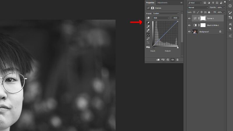
Firstly, open your image in Photoshop. If your image isn't black and white, add a Black & White adjustment layer. Leave it on its default settings.

Second, add a Curves adjustment layer.
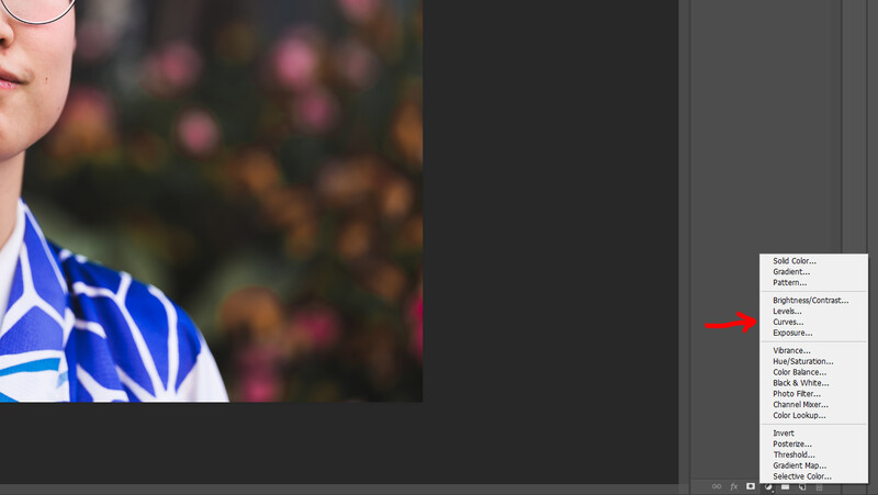
Select the bottom eye dropper tool, which sets the white point for the image.
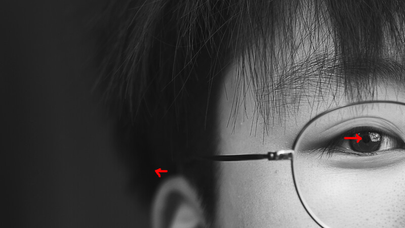
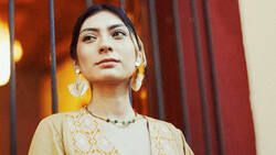
This image was a street shot in Tokyo using only natural light and an alleyway. Her garment's collar was blown out in places when her skin's exposure was correct; que sera, sera, we'll use it. With the eye dropper selected, click on any pure white in your image. If there isn't any, don't worry, we'll come back to that.
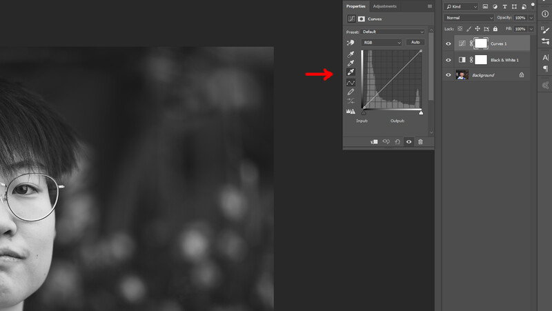
Now, select the top eye dropper on the Curves adjustment layer, which sets the black point.
Find an area in your image that is completely black. I will sometimes use the subject's pupil if it's a portrait, but this is only if I'm going to scale back the results, which I will discuss shortly. As with the pure white, if your image doesn't have pure black, don't worry, we'll talk about partial measure after this.
Now, by turning on and off your Curves adjustment layer, you can see what perfect levels looks like on your image. This is a technical process and not an artistic one per se, so it may not be to your tastes as is, or you may not have had white or black points to sample, which we'll address now.

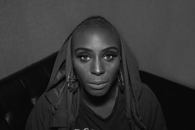
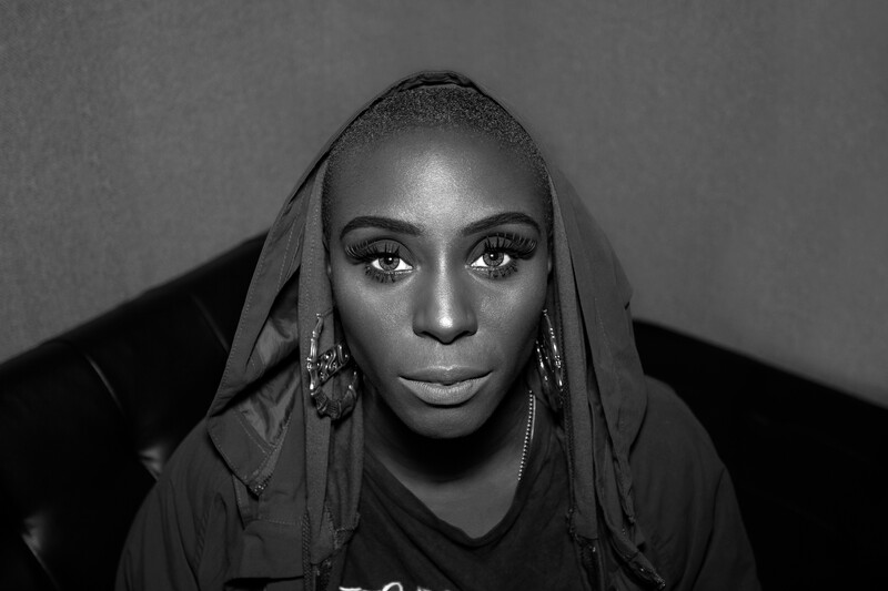
Here's a slightly more dramatic example of an exported snap of Laura Mvula from backstage at a festival for FAULT Magazine where, without processing, there's a real light of contrast.
Images Without 100% Black or White
Many images don't have pure black or white in them, so when you use this technique, the highlights blow out and the shadows lose detail; we don't want this. The solution is as easy as the original adjustment. Follow all the same steps, then zoom in on a blown highlight or a crushed shadow and lower that Curves adjustment layer's opacity until detail reemerges in both highlights and shadows.
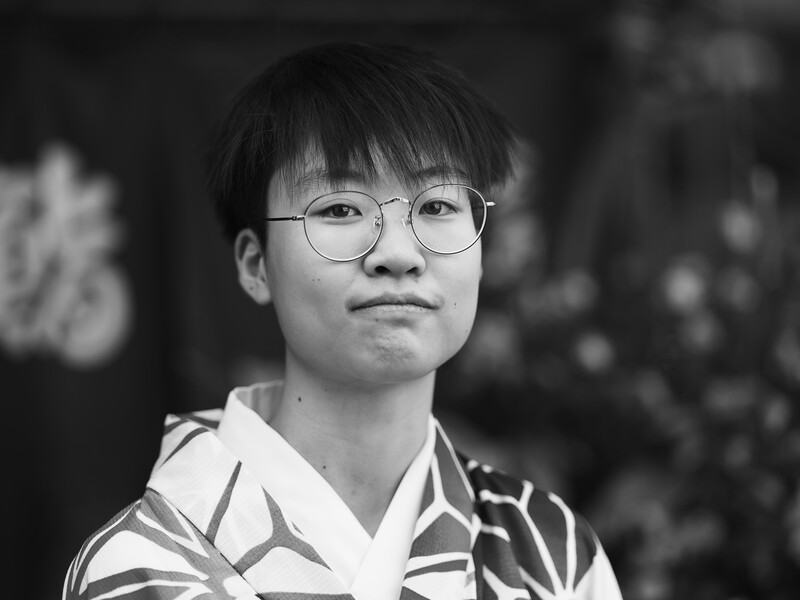
In the below example, there is no black or white, only grays. So, I sampled the white's of the model's eyes for the white point and the shadow under her hair for the black. Neither were black or white, so this happened:
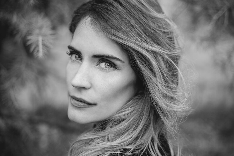
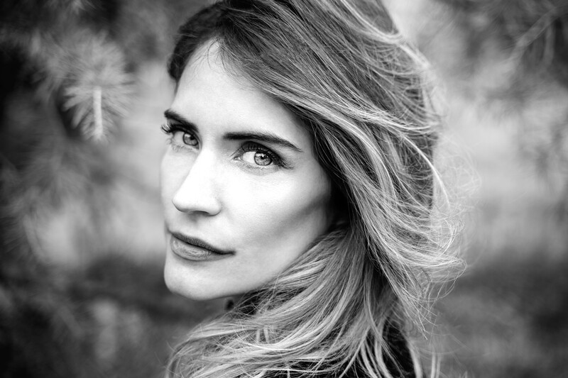
As you can easily see, but is more obvious on the histogram, we've lost a ton of detail in the skin. We can't have that. So, I simply zoom into somewhere blown out in this case.
I then lower the Curve adjustment layer's opacity until I'm not losing any detail in the highlights, which was 32% in this case.
Now, the technique is doing its job of correcting the levels. It's important to note here that if you don't have a fully calibrated monitor and are working in a room with the correct lighting, this level of fine-tuning can be very difficult indeed. I have two different monitors properly calibrated using a Datacolor Spyder, and when I edit images, I am in a darkened room.


Model: Rachel Wilkinson with hair and makeup by Holly Carter
I'll reiterate an earlier point in anticipation of some comments: this isn't necessarily a stylistic process. You may prefer the before image in this article or in your own tests — that's fine. This is just a tool that can identify incorrect levels that weren't intended as an artistic decision.
Using This on Color Images
This process can be used to check the levels of color images too. You just need to follow the same process and then remove the black and white layer when you're done. What I will say is you will need to do some more post-production after in most cases, as the increase in contrast will likely bring about high saturation and some other unintended alterations.
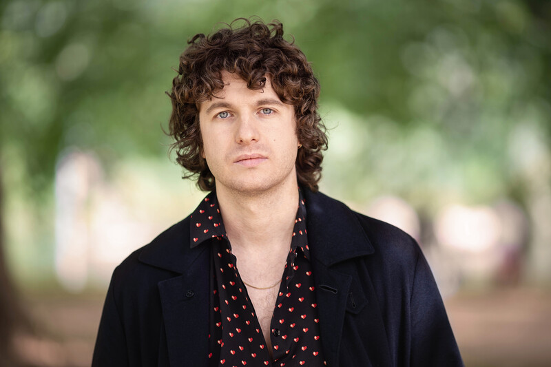

Model: Luke Pritchard, lead singer of The Kooks, shot for FAULT Magazine
The changes are subtle, but that's a good thing. If the changes are dramatic, it means one of two things: your image's levels were far from correct or your image was heavily stylized going in.
Not Just for Portraiture
Although I'm using it for mostly portraiture in this article, that's because I shoot a lot of portraiture. This technique works on all genres of photography.
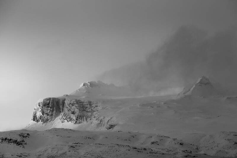

This image had the Curves adjustment layer lowered to 70% to avoid the snow being blown out.
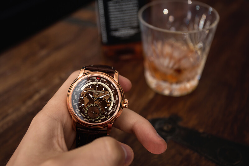
This image had the Curves adjustment layer lowered to 60%, as I didn't want the shadows to be black or to lose detail in the part of strap under the face that is in shadow.
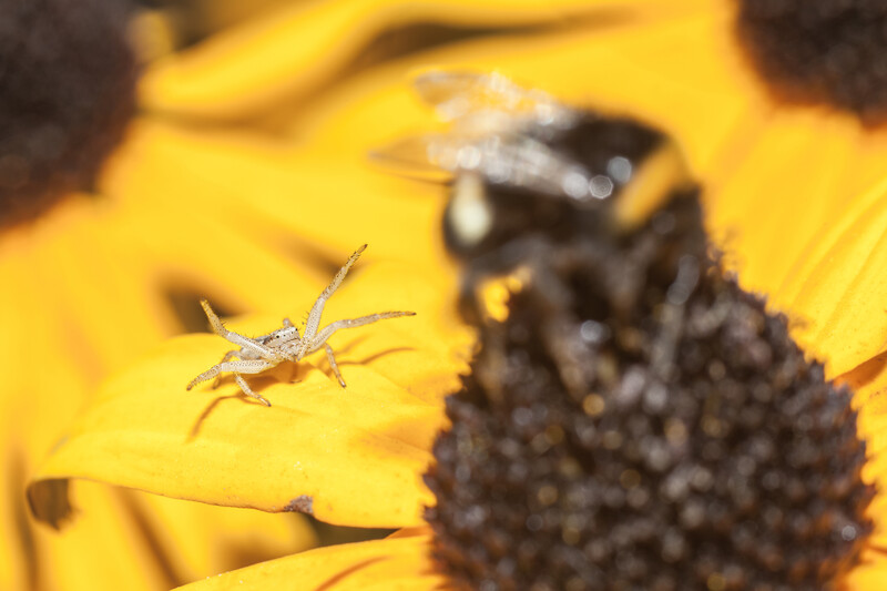
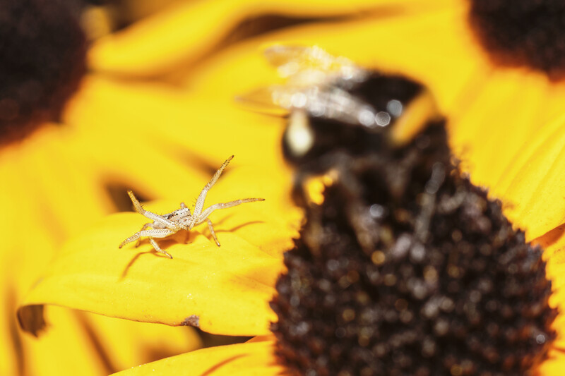
This image had the Curves adjustment layer lowered to 30% to avoid the highlights on the spider's leg being blown out.
In Closing
It's a quick technique, but it can be a powerful tool. I now do this at the start of every edit, and when I stumble upon one of my older images, I'll run this check on it to see if I had poorly edited it or decided to stylize the image too much.
Have you improved any images with this method? Do you have another way of ensuring your image has right levels? Share them in the comment section below.
Join the Fstoppers community for free
-
Post comments and join in the discussions
-
Browse the site ad-free
-
Share your work and get featured in the community
-
Compete in the photo contests for fun and prizes
7 Comments
Nice technique
Nice slider
Would be great if there was a single-click button to do this in LR. I have to hold down alt and manually adjust the blacks and whites until they almost clip.
There is. Just hold Alt and then double click on the blacks or the whites slider. It will automatically set the black or white point.
I think its Shift+double click that does this, Alt+double click in my case resets the sliders. By holding alt you may check at which point your whites are overblown and same for blacks.
Instead of guessing, you can find your lightest and darkest pixels using the "Threshold" adjustment Layer.
Great technique. Is there any similar quick fix in Capture One Pro?