
Do you have an image that should work, but doesn't? Perhaps some color alterations could transform it into something great.
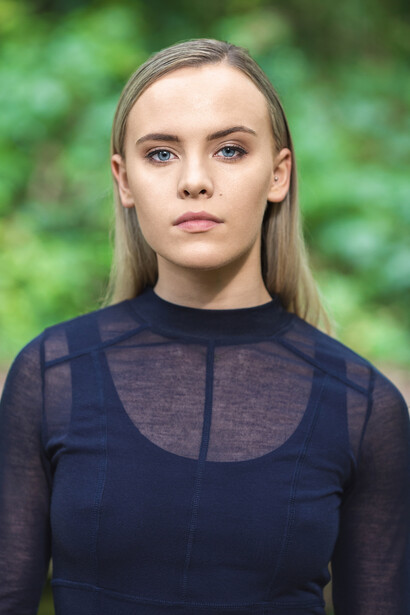
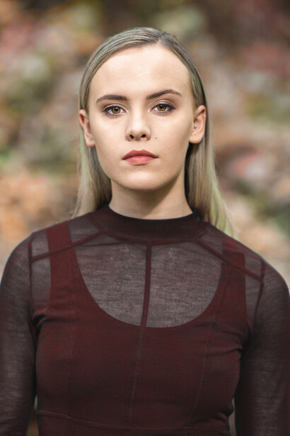
I'll start with what I expect to be one of the main points of contention: I prefer to get the image right in camera too. However, not every shoot or trip out with the camera is well thought through. Many times, I have taken snaps and wished they were slightly different, or I have been on a test shoot with little control over wardrobe or location, like with the image below. In that case, I'll either just keep the photograph in my archive without ever looking at it again, or I can alter the colors to see what else it could be.
My go-to situation with this is invariably test shoot portraits and green backgrounds. I don't know what it is, but beautiful, summery green foliage as a backdrop for portraits is distracting to my eye. It doesn't matter if color theory is in play or not; I can't stand bright emerald leaves behind my subject and find them oddly jarring. Fortunately, there's an easy way to fix this with just two tools. This can be applied to every genre of photography, and I have used it in landscape, commercial, macro, and so on.
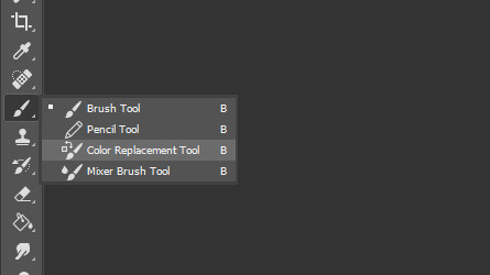
The first and primary tool in this quick transformation is the aptly named Color Replacement Brush, which hides under the Brush menu (B):
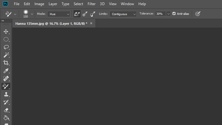
With that selected, you want to change the mode from Color to Hue. Color doesn't take into consideration the luminosity of the image and is far too heavy-handed for my tastes. Hue just adjusts the color of whatever you paint on (the cross in the middle of the brush is the sample point), using whatever color is your foreground.
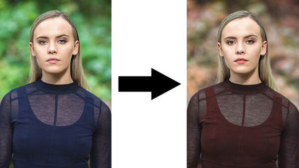
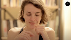
I decided to use an image I like, but don't enjoy the colors of. A quick caveat is that the garment Hanna, my model on this test shoot, was wearing is beautiful, but not ideal for this sort of change, as colors don't map to all of it very well, but I was still able to overhaul the whole photo in under five minutes.
I decided that if I was to make the background more autumnal, perhaps I could change Hanna's outfit to match rather than have it as complementary. So, from here, I selected pure red as my foreground and simply painted over the garment first, being careful not to overlap onto the background.
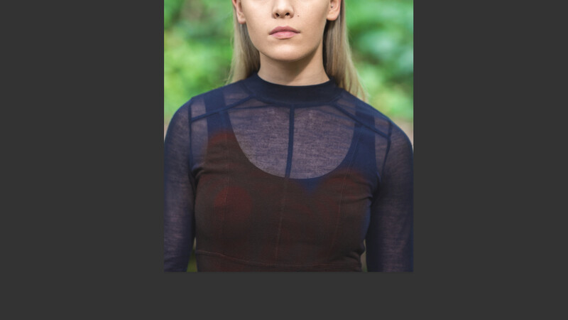
Once that was finished, I did the same again with the background, using orange rather than red to change the leaves to a less distracting color, but keeping it looking nice and natural. Colors of nature are seldom uniform, so I will then go over the background and just add blobs and patches of browns, reds, and yellows to make it feel more authentic.
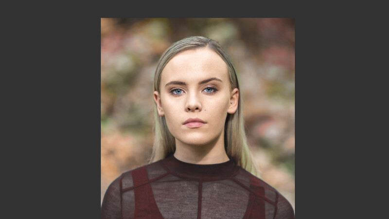
I then bring in the second tool: Hue/Saturation Adjustment Layer. With that, I will select specific colors that haven't been adjusted properly or now stand out and alter their hues until they match the rest of the image. For example, I darkened Hanna's lipstick to fit with the new color scheme and changed her eyes to brown from blue, in line with the new autumnal look. (Note: Hanna's eyes are naturally brown, they were changed to blue to better show the wholesale changes that can be made.)

The difference for just a few minutes of editing is profound. Yes, I have no doubt lots of people will prefer the before or balk at the idea of editing an image as dramatically as this, but the point is it's there for you should you need it. With just the Color Replacement Brush and the Hue/Saturation Adjustment Layer, you can reinvent an image's whole mood and color scheme. The applications for this method are myriad: you could change the color of a car to suit the grade of your image, the trees to make your landscape more seasonal, walls to complement your subject... the list goes on.
What's your best use of these tools? Share your images in the comment section below.

18 Comments
Well you killed the plants. Maybe create a plant killer action that just turns all trees and growth brown.
I like it. Colors looks more coordinated and aesthetic. Yeah, those greens bug me also. I typically do a hue shift and desaturate. But, I like your method better.
I have 1 question: WHY?
It's... literally in the second chunk of text....
Very helpful technique, which I wasn't aware of. Thanks. I assume you can get to that Brush tool by toggling through the Shift + B options.
PS: I prefer the first, but I like the second a lot as well and extra points for adjusting the dress so it wasn't incongruent with the rest of the image.
Taught me something new, (and maybe you did a quick job just for tutorial's sake) but you gotta commit. The edges of the clothes and hair definitely still have a green tint that betrays your editing.
You're right it does need some refining!
It looks really good! Haven't had a use for this tool yet, but I'll have to keep it in mind. Are you able to change your choice of color for the brush after the fact?
That's a good question. You could through use of layers I suspect.
I like the hue. You made it look nice. Hoping to get more photoshop lessons from your insightful posts.
Nooooo.
Wow, very cool!
I haven't used this tool much, but looks like I've been missing out. I like the speed and seem easy. I think fringes and edges are tricky though. Hair has a green tint on the edges still, but should be easy to take care of with some adjustment. Thanks.
At the very least, let the subject keep her lovely blue eye colour.
I believe her eyes were brown to begin with.
I can't seem to find the color replacement brush, is there a trick to accessing it?
I use the colour replacement tool all the time for product photography; when you have images for some colourways of a product but not for all - it works best for colors of a similar intensity - e.g. changing pale green to pale blue.
I've never tried it for portraits or backgrounds though, but now I will play with it.