

For some reason, Photoshop has decided to bury one of its most powerful tools in a place few photographers would ever look. Here's how to find and use this highly useful feature to take virtually any image to the next level.
I have been using Photoshop for a little over 18 years and would like to think I know my way around the software quite well. Even so, it wasn't until a few years back that I learned of a technique which involved using "Blend If" and it really did change how I retouched my images.
For those unfamiliar with Blend If, it's a tool which can be used to fine tune the blending options of a layer. The reason why I think it's such a game changer for retouching images is that it can be used on any kind of layer you can make in the program and the effects dialed in precisely to your needs. For those reasons, it doesn't matter if you shoot weddings, portraits, landscapes, or even product shots, understanding how to use Blend If is a valuable concept to learn and something I think is well worth having in your arsenal.
Finding the Blend If Tool
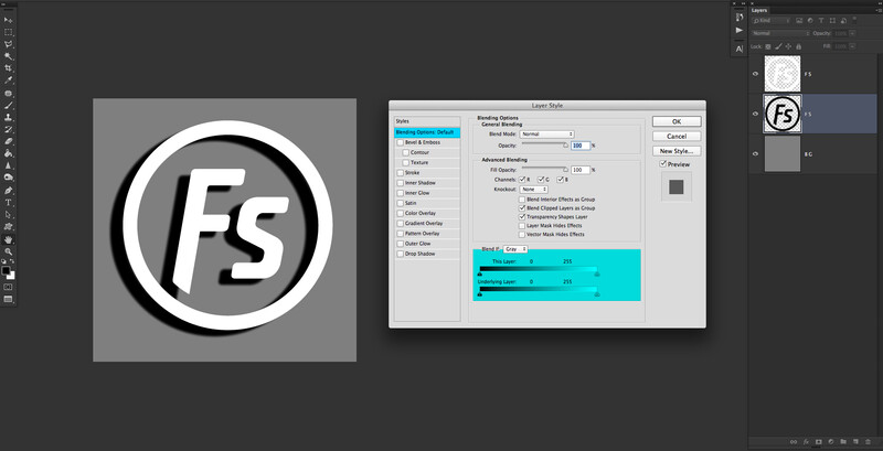
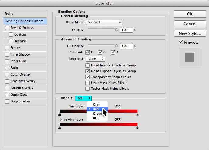
The Blend If tool is obscurely placed in the "Layer Styles" pop up window which is accessed by double-clicking on any unlocked layer. You may have occasionally ventured onto this window to add a drop shadow to a piece of text, but it's not really somewhere that is used by many to help improve their photographs.
If not already, make sure you have the "Blending Options: Default" tab selected on the left-hand side. All the controls we will be using for Blend If are on this first page and the two sliders you use to do all the fine tuning are located at the bottom of this particular window.
How to Use The Blend If Tool
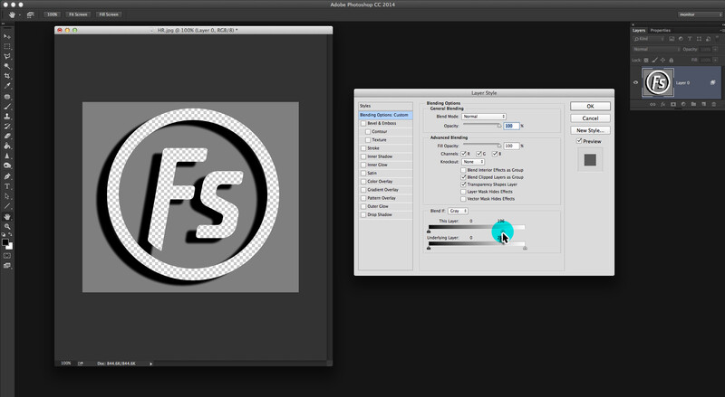
Before we delve into how to use these Blend If sliders, it's important to understand the difference between a shadow, midtone, and highlight.
As you can see in the simplified image above, this particular version of our Fstoppers logo is made up of a shadow, midtone, and highlight. Highlights are the lightest parts of an image and are the areas of a picture that have the most light hitting them. Shadows are the darkest sections of an image and although at times they will be solid black most often they will just be very dark. If a highlight is where the light has hit the photograph the most, shadows are the complete opposite and are the areas where light has hit the least. Midtones show the middle tones of an image, and as the name suggests, are somewhere in the middle of a shadow and a highlight.
So how does that translate to the Blend If sliders? Both of the sliders in this tool work slightly differently but are controlled in the same way. The top slider uses the information in that particular layer to blend from. The bottom slider uses the layers underneath the one you are working on to determine how to blend. Both sliders have their uses so play around with each of them to get the desired look you want.
To make adjustments with Blend If it's just a matter of moving the sliders with the mouse. As you make these movements you are telling Photoshop which parts of the shadows, midtones, and highlights you want to be visible and not visible.
As we move the right-hand slider away from the highlights on the right you will see how the lightest parts of our logo disappear to reveal the transparent checkerbox underneath.
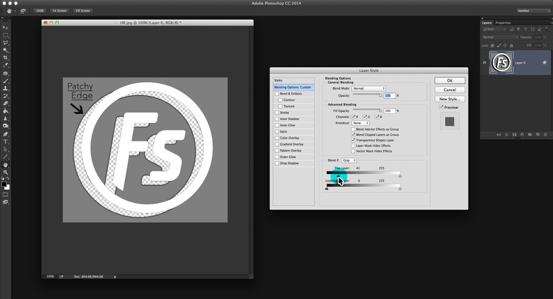
This time we will move the slider away from the shadows on the left so now they disappear instead. Notice how unlike our highlight example above when making the shadows invisible we are left with a rough pixelated edge behind. This is because the shadow on the logo is not a completely solid color. This is where the Blend If tool really comes into its own as we can fine tune the slider to dial out every last pixel we don't want.
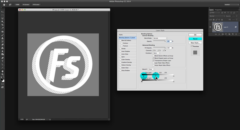
To do more gradual blends when making the shadows, midtones, or highlights of a layer invisible, hold down the Alt key (Option on a Mac) where you will see the "Cancel" button turn into the word "Reset." Now when you drag the tip of the slider it will actually split into two halves. This will give you more subtle blends depending on how far you space these two halves apart. Because most photographs contain many subtle graduations from light to dark you'll find that more often than not you will be splitting the slider in two to achieve the best results.
Real World Examples of Using Blend If
So with that lesson out of the way, here are just some of the many ways you can make use of this powerful tool in your own photographs.
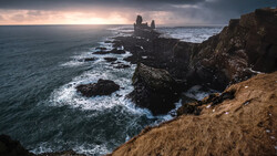
Improving Landscapes
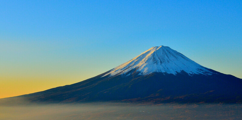
Copyright 2017 | Image by kimura2 | Pixabay.com
Even though this landscape was already a great image, I thought it would be interesting to change the mood of the piece so it felt like it was shot much later in the day. To achieve that look I used an image of a sky I already had and placed it as a layer above the original image. After that, all I did was move the Blend If sliders to taste. No other adjustments were done to the image. In total this dramatic transformation took 30 seconds to do.
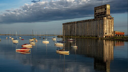
Improving a Location


Copyright 2017 | Image by smykcur | Pixabay.com
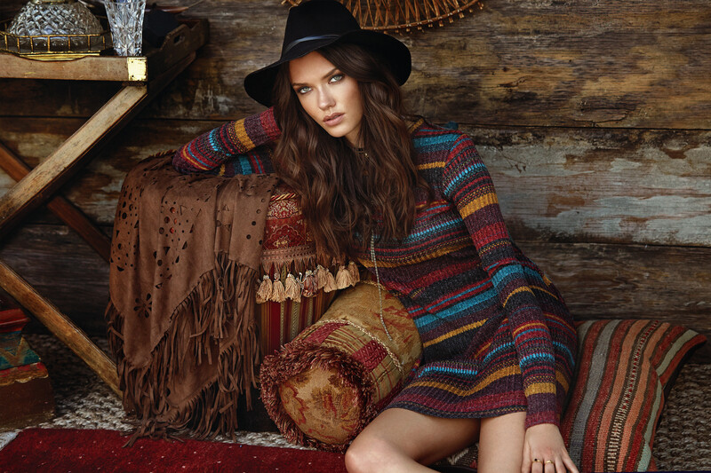
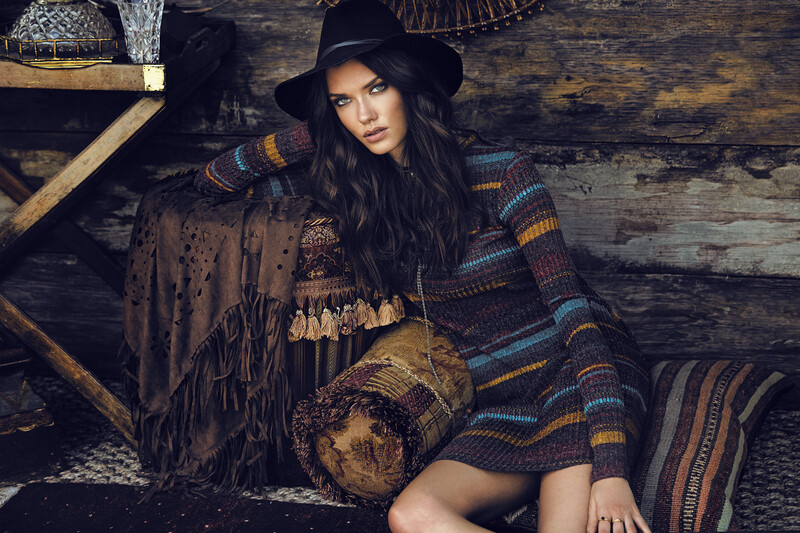
Sometimes you will be faced with a location which is less than inspiring. For this fashion image, I added a stock photo of graffiti by MMT to brighten things up. Again I placed the graffiti in a layer above the original image, set the blend mode to "Color," and dialed in the amount I wanted to show on the wall with Blend If. Notice how the shadows of the wall are still visible which helps sell the realism of the blend. Lastly, I erased a few spots of the graffiti layer which was interfering with the model but it still didn't require a complex selection or a time-consuming mask. Even though this piece was a little more involved in regards to post-processing this image still only took about a minute to make in Photoshop.
Adding a Texture File to Something

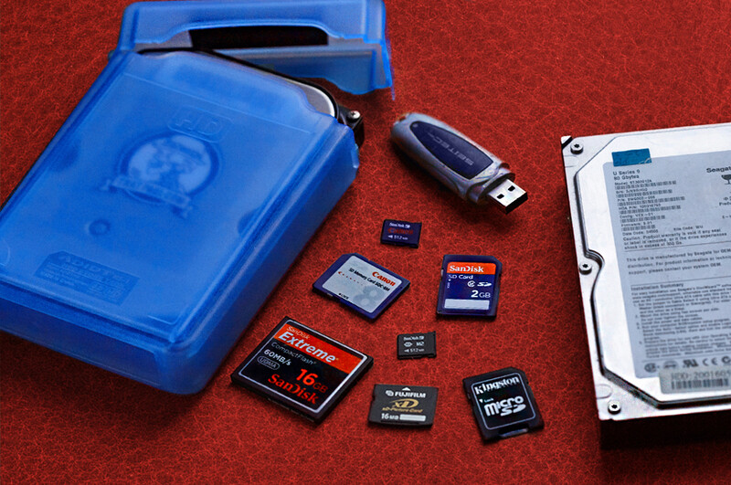
I shot this image especially for a recent article on making the most of old data storage. At the time I didn't have an appropriate background at hand so shot the thing on a big sheet of cardboard. In Photoshop I used a combination of Blend If and a basic image mask to achieve the look. I also took advantage of being able to use the individual channels of the image while using the Blend If tool to further fine tune my blending.
Even though this edit is a little more involved than the other examples it still only took less than five minutes to achieve what I think is a rather convincing transformation.
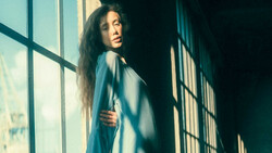
Stylizing and Increasing Drama
Copyright 2017 | Image by 3179289 | Pixabay.com
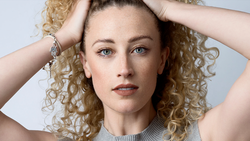
I quite like to stylize my images and what better way than using the precise sliders of Blend If. Even though I love this fashion image, I thought the original was a bit too busy in the color palette. For that reason, I took a "Black and White" adjustment layer and played around with the various color channels till I got something I liked. After that, it was just a matter of using Blend If to tell Photoshop which parts of the adjustment layer I wanted to be visible. I managed to keep the mid tones of the model's skin almost identical to the original while subduing all the other colors and adding a little more drama to it. No masks or other adjustments were used in this edit and in total it took me no more than three minutes to do.
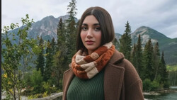
Adding Shape

Copyright 2017 | Image by Engin_Akyurt | Pixabay.com
Blend If is a great way to create the dodging and burning effect in Photoshop to add shape to your work. I took an empty layer and placed it above the photograph, then with a soft black brush, I drew some areas where I wanted it to look more 3D. Next, I used Blend If so the black areas I had roughly drawn with the brush were convincingly blended into just the parts of the image that I wanted. I also repeated this process with a white brush to help bring out the highlights of the model's hair. Again this edit took no more than four minutes to completes and I was really happy with the subtle enhancements.
So that is how to use one of the most underrated and unknown tools Photoshop has squirreled away. Obviously, a lot of the transformations above could have been achieved in various other ways in Photoshop, but what I like about Blend If is how precise the controls are, how quick you can transform an image, and how little you need to rely on making complex selections to achieve the look you want. When you combine the power of Blend If with some of the many other adjustment tools Photoshop has to offer, you really should be able to take your photographs to the next level in a fraction of the time.
Do you use Blend If already? Is it something you can see yourself using? I'd love to hear from you in the comments below.
Lead image by Engin_Akyurt from Pixabay.
Join the Fstoppers community for free
-
Post comments and join in the discussions
-
Browse the site ad-free
-
Share your work and get featured in the community
-
Compete in the photo contests for fun and prizes
34 Comments
Nice article, Paul. Thanks for showing the various uses for Blend-If!
You're very welcome Dan, it really changed how I edited once I learned it.
I don’t know much about luminosity masks (shame on me probably), but blend if allows you to operate on the color channels of the image as well as luminosity. Also, maybe blend if is more intuitive in that you have a slider and real-time feedback? Again, I don’t know anything about luminosity masks though
Excellent answer thanks Chris!
I'm kinda rough on luminosity masks too! Mainly because blend if does everything I need & more...
Basically two different ways of doing the same thing. I usually go for the blend if sliders just because I find them quicker and more convenient than making luminosity masks.
Thanks for the answer Pete. Great to hear so many people using blend if. I really love them. :)
Hey Royi, great question. Chris & Pete above have said exactly what I would have regarding the differences & similarities of the two techniques.
Being able to blend something into a particular colour channel is so much use.
Let me know if you have any further questions. :)
Blend-if is dynamic, a luminosity mask is static. For example, if you use a luminosity mask then adjust the underlying layer, the mask needs to be recreated. Where as the blend-if will update automatically.
Also luminosity masks contain a lot of bitmap data so can quickly balloon the file size of your working file. Whereas blend-if won't.
Blend-if is also a lot easier to adjust. With a luminosity mask if you would like to slightly change the range you need to remake it or destructively modify it using something like curves.
Great explanation, thanks Ryan. I've not played with luminosity masks much as Blend-if has always done what I needed. But when you talk about having to destructively modify luminosity masks it makes me want to stay with blend if even more!
To a degree, but that requires third-party software, and it is still much slower than blend-if. Overall, though, I was comparing luminosity masks vs blend-if as they are in Photoshop. If you add in third-party software things get a lot more complicated.
I do use Blend if time to time, but would like to see a video how you use it on some of the above-mentioned subjects.
Hey Agoston, there are many great videos on blend if on YouTube.
Most of the above was achieved with blend if & sometimes a very basic image mask in combination.
Let me know if you need further information.
I tried it. Without specific settings or an accompanying video to follow I'm a bit lost. I tried these instruction but my results on images have been poor. I've been using Photoshop for the past 20+ years.
Hey Tom, there are many great videos on YouTube regrading this subject.
I didn't add any specific settings because they would only be useful for that particular image.
What kind of image are you trying the technique on & what are you trying to blend with it?
Results will vary from image to image but it well worth sticking with it as the blend if is such a powerful tool...
I was trying it on a portrait from the waste up on a grey wall background. I wanted to give the wall a more colorful textured look.
Hey Tom, the picture sounds like a good candidate for blend-if.
If I was adding the graffiti picture I used above to your image I would do the following steps:
1) Open your portrait in Photoshop
2) Also open graffiti picture
3) Drag graffiti picture onto your portrait so the layer is above your portrait
4) Change blend mode of graffiti layer to "Color"
5) Double click on graffiti layer to bring up "blend if"
6) Holding the alt key (option on mac) move the sliders to taste
7) Hit ok
8) Because the mid tones of the grey wall will most likely have similar characteristic to the skin tone in your portrait you may need to either use an "image mask" or an "eraser" on the graffiti layer to remove any unwanted parts of graffiti off the human.
Every image is different but you should be able to get close to something you want with the help of blend-if. Sometimes it works straight off the bat while other times it needs a little help cleaning up afterward.
Hope this is of some help...
Anyone not using subscription editors and wondering how this feature works in Affinity Photo can check out this video I found. He kind of figures his way out through it, but I started it at the 3 minute mark where he starts specifically. https://vimeo.com/179440153
interesting video for those who don't use photoshop. For those who do this is a good one:
https://www.youtube.com/watch?v=3GKDBXrpV8s
Nice find Robert, Phlearn is the best...
Thanks for the alternative software solution James!
No, thanks for bringing this up. It’s been a great addition. Affinity is lacking in tutorials, but I can usually transcribe it from photoshop with a few small changes. Your examples are hard to recreate (they look great) but I’ve had a few successes. I’ll be working on it for the next few weeks for sure
Thanks, most helpful.
“Blend if” seems to be the flavor of the season, but I’m glad because I always forget about it and it really is super useful haha
Nice article
Haha thanks Chris. I've not seen too much about the subject recently but I'm glad to hear it's getting lots of well deserved attention!
I might be seeing the same things more than once, but I know I’ve seen at least 3 different videos/articles (including this one) in the past week or so 🤷🏽♂️
Could also be YouTube/google/Facebook/bigbrother showing me similar things to what I’ve watched haha
Impressive results. Never even heard of this thing before. Many thanks
You're very welcome Robert, hope it's of some use. : )
Great article and detailed step by step explanation with examples, Paul. I'm definitely bookmarking this one!
Thanks Aneesh, that's very kind! This one took a while to write!
These examples are awesome! Great tips Paul.
Cheers buddy, I use blend if almost daily!
Very informative, Paul! Could you please write more in depth article about Stylizing and Increasing Drama, using Blend If tool? Thanks.