
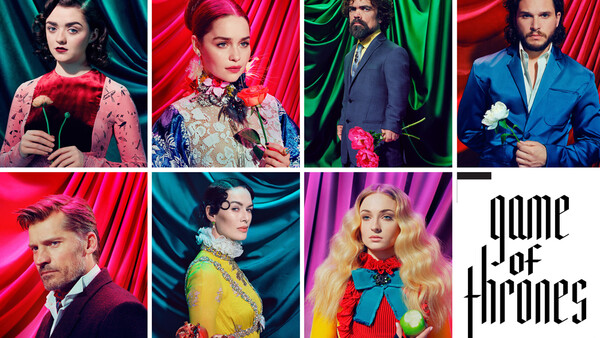
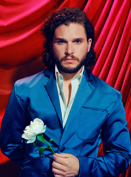
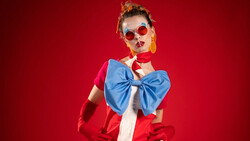
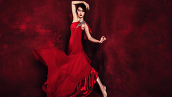
Allow me to put on my curmudgeon hat for a moment, but do you ever feel like photographers shooting for big publications will sometimes go for wild off-the-wall creative concepts that seem to just fall flat? That's how I feel about these portraits of "Game of Thrones" actors for Time magazine from British Photographer Miles Aldridge.
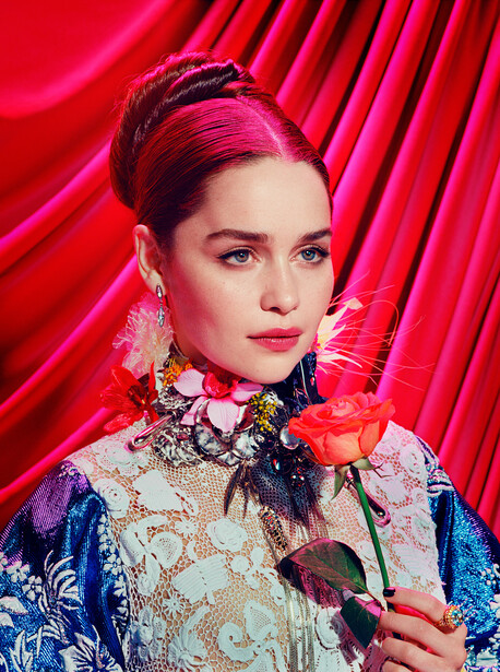
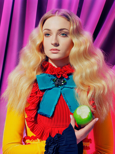
Now, these images are typical of Aldridge's work, so it's pretty safe to bet that these are exactly the kind of photos Time was going for when they hired him. Aldridge is known for exactly these kind of images, oversaturated colors, hard lighting, surreal settings and motifs, all of which are on display in these photos. My biggest question when I see images like these is why? I assume the pitch conversation for this issue went something like this:
"Hey, so what should we do for the 'Game of Thrones' edition of the mag this summer?"
"I dunno, have them wear their costumes and put them in the snow or something?"
"Nah, that's been done to death. People want to see something different."
"Different... What do you mean?"
"I mean different! Like Miles Aldridge!"
"Miles who?
"Miles Aldridge! He's so hot right now!"
*Googling*
"You mean this guy who does all these bright colored portraits of dead-eyed plastic looking women staring away from the camera? That Miles Aldridge?"
"Exactly! It'll be great, glad you agree. Let me call his publicist."
Or something like that.
But seriously, why? I am one of those people that thinks that photos are meant to, on some level, tell a story to the viewer. Now, that idea leaves plenty of room for artistic interpretation, but I think it's fairly easy to "artist" your way out of storytelling without realizing it. Look over the images from this article and tell me if they are anything more than actors dropped into a Miles Aldridge photo. Sure, they're funky and cool in a psychedelic sort of way, but is there any meaning behind them, any depth?
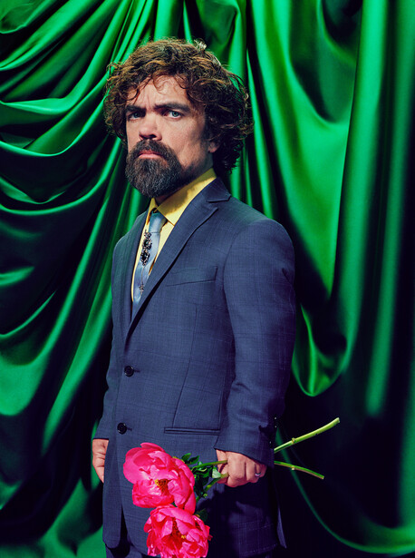
Photos like these just don't connect with me as a viewer. They seem more like an amalgamation of style and technique than the result of intentional process and vision. Bold, bright, oversaturated colors? Check. Funky silk backgrounds? Check. Random still-life articles to jazz up the scene? Check. Hard lighting? Check. Drop in any actor or model you want because the person in the photo really doesn't have any impact on the image? Check and check.
Time magazine is known for really killer photography, but I feel like they missed on this one. When I saw these photos I immediately thought of the portraits Time had shot of the cast of "Star Wars: The Force Awakens" back in 2015, because I loved those images so much. They're great portraits, well executed and compelling. And while they would still be great portraits if you swapped in a random model for the famous actors, I do feel like Marco Grob was able to make each image individual to the subject he was shooting (the Harrison Ford and J.J. Abrams portraits are particularly stunning).
So that's my two cents, but what do you think? There's every possibility that I am missing out on the sheer artistic brilliance of these images and I need someone to enlighten me. If that's the case, let me know in the comments below.
[via Time]
Join the Fstoppers community for free
-
Post comments and join in the discussions
-
Browse the site ad-free
-
Share your work and get featured in the community
-
Compete in the photo contests for fun and prizes
37 Comments
I think they have all to do a great shooting but didn't find the final portrait that connect whit every character.
As photos I think they're f*&^ing rad, but yeah I dunno if they make sense in this context.
Exactly. Aldridge has a very distinct style that I find equally intriguing and irritating. My issue isn't with his style, it's with the fact that his style for this shoot wasn't an interpretation of his subject, it was simply sticking his subjects into his style.
"it was simply sticking his subjects into his style." - Exactly!!!...... with renaissance references, so it is not wildly out of artistic context which can be loosely connected to the era of GOT - an imagining of how humans in that era would/may have taken photos. e.g. the portrait posing in almost all pre-modern portraiture (e.g renaissance era) had the same stiff, disconnected, sometimes angled, sometimes off looking poses.
I think this is one of those cases whereby, the viewer must just accept and understand it is what the client clearly wanted.
You don't like the concept, and that's cool!
Every dumb photo shoot or movie has an even dumber "boss or editor" saying OK lets do this. The photographer has a style, a style I do not like but hey I did not hire him.
Don't worry, Jackson Pollock's next door neighbor thought he could do that crap too....
I like these photographs. There is an aura of intentional parody of the standard conventions of most commercial portrait photography, a look that itself has descended into a set of almost irredeemable clichés.
Seem to be like a Mexican Telenovela with the overwrought drama, with GOT kinda is in some sense. I dig it
I think many people lose sight of the fact that ADs select a photographer based on what they did in the past. They have a very clear idea of what they want and they bring in the photographer and say "Shoot it".
Yes, photographers are creatives but they also have to take direction. I have been in that situation many times where I am told "We looooove your work, now shoot this set the way we have it staged." I will offer ideas and options but in the end they write the check.
I would add, that in this increasingly crowded field of derivative styles, impact and avant garde is available by the boatload.
The comparison to the Star Wars photo shoot is interesting. Because I didn't get a sense of a story being told through those images. They looked like well lit, stylized photos of actors in sometimes, Star Wars looking clothes. But overall you could make the same argument that any model could be dropped in and the images would still stand strong.
If the magazine enjoyed this photographers style, they probably just wanted a stylized shoot. Who's to say that every photo needs to tell a story, whether it's promoting an article about the cast or not. Can photography not just be for the sake of playing around artistically?
It's a promo piece. The entire point is to generate buzz, that's it.
It worked reaaaally well.
Photography doesn't always have to tell a story. I mean, just now I see half naked women in the desert and a watch in the small thumbnails at the botton of the Fstoppers page... are they suppose to be shite because they don't have a story?
It's about context though. The half naked women in the desert make sense in the context of the purpose of the shoot. Never said the images were shit, just said they're images that have no connection to the story they're paired with beyond using the actors as model.
This is an opinion piece, the entire point is to share my opinion :)
It's even sillier when you watch the BTS video. All that high end gears to create what I see as some subpar studio work. The absence of vision and creativity really have shown through this one. Sorry Time Mag! I don't see quality in this shoot, not the expressions, not costume, not the props, not the posing and expressions.There's better be a really good editorial write up to explain this.
"I was inspired by the work of artists such as Lucas Cranach and Albrecht Dürer whose northern European renaissance paintings resembled the medieval setting of the show and set about making a modern interpretation of their paintings with both lighting and set design." - not painterly
"The set design for this shoot played a huge part in conveying my idea and really giving the readers of TIME magazine a sense of both the topics in the show along with representing my distinct style. - only style, barely any story
The vivid colour narrative in each brings the viewers into the world I have created for these actors while the careful placement and selection of each prop brings to life the mystical, dark world of The Game of Thrones."
- poor choice in composition, flat lighting for a mystical world.
I really loved the concept, and that it was different to all the photo shoots I've seen in relation to GOT. That's all. Nothing more nothing less. Sometimes you just have to take photos at face value, when you go to deep, looking for what's not there, of course things will seem subpar and redundant.
I like these portraits and I love their overall getup, hair, the crazy colors. I just CAN'T STAND any of it in context of GOT... feels so... I dunno.. tacky?
Anyway, I just finished binge re-watching season 1 and 2 over the holiday break :) Need to find a way to squeeze 4 more seasons in before the 16th, LOL! Never thought I'd be the one to obsess over a TV show, yet here I am!
Yeah, I don't have any real issue with the style, they just don't make a lot of sense in context.
My wife and I just finished rewatching every season too! We go on social media lockdown for the new seasons and then binge them once they're all available, so I'm about to do into hardcore anti-spoiler mode.
Is the new season coming on 16th?
set your reminder and clear your calendar ;) oh, and don't forget to prep some munches ahead of time...
What would you have preferred? Another GOT photo shoot on some gloomy dramatic location with Annie Leibovitz light? I think these are pretty awesome. Fun sets, poppy colors, considered details, and they are something I've never seen before in a GOT shoot. They got my attention and clearly they got your attention enough to publish an article on it. They're editorial photos for a pop culture article, not a deep humanitarian piece. This is exactly where a photographer should have the freedom get weird.
Nah I think I even said in the article that's not I would have wanted but, if the only link between your images and the story they go with is that the actors are your models, that's pretty weak in my opinion. The story is about the show, find some way to connect the characters they play with the images, not just the actors. You can do that in this style, that's not hard.
I'm sure if you were hired to shoot this shoot, you would have found a way to "connect the characters they play with the images." But that isn't what the client wanted, and that isn't what this photographer shoots. I have a visceral instant love for these images. I'm not sure I can explain it. I cracked up laughing at the Peter Dinklage shot. I laughed because of the intense look on his face, the contrast of his GOT character with the absurd colours in the shot, and the reveal of the flowers that popped into the shot as I scrolled down the screen. This is art man, and sometimes art doesn't have to make sense. Sometimes it just needs to make you feel.
No it isn't hard to shoot the obvious. I'm sure you could do it, and I could do it too. It is much harder to shoot the "not-obvious": which Miles has (IMHO) successfully done. (And I loved the Star Wars photos as well. A completely different style, but fantastic images as well.)
Everyone gets their own opinion, that's the beauty of writing an opinion piece :)
With all due respect: its kind of lame to be falling back onto the old "its just an opinion" defence. You've felt strongly enough about your opinion to not only write an article about it on one of the most widely views photography websites on the planet, but you've argued with nearly everybody who posted their own opinions here in response.
Its your opinion. We get it. If you don't want your opinion critiqued though then you shouldn't be offering critique in the first place.
Not sure why you're using the word "defence", are we having an argument? I also never said I didn't want my opinion critiqued. I wrote about my opinion, you stated yours, I noted that it was cool that we all get to have our own. No need to infer things I didn't actually say.
I actually like the concept!
Would you mind expounding on what you consider the concept to be? Because I'm completely missing it.
The art direction, the lighting choices, the model direction... As a collection they look gorgeous together.
Photos don't all have to tell a specific story, sometimes they just need to be visually pleasing.
I like them.. *shrug
I don't dislike them, I just don't think they make any sense within the context of the story. They're just...photos.
I didn't read the time article, so I don;t know the context of the story they're featured in, but sometimes all you need are just... photos.
Exactly.... just photos.... of the cast..... for a pop culture magazine. :-)
I happen to love these images. I loved that these characters were taken so far out of the usual context in which we are used to seeing them. Was your article written to get a rise out of readers? I simply can't imagine another creative bashing these images, even if they are not your style.
As I said in the article, my problem (if you can even call it that) is that the images don't fit the context of the story. The only link is that it has the actors from the show, which isn't much of a link at all.
Andrew, TIME clearly wanted something different, but not too far off e.g. making use of renaissance references and poses. Renaissance = earlier times of the European era. GOT = fictional earlier times of a fictional European era. They clearly didn't want the exact context of GOT, cause it's been overdone. What you're complaining about, was possibly exactly their intention. Something different, out of GOT context. And anyway, who says the art direction has to be exactly within the scope of the typical GOT aesthetic. This is a take it or leave photoshoot TBH lol.....
THIS.
A. I think these portraits are sick.
B. I like that they took a different approach than every other publication this cast has ever been featured in.
C. The juxtaposition of deadpan stares and bright saturated colors is great.
D. The light is simple, not unflattering, and clean.
E. The contrast between outfits and backgrounds is well thought out.
F. This comment section is filled with people whining and it's hilarious to me.
All I hear from people complaining in the comments is that it isn't how they would have shot it... But they didn't get hired by Time for their aesthetic, Miles did.