
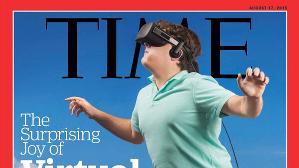
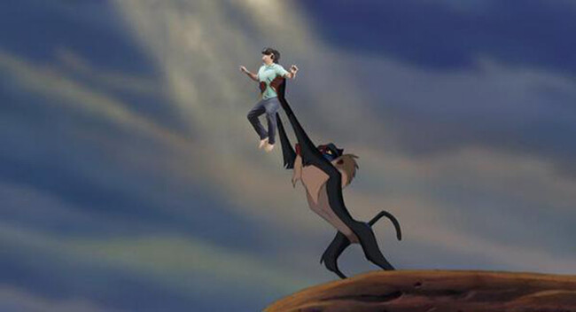
I've always considered Time Magazine to be a pretty high quality publication. Getting your photograph featured on the cover would be a lifetime accomplishment for most photographers. That's why the current cover with Oculus Rift inventor Palmer Luckey is particularly shocking.
This cover is so bad that I have found myself feeling a bit conflicted about it. On one hand it's sad. I feel sad for Palmer, who, at 22 years old, has created a product that will one day change the world and was fortunate enough to make the cover of one of the most coveted magazines in the world only to have it become a massive joke. I feel sad for the photography industry that a magazine as legitimate as Time cares so little about photography that it would allow this to be published. But at the same time I feel inspired. If this image can make the cover of Time magazine, anything is possible. I never considered myself good enough to shoot for Time magazine but now I can say with 100% confidence that I am overqualified to shoot for Time Magazine.
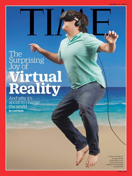
How bad is this cover? Let me count the ways.
The Concept
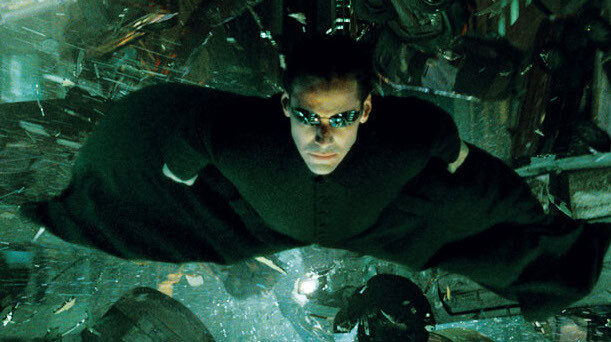
First of all, who is responsible for this concept? "We're going to have the founder of a billion dollar industry wearing his product barefoot, jumping, or floating, or sitting (I have no idea) and then we are going to Photoshop him on the most terrible image of the beach that we can find. We aren't going to match the lighting and we aren't going to add anything like a shadow that would make this look even the slightest bit real." Although the concept itself isn't good, it did have potential. What if he was flying at the camera instead of doing a fairy jump? The Matrix certainly made it look cool.
The Pose
Where do I even begin? This has to be the most awkward pose to ever hit the cover of any magazine. If you were TRYING to look as uncoordinated as possible you would not have been able to recreate a pose like this. I'm honestly not sure if he is jumping or about to sit down or trying to balance on his middle toe. This pose is so bad I would be embarrassed for this to be one of the outtakes from one of my shoots. I would have never let anyone see it, much less send it to the magazine and allow it to be published.
The Styling
What styling? Palmer looks like he showed up planning on being professionally dressed, only to find that he was suppose to dress himself. In every day life, jeans and a polo are totally acceptable, it's just not appropriate for the cover of one of the world's biggest magazines. That pose combined with those clothes are enough to ruin any image but there is so much more to cover.
The Lighting
If you were going to shoot the cover of Time Magazine, I imagine you would go all out on lighting. You would prepare for the shoot by planning out a complex lighting setup so that when your subject arrived, you would create an ultra unique image in only a few minutes. This cover appears to be shot with 2 lights; one high and from the left, one low and to the right. This isn't exactly 45/45 lighting but it's pretty freaking close. It reminds me of the lighting used in 1990's corporate chain photo studios. The size of the lighting and direction of the lighting in now way is realistic when it comes to compositing in that background, but I don't think that was even a consideration.
Check out the amount of thought that should go into lighting a Time Magazine cover.
The Background
Where did they find that shot of the beach? Is this even a photograph or is it a painting? I can't tell from these low res images online. Why does the sand look like smooth brown paper? That background plate is so bad I'm not sure it can be salvaged but luckily, you could go to any stock website ever and have an almost unlimited supply of beach images to choose from. Almost any snapshot of the beach would be better.
The Post Production
The post production on this image is so bad that I won't even joke that an "intern did it." An intern would have added a shadow. An intern would have given the image a "look." This finished cover looks like someone was given a 2 minute lesson on how to cut something out in Photoshop and then given total control of preparing the next Time Magazine cover.
Every aspect of this image is so bad that that someone working with the photographer or the magazine should have said "wait, we can't actually use this." Surprisingly nobody seemed to speak up and now we are left with one of the most embarrassing magazine covers of all time. The internet has responded with it's own edits to the cover image.
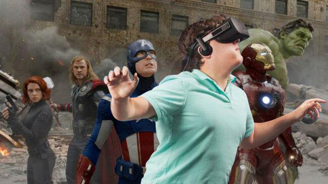

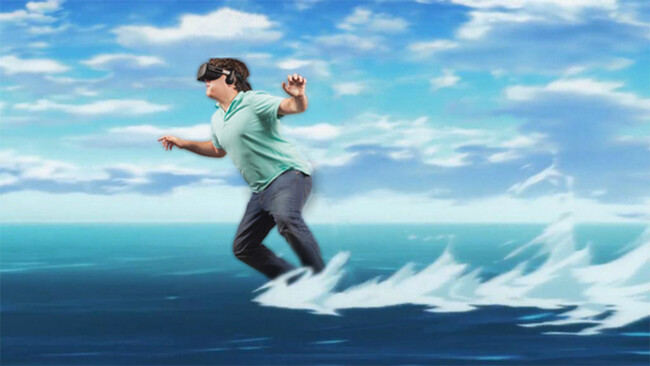


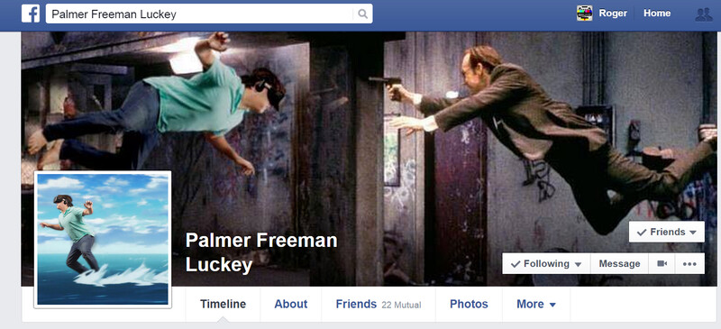
Luckily, Palmer has a great sense of humor. Check out his current Facebook profile which was posted on Reddit a few hours ago. Check out Palmer's Facebook page where all of his friends are uploading tons of these hilarious pictures.
The moral of the story is that no matter how bad at photography we all are, any one of us are capable of shooting the next cover of Time Magazine.


Join the Fstoppers community for free
-
Post comments and join in the discussions
-
Browse the site ad-free
-
Share your work and get featured in the community
-
Compete in the photo contests for fun and prizes
60 Comments
haha, i still can't believe that's a Time cover. I mean, great for your resume, just don't give them the tear sheet lol
Am I the only one who thinks that the whole point of the fake cover is that it's not reality, so they exaggerate that fact?
I agree. I don't think they were trying to make it look like he was actually on the beach. BUT I don't think that excuses every other horrible aspect of this image.
The sand looks fake because it's not real life. He's floating because it's not real life. He's in crappy wardrobe because the idea is that you do this from your living room at 2am on a Sunday.
This is a fair argument for the concept alone but I don't think it excuses such a poor execution. You could have someone floating without looking like an idiot. You could have someone dressed in average clothes without looking sloppy. You could make it obvious the background isn't "real" without looking like something out of the 1980s. I googled "virtual reality" and hundreds of pictures came up that conveyed your vision in a beautiful and compelling way. https://www.google.com/search?q=virtual+reality&rlz=1C1CHFX_enUS570US57…
No I definitely get that, but it seems that the 2 options on either extreme are plausible - one, a gorgeous VR creation; two, an exaggerated concept of how VR never really feels real. I think they went with the latter deliberately, and I think they nailed it.
You feel that they nailed their intended goal but do you think this is a "good" image. Would you be proud of this? Would you allow this to be on the cover of your magazine. I'm not trying to be a dick, I'm actually interested to know if you like this as a cover.
Oh I'm not saying they nailed their 'intended' goal - I'm just saying that it's perfectly plausible that this was their intended goal, that they don't look at it and say "GD that's beautiful!" And yes, if the story I was trying to tell in the image was "VR is here but it still doesn't feel real" then I'd absolutely let it be the cover.
We have games from 2004 in which the beach looks much more realistic and good.
Where in Virtual Reality book do we see that there are no shadows in VR ? :D
The pose... oh man... not even the worst model ever would pose like that, perhaps not even a totally amateur and clueless about portrait photography person would even pose his model like that :D
I've seen totally newbies doing elevation photography for the first time and coming with something way better than this.
Sports Illustrated also showcases lots of similar bad quality stuff the past few years... crooked horizons, the horizon at the beach cutting through a model's neck, non intuitive lighting.
I'd be surprised to find out that the photographer in case got paid for this :D
Again, if this was their goal - an exaggerated fakeness to convey that VR never really feels real - then they nailed it. And it's completely plausible that was their goal.
That's a conflicting point:
They say "something big that will change the world" and at the same time they imply that it feels very fake ?
( in reality by the way, VR with Unreal Engine 4 looks very real-life-like )
Right but does it ever FEEL real? It's the Turing test isn't it?
It will change the world, but VR now is nowhere near as 'real' as it'll be in 10/20/30 years.
If that is actually the concept, and it's a good idea, then it's just poorly executed because the idea needs to be taken further. If he's supposed to be at home, have him in a bathrobe and bunny slippers. If the beach is supposed to be virtual reality, then make it somewhat pixelated and looking distinctly unreal from him (as opposed to just 'slightly' unreal). If he's supposed to be floating/flying/not rooted on the ground, then REALLY take him off the ground plane by having his body in a more horizontal pose and his feet further away from the bottom of the picture plane, as opposed to looking like he might be jumping or balancing because his feet are too close to the bottom of the image, which to the eye begins to read as ground. I think that's the author's point: they could and should have done better, but this just reeks of amateur hour, from photography to design.
You're not, I think they intended the kid to look awkward, the beach to look as fake as possible and clearly not in the same world as the awkward kid. I really like that picture actually, Photoshopped images don't always have to look real, and especially when dealing with virtual stuff. Reminds me of Vanilla Sky and the obviously fake "Monet skies". Or when they break the fourth wall in the movies, they introduce reflexion on the supporting medium. Great picture!
Absolutely it's supposed to look fake!
How timely is this? Just yesterday while waiting in the doctor's office I picked up this issue of Time: http://time.com/3858353/the-great-pot-experiment/ and immediately I was struck by how bad the photoshopping was! So this isn't an isolated incident...
I can't see how bad it is from that image but that cover is a fantastic concept IMO. It immediately grabs your attention and it also tells a complete story.
I guess for the most part he's talking about the bad subject isolation ( masking ), look at the fur just above the right ( as we look at the picture ) leg.
Good concept, but the lighter and joint are sharper than the mouse and the lighter should be in shadow... Smoke around the masthead is well done. Here's a hi rez version.https://timedotcom.files.wordpress.com/2015/05/final-pot-cover.jpg?qual…
Agreed, it's crap. I mean fine, do something tongue-in-cheek if you're going to do a geeky virtual reality cover but make it GOOD.
If a publication like this doesn't value good photography/compositing/etc then you have to ask who does.
Lee, you should reach out to the photographer (Gregg Segal) and ask him to give his 2 cents. There's a lot of variables we don't know about like the AD's input. Maybe this was the exact look they were going for.
I totally agree Eric, I really think this was probably exactly the exaggerated 'fake' reality look they were going for.
I have no problem criticizing a huge publication but I try to stay away from criticizing individual photographers. That's why I didn't mention his name in the article. If he responds publicly I would be happy to post it but the internet is already giving this image such a hard time, I would hate to make his life even more difficult.
This cracks me up. Thanks for posting this.
The 'thing' ("das ding") about Virtual Reality is its 'uncanny valley' property. It's always an /almost/, and sometimes to the point where, when its unreality is succeeded, it becomes disturbing until it sufficiently resembles the lifelike that we are no longer disturbed by it. So I think this was a thematic choice. I mean, he's even floating FFS, so like, hello.
I'd rather not see FStoppers turn into a forum where we just rip other photographers apart. This post is pointless.
I agree with you. We always refrain from attacking individual photographers, that's why I didn't mention anyone's name in this post. That being said, we do try to cover photography news and whether you like it or not, this is big news right now. It's not "pointless" because it's interesting and entertaining (even you clicked on it). It will probably become the most popular post this month. I don't want this website to become the next Gawker but this cover is everywhere right now and it I couldn't overlook it.
I'm not sure why you think that by simply not mentioning his name, that somehow absolves you of your contribution to the negativity of the internet. I didn't click on it because it was entertaining OR interesting. I clicked on it, specifically to come here and voice my displeasure with seeing an article like this on a photography forum. It is one thing for a bunch of cyber bully know-it-alls on Reddit to make fun of something, but that hardly makes it newsworthy. To add insult to injury, your glib suggestion that "because this is crappy, that means I'm good enough to shoot a Time cover" comes off as unprofessional at best, and arrogant and crass at its worst.
It's not just on reddit. This is a massive news story in a number of different channels. The VR industry has been saying this is a step backward for their industry.
this makes me sad
Hmm... I did a VR tour of Mars at the science museum one day. I really hope I didn't look like I was descending on the planet to... how do I put this... use their toilet facilities.
Funny enough, when I think of Time covers, the first thought that pops into my head isn't technically excellent photography.
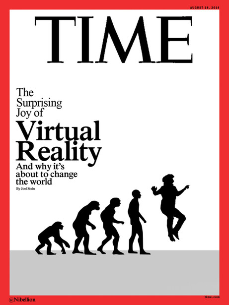
Oh man this is good http://i.imgur.com/fbU7xKZ.gif
We are in the age of shameless viral marketing, putting something ridiculous like this on the cover of Time has done what? Conveyed the message they were going for (virtual reality) and got people talking (even if it's about how bad the cover is) for example this article and all the examples of different versions. That weird pose is something that can be noticed even in silhouette form. It's recognizable. It's marketing. Personally I haven't looked at a Time magazine in I don't know how long, but today I saw it's cover. Why? Because it was bad enough to be talked about, written about and shared. Turning Palmer Luckey's goofy pose into a viral thing, which is the first time for me learning about who created the Oculus Rift.
In my opinion an it's ugly and unprofessional yet a very effective cover.
I totally agree with this but the question is; was that the goal? I certainly don't think so.
I think when it comes to effectively creating something that goes viral part of the objective is to not come across as it being intentional.
If you're right. I hope they eventually reveal that. It would be amazing.
I think an indicator that it's part of a strategy is the fact that Palmer is joining in by using it as his profile and cover pics.
This certainly helps your argument: http://time.com/3987961/virtual-reality-time-magazine-cover-memes/
Exactly, and it's now a viral thing.
People will recognize that awkward image everywhere and if they don't already know who it is they will research to find out so that they are not left out on the joke. Boom effective viral campaign.
for you: https://fstoppers.com/funny/was-planned-time-magazine-shares-memes-bad-…
Perfect.
This is a simple image that gets the job done. The words "Virtual Reality" go well with this image. Love it or hate it Gregg Segal shot the cover of Time magazine and not any one of us.
Was this article about the cover of Time or how this writer/photographer thinks he is better than everyone. Wow, would have thought FStoppers is better than this. it's Ok to give some constructive criticism, but to be a pompous ass is uncalled for.
I think the cover delivers the message well
Side question, how did you score the rights to that sweet music in your website video about yourself?!
https://www.songfreedom.com/artist/329/One%20Republic
thanks man! that is reasonable!
Actually I think this cover is simple and effective. I am so glad it didn't use complex lighting set up and bad ass wordrobe that you suggested. Making the Time cover look like just another photo or poster? No thanks :)
Looking at past "Between The Scenes" of Sports Illustrated feature stories, SI takes their photography seriously.
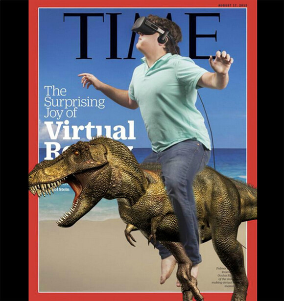
Looking at the Time cover, I have to ask, based on a commercial from years ago, "Is it live, or is it Memorex?" But yea, the memes are funny! Luckey riding a dinosaur is one of the better ones.
Who's to say that this Time cover is real or virtual reality? I saw a recent article on Space.com where we may exist in a virtual universe So, how is one able to tell if the world that we live in is real or if it is just a virtual universe?
PS: Palmer Luckey didn't even make the cover of that bastion of journalistic reporting, Rolling Stone.
https://www.youtube.com/watch?v=fJu6Up9w2Hc