I've always considered Time Magazine to be a pretty high quality publication. Getting your photograph featured on the cover would be a lifetime accomplishment for most photographers. That's why the current cover with Oculus Rift inventor Palmer Luckey is particularly shocking.
This cover is so bad that I have found myself feeling a bit conflicted about it. On one hand it's sad. I feel sad for Palmer, who, at 22 years old, has created a product that will one day change the world and was fortunate enough to make the cover of one of the most coveted magazines in the world only to have it become a massive joke. I feel sad for the photography industry that a magazine as legitimate as Time cares so little about photography that it would allow this to be published. But at the same time I feel inspired. If this image can make the cover of Time magazine, anything is possible. I never considered myself good enough to shoot for Time magazine but now I can say with 100% confidence that I am overqualified to shoot for Time Magazine.

How bad is this cover? Let me count the ways.
The Concept
First of all, who is responsible for this concept? "We're going to have the founder of a billion dollar industry wearing his product barefoot, jumping, or floating, or sitting (I have no idea) and then we are going to Photoshop him on the most terrible image of the beach that we can find. We aren't going to match the lighting and we aren't going to add anything like a shadow that would make this look even the slightest bit real." Although the concept itself isn't good, it did have potential. What if he was flying at the camera instead of doing a fairy jump? The Matrix certainly made it look cool.

The Pose
Where do I even begin? This has to be the most awkward pose to ever hit the cover of any magazine. If you were TRYING to look as uncoordinated as possible you would not have been able to recreate a pose like this. I'm honestly not sure if he is jumping or about to sit down or trying to balance on his middle toe. This pose is so bad I would be embarrassed for this to be one of the outtakes from one of my shoots. I would have never let anyone see it, much less send it to the magazine and allow it to be published.
The Styling
What styling? Palmer looks like he showed up planning on being professionally dressed, only to find that he was suppose to dress himself. In every day life, jeans and a polo are totally acceptable, it's just not appropriate for the cover of one of the world's biggest magazines. That pose combined with those clothes are enough to ruin any image but there is so much more to cover.
The Lighting
If you were going to shoot the cover of Time Magazine, I imagine you would go all out on lighting. You would prepare for the shoot by planning out a complex lighting setup so that when your subject arrived, you would create an ultra unique image in only a few minutes. This cover appears to be shot with 2 lights; one high and from the left, one low and to the right. This isn't exactly 45/45 lighting but it's pretty freaking close. It reminds me of the lighting used in 1990's corporate chain photo studios. The size of the lighting and direction of the lighting in now way is realistic when it comes to compositing in that background, but I don't think that was even a consideration.
Check out the amount of thought that should go into lighting a Time Magazine cover.
The Background
Where did they find that shot of the beach? Is this even a photograph or is it a painting? I can't tell from these low res images online. Why does the sand look like smooth brown paper? That background plate is so bad I'm not sure it can be salvaged but luckily, you could go to any stock website ever and have an almost unlimited supply of beach images to choose from. Almost any snapshot of the beach would be better.
The Post Production
The post production on this image is so bad that I won't even joke that an "intern did it." An intern would have added a shadow. An intern would have given the image a "look." This finished cover looks like someone was given a 2 minute lesson on how to cut something out in Photoshop and then given total control of preparing the next Time Magazine cover.
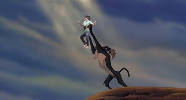
Every aspect of this image is so bad that that someone working with the photographer or the magazine should have said "wait, we can't actually use this." Surprisingly nobody seemed to speak up and now we are left with one of the most embarrassing magazine covers of all time. The internet has responded with it's own edits to the cover image.


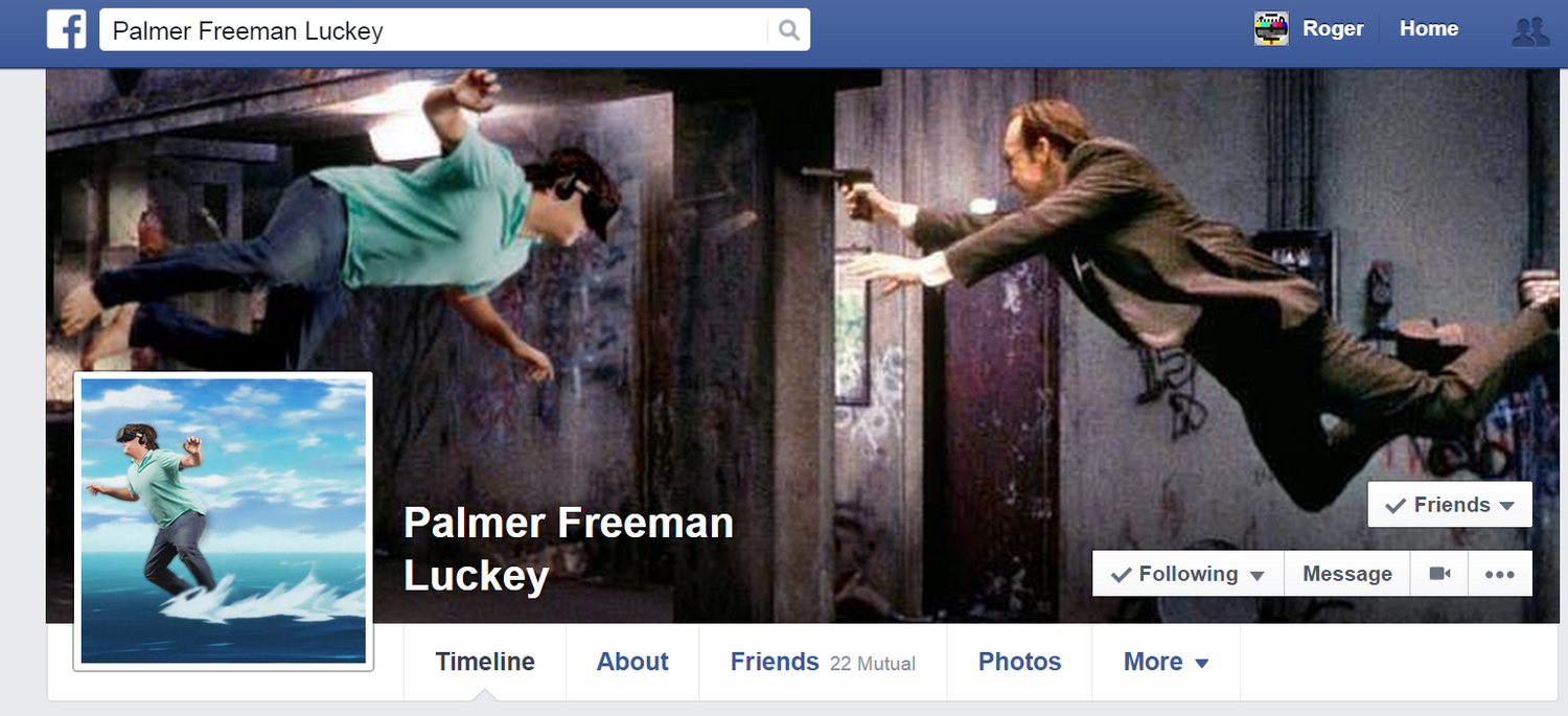
Luckily, Palmer has a great sense of humor. Check out his current Facebook profile which was posted on Reddit a few hours ago. Check out Palmer's Facebook page where all of his friends are uploading tons of these hilarious pictures.

The moral of the story is that no matter how bad at photography we all are, any one of us are capable of shooting the next cover of Time Magazine.


I also find it inspiring but for a different reason. Some of the comments indicate that there are people who are able to look beyond purely technical considerations to analyze the complete package of potential meanings in relation to the final product. I find this quite rare among photographic professionals. The interesting derivative (can't really call it imitative) work is a bonus.
For what it's worth, the photographer made a statement on his FB profile defending the picture. It seems he's (at least partly) misunderstood the criticism as being directed at Palmer's body as opposed to the aesthetic and message of the image. He also mentions that the beach is a scenic painting he brought to the Facebook office specifically for the shoot, so there's that...
https://www.facebook.com/GreggSegalPhotography/posts/1161307697229237:0
IMO the objective of the photoshoot and concept were well captured. It would be very boring to have a realistic scene like the ones we see on movie posters. Instead of trying hard to throw in all kinds of effects to make it a reality this photo simply tells the story really well - an ordinary boy is enjoying himself in the VR world. A lot of people are too technically oriented and get distracted from the main point of photography. Besides, this is not a photography magazine after all.
No one's arguing it should look "realistic" - just that it should look good. Your qualifier that Time "is not a photography magazine" doesn't do much to strengthen your point. Also, Palmer is far from an "ordinary boy" - he's a millionaire visionary of a potentially world changing technology, and yet, there he is on the cover of a high profile magazine in an image that looks more like a satirical jab at the VR trend than an illuminating glimpse into it. Again, the point isn't that the picture needs "more effects" (whatever that means...) it's that it needs to look good.
IMO in photography you don't need hero portrait to make things interesting. Whoever with the vision can also nail the shot with other styles that are just as good if not better. Palmer is an ordinary boy. He doesn't need to dress in leather jacket to look like someone else to be cool enough. His identity links closely to the pair of VR glasses he's wearing. Simplicity sores full mark in this editorial pic. A lot of people will get it and like it. Unfortunately, not every photographer thinks the same. I can understand why people want to pull off a complicated lighting step up in order to remind themselves as photographers.
I wonder if other photographers are missing the point because they are judging the form but missing the message?
When I saw this edition of Time sitting on our entry table it grabbed my attention, I chuckled, and it was thought provoking.
To me the picture communicates the optimistic dream of virtual reality; of being able to transport yourself to a desirable location, such as an idealistic beach. Which explains the cheesy stereotypical image of a beach.
But the promise of virtual reality must also must confront the awkward detachment from one's reality. He takes off his shoes in an attempt to make the virtual reality experience more immersive. In the virtual world he is wading out into the warm waves, but in reality he looks like a goofball.
Ultimately, virtual reality is something akin to awkwardly photoshopping your self into another location. Which is exactly what the cover conveys.
The fact that the cover begs to be remixed by photoshopping his body into other scenes is viral icing on the cake, which is completely and brilliantly consistent with the original message.
According to PetaPixel the photographer had Luckey jump in front of a large mural of the beach at Facebook HQ. So if that's correct it may actually not be a composite at all.
http://petapixel.com/2015/08/07/everyone-is-mocking-times-latest-cover-p...
Did anyone mention anything about the fact that it looks like he's got chewing tobacco in his cheeks?
Hey guys, I really think this FS article has missed the point of the photograph, focusing entirely on technical aspects of it, explained best by Jerry Friedman in the comments, <3 <3
And I have a feeling that the cover photo was thoroughly conceptualized. It goes against most of the trends in commercial photography these days, doesnt't it? Maybe it's even radical? How many of us, if given the same task, would make something like this? Don't know for you, but probably I could never come up with something like that. 99% of work that I see (including mine) are respecting some kind of aesthetic boundaries. This photograph goes beyond that boundaries. It doesn't have to be like Anne Leibovitz to be valuable and good (not pretty but good).
Please share with us if you find some kind of explanation / concept by the photographer :) it definitely will be interesting.
This is too funny, this issue is sitting a few feet from me right now. It's just so awkward.