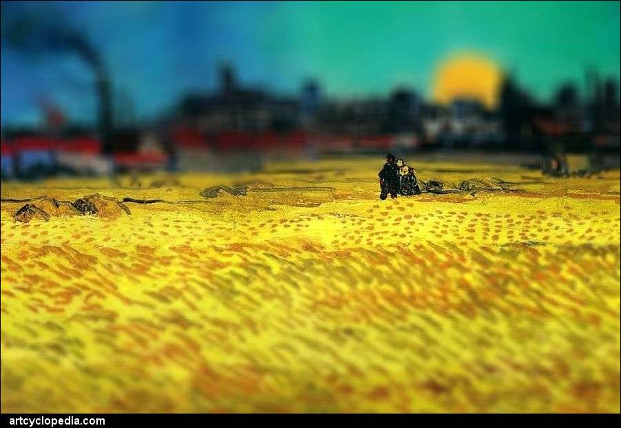
For those who are only familiar with "tilt-shift" as a filter setting on Instagram, tilt-shift refers to the physical tilt and/or shift of the lens plane that can create some dramatic selective focusing. Taking into account the Scheimpflug principle, tilting and shifting the lens plane can dramatically change the depth of field forcing a change of size and perspective in an image. Serena Malyon, a third-year art student applied a Photoshop replication of this technique to some of Vincent Van Gogh's most famous works.
The ability to tilt and shift lenses has been around since the dawn of photography. Adopted to smaller format photography in the 60s, Nikon was the first to create a consumer-based product to allow the freedom of both tilt and shift. Today, a selectively placed lens blur layer in Photoshop can achieve very similar effects at a lower price tag.


The results are mesmerizing. Adding a shallow depth of field creates a tiny world of dramatic color and texture. Simply applying the tilt portion of the technique can drastically change an image. Adding a third dimension to famous two-dimensional art adds a new layer of emotion to already amazing works.
Selectively tilting or shifting an image can add some truly amazing effects. Mike Kelley often praises the tilting principles of this lens and technique for its assistance in architectural photography. "At least 90 percent of my images are shot with a tilt-shift," claims Kelley. The shift of the lens plane can allow a photographer to keep structural lines as intended, thus accurately depicting important architectural geometry. Just utilizing the tilt aspect of the lens has its own singular benefits as well.


[via Artcyclopedia]


Not sure why this is called "tilt-shift". Looks like regular DOF effect.
Looks cool nonetheless.
Agreed, tilt + shift can't increase DOF, just change the angle of the plane. So it would never be possible to make something like some examples here where a mountain is in focus and what's behind it isn't. That's only possible by using wider aperture, being closer to the subject or using longer focal length. Scheimpflug principle doesn't apply here.
For instance take this picture shot with a real tilt+shift lens: http://www.pbase.com/image/68094777
See that the lightpole is out of focus on the top, whereas if DOF were to be increased, the pole would have to remain in focus and only the building in the background out of focus.
Whenever you mask objects before lens blur, you are not talking about tilt+shift effect anymore.
I think the reason this is Tilt Shift and not just a wide aperture is because while these images are 2D and flat, the impression they give is a wide angle with super shallow DOF. That effect can't be created with a wide angle unless you do the Brenizer effect. Shooting at say 24mm-35mm at 1.2 will not give you the look that these paintings have.
tilt shift also won't. it will blur both bottom and top of the subject, no matter its relative distance.
This is absolutely the height of stupidity and horrific taste. It's like some bonehead taking an Ansel Adams image and changing the DOF that the artist had intended. Imagine somebody doing that to even one of your images.What a pretentious thing to do. "Yeah, Imma make that Van Gogh PIC better yo!!