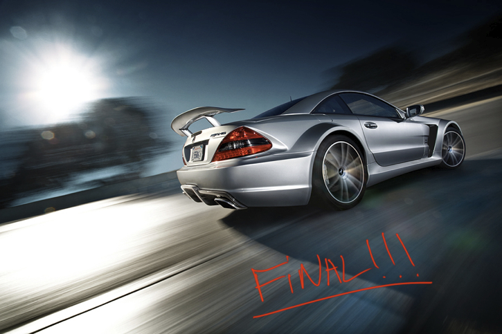
Have you ever been going through the magazine rack of your local book store and just stood staring at the cover of a car magazine? No? Ok, well maybe that's just me. But when I see a photo of a blazingly fast sports car clinging to the corner of a race track it certainly piques my interest. Even if you aren't a "car person" chances are you have at least wondered how these cover shots are made. Well there is a secret that all car shooters know that you may not. Automobile photographer Scott Dukes joins us to dissect one of his images for "0-60 Magazine", while also letting us in on the tricks of the trade.
So the car above is clearly traveling at 80mph right? Maybe more. I mean the background is heavily blurred and the wheels are clearly fighting for traction and struggling to stay on the track. The driver must be a pro because surely Mercedes wouldn't trust a few random assistants to maneuver an SL65 AMG Black Series around a corner at speeds like this. The photographer? Well I assume he is hanging out the window of another car driving just behind the Mercedes shooting pictures while praying he doesn't fall to his death.
As amazing as that all sounds, it couldn't be further from the truth. I recently caught up with Los Angeles-based car shooter Scott Dukes to ask him how he has managed to escape death so many times while hanging out of speeding cars.
As it turns out there are no speeding cars; quite the opposite actually. The car in the above shot was probably traveling around 3-5mph…while in Neutral.
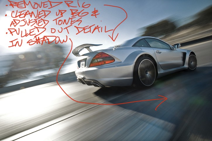
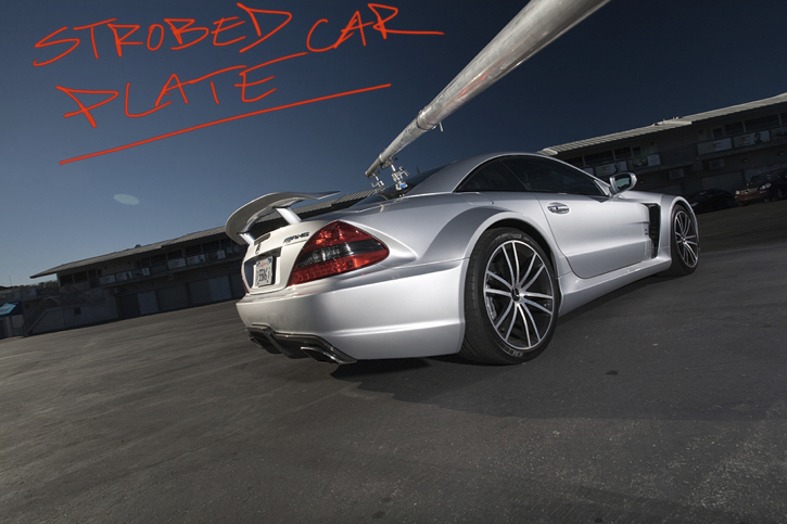
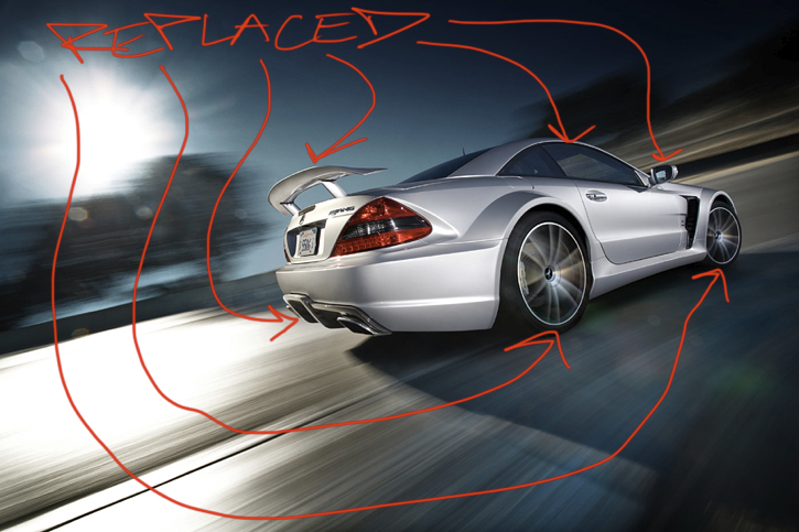
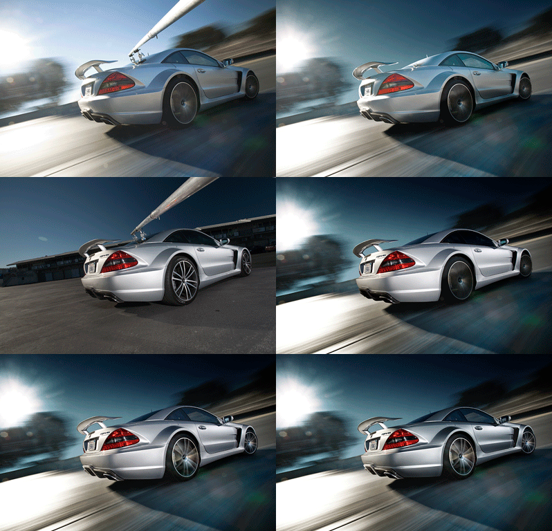
That's right, no tire squealing burnouts required...bummer! A combination of the car being pushed in Neutral and the camera using a long shutter speed causes the background to blur. More importantly, an apparatus known as a "rig" is used to attach the camera to the car. Essentially, think of the rig as a huge boom arm that is attached to the car at one end, and has a camera dangling off it at the other end. Therefore the camera is traveling at the exact same speed as the car. This allows it to capture a sharp shot of the car while turning the background to mush. The on track portion of the shoot is only the beginning for an image like this. There is also a series of photos taken when the car is completely stationary. These shots are lit by multiple strobes and later composited over the "on track" car's various parts. Making for a perfectly lit "high speed" car image.
Scott was nice enough to share his image build up for this very shot. He also wrote some notes on each image explaining the steps he took while in Photoshop.






Scott has shot for numerous automobile magazines including "Rides", "0-60", "Automobile Magazine" and "Super Street Magazine". To view more of Scott's work be sure to visit his website. Also, if you are interested in more b.t.s. shots and image builds like the one above be sure to visit Scott's blog. For you social media types you can locate Scott via the following sites: Facebook, Twitter and Instagram: @scottdukes



That is awesome! Well done Nick, I know tons of people want to know how these are done. Thanks for writing that up.
Great stuff. Basically a Photoshop tutorial. :)
I am entirely sick of rig shots, as I feel they have been done to death and don't really portray the car that well, but this is a fresh take and very interesting. I also appreciated the fact that he removed the distortion. Nice stuff!
Great overview, thanks. I'm starting to get into shooting moving cars, and now I know a bit of the magic behind those shots.
This makes me wanna shot cars! Looks almost more fun than driving them! Not that I have one of those...
/ <a href="http://zayaphotography.com/" rel="nofollow">Carlos Zaya Photography</a>
These simple little image run-throughs are far better than 99% of the videos that people put out these days.
Clean up the skin, thin the face, raise the cheeks, enlarge the lips... Car "shots" like this are just as fake as the "shops" in beauty mags.
How disappointing.
Huh? The only "thinning" done was to correct for the distorted perspective of the lens (which is only necessary because the length of the rig needed to use a lens that would more accurately represent the proportions of the car would be unusably unstable and unwieldy). Everything else was just tweaking the lighting. That's nothing like changing the entire shape and skin tones of a model.
It's a composite of two shots of the same car, each lit differently. But both are straightforward captures of the car. The contrast is tweaked on a local level and then the rear of the car gets "pinched" to correct the misleading proportions already mentioned.
Why the hate? If you think this is the same as the B.S. in "beauty mags" (most every magazine involving portraits, actually) then you completely missed what happened.
That's a cool image. What I find uncool is that it's extra synthetic. It's extra misleading. As Nick writes in the article, this car must be going 80 plus, right? But no, it was actually shot at a blazing 3-5mph in neutral. Misleading. Lighting the car whilst travelling at light-speed must have been really difficult to pull off. Nope, the lighting comes from a second shot made in a controlled environment while it was in park. Misleading. Also look at all the details he altered; he replaced the wheels for crying out loud.
I understand that all photographs are staged to some degree, that photographers lie to some degree using framing and timing, and that tones are balanced. There's room for manipulation. That being said, I believe a distinction should be made when manipulation goes to this level. To me, more photoshop skills were involved in producing this image than photographic.
Disappointing.
That makes far more sense than your earlier comparison to the glamour shots. Still, I don't understand what is so misleading about accomplishing a shot that looks like the car is going 80mph while accomplishing it at a safer speed for the production? And the point of the shot isn't to impress the viewer with the lighting; only photo-geeks like those of us who subscribe to blogs like this even notice the lighting. You aren't the target viewer. The point is to showcase the vehicle, which is accomplished by blending an ultra-sharp still shot that is light by strobes with another shot showing movement. Plus a little distortion correction to compensate for the production techniques and keep the presentation as accurate for the viewer with respect to the actual subject as possible.
Again, we're talking about the blending (compositing) of two actual PHOTOGRAPHS. (Not trying to shout, I'm just not aware of a way to italicize in this system.) With the kind of retouching to which you related it earlier, the issue is artistic interpretation and even wholesale fabrication or elimination of the captured photographic information, to the extent that the final result is often only vaguely reminiscent of the original.
Here we have an effective presentation in a single printed image that accomplishes the feel that would otherwise (without the editing you dislike) require video to convey.
I think he nailed what appears to have been the creative goal of the production, and with only basic compositing (which, for the record, could have been accomplished in the darkroom by a master printer, other than the selective distortion correction AFAIK), which is an entirely different skill set than retouching.
So again, I ask: What is it that is misleading? No claim as to how the image was created is made in its presentation to viewers. The only claim it makes is the emotion it evokes, and that is completely authentic with the techniques we've seen applied here.
Incidentally, there is one element that is inaccurate. He blended the wheels from the shot with movement and the shot with strobes. But he did so evenly across the entire wheels. That effect would only be achieved (and not precisely as shown, but close enough) if the wheels were spinning in place, such as while burning out from a dead stop or while the car is up on a lift. While actually moving down the road the bottom part of the wheel isn't moving. Any given point on the circumference of the wheel moves in a pattern like the McDonald's arches repeated over and over. It moves up then forward then down then stops ever so briefly before moving up again for another arch.
There is a famous photograph of train wheels that was captured in the 1800s that proved this concept which was well known by scientists but largely disbelieved by the general public because they couldn't see or conceptualize it. I can't seem to find the right keywords to search to locate the image right now, and it's difficult to capture because you have to have the perfect shutter speed to match the speed of the vehicle, so it's rarely done by accident. For now this illustration will have to suffice:
http://www.triumphofmind.net/2011/05/relative-motion-or-what-part-of-tra...
So the bottom of the wheels should be clearer (showing less motion blur) than the tops, if not completely sharp. So, yes, in one sense this image is misleading. But in the ones that are relevant to honest advertising I think it succeeds beautifully. Besides, most consumers would probably be confused if the wheels didn't show the same blur pattern as a Ferris Wheel. :-D
actually that's only true if the camera's reference frame is stationary. In this shot, because the camera's reference frame is the same as the car's the wheels would blur in a circular pattern.
Oh, swing and a miss! ;)
The issue here is the way the different parts of the wheel move with respect to the rest of the car, or more specifically the axle.
A Ferris Wheel blurs in a radial pattern because the axle is not in motion. But the axle of the car is. The top of the wheel is moving at twice the rate of the axle. The bottom of the wheel is stopped. Everything in between is at some point between those two speeds (with 3:00 and 9:00 positions moving at the same rate as the axle).
I'm really tempted to hook up my rig and do a series of shots specifically to demonstrate this, but I really don't have time for that. But the fact is that regardless of the location of the camera the top of the wheel is moving faster than the axle while the bottom of the wheel is stationary (though only for a brief moment). At "3-5 mph in neutral" this would feel like a longer moment than at 80 mph, but in fact the duration doesn't change, we are simply able to perceive more precise divisions of the circumference of the wheel. (Like the difference between a wheel with 6 spokes (or I guess spoke-pairs? as this wheel has) vs a bicycle wheel with dozens.)
Frame of reference is very important in physics, as you are right to point out. But here the frame of reference is the circumference of the wheel relative to the axle, not to the camera. The location and vector of the camera have no impact on the relationship between the circumference of the wheel and its axle. But it does seem like it would affect the ideal shutter speed at which to capture that effect.
Yeah, I'm definitely going to need to hook this up. :)
Crap, I just thought through this some more and now I'm thinking you're right. Gotta love thought experiments! Time for some real ones. :)
I think you've hit up on the key: is the axle moving. With the camera mounted to the car the axle is stationary in the camera's frame. So you'll have circular blur.
Well, welcome in the world we're living in. The advertising has reached a point (long time ago) where the product must impress (or even shock) regardless of how it look in reality. No one seem to be interested in the reality anymore. No one buys the reality. Consumers like to be lied and mislead.
I like nice processed photos, but I think a product must be advertised as it looks and behaves in reality, not in ultra-special-particular conditions and ultra-processed. I buy a real product, not lies about that product.
All bow down to Scott Dukes!
What do you call these so called booms and where can one acquire such equipment, kind sir?
There are lot's of ways of making rigs and I'm sure Scott could give more details but here is a good tutorial: http://diyphotography.net/take-cool-car-photos-with-a-diy-specialized-ca...
Pretty much all of them involve a couple of Manfrotto suction cups and c-clamps on the car end and a Manfrotto magic arm at the camera end. Plus the aluminium pole etc. Hope that helps. Tons of stuff on Google too if you simply search "car rig".
Thank you for your awesomeness.
I use the Harbor Freight double-suction cups. Two of them on the car with doubled-up superclamps (one to grip the suction cup handle and one to grip the pole, which can be doubled-up/nested electrical conduit for strength an rigidity). In my testing with an already broken camera body and deliberately releasing one of the suction cups from each set it's still enough to hold it safely. But it's best to still use safety wire as a backup, unless the cost of fixing the paint job on the car would exceed the cost of replacing the camera...
http://www.harborfreight.com/dual-cup-suction-lifter-46134.html
The one I have is a darker orange, but I believe this is the same thing. It's designed for installing windshields. Holding your camera onto a car is tremendously easy by comparison.
They're also great for pulling dents out of body panels. I used one to pull a 30" dent out of the roof of my sister's car after the weight of snow from a series of heavy snowstorms collapsed it. They're great to have around. I also use them to stick to windows and then superclamp a flash to it when lightstands and other methods aren't practical. I have two of these double ones and several sizes of single ones. Couple bucks each. :)
Cool. Thanks.
Who said a photograph never lies?
Yeah you can do it this way but I still shoot hanging out of another car going 120km/h, comes out not as good but more fun and I have Toyota as a client.. In saying that, this is cleaner, more controllable and safer. Thanks for the pointers :) www.juanmon.com
well if you have enough patience...go ahead and read thoose 450+ pages
http://photography-on-the.net/forum/showthread.php?t=490505
very instructive
Whoever mentioned tech geeks wasn't kidding. I had a headache by the time I slogged through the first dozen comments. To the critics: This shooter is obviously working. Are you? You might want to consider focusing more on what you can learn from the article, and how you can apply it to making a living as a pro.
I have found that those who spend most of their time nitpicking others have generally accomplished the least.