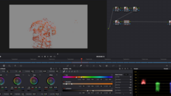
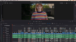
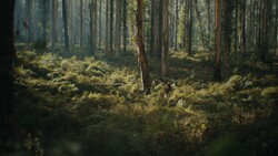
The current trend for color grading videos is the orange and teal look. It’s not rocket science to understand why it works so well and why everyone uses it. Complementary colors are an easy choice when it comes to color grading and using orange for brighter tones allows keeping the skin tones look quite natural. In this nine-minute-long tutorial, Theo from MiesnerMedia shows us how we can achieve that trendy look using DaVinci Resolve 14.
In the tutorial above you’ll discover two examples in which Theo explains how to get the famous orange and teal look. It’s not complicated, and even if you don’t know much about DaVinci Resolve you should be able to follow and get the same result on your sequences. He mainly relies on Qualifiers to create luminosity masks and then the White Balance sliders to adjust the color. He explains that he prefers to rely on the White Balance tool rather than the Color Wheels as the first seems to keep the black and white points more intact. However, if you feel like the Color Wheels make more sense to you, be sure to give it a go and play around with them. The use of the Qualifier, however, is an excellent idea as it will let you pick exactly the part of your clip where you want to apply the color settings.
For more DaVinci Resolve and color grading tutorials, be sure to follow MiesnerMedia on YouTube.


Join the Fstoppers community for free
-
Post comments and join in the discussions
-
Browse the site ad-free
-
Share your work and get featured in the community
-
Compete in the photo contests for fun and prizes
No comments yet