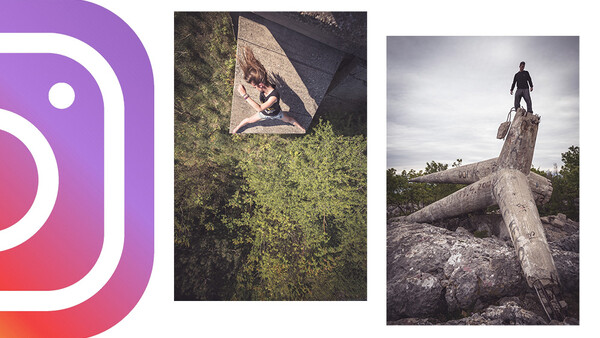
You might have spotted the latest trend on Instagram for making carousel posts more exciting. They've always been a good way to present a body of images and this funky new template now makes carousels more engaging to viewers and also makes your images look rather smart, too.
I’ve rarely used Instagram’s carousel option over the years but this approach feels like a fun way to present images in a manner that’s eye-catching and allows you to stand out from the crowd (for now, at least). As outlined over at Booooooom.com, the Photoshop template takes a few minutes to put together and it’s simply a matter of dropping in a mixture of images into a new file and reshuffling them creatively in a way that makes people want to swipe through your work.
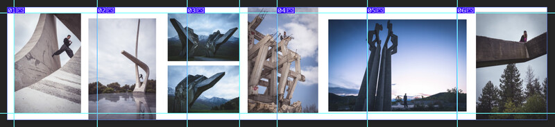
Very simply, create an image that measures 6480 x 1350 pixels, and then use the slice tool to divide it up into segments that are 1080 in width. Then 'Save for Web' and export 6 (or more) individual JPEGs, ready for uploading to Instagram.
Presenting 3:2 portrait images on Instagram typically means cropping to a 4:5 ratio. By contrast, this carousel trick really lends itself to 3:2 images, allowing you to create pleasing layouts that work really well on tablets and mobile devices.
White borders around the individual images seems to work particularly well, creating a pleasing sense of negative space.
Creating the template involves using slice tool, a part of Photoshop that I’ve never even encountered before, never mind found a use for it. Please note that if you’re using Photoshop CC 2019, the Save for Web (File > Export > Save for Web) function operates slightly differently to some previous versions, requiring you to set the output for each individual slice. This isn’t immediately obvious but you need to zoom out from the preview and/or hold spacebar to drag the image around, click each slice individually.
Be sure to post your results in the comments below.


21 Comments
That's a pretty neat idea. There are apps out there that will slice for you. Mainly used to post a panoramic but could work with this. Just don't know if you can set the slice size.
Am i the only one that feels this is more annoying than eye catching, and enjoyable? If I was following someone who did this regularly I'd unfollow pretty damn quick. Too much effort just to see some cool pics on a tiny screen
I agree. I looked at this post on my phone and find it annoying to have to keep my finger on the screen to be able to see the whole image at one time. If I take my finger off it I see half of one image and half of another.
I don't understand, is the idea to make it harder to see your whole image, destroying any composition.
The idea is to tease them with a bit of the next image, encouraging them to continue to click through. It's an immediate and obvious cue that there's more to see where not having that little bit might otherwise cause people to miss this.
The only think that I'm not really fond of is that I feel like it should be done in a manner where the click through will show the next image in full rather than slicing the image into two separate pieces. In essence, you should add a bit of redundancy so that you're not cutting certain images. It won't look as smooth, of course, but unless you're in the habit of framing things to be deliberately cut off, you're probably messing up your presentation a bit.
Latest trend? It seems you were frozen in 2012 or something :)
Considering carousel wasn't introduced until 2015 (and even then, only in square format), I'd say the author is not so far off the mark. :)
feels like ages though.
Hmm, just about works for that post but can't see it working in many other situations.
I really don't see the point in doing this with your photos. When I first saw it I thought it was done by mistake. The images are chopped into pieces and your composition is gone.
For me, it's a nice way of presenting a body of work, especially one that's already been published as individual images. I've had much higher engagement on these images than the vast majority of my other posts so it certainly seems worthwhile.
Not well executed, the teaser image should be repeated in full on next "page".
Thanks for the (unnecessarily brutal) suggestion. I've had really good engagement on this layout so I think I'll stick with it. Perhaps you can try the teaser method and see how it works for you?
If it worked for you, great! I actually kind of like how the next image is "teased". It immediately draws the viewers attention and says " hey look here, theres more!". Whereas when you use carousel the way it was originally intended, most people tend to not even scroll past the first image, because, well, they dont always realize there is more. We dont always notice the "1∕3" overlay.
I had no intention to sound rude.
This is a different idea. I like it!
Yeah, I like it. Most comments here are negative, but I've had dramatically more likes on these two posts compared to my regular posts.
The level of sheer negativity and whining on these comments is pretty ridiculous. Not just this article, but throughout all of Fstopper's articles. Just keep in mind those who actually do enjoy the articles often remain silent, and are just appreciating the content.
There's always a few who feel the need to rant about whatever minor thing they disagree with, or to show how smart they are by contradicting whatever little thing.
That being said, carry on with the great work and bring us even more content :)
Yup. And thank you! :)
I didn't even know it's called carousel. :D
I'm not sure what the problem is, but the images are not working well for me. They are getting cut in the middle so you don't see a full photo at once, I'll see half on one slide and half on another. That can't be correct.