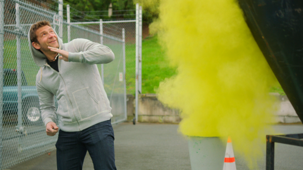
I woke up this morning to find an email from Chase Jarvis's camp showcasing his new photo campaign for the Samsung 9 Series Monitors. It feels like ages since Chase has released one of his epic behind the scenes videos, so I was excited to see he's still alive and kicking the creative cloud (pun intended). If your imaginative juices don't start flowing after watching this video then it might be time to put your camera into retirement. Check out the behind the scenes video and then head over to Chase Jarvis's blog to see the entire setup, test shots, explosions, and a ridiculous Go Pro bullet time setup.
A few Behind the Scenes images:


Check out Chase's full blog post where he explains exactly how he dreamt up this shoot.


Another great BTS, I would love a studio like that, with a built in trampoline, just epic, not sure on the final result, especially the goggles & expression.
Louis it's not his usual studio, think they rented it for the occasion. Besides Samsung paid for everything :) Agree with you on the expression, could've been better. But then Chase is not a professional model
Great content from Chase as always. I love my Samsung SSD, but this monitor is sRGB, not full Adobe RGB. I had to dig around 5 different websites to find that out. So, you're better off with the latest Dell if you're going to spend that much money.
I was thinking about same thing, glossy screen and no information on website about color accuracy, definitely not a professional monitor.
Great monitor for not so big money, Asus Pro art series 24"
Great colors, great color accuracy, almost full adobe RGB.
Btw. Chase shooting was great, really great :)
Great concept and I normally love Chase's work.
But just not digging the final product on this one
I love that Chase can take his vision and get you hooked into the story from the inside out. Add in his ability to bring professional eye candy and production value, it's a win win.
http://www.fridayweddingphotography.com/
I almost always love his work. If that's the final piece it looks really Photoshopped. What's with all the weird shadow casts on the clouds? You might actually even have been able to do a better job with the source images. I'd probably be more sold on the shot IF the whole studio setup was shown and not just clouds. There is not sense of space.
Nailed it, it does look shopped in he final image, each color cloud looks layered in with the black outlining, the shots in the video looked better from what I could make out.
Aren't they showing the shopped elements in the behind the scenes video? It's a commercial image, of course it's shopped
Aren't images from your dreams 'shopped' especially the dreams where you hook up with that girl from the supermarket.
I love the whole idea and how the execution began, but I think they totally blew it composing the whole image in photoshop (which actually we can see in the quick part of the BTS), I think they did too much production to end up spoiling it with post production...
The whole set up for this sort of final photo?
I agree with a few people on here. If you go to his blog and check out the BTS photos you can see the raw clips in photoshop. They look miles better than the final product in my opinion. You can see the canons and how its done - which I think adds to it. Plus it doesn't look so photoshopped on those as well! Cool idea nonetheless. Like it.
what a mess
The final image is horrible, the masking of the added clouds and the overall retouch on the clouds look like it's made by someone that opened Photoshop for the first time to be honest. But I guess you get away with anything if you're already famous..