
In March, I did a post that was critical of Adobe applications of late: lots of bugs, sometimes unintelligible offshore customer support, and their Creative Cloud menu bar app (on Mac OS) that seemed more a marketing device than a useful way to know about Adobe updates (on Windows, the Creative cloud app is launched from the Task Bar).
In April, I did another post, quoting Adobe's Mark Little, who said there would be a lot of improvements and to watch for a new Creative Cloud app.
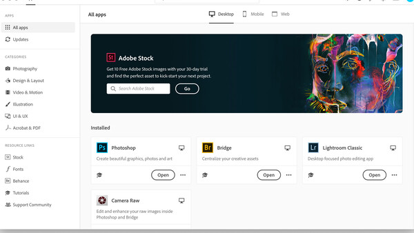
Well, we got the new app, and it seems a step backwards. Instead of a small dropdown window, it's now full screen. And just like the previous version, which Adobe admitted people didn't like, the new one has a main page hawking Adobe Stock photos. Or Illustrator. Or fonts. And so on. It's just more marketing, when all most people want to know is about recent updates to the apps they use. Worse, if you click on one of the many needless categories in the now huge window, you often get moved to your browser, even though it is pretty clear that this new Adobe "service" is a browser window already.
When I was involved in software design, the first rule was "do not irritate the customer." The second rule was "updates must offer improvements" to justify their existence. Either a better design, bug fixes, or both.
I really don't need a full page covering my screen when I just want to learn what the changes are in a new Adobe update.
To add even more aggravation, on more than one occasion, this "improved" app told me my Photoshop was updated three days after I was already alerted to the update. I could have lived without the interruption. I've seen Adobe use their alert system to market things to me. Please don't do that.
I'm wondering why Adobe just doesn't alert you to updates when you launch an app that needs one? Why the need for a full screen window that seems dedicated to tutorials and marketing as much as anything else?
One positive: If you checked software updates, the window will remember that's where you were the next time you check, but it's still galling that most of this app is dedicated to selling you something. And you can avoid going to the updater window at all if you are set to auto update, but you'll still get notifications that will make you want to open that window.
I really fear Adobe is just getting sloppy, arrogant, or both. Mac users who moved to Catalina were faced with weeks waiting for Adobe to fix the simple act of saving files in the proper format. I'm sure Adobe had the Catalina betas. No other photo app I use (and I use a lot) had trouble getting files to save under Catalina.
If you add to this the troubling security problems at Adobe we recently reported on, it all seems pretty messy.
Adobe controls the market, and they have earned their popular status through hard work and good products for many years. However, competitors are cropping up and gaining more and more traction. And all I've seen have simpler, far less intrusive updating methods.
I'm not the only one unhappy with these issues of late, and I've seen a lot of complaints about the Creative Cloud app for years. This change to full screen and relentless marketing is not likely to please the masses either.
Adobe: Minimalism would be a good thing. Not a full-screen, 800-pound gorilla taking up my workspace. Find another way to market your stuff to me. Please.


Join the Fstoppers community for free
-
Post comments and join in the discussions
-
Browse the site ad-free
-
Share your work and get featured in the community
-
Compete in the photo contests for fun and prizes
20 Comments
Does leaving 7.5 million Creative Cloud user records exposed online count as an improvement? Probably not, although they did something similar a few years ago. But when greed is the only thing that motivates the business, I guess that's to be expected.
Many companies have chat support, using off the shelf tools and libraries to build a chat system. Adobe saw fit to write their own inscrutable version of a non-working chat system. I can deal with unintelligible support. But unintelligent support? No excuse.
I’ve asked for an update to the LR curves dialogue since it was introduced. Nothing radical, just handles to grab at the white and black points, I still love working in curves, why can’t it be be simple? Instead we are constantly trying to grab the fiddly point of the curve to drag it forward. They don’t give a rat’s ass what we want. Adobe just wants our money. I did call to complain about the the updated app, sadly I couldn’t understand what the guy tried to convey. Asking to roll back to the old version, he started to talk and we were cut off.
They have no financial reason to add value. Time to leave.
Anyone know how steep the learning curve is if you switch to Affinity?
Not very. Download the trial version and play with is for a few days - most of the common things are almost identical to Photoshop but there are differences and some missing "features".
Personally, I found Affinity Photo easier to use for the things that I do (I'm not a professional)
I'm not a pro either, so that sounds fine.
I have been a beta tester for this new CC app, I still can't figure out what they are thinking here. They took something simple and made it a mess.
Cause their thinking is to look like they are working on stuff to justify subs. And then when everyone gets fed up they will introduce another selection tool or something stupid to get your attention off the fact that they are pawning software from the 90s still.
The new CC app now shows apps (like Photoshop) that I've recently updated, rather than those that I need to update. Come on, Adobe.
I am not a fan of the marketing but disagree strongly that the app has not been improved. Your cursory observations reveal that you did not drill down into the categories, review the improved tutorial links, or take into consideration that the last version was essentially real crap! You could not even resize the freaking window.
So easy to troll. More difficult to actually analyze what improvements were made. It is a much smoother interface. Easier to navigate, find fonts, info on updates etc.
How much time do you spend using it anyway? It's not a core app.
I think a lot of people just find reasons to complain, especially about the leader of a particular industry. Sure, they don't do things right a lot of the time, but millions of people aren't using their software b/c it's free. For years people have complained that they are "stuck" in the Adobe ecco system b/c there were no alternatives. Well now there are plenty of alternatives, including Capture One (which I still don't see the speed difference everyone says and yes I have purchased both LR and CP1). People complain that Adobe went to a subscription base method, but CP1 offers the same thing, but for more money. So now there are choices like CP1, Affinity and others, so hopefully people who are dissatisfied with Adobe can just move along to one of the other alternatives.
If I were to point out that saying "other alternatives" is redundant and stupid, THAT would be an example of a person finding a reason to complain. Expecting a company that makes millions of dollars, and easily has the budget to address their customers' concerns, to actually do so instead of making things we don't even care about much worse, is not "finding a reason to complain". See the difference? The fact that there are alternatives is not a good reason for a company to ignore their users. And I'm sorry, but if you rely on these products for a living and you're neck deep in work, "just moving along" to an entirely different platform is not a viable solution.
The new creative cloud app looks like bloatware, plain and simple. I don't need what amounts to an entire app store just to keep Lightroom and Photoshop up to date. This is the perfect example of going in the wrong direction, and it isn't nitpicking to point that out.
Arrogance and complacency - that's Adobe. But the alternatives are getting better and before long Adobe will find themselves left in the dust.
Once I learn Davinci Resolve I can ditch Premiere's stuttering playback crap and save $30 a month.
"I really fear Adobe is just getting sloppy, arrogant, or both."
Where have you been?
It too think this change is dumb. I also don't like seeing the red "1" show up thinking there is an update, and instead it's some marketing piece of toth.
It is poo.
I don't go there often, did last week to look for a font (that they didn't have)
Immediate thoughts were, 'woah, you went and fixed something that wasn't broken, you muppets'
The updated Creative Cloud app was so weird -- showing up without any notice -- that I was sure I had been hacked or it was somehow malware. Sadly, this article and all of the thoughtful messages from users convinced me I was not. Uggh.