
Architectural photography is an exacting discipline. Consequently, small mistakes can make a large impact on your body of work. In this article, I cover five common mistakes that I’ve observed in architectural photography.
I’ve never met an architectural photographer who became competent overnight. My progression evolved from 15 years of photography and then six years as a specialist architectural photographer. In the first few years of specializing, I made all of the mistakes covered in this article. They’re also common to most photographers starting to specialize in architecture. Many of them arise from moving from real estate photography (including Airbnb and hotels) into architectural photography.
In real estate photography, your objective is to get the property sold. Your end client is the property owner. In architectural photography, your objective is to highlight the design. Your end client is the architect/designer. The following mistakes are not acceptable for architectural photography.
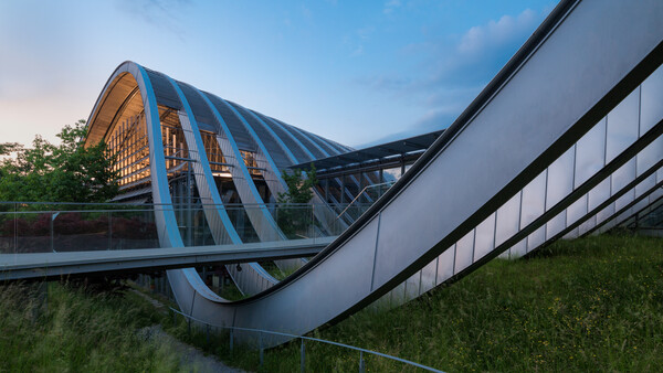
Angles That Lack Intention
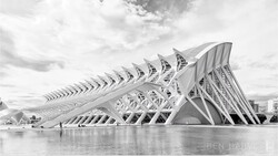
Architectural photographers work predominantly with two angles: the one-point perspective (straight-on view) and the two-point perspective (corner-to-corner or diagonal view). Architectural images are effective when the intent is to show either of these angles. The mistake I often see is settling on an angle between these two — not quite straight on enough to be a one-point perspective and not diagonal enough to be a proper two-point perspective.
It is important to be deliberate when composing architectural images. Sometimes, the best composition may be the angle between the two standard angles, and if so, it's perfectly acceptable to choose this angle. The point is, always be deliberate and intentional when choosing angles to photograph.
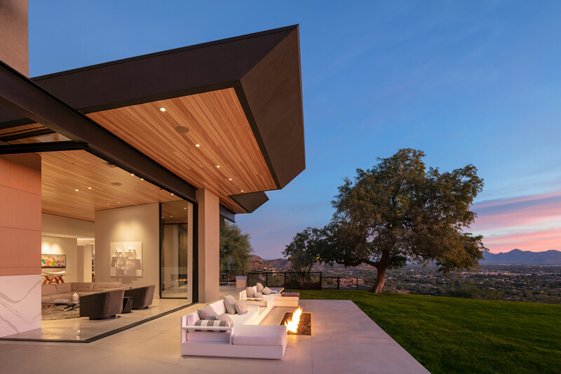
Blue Light Spill
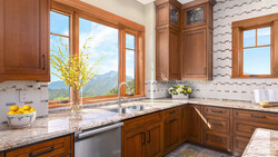
Artificial light is very warm in comparison to natural light, especially during twilight or on a blue-sky day. When setting the white balance to the artificial light, blue light streams through the windows and doors of the building. If it were just the windows and doors, it would not be too detrimental to the image, but often, reflective surfaces such as the floor and furniture take on a blue color.
This is rectified in two ways. The first is to use flash and gels to balance the color temperature. For residential architecture, this technique works well, but for larger buildings, it becomes problematic trying to cover the entire scene with flash. Instead, I pick a white balance that creates natural, neutral color for the majority of the scene and then I desaturate the offending color: either blue or yellow.
Making One Image Do Too Much
A common mistake from photographers moving to architectural photography from real estate photography is trying to squeeze too much information into a single image. This often means shooting too wide. A successful architectural shoot relies on a set of images. Trying to achieve too much with a single image dilutes the quality of that image. In addition, shooting too wide introduces wide angle distortion. Subjects near to the camera are inevitably stretched.
I would hesitate to go wider than 24mm for interiors. In addition, I would aim to capture the building in 10-20 images. This will include 2-4 “hero images,” which will reveal the main design features, but I will never attempt to cover all the design features in a single image.
Moving Too Quickly
When I moved from real estate to architectural photography, I was amazed at the extra time I was given. For real estate work, I would have to cover an entire house in roughly one hour. When working for an architect, I would have the entire day. The mistake many architectural photographers make is attempting to move too quickly through the shoot.
The extra time afforded to architectural photographers means being able to work from a tripod, being meticulous about composition with micro-movements to get the perfect angles. In addition, the extra time gives you the opportunity to straighten furniture, sweep the floors, and wipe down reflective surfaces. The extra time means that much of the “retouching” should take place before the shutter is released.
Pushing Retouching Too Far
Architectural photography requires decent light and good weather. Unfortunately, the weather does not always cooperate, and the photographer has to resort to composites. In doing composites, a moody gray sky is replaced with a blue sky. The common mistake is creating a composite that is too far from the original. Even if you do a great job, the final images will feel wrong somehow. The key is to replace a moody gray sky with a slightly better sky. So instead of a perfect blue sky, choose a sky that is mostly cloudy with patches of blue.
Architectural photography also tends to use muted colors. The reason for this is that color can be a distraction. If you have too many saturated colors or areas of high contrast, it can pull the viewer away from the design elements that you’re trying to portray.
Retouching for architectural photography can take hours per image, but it should never draw attention to itself. An effectively retouched architectural image feels untouched.
Conclusion
I’ve mentioned that I’ve specialized in architectural photography for six years. I’m still new to the genre, which means that I’m constantly learning new techniques, processes, and most importantly, new ways of seeing. The five mistakes mentioned in this article I’ve observed in my own work and in the work of other photographers learning architectural photography. I’m certain that there are many more, and I would love to use the combined experience of the community to identify more common mistakes. If you can think of any, please write them down in the comments section.
Join the Fstoppers community for free
-
Post comments and join in the discussions
-
Browse the site ad-free
-
Share your work and get featured in the community
-
Compete in the photo contests for fun and prizes
36 Comments
Useful article, thumbs up!
Thank you!
Useful article, clear and concise. Thank you for writing well, rather than blathering on video.
Thanks. I personally prefer a written format. Glad to hear someone else feels the same.
Helpful article, thanks! One thing about blue light spill: if you utilize a circular polarizer on your lens, it’ll cut the majority of reflected sunlight (and glare) from polished wood floors, furniture, countertops etc. This method definitely makes a big difference.
Really? I've been shooting real estate for years and have always just done the blue desaturation. So you are saying if I just shoot with a CPL I won't get the blue light reflection spills everywhere? If so is there any drawbacks for shooting interiors with a CPL?
Often these days, the windows have slight polarisation and then using a polariser brings out weird patterns. Otherwise, it’s a great tool to bring down the blues.
Yes the CPL def helps. I shoot with a UV filter (which helps and mostly just for general protection) plus a CPL on either a 28 Summilux, 24 GM or 28 Sigma. The glare from polished wood is the biggest issue for me and this set-up (mainly the CPL) removes quite a bit of it. It’s not intuitive but wood flooring is the worst offender, more so than countertops or tile floors.
Some windows with UV coating do look strange but the wide angle lenses throw the outside so far away, and it’s usually so much brighter outside as well, that the effect is minimal on the overall picture. But, I have new low-e, coated windows in my house and the pattern/purple tinting due to the CPL is really most noticeable when photographed from the exterior (not from the interior).
I also don’t like to desaturate blue too much, because, for me, the viewpoint through a window looks strange. like a black and white picture outside, as without blue channels no other color may remain.
I hear you. I tend to desaturate blues only where it spills into the interior. I wouldn’t apply the effect globally.
Thanks for the info! I am certainly going to try this now! Using the blue desaturation (also using a window pull shot so that process doesn't effect the area outside the window) I was never a big fan of as often there are other areas in the home that I don't want to alter (carpet, artwork...) and don't want to do a bunch of masking as with shooting anywhere from 3-5 houses a day in the summer/spring/fall I need to process as quickly as possible to maintain my 24 hour turnaround.
Gerald Bertram Glad this info is going to be put to good use! I feel you on not wanting to touch up glare on every picture, it’s extra work def if you’re running and gunning all day. Hopefully a CPL will work our for you as well.
@JonathanReid: I wasn’t even connecting the dots when you suggested just desaturating blue in offending areas. Of course that would work too! I don’t focus bracket (though I should), so glare (highlights) sometimes would degrade data in highlights which may be wood floors,or fancy countertops, metal kitchen backsplashes, glass shower doors, etc.
For me, a mistake made by many photographers is to want to straighten the vertical lines to make them parallel at all costs. With high buildings this leads to a completely unnatural effect. If the verticals need to be straightened, in many cases straightening them slightly is sufficient.
I hear what you’re saying, but architects want them parallel as that’s how they draw them. Best bet here is to know and understand your final audience.
Not all architects want them to be parallel (but yes most of them).
Some of them understand very well that with very tall buildings, the appearance is absolutely not natural if the vertical lines are parallel on the picture.
The human eye more or less automatically corrects the perspective effect, but within a certain limit. Once this limit is reached, the brain more easily accepts the idea of a line of flight and therefore a good picture must reflect this perception.
If you want vertical parallels when photographing tall buildings it is best to find, when possible, a viewpoint as far away as possible and not use a wide angle.
It is also a good idea to find a higher point of view (a hill, a high floor of another building, a helicopter, a drone...)
All good points. I’ve been doing a lot more work from a drone. It seems to be the perfect tool for getting that mid way up view of tall buildings
That’s serious, if my real estate photographer did that I’d be very impressed. Would love some good, straight shots taken half way up subject properties.
DxO Perspective is a useful tool here and much more flexible than Transform in Photoshop. The DxO has a preset named “natural” which usually nails it when shooting something like a skyscraper at 17mm. It doesn’t make completely straight verticals but gets them pretty close and the effect is pretty natural to the eye. Also it doesn’t crop as much as Photoshop does.
Always correct the keystone effect in post. Or shoot with a tilt shift or whatever. Just make sure verticals are vertical.
Nice Article! Thanx for sharing!!
Very good points. I really appreciate the fact of taking time. RE is a frantic rush and the agent wants a 240 degree AOV on every room.
I love getting calls from architects and builders who understand the project takes time to do right.
I would note also that RE can drift into the cartoonish while architectural images look dead to a realtor.
I work in real estate, and also am an amateur photographer. What is really strange is that clients like photorealistic renderings now more than actual pictures. Now some interiors are advertised with renderings (made prior to construction) instead of actual pictures after the spaces are built out.
I see a lot of that too. Usually when they’re flogging the property before it is built.
Then there is virtual staging. I was asked by a client to furnish an empty apartment. I found any number of services for this and was able to very nicely get the job done.
That’s a whole new world!
Virtual staging really an incredible tool, I do it not just for selling but even to lease apartments. It’s like $50 vs $3-10,000, and if your online shots are good people will call your agent and come through the door. Which of course is what counts.
It is excellent for vacant property. What I find interesting is I had a $1.2 million property lately that the seller did not want to pay for VS. I have no idea what it sold for but I can be sure it took longer to get visits.
Very useful. I've been asked to shoot architectural images with no experience and this short article has given me many tips.
Thank you
Thanks. Well done
yet you go to the writer's portfolio and all you can see is the opposite
This one? http://arch.photos
I find this really encouraging and a welcome confirmation of my own tendencies. Especially when it comes to retouching- I see many of my contemporaries working in Real Estate or having come from there and pushing the photoshop beyond what's natural, and I start to worry that tastes have widely changed and that it's a trend all clients will want. Thanks for your wisdom and expertise!
Amateur Photographer here who wants to learn how to shoot buildings, this will help immensely. Thanks
Really cool, hope it's ok I shared it on my blog https://blog.cherrydeck.com/2019/05/29/jonathan-reids-clever-guide-on-a…
Good article. When I desaturate the blues/purple due to color temp imbalance, I generally will brush in a slight warmer color temp in the area to avoid it looking too B&W. Especially on black or really dark floors/surfaces.