
One of the most popular videos we have produced in the last year was with Mike Kelley and Lee Morris as they battled it out in the Amateur Vs Pro Architecture Photographer Shootout. This week Mike and Lee have set their rematch, and you our audience will be the judges!
If you are a reader of Fstoppers then you obviously know Lee Morris, a jack of all photography trades but master of none. Mike Kelley is a master of architectural photography but rarely shoots anything outside of that field. Since all three of us a great friends, we figured it would be fun to revisit this shoot off and see if Mike can redeem himself after losing last year to Lee.
The Previous Shootout
What is interesting about the previous shootout is that when the photos were posted anonymously, the overwhelming consensus was that Lee's photos were taken by Mike and that Lee's photos were the best out of the two sets. This is pretty ironic because Lee basically learned everything he knows about architecture photography by producing three of Mike's real estate and architectural tutorials Where Art Meets Architecture. The other irony is that after the results were revealed, much of the public changed their tune and opted for Mike's photos after they knew who was behind each set of images.
All this being said, when the votes were pulled to reveal the winner, Lee Morris was the clear victor with 65% of voters preferring his images of Mike's photos. You can see the votes here on this article and you can view the final photos on the Dome House Shootout Article here.
Who Will Win Round 2?
For this second competition, the stakes have been raised. Instead of shooting an exotic hurricane proof house like the Dome House, this competition will focus on a massive $6.25 million dollar riverside chateau located on the Wappoo Creek in Charleston, SC. Unlike the previous house, this massive 6 bedroom, 7 1/2 bathroom mansion has plenty of variety in terms of hero shots.
The rules for this competition were simple. Each person had to produce 3 different photographs that could be used by the architect or builder, and all three images must be placed in a single 16x9 montage. Each set of images would be voted on by you our readers anonymously and the winning set of images will be revealed live on camera in 24 hours.
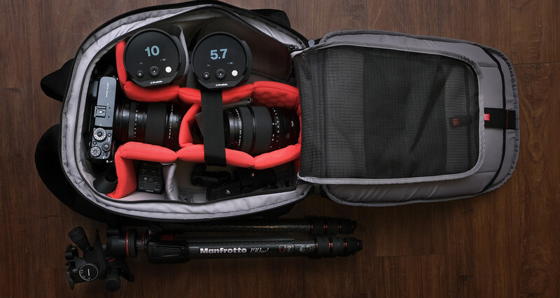
To make things a bit more challenging and interesting, both Lee and Mike had to shoot on the FujiFilm 50s Medium Format Mirrorless Camera and could use either the FujiFilm 32mm - 64mm zoom lens or the FujiFilm 23mm wide angle lens. For lighting, the two photographers were given two Profoto B10 flashes with no modifiers. Since Mike is known for using super expensive tripods and geared heads, the competitors also had to use the Manfrotto MT190 Go Tripod with Manfrotto MHX Pro-3WG geared head.
Here are the two sets of images.
Set 1

Set 2

Below, you can vote both for who you think took each set of images as well as which set of images best showcase this amazing house on the water.
If you want to find out the results, make sure you subscribe to our Youtube Channel where we will be releasing the full shootout video and the final results!


Join the Fstoppers community for free
-
Post comments and join in the discussions
-
Browse the site ad-free
-
Share your work and get featured in the community
-
Compete in the photo contests for fun and prizes
102 Comments
I find the composition in picture #1, #3 and #4 weird.
I prefer set 2 but I think it is a bit too dark.
(I think #4 was originally shot and designed to be horizontal and then adapted vertically for the contest)
Poor lighting on set 2... dont know what was Morris thinking when composing the shot
This one's harder than the previous one. I have to say I really don't like #4, maybe you could have used some lighting there in the porch area, I understand you wanted to use natural light but it just looks underexposed and kind of like a snapshot to me. Because of that to my eyes set 1 looks better although I really like #5 and #6 from set 2.
The window frames are a dead giveaway in image #6 as to who did which set.
Also, using Chrome I could not vote. Pressing the vote button did nothing. Edge worked, but neither had a click pointer when hovering over the word "Vote".
Mike set 1, Lee set 2. Winner, set 1
how the heck do we vote?
Set 1 is obviously Kelly's. Lee underexposed set 2 by 1/2 to 1 full stop on some images.
Set one is something super beautiful and bright thught the BG in shot #2 feels too bright
Set #2 is a lot more editorial, which I personally PREFER but I don't think is as MARKETABLE
Also Photo #6 in Set #2 i crooked and cropped wierd
The sy replacement on Image 5 is just... Not good. SO much haloing!
My vote goes to Set 1. I assume Lee.
Set 2 composition is nice but to dark.
These comments are hilarious. Image set 1 is Mike's. The compositions, the colour, the exposure and quality of light are all trademark Mike Kelley. It's a much more architectural and interior design style. Set 2 seems drab and under exposed. The sky on #5 is odd. I kind of like the moodiness of set 2, and the fact that you see more of the context including the size of the pool and the view, but it feels like Lee has chosen classic real estate (i.e. wide) compositions, but then gone for a super moody interior design style of lighting/exposure, which is quite unusual and I've not seen Mike really do it like that so far.
I've been watching the YouTube channel for a long time now but only just joined the community :)
Regardless of who shot what - there are pictures in the montage of each one that are better and some that are not.
Example: I really like #3 in the first montage and #6 in the second set.
I think both did a good job - I am going with Set1 because of the more saturated windows light in #3 which I think has a better look.
On the other hand - #6 in set 2 has better composition giving a better angle showing the pool better maybe?
I liked set 2 better except for number #4 which blew the whole set for me so I voted 1. 4 is just way too dark and uninviting
So excited to see the behind the scenes on this one. I can't see Mike taking pic 1, comp is all wrong and it doesn't show the house in a flattering light, pun intended. Pic 2 is 'styled' but my guess is that it's close to how the room looked to begin with and it's the wrong time of day. Lee, 3 is good and you clearly spent a lot of time on it, but it's not Mike's. 6 is classic Mike styling (so if I'm wrong, Lee you killed it). 5 is flattering to the house and sense of the property. 4 is, well, terrible, but you definitely ran out of time - and it keeps the contest fun. They can't all be winners :)
Just remember, it's not about who won [cough] (it was Mike), but about how much fun you had!! Thanks boys!
is it just me or is there some ghosting going on with the plant in #5? also looks like some grass replacement going on up against the tree behind the haunted plant.
I didn't notice that one but I did notice something else. Not sure if it's a person or a light but it does look strange. If you take a closer look at the first image the balcony on top of the front door their is something strange going on in the window/door on the right of the frame.
I had my doubts for couple of minutes but than I opened both fullscreen and now it's so obvious I am astonished I have a doubt.
The First set Mike's work and that's a win for me.
The Second set it Lee's work. Which I should say are good. Not the 4th one, but 5 and 6 are rather ok.
But they do not have that feeling of joy a perfect composition does to you. And I don't want to buy a house looking at the second set of images.
My guess is Lee took set #1 and Mike set #2. In the last shoot, Mike's images were brighter, I could be wrong but I think they flipped this time. Also hard to gauge knowing that last time, Lee put in more effort especially in editing. Something bothers me about each of the 1st 3 shots. I don't like the house straight on, it appears unimpressive for a multi-million dollar home. I don't particularly care for the light, especially how it hits the garage in the right of the frame, my eye goes there. Yes, I get it, it is the sun, shoot a different time of the day. :) The lines in the living room shot also don't seem right, and I would have expected a richer exposure out the door from Mike. I like a lot about the 3rd shot with the house, however I feel like it missed displaying the pool and view like #5 does, and all in all it doesn't have the room in frame it deserves.
What does throw me off is image #4. The view in 4 is great, but the clutter up front isn't right. The chair, table and plant could have been moved. The table creates a leading line into the plant instead of the view. I would have preferred the chair facing the view on its own. #5 is the money shot. Whom ever took that, should be doing the architectural photos. :) If I am wrong, and Lee took the second set, Mike should find something else to shoot for a living because he got spanked again by an amateur. haha JK. You guys are good at busting each other, this is all in good fun!
While set 2 tries to use the lake view over and over to empower each composition, set 1 makes a way smarter approach by showing more architectural aspect of the house without neglecting the view with the living room picture. Picture 6 could have been taken by mike but i doubt he would make the mistake of where is the sun or let these muddy windows frame, picture 4 is just not good enough too. The crop on Picture 3 is a bit weird too but probably forced by the layout.
Voting based on the single point perspective that I would expect a pro architecture photographer to use I voted Mike Kelly for number one set. And the use of flash in the evening shot. But then who knows I could be talking cr#p as is often the case ha ha.
. . .was there any post-processing used with these images? If so and these images present the final results, then I think that the first set is clearly better since the exposure / lighting is more impressive, whilst the second set is better (I think) in respect of it´s value in presenting the real estate -- but it would need some post work to make it usable.
I don’t like either set. The compositions in the first set are not good. The second set is under exposed.
I'd rather buy the property as displayed in set 2! Set 1 focus on the exterior a bit too much. The eyes tend to snap on the two strong triangles on top of the house - a dead end & selling point. Colors are not consistent throughout the set. They are shot and edited in different directions and with the artistic freedom found in fashion photography (#1 is in flat shade #2 too warm for the set and #3 with a different black point, and boosted magenta tint).
Set 2 is consistent and sell the most important features of the property without distractions. The outside pool area, the kitchen and the view - all USP:s. The crop in #4 is very odd but the pillars frame the set and makes the eyes bounce back into the scene, well done.
Feels like set 1 is emulating the "old Mike Kelly" teaching his first tutorial, whilst set 2 is an evolved and contemporary Mike Kelly.
Choice of motives alone makes me think Mike took set 2. Why would you shoot 2 wide exteriors from the front and the back and one wall-2-wall interior? Plus leave the leaves and dead grass patches on the ground in shot #3. Don't think Mike would do that. Shot #4 gives me a beautiful idea of what it would feel like to sit on that chair, #5 gives me a great sense of the location and the exterior overall without being overpowering and #6 give a nice idea of the interior and the feel and view from the inside. The combination of motives in set 2 alone makes more sense to me.
Should I be wrong, AMAZING job Lee Morris , should I be right AMAZING job Mike Kelley obviously. That said, I also like set 1. Those are not bad photos. I just find set 2 more sophisticated and with more purpose :)
Wow this is tough....there are aspects of both that I like, number 5 really grabs me though I wish it was brighter. I wish the kitchen shot (6) had the same exposure of the living room shot (2)
I think I'd have to go with Set 2 just because of the perspectives, but the exposure needs work.
How do you vote...or is it done already?
It's pretty clear 2 is Lee, 1 is Mike, evidenced by the lighting ratio and the lesser wide angel distorted image.
Hmmm an obnoxious vignette on set 1, but a nice sky replacement on set 2, this is hard to pick! Both Mike telltale signs.
I voted set 2 as the best, but I really dont like photo 4. If you only have 3 shots to show the absolute best, photo 4 just doesn't show off enough. Luckily 5 and 6 were both amazing to make up for it.
Tough call. Neither I like perfect.
1st set seems to be better made in technical meaning. Sharper, brighter and more refined HDR - in short: more effort put into making them, so they look a higher end professional created them. But none of the three images I like from narrative stand point. 1) garage hidden by that tree, I would go more left, more back or closer. I do not like framing. 2) It seems like normal apartment on vacation. I can't feel the 6,5 million on this image. Again light stacking is very refined. 3) Why two images tel same story. One daylight, one at dusk. Waste of montage space. It does not add to image 1, since pool is easily overlooked and image should be landscape not chopped into portrait. Nothing special. I dislike dark (almost black) tree hanging from nowhere from the top left. Author put his stake on "SIZE" of this house, rather on surroundings, to justify the price. Regardless who made it, I do not like this montage and I voted against.
2nd set seems dark and muddy, shot in dusk or too low exposure. HDR light stacking seems worse than previous set, some dreamy glowing look is seen, the tree was lighted up as it seems, editing is made faster I would say from this images. I dislike darkness of all three images, but I like all three for what they represent. They tell more rounded story from broad (5) to narrow detail (4). Pool is clearly represented with surrounding as whole, rather on concentration only on house. House is not in main focus. Also kitchen better repesents luxury, since living room every vacation hotel have, while this kind of kitchen is only part of luxury homes. This 6) image wipes away any thought this might be vacation home or multi apartment house. The third detail (image 4), adds spice to overall representation and represent style of the house (retro pillars) and point out the view from sitting point. All in all this author did not try to byte everything in one montage, but rather focused on one (single) aspect of the house: All three images are connected as they are from same part of house. Image 6 is establishing shot, while 4 and 6 both represent detail from image 5; one from outside and one from inside. Set 2 make me more curious to find out more about the house. I like set 2, but I wish to be a bit brighter.
Now who made what? Lee could be over processing to trick audience. Mike could be lazy, to put last effort into this images since this duel is for fun, and not his signature portfolio work. It might also be that they deliberately make it harder to guess. So I just guessed and voted for set 2 being Mike's.
I don't know who took which set, but set 2 seems so dark on my monitor, and, as we all know, Lee just calibrated his monitor.
I can't see Mike deviating too much from his style, so I say he did Set 1. Set 1 if far superior. I could see it in a Luxury Home Tour Magazine. Although, the right chair on photo 2 is off center from the door which could easily be fixed.
Set 2 is too dark, the angles chosen don't make sense, photo 4 is just abysmally bad for Lee and Mike's abilities.
Patrick, if you don't tell the loser, 'You've been Fstopped." and have giant F put on their face in post, I will be sad.
Have to give it to SET 2. Massive trees in set 1 image and off center of one point perspective of the living room image is too much to bear.
6zero8photography on Instagram lol
Perhaps it’s because I’m on my phone, but there seems to be a very obvious skyswap in number 5. There’s something funky going on around the trees in the top right. On top of that, there appears to be some serious haloing near the trees. It’s so distracting that I’m going to hope it’s not Mike’s, for the sake of his new tutorial.
Again, it could just be my phone screen, as no one else has seemed to mention the problems I’m seeing in 5, so I’ll double check on my PC tomorrow night, but as it stands now, set one is the winner.
I didn't realize that the house had a pool until looking at set 2, so I'm going with set 2 (which I think Mike took).
Set 2 sells the house better. They're tasteful and show off the houses best assets.
Set 1 is pretty amateur if I'm honest. The front shot is boring and that tree is too distracting, the living room shot is weirdly off-centre and the back yard shot is too tightly cropped with the pool barely visible at that angle. There's no chance Mike shot them.
The differences are actually very subtle and the both sets are very good. I voted but it really was a guess because I can't really tell who took what photos.
Set one is so much better, set two is way too dark. Maybe pump up the shadows in set two, those two dark big trees in set two are killing that set.
I noticed how Mike changed his style several times, always improving. Now I think he draws more attention to colors and shadows, which I really like! Maybe someone will say that in the second set the pictures are darker, but I like it, the composition is very balanced and well arranged, interesting colors and pleasant atmosphere. The first set looks like Mike's style when you made WAMA 1 :) Sorry if I'm wrong;)
Sorry Mike!!! I need to LEARN MORE!!!
It has been well over 24hrs for the results. I am excited!
I can't get past photo #4, you guys wouldn't give 2 to it! The other 2 photos in that set are much better, and probably better than those in set 1 (even thou the kitchen is too dark), but because of the #4, it is a tie for me.
First set has a lot of other issues, like distortion on the right (which would be unacceptable for a serious commercial shoot I guess), or the composition in the first one, where, if you're not going to get buildings on the side completely in the frame, get closer and get the trees out of the composition.
First duel was better.
I am probably completely wrong with my vote, but I still gave it a shot. Hm...looks like I am the only female commenting on this.
Easy ;) - look back at the first shootout and you'll see that Mike used a border frame between his photos and Lee didn't. They've both repeated this here - Mike has used a black border frame between photos and nothing from Lee. Therefore Mike Set 1 and Lee Set 2
I'm curious if there was a problem with firing the Profoto's, I don't see any use of them in the photos? To me everything in Set 2 is too dark. I voted that Mike took set 1, but it's anyone's guess as to who took what, so not really sure. I don't feel these photos are either's best work.
I think Set 1 sells the house better as it's all just a bit brighter and more inviting. I like the composition of photo 5 (set 2) the best, but it seems undercooked / too darker shadows.
My caveat - I'm quite happy with my photo skills, but I don't work in architectural photography, so all my comments aren't qualified.
Profoto worked well. They both used strobes but also shot a lot of natural light. I'm editing the video now. Hope to have it done by Friday.
Set 1 is the best....
Set 1 is Mikes. This is his bread and butter and I feel like set 2 is compositionally way too clunky to be his.