

Slow load times. No clear pricing page. A portfolio organized by date instead of genre. These are the silent killers that drive potential bookings away before a visitor ever reaches your contact form. Your website might be gorgeous to you, but if it's not converting visitors into inquiries, something is broken, and it's probably one of these things.
1. Your Images Are Tanking Your Load Times
Here's the brutal math: if your site takes longer than three seconds to load, more than half your visitors are already gone. They didn't see your portfolio. They didn't read your about page. They hit the back button and booked someone else.
The most common culprit is embarrassingly simple: you're uploading full-resolution files straight out of Lightroom. That 45-megapixel file does not need to be served at 8,192 pixels wide to someone browsing on their phone during lunch. Export your web images at 2,048 pixels on the long edge, compress them to 80% quality JPEG or convert to WebP, and use lazy loading so images below the fold don't load until the visitor scrolls to them. Run your site through Google PageSpeed Insights and watch your score climb from embarrassing to respectable. If you're not confident in your export and editing workflow, Mastering Adobe Lightroom is a solid place to start. This single fix will do more for your bookings than any new lens ever will.
2. Your Portfolio Is Organized by Date
Nobody looking for a wedding photographer wants to scroll through "Fall 2023 Sessions" and "Spring 2024 Work" hoping to stumble across something that looks like their venue. Organizing your portfolio chronologically tells your visitor that you think about your work in terms of when you shot it. They think about your work in terms of whether you can shoot theirs.

Reorganize by genre or service type: weddings, portraits, corporate headshots, families, or whatever you actually want to be booked for. Within each gallery, lead with your ten absolute best images, not your ten most recent. And if you're shooting across wildly different genres, consider whether every genre even belongs on the same site. A client hiring you for corporate headshots doesn't need to know you also shoot boudoir. That's not range; it's confusion.
3. Your Site Isn't Mobile-Optimized
More than 60% of web traffic is mobile. For local service businesses, which is what most photography businesses are, that number is even higher. Someone sees your work on Instagram, taps the link in your bio, and lands on a site where the text is microscopic, the menu doesn't work, and your images are getting cropped by the viewport in ways that would make you cry.
If you built your site on a desktop monitor and never pulled it up on your phone, do that right now. Navigate every single page. Try to book yourself. If any part of that experience is frustrating, it's frustrating for every potential client who finds you on their phone, which is most of them.
4. Your Contact Information Is Buried
If a visitor has to click more than twice to find out how to reach you, you've already lost a percentage of them. Some photographers bury their contact page in a dropdown menu, or worse, only list an email address in the footer in 10-point type with no visual emphasis whatsoever.
Your contact information should be accessible from every single page, ideally in both the header navigation and the footer. A dedicated contact page should include a simple form, your email, your general service area, and your expected response time. The visitor who's ready to book shouldn't have to go on a scavenger hunt to give you money.
5. You Have No Clear Call to Action
A beautiful portfolio page with no next step is a dead end. The visitor thinks, "These are great," and then leaves. There's no button saying "Check Availability," no prompt to "View Packages," no invitation to "Start Planning Your Session." You showed them the work and then left them standing in the hallway.
Every page on your site should gently guide the visitor toward one action: making contact. That doesn't mean plastering "Book Now" across every image. It means a tasteful, obvious button at the end of each gallery. It means a sentence beneath your about section that says, "I'd love to hear about your day. Let's talk." Give people the breadcrumb trail. They want to follow it.
6. Your Homepage Is a Slideshow Hostage Situation
The full-screen slideshow was impressive in 2014. Now it's a loading liability and an attention trap. Your visitor arrives, sees one image, waits five seconds for the next one, waits five more seconds for the one after that, and has now spent 15 seconds on your site without learning who you are, where you're based, what you shoot, or how to book you.
Replace the slideshow with a single strong hero image and a clear headline: who you are, what you do, where you do it. If you absolutely must use a slideshow, keep it to three images with a two-second transition and overlay your key information on top so the visitor gets context immediately, not eventually.
7. There's No Social Proof Anywhere
You could be the best photographer in your city, but if your website doesn't include a single testimonial, review, or client quote, you're asking visitors to take your word for it. And strangers on the internet don't do that.
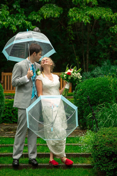
Dedicate a section (on your homepage, your about page, or a standalone page) to real words from real clients. Three to five short, specific testimonials are more effective than twenty generic ones. "Sarah captured our day perfectly" is forgettable. "Sarah noticed my grandmother was about to leave and grabbed the three-generation portrait without us even asking" is the kind of detail that makes someone pick up the phone. If you have awards, publications, or "as featured in" logos, put those here too. This isn't bragging. It's proof. For wedding photographers especially, the Wedding Photography Training System covers how to build the kind of client experience that generates those glowing reviews in the first place.
8. Your About Page Is a Gear List
"I shoot with a Canon EOS R5, 24-70mm f/2.8, and Profoto B10s." Congratulations: you've just told your potential client absolutely nothing they care about. Nobody booking a family portrait session is choosing you based on your strobe brand. The about page is where clients decide whether they'd enjoy spending four hours with you at their wedding.
Talk about your approach, your personality, what the experience of working with you is like. Mention that you're calm under pressure, or that you always scout venues in advance, or that your editing style leans warm and natural. Say something about who you are as a person. If your about page could be swapped with any other photographer's page and nobody would notice, it's not doing its job.
9. You Have Too Many Portfolio Categories
Sixteen gallery tabs is not a sign of versatility. It's a buffet that makes people lose their appetite. When someone lands on your portfolio and sees "Weddings / Engagements / Elopements / Proposals / Couples / Families / Newborns / Maternity / Seniors / Headshots / Events / Products / Real Estate / Pets / Boudoir / Fine Art," they don't think you can do it all. They think you haven't figured out what you're best at.
Consolidate down to three to five categories that represent the work you actually want to book. Everything else either gets merged into a broader category, removed entirely, or put on an entirely separate site. Remember: the portfolio isn't a record of everything you've ever shot. It's a sales tool. Curate it like one.
10. You're Invisible on Google
If a potential client searches "wedding photographer in [your city]" and you don't show up in the first two pages, you effectively don't exist for that search. Having a beautiful website doesn't mean a thing if no one knows it exists.
You need a blog, and not the kind where you post full galleries with two sentences of text. Write about your work in a way that includes the words people are actually searching for: the venue name, the city, the type of session. "Jessica and Mark's Summer Wedding at Cedar Ridge Estate" is both a good blog title and a search-optimized one. At minimum, each blog post should be 300 to 500 words, include location-specific keywords naturally, and feature alt text on every image. This is the single most effective long-term marketing strategy for a photography business, and most photographers skip it entirely because it feels like homework.
11. You Have Broken Links and Dead Pages
Nothing says "I don't actually maintain this business" like clicking a portfolio link and getting a 404 error. Dead pages, broken image galleries, and links that go nowhere are the digital equivalent of a storefront with a burned-out sign. It signals neglect, and a client who's about to hand you $3,000 wants to feel like you're paying attention.
Audit your site once a quarter. Click every link. Load every gallery. Check every form submission. If you've removed or renamed pages, set up proper redirects. If you're linking to an external site that no longer exists, remove the link. There's no excuse.
12. Your Contact Form Asks for Their Life Story
Name. Email. Event date. Event type. "How did you find me?" That's five fields, and even that might be one too many for a first-touch form. If your contact form asks for the venue address, the number of guests, the names of the bridal party, their budget range, and a detailed description of their vision (all as required fields), you've built an application, not an inquiry form.
The goal of a contact form is to start a conversation, not to close a deal. Get their name, their email, and enough detail to write a personalized reply. You can gather everything else once you're actually talking to them. Every additional required field is a percentage of potential clients who decide it's not worth the effort.
13. There's No FAQ or "What to Expect" Page
A potential client who's never hired a photographer before has questions. What should they wear? How long does a session take? When will they get their photos? What happens if it rains? If your website doesn't answer these questions, they're either going to email you and wait (losing momentum), or they're going to book someone whose site already answered everything.

An FAQ page or a "What to Expect" section does double duty: it reduces the friction that kills bookings, and it dramatically cuts down on repetitive emails you have to answer. Walk them through the process from inquiry to final gallery delivery. Address the top five concerns you hear from every new client. This page won't be the flashiest part of your site, but it might be the most profitable. And if you're looking to sharpen the business side of your photography, Making Real Money: The Business of Commercial Photography covers everything from pricing strategy to client management, while How to Become a Professional Commercial Wedding Photographer digs into the wedding-specific workflow from first inquiry to final delivery.
The Uncomfortable Truth
Your website isn't a portfolio. It's a storefront. And right now, the equivalent of people walking up, peering through the window, and leaving without coming in is happening every single day; you just can't see it.
The good news is that almost everything on this list is fixable in a weekend. Not all of it, but enough to make a measurable difference. Pick the three that made you wince and start there.
Your next client is already looking for a photographer. Make sure your website doesn't talk them out of choosing you.



Join the Fstoppers community for free
-
Post comments and join in the discussions
-
Browse the site ad-free
-
Share your work and get featured in the community
-
Compete in the photo contests for fun and prizes
3 Comments
Website design for wedding photographers and landscape/art photographers are two different things. Especially as it pertains to the quantity of images shown on your site. Granted, portrait photographers only want to show a few best images. Landscape photographers, however, need more photo choices... at least I think we do. Indeed, most of my commercial art buyers comment favorably on having such a large diversity of images on my site. I also don't need a shopping cart or any sort of e-commerce feature for those type of accounts.
Selling to the general public though hasn't worked very well. Too many picture choices probably make the decision more tedious. And maybe the fact that they have to send an email to place an order loses a few customers, or maybe a lot. Hard to tell. Creating e-commerce shopping carts seems like a lot of work for an unpredictable return. I'm wondering if anyone else has an opinion on them? And it would be great to have more articles about landscape photography sales. I would live in a tent and eat refried beans and stale bread every night for dinner before working as a wedding photographer.
I Googled landscape photos for sale and visited the top three sites. Each had a wide variety of images to choose from with numerous size and frame/canvas options. Purchasing was as easy as picking and image, size and mounting options. This then led to a shopping cart where you add your info and credit/PayPal. So I guess to answer your question, the absence of e-commerce is probably hurting your sales. Today people just want to choose and buy with zero human interaction, and the ability to do it right now knowing the full cost plus shipping. You have some great photos on your site. Just make it easier to purchase them.
Thank you for taking the time to respond to my questions. I can appreciate the idea that people want to buy something at that moment without waiting. What really feels like bitter medicine to swallow is that people want to buy something with zero human interaction. I despise those self-checkout machines at the grocery store and would rather wait in line for a human to take my money. It must just be older folks who feel that way, otherwise the stores wouldn't be cramming that stuff down our throats. Photography is not terribly complicated, but I've always imagined that buyers have questions and want that personal touch. I suppose, to be honest, most of the questions I get deal with how to pay for the order and not the product itself. Anyway, thanks again for the reply. I'll be giving some serious thought about the human interaction aspect of the question.