
Never say never, but there are several quick reasons that make business cards with images a bad decision — even for a photographer. Every rule has its exceptions, but for most, a photographic business card is certainly not something you should automatically assume to need or even want.
Back when double-sided color printing required an arm, a leg, and selling your baby into slavery, having a color photograph on both sides of your card may have been about as amazing as your card could get. It told your potential and current customers that you had the success to afford the cards, and also served as a great way to showcase your work in a way that no one had seen before. But times have changed, and here’s why:
1.) Banality
Aside from perhaps being the art critic’s favorite, most used, and ironically banal word, that is exactly what photograph-impressed business cards have become: banal. They’re everywhere. Proper or traditional support for this argument isn’t even necessary; that’s how common these cards now are. And that alone is enough to stay away from the monotony and commonality that is the photographic business card.
2.) Print and Paper Quality
Text looks incredibly amazing in print today. Somehow while we’ve managed to obliterate real wheat, organic vegetables, and hormone-free meats, creating the need for some fantastic and imperative rehabilitory farming programs, typography, fine papers, and printed text quality need no such rehabilitation. Those never got lost in the post-modern world of plastic and genetic modification to begin with, perhaps because of Apple, the technology revolution, and the 2010's resurging love of hand-made, well-designed, form-conscious materialism.
Photographic printing, unfortunately, has taken a real hit in part to an effort to remain a quickly attainable reality as opposed to a costly option available to those with good, spare money to invest in quality. We can thank the digital age for that, too. Digital imaging brought increased speed of file delivery and, with it, a demand for a similar increase in the speed of printing. Art directors didn’t take long to lose patience for the art of printing from a true emulsion, which became too time-consuming to let live. And thus was born the crappy print.
Today’s photographic business cards, with little exception, arrive to customers on thin, poorly crafted papers with horrible sheens or with the dots of the low-DPI printers still visible at arm’s length. Too many photographers opt for a color photograph over great paper, and it’s all to the detriment of the customer’s experience with their brands.
3.) More Time ≠ Better Interaction
How many times has a fellow photographer fanned his or her cards out toward you and asked you to pick which card you’d prefer? Sure, you look for a minute and try and decide which one to pick as your “favorite,” all somehow without insulting the others. And all the while, the photographer is assuming the interaction is a good one based on the length of time. But in reality, it’s just uncomfortable, especially if the work is on the less inspiring side of the spectrum. Even if it is amazing work, everyone has different tastes. About two to five percent of all art really speaks to me, personally. The rest just isn’t for me. So to put people in the position to choose something that may not resonate with them is something you want to avoid if possible. In the end, acknowledge that not everyone is your customer (or fan). Don’t make them choose. Choose nondescript (but good) design over something that will create an uncomfortable situation. Besides, you’re better off using the always-limited time you have with a potential customer talking about what he or she wants as opposed to discussing the differences between three images you took two years ago.
4.) Medium of Presentation
How many of us want our images to be displayed as glorious four by six-foot prints hung in galleries around the world, if they’re not already? Okay, put your hands down. Is it odd to anyone that it somehow seems appropriate to put what is likely your best work onto a tiny two by three-inch card? Is that the way in which you would prefer your first interaction with a customer to be presented? That’s not even 0.002 percent of the surface area of your lovely four by six-foot print. Is it not hard enough to deal with the reality that our websites will be viewed on laptops just 11 or 13 inches wide, let alone the more likely reality that a customer’s first impression of us will be on their 4-inch smartphone? And you want to put that first impression into an even smaller presentation? Let’s just think about that for a moment.
5.) Mystery, Or a Lack Thereof
This leads us directly into mystery. If your card is designed well enough and printed well enough, adding an image will only destroy any mystery associated with that word we all love to put on our cards more than our own names: Photographer. It takes us all enough time to stop putting “future photographer” in our profiles or to quit describing ourselves as “up-and-coming” in our biographies on the web during and as we come out of college. And when we finally get to the point at which we feel comfortable putting those lovely 12 letters up, some of us choose to destroy any level of mystery and romance associated with this term of endearment with a photograph on the reverse side. Stop it. Let the word sit there and hang in the air. Let it make your customers see you with a permanent “squinch,” or “smize,” or whatever you want to call it.
Here’s a million-dollar piece of advice: For all of you who are still belittling yourselves with “future photographer,” or “photographer-to-be,” or “up-and-coming” — you name it — stop that right now. You either are or you aren’t. If you aren’t, you better fake it ‘til you make it. We all start somewhere, and that’s totally OK.
There’s little worse than being a poor photographer (or poor at anything you do). But being a poor “future photographer” is certainly a part of that “little worse.” It’s much, much worse. You’ll never wake up one morning and go, “Now I’m a photographer. Time to order new cards.” You’ll look back after three or four years and think to yourself, “I guess now I’ve really been a photographer.” For the time being, quit beating around the bush. You should always take yourself more seriously than your clients do. The minute you stop doing that is the minute you stop growing. Dream it, own it, become it, or go home.
“Well, crap. I still have 1,500 cards in my closet with a variety of images on them that I ordered last year. What do I do now?”
If we didn’t make these mistakes, life would be too easy. Learn from it, and move on.
A lack of a huge, central photographic interest demands fantastic design. Invest in a great design that can carry your business. Find a company that places as much of an importance on whether or not to emboss, and what kind of paper to use, as they do on the design and logo elements on your cards.
It won’t be cheap. But it’ll be worth much more to you and your business than that fourth or fifth lens you have saved in your B&H Photo cart. Do it once and be done with it. And then good luck to you.
“What do you know? You have photographs on your cards!”
Or do I…? No, you’re right. I do. You caught me! But the cards are old, I made them when I was still in college, and I’ve been meaning to (and currently am) finding a place from where I can source the perfect cards I’ve had in my head for over a year now. It’s happening. If you don’t join me, no problem. I’ll see you later on the side of the road.
There’s Always an Exception or Two
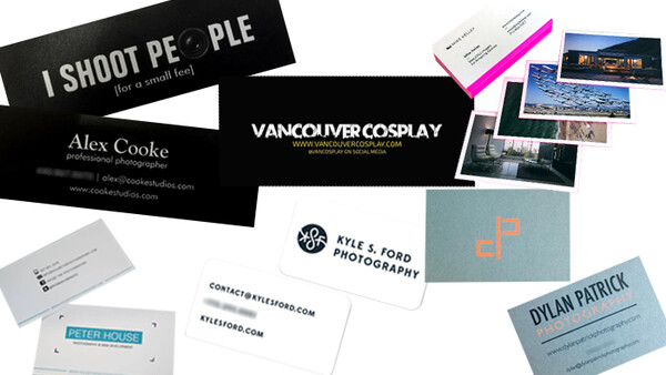
Mike Kelley is a perfect example of a photographer whose images just beg to be seen in every presentation. As much as I’d love to say it’s the man himself that creates the time and place, the geometry of his architectural work (for which he has been fortunate to shoot some of the most outstanding examples of manmade structures) is something that reads extremely easily at any size.
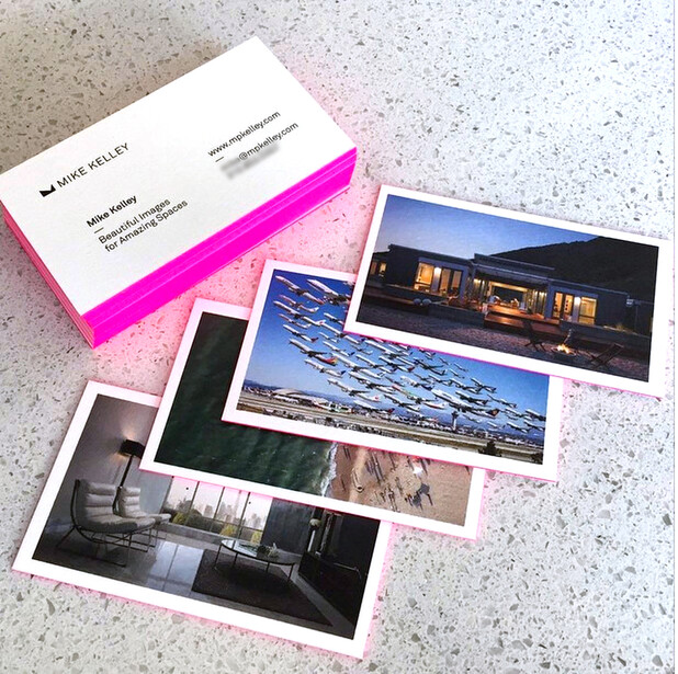
Meanwhile, Kelley’s recently-gone-viral “Wake Turbulence” provides another example of one of the few exceptions to the rule of photographic business cards: recognition. When a project you’ve created is successful enough that there’s a chance that someone would recognize an image you’ve made, but not your name or your face, you want to put it out there when you meet people as often as possible. That recognition is hard enough to come by — you don’t want to give up on it because of some silly article you read here.
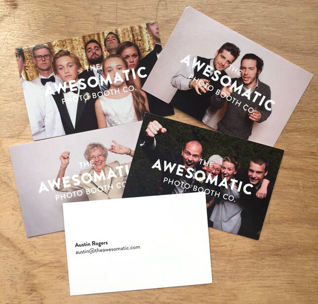
Finally, there are times at which your business itself simply lends itself to the photographic business card. Such is the case with Austin Rogers’ Awesomatic photo booth based out of Columbus, Ohio. In this case, The Awesomatic’s quirkiness lends itself so perfectly to the equally goofy photographs captured in a photo booth environment that including it on a business card instantly fills the receiver of that card with happiness. Instantly, potential customers get the feeling that the photo booth gives on the day-of before they’ve even given Awesomatic the job. But again, Rogers’ extreme care in photo selection is evident: not a single photograph is a less than perfect example of the never-ending fun that you might have with an Awesomatic photo booth.


Join the Fstoppers community for free
-
Post comments and join in the discussions
-
Browse the site ad-free
-
Share your work and get featured in the community
-
Compete in the photo contests for fun and prizes
32 Comments
My problem with photos on my cards... after looking at the photo over and over, I hate it.
It's not that I think it's a bad photo (although the flaws become more and more noticeable), it's simply that it feels old very quickly and doesn't represent "the next shoot".
Also, trying to encapsulate your *entire* repertoire with just ONE photo is tough if you specialize in different markets at once, like concert photography AND commercial model photography.
Totally disagree. Your argument is first based on a need to not be perceived as a trend follower, then it switches to quality issues (like it's impossible to get good quality photo cards), then you go off on a tangent about "up and coming photographers", then you show great examples of photo cards. Wut?
We're photographers. Why wouldn't we show an example of our work given the chance?
I think the biggest of all the points the author made is the one about the medium. 2x3" is not ever the desired presentation size of an image, and rarely will the quality of a photo be translated to that size (also true of Instagram, but I digress). I don't think it's likely that a potential customer will call you based on your business card image. They need to see your real portfolio, so make your card good and well designed (not just another card with a tiny photo on it), and hook them to look at your website.
I so agree with you.
I completely agree with you on this one, this is what happens when people are forced to write an article to a deadline, not for quality. Some of the cards he has shown here are from well known people in the industry, which have name and/or brand recognition built in. You think Peter Hurley needs anything on his business card other than his name and email address? For that matter does he even HAVE business cards? It all comes back to "who is your target audience" -- which this author neglects to mention in this article.
If you're marketing to a normal person, such as with portraits, senior photos, or weddings, after you hand them a business card with NO pictures on it, if they even hang on to the card in the first place, then what are they going to do? Look up your website on their phone -- which coincidentally is almost the exact same size as a business card (if you have full screen mobile photos). And from what I've seen, the print quality on a nice card (even the ones from Moo.com) are the same level of quality and color than a lot of average cell phone screens. And then you've got to get them in the first few photos they see -- wouldn't it be easier to have those photos on you in person when you're standing right there and can talk to them about it -- or would you rather rely on their own interpretations of your images. Plus, with the way the current photography market is, how do you stand out from the "fauxtographers" if you don't show your work? You could be talking with someone at a coffee shop and with one of the cards above that have no images, but just a catchy slogan, they have no idea whether you're Joe Schmoe with his camera he got at Walmart, or a highly respected member of the industry.
Now if you're marketing to a professional, such as a marketing person, someone in sales or management, or a creative director, giving them a card with no images on it, or talking to them in person without showing your work is just looking for failure. While some people like to stand out and "be different", you're also going to immediately remove yourself from consideration several times because they don't want to go through the effort and time to see your work. They will hire people who will make their jobs easier and just "take care of" that they don't have to worry about. That isn't the time to go "cute" on people.
So from all of this, it appears that the only people who would find a photographers card without images on it unique, different, and innovative is another photographer. Who's not going to pay you for your work anyhow.
That's the point. You should focus on BRAND RECOGNITION, which is easiest with simple text, logo, and design... rather than trying to use a photo to represent your *entire* brand.
You bring up the argument about checking your website on mobile devices. However it goes without saying that your website -- especially if optimized for mobile viewing -- is 100000x more dynamic than a single tiny image on a card.
If you want to "talk to them" about your images while you're standing there as you put it, you can have a mini-portfolio set up on your OWN phone to show them. Or stand there with them as they flick through your mobile site. THEN, hand them your card for them to keep as collateral and leave a lasting impression with your keen sense of design and easy-to-read URL and contact info.
May take from this - everyone is doing it so try to be different - thank you for making me consider that fact and I think you make an excellent point!
As you said, there are exception, and I'm sure I'm not the only one having this specific case: When you have a clear signature, you might be known for that more than your name and your face. The number of times I spoke with people and at the moment I give them my card (with my usual trail of light), then I get that huge reaction saying they know my work and they have seen it here and there. This is a huge win.
As soon as you choose an image and print it on your business card, it immediately becomes and example of your old work. Everyone is (ideally) always improving and creating better work, so why show your old work? Have a well designed card that leads to your website, where your can actually show a real updated portfolio (that is larger than 2"x3"). Fully agree with this article.
And then they'll go to your website on their phone, which has a screen that is almost the same size as a business card in the first place.
...where they can flick through DOZENS of your photos. Not just one static image.
And maybe there's even a link to your Facebook fan page, where they can become a fan! That way even if they lose your tiny little card, they'll be reminded of your work every time your post pops up on their feed!!
See how effective brand recognition can work for you?
I was more referring to the comment where they'll see your portfolio that is larger than 2"x3" -- nope, roughly the same size on your phone -- so whether you have an image on your business card, or a portfolio on your website which they look up on their phone, a typical client's first view of your images is in a small format.
Ideally it should be every photographer's goal to get a potential client/customer to their website, Facebook page, whatever method of portfolio delivery that you have. That helps with SEO, bookings, shares, etc. There is no debate there here from ANYONE.
Once they're at your website, everything listed in the article is moot, so that's not the point, the ultimate question here is: "Is someone more or less likely to go to your website if there are images on your business card?"
I know what you meant, but the ultimate question isn't if people are more or less likely to go to your page if you have an image, but are people more or less likely to remember your BRAND.
In a world where everyone is a photographer, one little static image isn't going to be what sets you apart.
They might, but those aren't the people I care about. My site is built to be viewed best on a 27" monitor. If someone comes to it on their phone, they're not serious about viewing my work.
Comment deleted.
Old work? Well then if it is a portfolio or website it is also old...in fact I have some pictures that have been in my portfolio for years, I guess they are old but they are damn good and if someone hasn't seen them the images are new to them!
When I say old work, I don't mean it in the sense of that it's been played out or over-seen. I mean that ideally, you should be getting better every day. My best work that I was over the moon about and proud of two years ago is barely in my portfolio now.
"They’re everywhere. Proper or traditional support for this argument isn’t even necessary; that’s how common these cards now are. And that alone is enough to stay away from the monotony and commonality that is the photographic business card."
Do you know what's even more everywhere than business cards with photos on them?
The text-focused business cards you advocate.
When I saw Mike's cards at the fstoppers workshop I loved them, they reminded me of trading cards with the variety of images and the colored trim. Makes you want to collect them all haha
Photographers are visual communicators and you should never miss an opportunity to use your work to initiate a client relationship. Your business card photos are an instant opportunity to have a person say " I have seen your work" or "I see you know my friend/business/magazine" or "I love that band/celebrity/place." You card should instantly communicate the quality and impact of the work you can do for a client.
Funny, I just switched from a basic, simple card design to a photo card a month ago. Wow, I haven't disagreed with an article on here but this one strikes out for me on all 5 points.
1. They're everywhere. Really? Of all my photographer friends and business cards I've received from photographers that I've met, I've only seen one and she doesn't carry them anymore.
2. Print and Paper Quality. I ordered Moo's printfinity cards and the quality is amazing! When I hand one to a potential client they usually responds something like, "wow, nice feel and I like the photo too."
3. I NEVER ask them to choose a card...ever. I hand them a card based on what kind of photography I think they would need. If I am chatting with a family I hand them a family card. When chatting with a couple I will hand them portrait cards...etc.
4. The images on my cards look great and you can see them well. Would it be nice to have a 4x6 to show? Yes. Is it always practical? Nope.
5. The mystery is, "wow, I wonder what their other photos look like."
I couldn't agree with you more Michael Shea - I am also a recent moo-convert and in general regarding the medium size - what happens when you hand over your non-photo-embedded card? your new potential client logs straight onto your webpage from their smartphone with a 2-4" display - not far from the size of a business card - first we had the cookie disclaimer on every webpage whats next? a disclaimer on all photo webpages stating that 'in order to fully enjoy my spectacular and overrated photos' please visit this page from a computer, preferably one with a display larger than 11"' #BahHumbug
I certainly agree that you at minimum need to choose your photo cards wisely. I've ended up regretting many of my card choices. A shot you were proud of fades as your skills improve and as you examine it daily. That sultry, arresting look you captured is completely inappropriate to hand out in most business situations.
However, as a photographer you're selling your eye for the good shot. A good image choice - one that suits all occasions and reads well even printed on a small card - tells the recipient something about you. It took me a few print runs and discarded sets of cards, but I now have shots on my cards that make people smile and help make a good impression.
While I agree that photo cards can be bad, choosing the right impact image is always important for those that choose to use this. I have a photo business card, it is quickly grabbed by many and asked for so I will continue to use one.
But many of your points are valid, but the importance as with many things in life is choosing wisely.
How about photographers' websites? Are those banal because they have pictures on them? I think what makes it banal is if the the picture and the quality of the presentation is banal. Most cards have text on them. Is having text on a card unoriginal too?
Not sure I agree with this, though I get the idea. When my clients (and potential clients) find out that I have different pictures on the backs of my cards, it turns into almost a trading card game. It draws them into the card, and they don't want just one, they want to see a stack, pick out their favorite pictures, and they take 3 - 5 so they keep 1 or 2 for themselves, and can give the rest to OTHER potential clients... that's exactly what I WANT. I WANT people taking as many of my cards to hand out to other people. I WANT my clients to take notice and spend extra time on my card. And in the World of corporate clients, which is mainly who I am dealing with, most cards are thin, cheap, cookie-cutter cards on white with one printed side, so my thick stocked, double sided cards with pictures are DIFFERENT and NEW to them, even though we, as photographers / artists are flooded and inundated with it. It's an industry difference. In the end, you must be the judge of what is best for your business.
I've always agreed to NOT put photos on your cards...
While I can also concede that there are a FEW exceptions to the rule, for about 95% of photographers it's best to accentuate your brand and sense of style, as opposed to using a single photo to try to encapsulate your entire repertoire.
Here's my business cards for www.justingillphoto.com which you'll find match my brand and website as a whole WAY better than a single tiny image ever could.
They always get good compliments whenever I hand them out:
Truth is I'm so happy with my works on my business cards. I always give the right ones to the future clients, give them what they like, what style they are going to shoot. And about the quality, it's so good, more than I expected. I've got my business cards from www.Moo.com
Times are changing my friends, I am glad there are choices. More choices than before. A photo on the back of a card is a little teaser to remind clients who you are and to preview your work (if they haven't seen it before). I went forever with type and a "branding" (overused buzzword alert) logo. Then I spent a couple hundred $ on 4 different Moo heavy letterpress cards with for the fun of it, photos on the back. Not photos from my work a day work but from a special artsy project...I get nothing but compliments
Do what you feel best doing, either follow the herd or break from it. The herd is always changing directions any way.
But PLEASE, when you write the "about me" paragraph, remember blathering on about your "passionate love of all things photographic since you were 7" may sound good when writing it at 2am, makes you sound like a serious passionate kind of guy, but it makes you sound like an pretentious arse. And every other photographer uses it.
Save your passion for someone who can return the favor....
Funny...I couldn't disagree more. I wonder what the alternative is. We create images, showing them in my opinion is the best way to get your work out there. Maybe this is not a matter of following a trent by putting your art on the back of the card but more a discussion about taste. Some people like wooden cards, others go crazy with a lasercutter but we as a photographer I think our work should speak for itself. The image a potential new client sees should definitely arouse more curiosity than just a logo..
I have wallet prints made by WHCC on Kodak metallic paper so they have snap. Each sheet has 8 "cards" so I can change them over time. I do something similar where I will use one of the engagement photos of the B&G with the URL to the site where their guests can order 8x10 or smaller prints. Advertising for me and it is something they will take the bother of taking home and saving.