
When is the last time you visited a website and thought that there were ways they could improve it so your user experience was better? Do you think it’s possible that the same is true for your website? Maybe you’re losing potential clients because of a small oversight in your website. Here’s how to find out…and it’s FREE!
Many of you, like me, have built and curated your website in order to attract a certain clientele, and you probably think it's doing a good job at that. You may not even realize that one of the links in your menu doesn't work properly, or that your portfolio sliding gallery is too slow and people get annoyed with it and stop looking. There are many ways that your site may be tweaked really easily to make the user experience better, and I've found a great tool to help you find those ways.
Peek is a beta offshoot of UserTesting.com and is really really quick, easy and free way to have a random person peruse your site and give you immediate feedback as to what they're thinking about it. With Peek, you get 3 free tests per site, and you are emailed a video of a person that is going through your site and giving you feedback about it's usability.
Click here to PEEK into your site
I've used this free option twice now and was very happy with the suggestions received, and have since made some quick changes to my site that I believe makes it a stronger site. Here's my first video (Chrome seems to be better at displaying these videos than Firefox for your information)
http://peek.usertesting.com/result/269441581514?autoplay=true
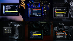
As you can see now, I've changed how my galleries function, and am quite pleased with the results. Here are a few screen captures of the changes I've made.
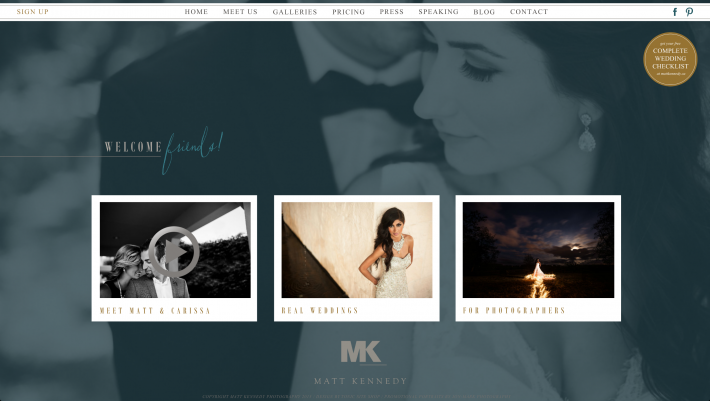


You can view my site at http://www.mattkennedy.ca
From the dozens of photographers that I've talked to who have used the Peek test, most have been very pleased with their video, and have made changes to their sites because of it. Keep in mind that the users who are doing the testing are picked at random and you may get feedback that you find irrelevant or that you disagree with. That's ok, and you get 3 free tests to get a good variety of testers.
Paid Testing Through UserTesting
Another option is using UserTesting's actual paid service where you can select your target demographic and have them do a test of your site. When you do this, you can even ask your own questions and give your own directives in order to the get the type of feedback you want for your site. You can get them to compare your site with another photographers site and give you their opinions. You can ask them to find certain things on your site and see how long it takes them. You can ask them why they would or would not contact you as a client. You can even to specific mobile site testing and select what device they use to access your site.
When you use the paid version, you have total control and it's VERY useful information to have! Here's a video of a targeted user testing from a good friend of mine Trevor Dayley:
http://www.usertesting.com/videos/pRpX6OWJBIl0PqrBHz-QVg
I think you'll find that after a couple sessions you'll either want to make changes and do it again, or you'll be happy with your site and glad to have the confirmation. Either way, I think you should try it because it's as simple as putting in your URL and email.
When you've completed it, if you think there is value in what you heard, post up your video in the comments below! It's valuable hearing what other sites are doing right and wrong so we can all learn together.


Join the Fstoppers community for free
-
Post comments and join in the discussions
-
Browse the site ad-free
-
Share your work and get featured in the community
-
Compete in the photo contests for fun and prizes
24 Comments
As someone in the marketing industry with a focus in IA/UX - the information they provide, even if it's 5 minutes is crucial! Often, designers fall in love with their product and the pool of great designers and great user experience thinkers is small. Anyone in the UX industry will tell you the customer's perspective and experience is king. A valuable resource to have!
Pretty cool. Happy with the results. http://peek.usertesting.com/result/814487414818?autoplay=true
Im in the process of redoing my website (launching within a week or two), but decided to see what they have to say about my current version... came out very nice, but will be interesting to compare it to the next version later this month. http://peek.usertesting.com/result/737489885206?autoplay=true
Great timing for that Noam! Glad to hear!
Thanks for sharing! Also, love your website Matt!
I just received my review and I must say the guy doing it was quite the bore. He had no artistic sense, at least non open minded and spent too much time on my link to Fb instead of the site itself. Don't bother.
My suggestion is to submit your site multiple times and get feedback from multiple people. What one person thinks doesn't necessarily mean its what others think. If you see a consistent pattern of feedback fro more people then that would be the time to rethink maybe you need to change things up. Depending on your clientele, not all clients or many will be artistic or have artistic sense and your website shouldn't be geared towards trying to wow other profressionals in the industry or thinking you are wowing your clients. Websites should be simple, effective, easy to read and navigate, to the point and pretty/clean on top.
to bad, my website www.samten.fr can't be explored by peek !
"This website is in a language Peek can't read."
... So if you want to do a review you are welcome ;)
Hi Samten. Since I can read your language. I thought I'd give you a little review... :o)
-Your site is very clear and easy to navigate.
-I'm not crazy about the header. Your logo is hard to see and I'm not sure the wavy lines design reflect the still of your work.
-Otherwise your work is outstanding. Not my style, but I can definitively appreciate your artistic creativity. Your style is very consistent. It looks like you find your niche.
- Since you have so much work to show. You should cut a fourth or even a third out ( I know it's to do ) But It will make your portfolio so much stronger.
- Also for your info page. Too long ! I don't think visitors want to read the all thing. Make it half the size.
Hope that help. Don't hesitate to contact me directly if you have any questions.
Cheers,
Frederic.
Hello Frederic,
Thank's a lot for your review !
And also thank you for your compliment, even if my work isn't in your style and taste !
This version of this site is already with a "light" content compare to my old one ... but you're right, I'll still have to reduce the quantity of images ... but it's hard to choose !
And you're also right about the info page ... but the French audience sometime complain about the lake of it ... so I'll have to find a good balance ( you know how French are grumpy ... ;) )
But again, thank you, it's nice to have review on this as it's a site I've handle all by myself ( using a really nice CMS by the way ) and It's hard to figure if things are going right or not !
You're very welcome Samten. Hopefully some one else will do a review on your site. So you get more perspectives...
I guess you're right about the French. They may need more info....
But I'd suggest that you make an English info page too. Since you art is so distinctive. You may attract client from other countries.
Have a great week.
Frederic.
I wish I do ... haven't been very fortunate till now ... but who knows :)
... I'm working on it.
And you're right about having it in English ... I was trying to get a .com version of my site, but it's owned by those crappy companies who by all the available domain's name :s
Samten, I agree with Frederic about the volume of work you have on the site. I should also say that your site loads painfully slowly on my connection. As an example, Frederic's loaded almost instantaneously where yours took 10 - 15 seconds to get the first photo to load and frankly, I never did get all of the images to load in any of the several categories I looked at. Nobody is going to wait that long to see your beautiful work unless they REALLY want to see it... like they're a relative or actually IN one of the photos!
That aside, the work I did see is beautifully done!
As an exclamation point on the conversation, in the time it has taken me to create this response, there are only two photos that have appeared in your "news" section. The remaining images are still little spinning gears. I had similar experiences in each of the other categories.
That's weird because I've tested it in many different places and it always has been quite fast to load !
Maybe there where doing some work on the network server ?
I'll have an eye on this problem !
If you want to be really nice, would you accept to try again tomorrow or any later and tell me if it's still the same speed ? That would be interesting for me to know that !
... and also thank you a lot for the nice compliment about my work :)
I rarely have any review about it as I'm working a bit like a lonely wolf in my small town and I don't get in touch a lot with the photographer's community, so that's mean a lot for me :)
I can definitely try again tomorrow and let you know.
If you`re interested in my site (if you haven`t already googled it) my work is at: www.arnalpix.com Your opinion is most welcome.
Cheers!
I could definitely use some of the places you've been shooting in as setup for my scenographic work ;)
About your website, we are based on the same type of navigation, that work fine for me :)
Maybe the only point that annoy me a bit is the fact that the pictures as stuck to the top of the page, which in my case, using a large screen, make them be really high !
We'll get in touch again soon ... here in France it's getting really late !
Cheers !
Thanks. I gave the site a try. The reviewer seemed knowledgable with photography. He gave some good insight.
Well, I had mine just done. http://peek.usertesting.com/result/637564103140?autoplay=true
It was pretty frustrating since the person I've got didn't know how to scroll on my site and barely saw anything of my site. So made some judgment on the 10% visible to her.
So I don't if is it something that most of the people that goes on my site Have difficulty with and I should address it immediately or it was just that visitor...
@fredericcharpentier:disqus Hey man. Your work is stellar for sure! And the site is clean, but to be completely honest, if you never told me about the scroll bar, I NEVER would have found it. It's so small at the bottom of the page. I literally spent 20 seconds trying to figure out what you meant by "scroll". I tried my scroll wheel a few times before seeing the little handle. Just my personal experience. Once again, beautiful work!!! Maybe if the scroll bar was a different color to stand out? Cheers mate! :)
Thank you so much Josiah for your kind worlds on my work and your honest feedback on my site.
So the scrolling bar is really a problem to be addressed !
WOW That "peek site" does really help. Okay I was frustrated this morning. But now I'm motivated to make some changes....
Again thank you Josiah and have a great week !
Cheers, Frederic.
Awesome! You're welcome man, hope the website tweaking goes smoothly!
Frederic, nice work and I hope your site is easy to navigate... since the navigation on yours is much like mine! LOL I have considered adding a scroll bar immediately under the images rather than the handle that goes with the browser. Based on your "Peek" person and Josiah's comments, that may be something you and I should add sooner than later. My visitors may likely have similar issues.
My only critique of your work is that it's awesome work, but there's a LOT of it on the site! From everything I've ever heard or read, it's best to keep to not more than 15 - 20 images per category. I know, I broke that rule a bit too, with 25 - 30 in my residential interiors section.
If you have a moment, I'd love your feedback on my site too: www.arnalpix.com
Cheers!
Hey Arnal, I guess you're using the web provider "4ormat" too.
I had this template for more then a year now and nobody complained. Then suddenly a friend a couple weeks ago asked me "where the rest of the photos went". I just thought that it was high and that was his problem...
But Now with the "Peek" review and Josiah confirming this issue. I'm spending the all day changing my template. Should be up tomorrow....
Your work is great Arnal. I definitively would have the confidence to hire you for architecture photography.
But ask around if people have the same problem than mine about the scrolling...
Anyway Thanks for the kind worlds on my work and yes I'll try to cut out more.
Cheers,
Frederic.
just got my one: http://peek.usertesting.com/result/277666332629?autoplay=true
My website is: www.muradrm.com