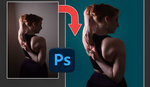
Most of us love photos with vibrant colors that seem to pop off the screen, but it's a subtle art creating such a look without making the final image gaudy and oversaturated. This helpful video will show you several methods for making colors burst using Photoshop.
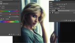
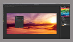
Coming to you from Nathaniel Dodson of tutvid, this video examines five techniques for bringing out color in Photoshop. Of the methods, my personal favorite is the Color Balance adjustment layer. I personally love adding a smidgen of blue and green to the shadows of my portraits and countering it with a bit of yellow in the highlights, and with that adjustment, it's exceedingly easy to dial in the exact same look every time, which in turn ensures consistency in my portfolio. Any of the techniques shown in the video work well, though; it's all about finding the one that works for what you shoot and how you edit, as well as how precise or global you'd like your adjustments to be. And remember, like most editing techniques, subtlety is the key here; it's typically better to err on the side of being conservative with your adjustments, especially with something like color saturation.


People really, really, really need to tone down the lens flare usage with the Lens Distortions pack. It is so painfully obvious and looks like garbage when not used properly. It is the first thing I noticed when I saw the video thumbnail. If you're going to use it, please for the love of god use it tastefully.
Ohhh I love this effect, brings so much life to the photos!!